鼠标悬浮特效:常见6种背景类悬浮特效
前言
在之前的文章中,我们介绍了常见的鼠标悬浮特效分为元素边框类特效(改变元素边框的展示方式)和元素背景类特效(改变元素背景颜色、阴影等)。在之前的文章中,介绍了 常见6种边框类悬浮特效 。本文将着重介绍日常开发中,常见的6种元素背景类特效。
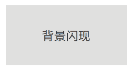
背景闪现
背景闪现:鼠标悬浮时,元素产生一个新背景,其效果图如下所示:
效果预览
代码展示
html
<!DOCTYPE html>
<html lang="en">
<head>
<meta charset="UTF-8">
<meta name="viewport" content="width=device-width, initial-scale=1.0">
<title>背景闪现</title>
<style>
.hover-border {
margin: 50px;
width: 200px;
height: 100px;
background-color: #e0e0e0;
position: relative;
transition: background-color 0.3s ease;
/* 文字相关属性 */
display: flex;
justify-content: center;
align-items: center;
font-size: 20px;
color: #333;
}
.hover-border:hover {
background-color: #230FEE;
}
</style>
</head>
<body>
<div class="hover-border">背景闪现</div>
</body>
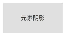
</html>元素阴影
元素阴影:鼠标悬浮时,元素产生阴影效果,其效果图如下所示:
效果预览
代码展示
html
<!DOCTYPE html>
<html lang="en">
<head>
<meta charset="UTF-8">
<meta name="viewport" content="width=device-width, initial-scale=1.0">
<title>元素阴影</title>
<style>
.hover-border {
margin: 50px;
width: 200px;
height: 100px;
background-color: #e0e0e0;
position: relative;
transition: background-color 0.3s ease;
/* 文字相关属性 */
display: flex;
justify-content: center;
align-items: center;
font-size: 20px;
color: #333;
}
.hover-border:hover {
box-shadow: 5px 5px 10px;
}
</style>
</head>
<body>
<div class="hover-border">元素阴影</div>
</body>
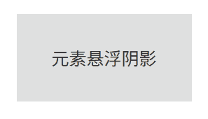
</html>元素悬浮阴影
元素悬浮阴影:鼠标悬浮时,元素向外扩大,并产生阴影效果,其效果图如下所示:
效果预览
代码展示
html
<!DOCTYPE html>
<html lang="en">
<head>
<meta charset="UTF-8">
<meta name="viewport" content="width=device-width, initial-scale=1.0">
<title>元素悬浮阴影</title>
<style>
.hover-border {
margin: 50px;
width: 200px;
height: 100px;
background-color: #e0e0e0;
position: relative;
transition: background-color 0.3s ease;
/* 文字相关属性 */
display: flex;
justify-content: center;
align-items: center;
font-size: 20px;
color: #333;
}
.hover-border:hover {
transform: scale(1.1);
box-shadow: 5px 5px 10px;
}
</style>
</head>
<body>
<div class="hover-border">元素悬浮阴影</div>
</body>
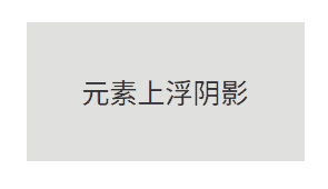
</html>元素上浮阴影
元素悬浮阴影:鼠标悬浮时,元素会向上浮动,同时在元素下方生成一个缩小的投影,其效果图如下所示:
效果预览
代码展示
html
<!DOCTYPE html>
<html lang="en">
<head>
<meta charset="UTF-8">
<meta name="viewport" content="width=device-width, initial-scale=1.0">
<title>元素上浮阴影</title>
<style>
.hover-border {
margin: 50px;
width: 200px;
height: 100px;
background-color: #e0e0e0;
position: relative;
/* 文字相关属性 */
display: flex;
justify-content: center;
align-items: center;
font-size: 20px;
color: #333;
}
.hover-border::before {
content: '';
position: absolute;
z-index: -1;
top: 100%;
left: 5%;
height: 10px;
width: 90%;
opacity: 0;
background: radial-gradient(ellipse at center, rgba(0, 0, 0, 0.35) 0%, rgba(0, 0, 0, 0) 80%);
}
.hover-border:hover {
transform: translateY(-10px);
}
.hover-border:hover::before {
opacity: 1;
transform: translateY(10px);
}
</style>
</head>
<body>
<div class="hover-border">元素上浮阴影</div>
</body>
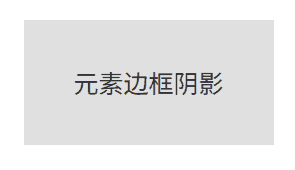
</html>元素边框阴影
元素边框阴影:鼠标悬浮时,元素左侧和上侧会产生一个内阴影,看起来元素像是"下沉"到页面中了,其效果图如下所示:
效果预览
代码展示
html
<!DOCTYPE html>
<html lang="en">
<head>
<meta charset="UTF-8">
<meta name="viewport" content="width=device-width, initial-scale=1.0">
<title>元素边框阴影</title>
<style>
.hover-border {
margin: 50px;
width: 200px;
height: 100px;
background-color: #e0e0e0;
position: relative;
/* 文字相关属性 */
display: flex;
justify-content: center;
align-items: center;
font-size: 20px;
color: #333;
}
.hover-border:hover {
box-shadow: inset 5px 5px 5px rgba(0, 0, 0, 0.2);
}
</style>
</head>
<body>
<div class="hover-border">元素边框阴影</div>
</body>
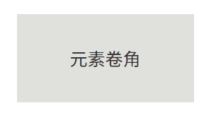
</html>元素卷角
元素卷角:鼠标悬浮时,元素的一个角卷起来了,其效果图如下所示:
效果预览
代码展示
html
<!DOCTYPE html>
<html lang="en">

	<head>
		<meta charset="UTF-8">
		<meta name="viewport" content="width=device-width, initial-scale=1.0">
		<title>元素卷角</title>
		<style>
			.hover-border {
				margin: 50px;
				width: 200px;
				height: 100px;
				background-color: #e0e0e0;
				position: relative;
				/* 文字相关属性 */
				display: flex;
				justify-content: center;
				align-items: center;
				font-size: 20px;
				color: #333;
			}

			.hover-border::before {
				content: "";
				position: absolute;
				top: 0;
				left: 0;
				width: 0;
				height: 0;
				border-style: solid;
				border-width: 0;
				border-color: rgba(255, 255, 255, 0.8) transparent transparent rgba(255, 255, 255, 0.8);
				box-shadow: 1px 1px 1px rgba(0, 0, 0, 0.2);
				transition: border-width 0.3s ease;
			}

			.hover-border:hover::before {
				border-width: 20px;
			}
		</style>
	</head>

	<body>
		<div class="hover-border">元素卷角</div>
	</body>

</html>
结语
本文主要介绍了6种常见的鼠标悬浮背景类特效,你还知道哪些鼠标悬浮背景类特效?欢迎在评论区留言分享!