什么是css
Cascading Style Sheet 层叠级联样式表
表现 (美化网页)
字体,颜色,边距,高度,宽度,背景图片,网页定位,网页浮动..
发展史
CSS1.0
CSS2.0 DIV(块)+CSS,HTML与CSS结构分离的思想,网页变得简单,SEO
CSS2.1 浮动,定位
CSS3.0 圆角,阴影,动画...浏览器兼容性~
css入门
html
<!DOCTYPE html>
<html lang="en">
<head>
    <meta charset="UTF-8">
    <meta name="viewport" content="width=device-width, initial-scale=1.0">
    <title>Document</title>

    <!-- 规范,<style>标签,css代码写在这里面,每一个声明用分号隔开
    语法:
        选择器{
            声明1;
            声明2;
            声明3;
        }

    -->
    <link rel="stylesheet" href="css/style.css">
</head>

<body>
    <h1>我的第一个css程序</h1>
</body>
</html>
建议使用这种规范
css的优势:
1、内容和表现分离
2、网页结构表现统一,可以实现复用
3、样式十分的丰富
4、建议使用独立于html的css文件
5、利用SEO,容易被搜索引擎收录!
css的三种导入方式
html
<!DOCTYPE html>
<html lang="en">
<head>
    <meta charset="UTF-8">
    <meta name="viewport" content="width=device-width, initial-scale=1.0">
    <title>Document</title>
</head>
<!-- 内部样式 -->
<style>
    h1{
        color: red;
    }
</style>

<!-- 外部样式 -->
<link rel="stylesheet" href="css/style.css">

<body>
    <!-- 优先级:就近原则,谁离标签近,就听谁的 -->
    <!-- 行内样式:在标签元素中编写一个style属性,然后编写样式即可 -->
    <h1 style="color: green;">导入样式</h1>
</body>
</html>
扩展:外部样式的两种写法
- 链接式:
html
html
<!-- 外部样式 -->
<link rel="stylesheet" href="css/style.css">- 导入式
@Import是CSS2.1特有的
html
<style>
    @import url("css/style.css");
</style>
三种基本选择器
1、标签选择器:选择一类标签 标签{}
html
<!DOCTYPE html>
<html lang="en">
<head>
    <meta charset="UTF-8">
    <meta name="viewport" content="width=device-width, initial-scale=1.0">
    <title>标签选择器</title>

    <!-- 标签选择器 -->
    <style>
        h1{
            color: red;
        }
        p{
            color: blue;
        }
    </style>
</head>
<body>
    <h1>陈兴勇</h1>
    <h1>2025海南专升本</h1>
    <p>上岸海南热带海洋学院软件工程专业</p>
</body>
</html>
2、类选择器 class:选择所有class 属性一致的标签,跨标签.类名{}
html
<!DOCTYPE html>
<html lang="en">
<head>
    <meta charset="UTF-8">
    <meta name="viewport" content="width=device-width, initial-scale=1.0">
    <title>Document</title>

    <!--
     类选择器的格式.class的名称{}
     好处,可以多个标签归类,是同一个class,可以复用
    -->
    <style>
        .title{
            color: red;
        }
        .content{
            color: blue;
        }
    </style>
</head>
<body>
    <h1 class="title">陈兴勇</h1>
    <h1 class="content">2025海南专升本</h1>
    <p class="content">上岸海南热带海洋学院软件工程专业</p>
</body>
</html>3、id 选择器:全局唯一! #id名{}
html
<!DOCTYPE html>
<html lang="en">
<head>
    <meta charset="UTF-8">
    <meta name="viewport" content="width=device-width, initial-scale=1.0">
    <title>Document</title>

    <style>
        /*
         id选择器的格式:#id的名称{}
         好处:id选择器是唯一的,不能重复,所以不能复用
         优先级:不遵循就近原则,固定的
         id选择器>class选择器>标签选择器
         */
        #title{
            color: red;
        }
        #content{
            color: blue;
        }
        h1{
            color: green;
        }
        .title{
            color: yellow;
        }
    </style>
</head>

<body>
    <h1 id="title" class="title">陈兴勇</h1>
    <h1 id="title">2025海南专升本</h1>
    <p id="content">上岸海南热带海洋学院软件工程专业</p>
    <h1>加油</h1>
</body>
</html>
**优先级:**id选择器>class选择器>标签选择器
层次选择器
后代选择器:在某个元素的后面 祖爷爷 爷爷 爸爸 你
html
        /* 后代选择器
        body p{
            color: red;
        } */
子选择器:一代,儿子
html
        /* 子选择器
        body > p{
            color: blue;
        } */
相邻兄弟选择器:同辈
html
        /* 相邻兄弟选择器 */
        .active + p{
           background-color: red;
        }
通用选择器
html
        /* 通用选择器 选中当前元素向下的所有兄弟元素 */
        .active ~ p{
            background-color: blue;
        }
结构伪类选择器
html
<!DOCTYPE html>
<html lang="en">
<head>
    <meta charset="UTF-8">
    <meta name="viewport" content="width=device-width, initial-scale=1.0">
    <title>Document</title>

    <style>
        /* 避免使用id,class选择器 */
        /* ul第一个子元素 */
        ul li:first-child{
           background-color: red;
        }
        /* ul最后一个子元素 */
        ul li:last-child{
            background-color: green;
        }

        /* 选中p1:定位到父元素,选择当前的第一个元素
        选择当前p元素的父级元素,选中父级元素的第二个,并且是当前元素才生效!,顺序 */
        p:nth-child(2){
            background-color: yellow;
        }
        /* 选中父元素,下的p元素的第二个,类型 */
        p:nth-of-type(2){
            background-color: aqua;
        }

    </style>
</head>
<body>
    <h1>h1</h1>
    <p>p1</p>
    <p>p2</p>
    <p>p3</p>
    <ul>
        <li>li1</li>
        <li>li2</li>
        <li>li3</li>
    </ul>


</body>
</html>
属性选择器(常用)
把id+class结合
html
<!DOCTYPE html>
<html lang="en">
<head>
<meta charset="UTF-8">
<meta name="viewport" content="width=device-width, initial-scale=1.0">
<title>Document</title>
<style>
demo af {
float: left;
display: block;
height: 50px;
width: 50px;
border-radius: 10px;
background: #2700ff;
text-align: center;
color: gainsboro;
text-decoration: none;
margin-right: 5px;
font: bold 20px/50px Arial;
}
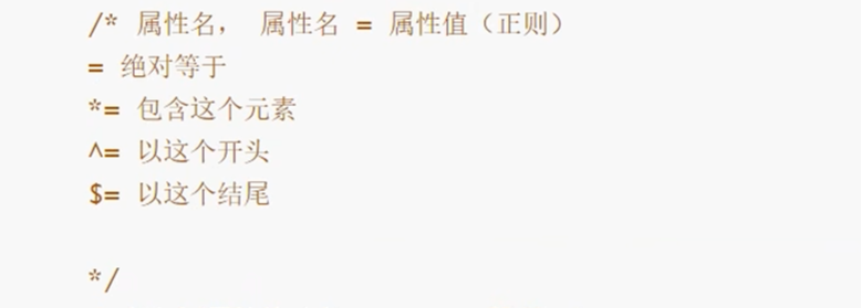
/* 属性名,属性名 = 属性值(正则
= 绝对等于
*= 是包含这个元素
^= 以这个开头
$= 以这个结尾
) */
/* 存在id的元素 a[]{}*
a[id]{
background: yellow;
} */
/* id = first的元素
a[id = first]{
background: yellow;
} */
/* class中含有links的元素
a[class *= "links"]{
background: yellow;
} */
/* 选中href中以http开头的元素
a[href^=http]{
background: yellow;
} */
/* 选中href中以http结尾的元素 */
a[href $= pdf ]{
background: yellow;
}
</style>
</head>
<body>
<p class="demo">
<a href="https://www.baidu.com" class="links item first" id="first">1</a>
<a href="https://una" class="links item active" target="_blank" title="test">2</a>
<a href="images/123.html" class="links item">3</a>
<a href="images/123.png" class="links item">4</a>
<a href="images/123.jpg" class="links item">5</a>
<a href="abc" class="links item">6</a>
<a href="/a.pdf" class="links item">7</a>
<a href="/abc.pdf" class="links item">8</a>
<a href="abc.doc" class="links item">9</a>
<a href="abcd.doc" class="links item last">10</a>
</p>
</body>
</html>美化网页元素
为什么要美化网页
1、有效的传递页面信息
2、美化网页,页面漂亮,才能吸引用户
3、凸显页面的主题
4、提高用户的体验
span标签:重点要突出的字,使用span 套起来
html
<!DOCTYPE html>
<html lang="en">
<head>
    <meta charset="UTF-8">
    <meta name="viewport" content="width=device-width, initial-scale=1.0">
    <title>Document</title>

    <style>
        #title1{
            font-size: 50px;
        }
    </style>

</head>
<body>
    欢迎学习 <span id="title1">Java</span>
</body>
</html>
字体样式
html
<!DOCTYPE html>
<html lang="en">
<head>
    <meta charset="UTF-8">
    <meta name="viewport" content="width=device-width, initial-scale=1.0">
    <title>Document</title>

    <!--
        font-family:字体
        font-size:字体大小
        font-weight:字体粗细
        color:字体颜色

    -->
    <style>
        body{
            font-family: 楷体;
            color: green;

        }

        h1{
            font-size: 50px;
        }

        .p1{
            font-weight: bold;
        }
    </style>
</head>
<body>
    <h1>桃野又奈</h1>
    <p class="p1">xxx</p>
    <p>xxxxxx</p>
    <p>xxxxxxx</p>
</body>
</html>
文本样式
- 颜色 color rgba rgb
- 文本对齐方式 text-align = center
- 首行缩进 text-indent:2em
- 行高 line-height
- 装饰 text-decoration
- 文本图片水平对齐:vertical-align:middle
html
<!DOCTYPE html>
<html lang="en">
<head>
    <meta charset="UTF-8">
    <meta name="viewport" content="width=device-width, initial-scale=1.0">
    <title>Document</title>
    <!--
    颜色:
        单词
        RGB 0-F
        RGBA A:0-1

        text-align:排版居中;
        text-indent:2em; 段落首行缩进
        行高,和块的高度一致就可以上下居中

    -->
    <style>

        h1{
            color: rgba(0, 255, 255, 0.9);
            text-align: center;
        }

        .p1{
            text-indent: 2em;
        }

        .p3{
            background: goldenrod;
            height: 300px;
            line-height: 300px;
        }

        /* 下划线 */
        .l1{
            text-decoration: underline;
        }
        /* 中划线 */
        .l2{
            text-decoration: line-through;
        }
        /* 上划线 */
        .l3{
            text-decoration: overline;
        }
        /* 超链接去下划线 */
        a{
            text-decoration: none;
        }
        /* 文字图片水平对齐 */
        img,span{
            vertical-align: middle;
        }
    </style>
</head>
<body>
    <p class="l1">123321</p>
    <p class="l2">123321</p>
    <p class="l3">123321</p>


    <h1>故事介绍</h1>

    <p class="p1">
        陈兴勇2025海南专升本上岸海南热带海洋学院软件工程专业
    </p>

    <p class="p3">
        hahahhaahahahhahahaha
    </p>
</body>
</html>
阴影:
css
        /* text-shadow:阴影颜色,水平偏移,垂直偏移,阴影半径 */
        #beautiful{
            text-shadow: blue 10px 10px 10px;
        }
超链接伪类:正常情况下:a:hover
css
        /* 默认的颜色 */
        a{
            text-decoration: none;
            color: #000000;
        }

        /* 鼠标悬浮的状态(只需要记住) */
        a:hover{
            color: orange;
            font-size: 50px;
        }
列表
css
/*
list-style:
    none 去掉原点
    circle 空心圆
    decimal 数字
    square 正方形
*/


ul li{
    height: 30px;
    list-style: none;
    text-indent: 1em;
}
背景
背景颜色
背景图片
css
       div{
            width: 1000px;
            height: 700px;
            border: 1px solid red;
            background-image: url("images/3.jpg");
            /* 默认是全部平铺的 */
        }

        .div1{
            background-repeat: repeat-x;
        }

        .div2{
            background-repeat: repeat-y;
        }
        .div3{
            background-repeat: no-repeat;
        }
渐变
css
background-color:#FFFFFF;
background-image: linear-gradient(115deg, #FFFFFF 0%,#6284FF 50%, #FF0000 100%)
盒子模型
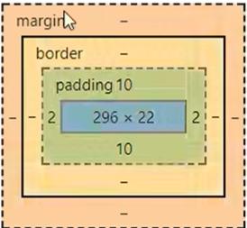
什么是盒子模型
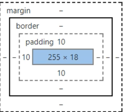
margin:外边距
padding:内边距
border:边框
边框
1.边框的粗细
2.边框的样式
3.边框的颜色
css
<style>
        body{
            margin: 0;
        }
        /* border:粗细 样式 颜色 */
        #box{
            width: 300px;
            border: 1px solid red;
        }

        form{
            background: green;
        }

        div:nth-of-type(1) input{
            border: 3px solid blue;
        }

        h2{
            font-size: 16px;
            background-color: green;
            line-height: 30px;
            color: white;
        }

        div:nth-of-type(2) input{
            border: 3px dashed red;
        }

        div:nth-of-type(3) input{
            border: 3px dashed pink;
        }
    </style>
内外边距
html
<!DOCTYPE html>
<html lang="en">

<head>
    <meta charset="UTF-8">
    <meta name="viewport" content="width=device-width, initial-scale=1.0">
    <title>Document</title>

    <!-- 外边距的妙用:居中元素
        margin:0 auto
    -->
    <style>
        body{
            margin: 0;
        }
        /* border:粗细 样式 颜色 */
        #box{
            width: 300px;
            border: 1px solid red;
            margin: 0 auto;
        }

        /*
         顺时针旋转
         margin:0
         margin:0 1px
         margin:0 1px 2px 3px

        */

        form{
            background: green;
        }


        h2{
            font-size: 16px;
            background-color: green;
            line-height: 30px;
            color: white;
        }

        input{
            border: 1px solid black;
        }
    </style>
</head>

<body>
    <div id="box">
        <h2>会员登录</h2>
        <form action="#">
            <div>
                <span>用户名:</span>
                <input type="text">
            </div>
            <div>
                <span>密码:</span>
                <input type="password">
            </div>
            <div>
                <span>邮箱:</span>
                <input type="text">
            </div>
        </form>

    </div>
</body>

</html>
盒子的计算方式(margin+border+padding+内容宽度)
圆角边框
css
    <!--
    左上 右上 右下 左下,顺时针方向
    -->

    <!--
    圆圈:圆角=半径
    -->
    <style>
        div{
            width: 100px;
            height: 100px;
            border: 10px solid red;
            border-radius: 100px;
        }
    </style>
阴影
html
<!DOCTYPE html>
<html lang="en">
<head>
    <meta charset="UTF-8">
    <meta name="viewport" content="width=device-width, initial-scale=1.0">
    <title>Document</title>
    <style>
        img{
            border-radius: 50px;
            box-shadow: 10px 10px 100px yellow;
        }
    </style>
</head>
<body>
    <div style="width: 500px;display: block; text-align: center;">
        <img src="images/1.jpg" alt="">
    </div>
</body>
</html>
浮动
标准文件流
行内元素:独占一行
h1-h6 p div 列表...
行内元素:不独占一行
span a img strong
行内元素可以包含在块级元素中,反之,则不可以
display
css
    <!--
    block 块元素
    inline 行内元素
    inline-block 是块元素,但是可以内联,在一行!
    none
    -->
    <style>
        div{
            width: 100px;
            height: 100px;
            border: 1px solid red;
            display: none;
        }

        span{
            width: 100px;
            height: 100px;
            border: 1px solid red;
            display: inline-block;
        }
    </style>
1.这是一种实现行内元素排序方式,但我们很多情况都是用float
float
元素怎样浮动
元素的水平方向浮动,意味着元素只能左右移动而不能上下移动。
一个浮动元素会尽量向左或向右移动,直到它的外边缘碰到包含框或另一个浮动框的边框为止。
浮动元素之后的元素将围绕它。
浮动元素之前的元素将不会受到影响。
如果图像是右浮动,下面的文本流将环绕在它左边:
img
{
    float:right;
}
彼此相邻的浮动元素
如果你把几个浮动的元素放到一起,如果有空间的话,它们将彼此相邻。
在这里,我们对图片廊使用 float 属性:
.thumbnail
{
    float:left;
    width:110px;
    height:90px;
    margin:5px;
}
清除浮动 - 使用 clear
元素浮动之后,周围的元素会重新排列,为了避免这种情况,使用 clear 属性。
clear 属性指定元素两侧不能出现浮动元素。
使用 clear 属性往文本中添加图片廊:
css
.text_line
{
    clear:both;
}
父级边框塌陷的问题
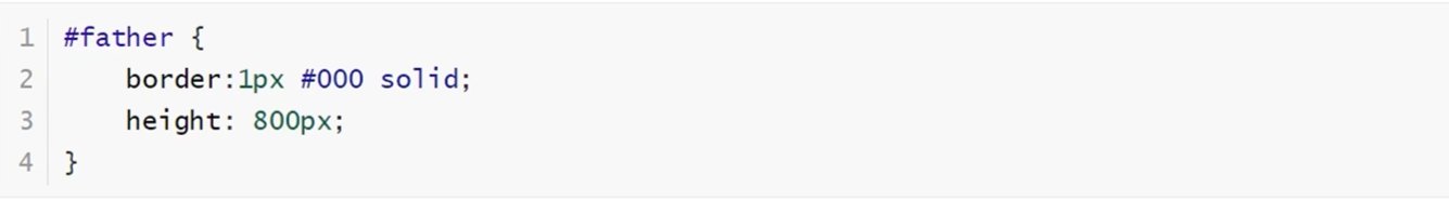
1.增加父级元素的高度
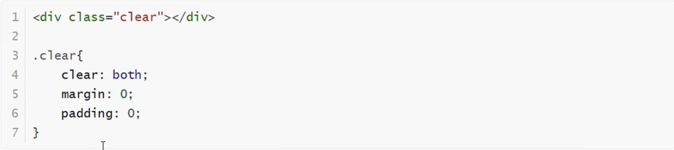
2.增加一个空的div标签
3.overflow

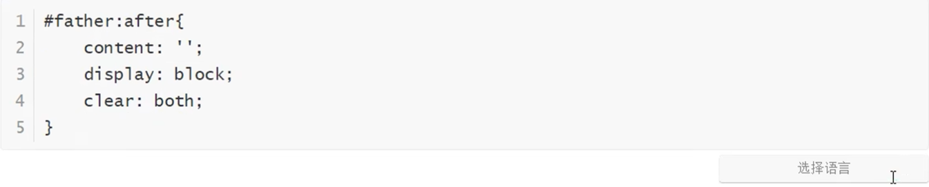
4.父类增加一个伪类:after
小结:
- 浮动元素后面增加空div:简单,代码中尽量避免空div
- 设置父元素的高度:简单,元素假设有了固定的高度,就会被限制
- overflow:简单,下拉的一些场景避免使用
- 父类添加一个伪类:after(推荐)写法稍微复杂一点,但是没有副作用,推荐使用!
对比
- display
- 方向不可以控制
- float
- 浮动起来的话会脱离标准文档流,所以要解决父级边框塌陷的问题~
定位
默认情况
css
<!DOCTYPE html>
<html lang="en">
<head>
    <meta charset="UTF-8">
    <meta name="viewport" content="width=device-width, initial-scale=1.0">
    <title>Document</title>
    <style>
        div{
            margin: 10px;
            padding: 5px;
            font-size: 12px;
            line-height: 25px;
        }

        #father{
            border: 1px solid green;
            padding: 0;
        }

        #first{
            border: 1px dashed gray;
            background-color: blueviolet;
        }

        #second{
            border: 1px dashed blue;
            background-color: aqua;
        }

        #third{
            border: 1px dashed red;
            background-color: yellowgreen;
        }
    </style>
</head>
<body>
    <div id="father">
        <div id="first">第一个盒子</div>
        <div id="second">第二个盒子</div>
        <div id="third">第三个盒子</div>
    </div>
</body>
</html>
相对定位
相对定位:position: relative;
相对于原来的位置,进行指定的偏移,相对定位的话任然在标准文档流中!原来的位置会被保留
css
top:-20px;
left: 20px;
bottom:-10px;
right:20px;
绝对定位
定位:基于xxx定位,上下左右
1、没有父级元素定位的前提下,相对于浏览器定位
2、假设父级元素存在定位,我们通常会相对于父级元素进行偏移
3、在父级元素范围内移动
相对于父级或浏览器的位置,进行指定的偏移,绝对定位的话,它不在在标准文档流中,原来的位置不会被保留