效果图
vue-grid-layout
文档地址:vue-grid-layout
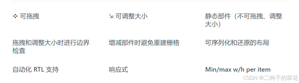
官网介绍:
使用
js
// 安装:
npm install vue-grid-layout --save

// 引用:
import { GridLayout, GridItem } from 'vue-grid-layout'

// 注册:
components:{ GridLayout, GridItem }
场景
项目中,用户需要通过拖拽修改工作台布局,故使用该插件。
1.将每个模块都单独作为一个组件引入,通过 <component :is="item.components"></component>实现动态组件的加载。
2.根据设计稿,设置layout,参数解析请看gridItem 属性解析。
3.根据官网给GridLayout设置属性
实现
js
<template>
    <div class="workbench-container">
        <grid-layout :layout.sync="layout" :use-bounds="true" :col-num="3" :row-height="100"
                    :is-draggable="true" :is-resizable="false" :is-mirrored="false" :vertical-compact="true"
                    :margin="[16, 16]" @layout-updated="layoutUpdatedEvent" :use-css-transforms="true" ref="gridRef">
            <grid-item class="gridItem" v-for="item in layout" :x="item.x" :y="item.y" :w="item.w" :h="item.h"
                :i="item.i" :key="item.i">
                 <div class="w-100 h-100 realtive grid-content">
                              <component :is="item.components"></component>
                            <i class="del-icon" @click="delItem(item.i)"></i>
                        </div>
            </grid-item>
        </grid-layout>

    </div>
</template>

<script>
import { GridLayout, GridItem } from 'vue-grid-layout'

export default {
    name: 'GeopOpWebIndex',
    components: {
        GridLayout, GridItem,

        sysAnnounce: () => import('./components/sysAnnounce.vue'), // 公告
        shortcutOperation: () => import('./components/shortcutOperation.vue'), //操作
        groupInfo: () => import('./components/groupInfo.vue'), // 信息
        complaintsAfailures: () => import('./components/complaintsAfailures.vue'), // 投诉
        advertisieMarket: () => import('./components/advertisieMarket.vue'), //营销
        systemTodo: () => import('./components/systemTodo.vue'), //待办
        processNavigation: () => import('./components/processNavigation.vue'), //导航
        industryRanking: () => import('./components/industryRanking.vue'), //排名
    },


    data() {
        return {
            // y:高度--基于设置的row-height(100)  h:高度--基于设置的row-height(100) 注意计算的时候会加上margin,不是完全是100的倍数  x:横向位置  w:宽度--基于设置的col-num(3)  i:唯一标识
            layout: [
                //左侧
                { "x": 0, "y": 0, "w": 2, "h": 3.715, "i": "systemTodo", components: "systemTodo" },
                { "x": 0, "y": 3.715, "w": 2, "h": 4.12, "i": "processNavigation", components: "processNavigation" },
                { "x": 1, "y": 7.835, "w": 1, "h": 2.05, "i": "complaintsAfailures", components: "complaintsAfailures" },//投诉
                { "x": 0, "y": 7.835, "w": 1, "h": 2.05, "i": "groupInfo", components: "groupInfo" },//信息


                //右侧的
                { "x": 2, "y": 0, "w": 1, "h": 1.255, "i": "advertisieMarket", components: "advertisieMarket" },//广告营销
                { "x": 2, "y": 1.255, "w": 1, "h": 2.05, "i": "shortcutOperation", components: "shortcutOperation" },//操作
                { "x": 2, "y": 3.305, "w": 1, "h": 2.9, "i": "sysAnnounce", components: "sysAnnounce" },//公告
                { "x": 2, "y": 6.205, "w": 1, "h": 4.1, "i": "industryRanking", components: "industryRanking" },//排名
            ],


        };
    },

    mounted() {

    },

    methods: {
  // 移除某组件
        delItem(i) {
            let index = this.showSelectionList.findIndex(item => item === i)
            this.showSelectionList.splice(index, 1)
        },
  layoutUpdatedEvent(newLayout) {
            this.handleUpdate(newLayout)
        },
        // 解决自适应有组件顶部会遮挡的问题
        handleUpdate(layout) {
            let isResize = false
            layout.forEach(item => {
                if (item.y < 0) {
                    item.y = 0;
                    isResize = true
                }
            });
            this.layout = layout;
            if (isResize) this.$refs.gridRef.layoutUpdate()
        },

    },
};
GridLayout属性
layout:初始布局margin:定义栅格中的元素边距isDraggable:标识栅格中的元素是否可拖拽。isResizable:标识栅格中的元素是否可调整大小。verticalCompact:标识布局是否垂直压缩。cols:列数preventCollision:防止碰撞属性,值设置为ture时,栅格只能拖动至空白处。
事件:
layout-updated:布局updated事件
GridItem 属性
本次使用的为以下属性,其他内容请自行查看文档。
i:栅格中元素的ID,要唯一。x:位于第几列,自然数;y:位于第几行,自然数;w:栅格元素的初始宽度,值为colWidth的倍数h:栅格元素的初始高度,值为rowHeight的倍数;