这是接着上一篇css基础的第二篇:主要开始对页面的布局进行学习
显示模式:
块级模式(Block)
-
特点 :
-
元素会独占一行,在其前后会自动换行,与其他块级元素在垂直方向上排列。
-
宽度默认为所在容器的 100%,可以通过设置
width属性来改变。 -
可以通过
margin和padding来控制元素与其他元素之间的间距以及内部内容与边框之间的间距。 -
常见的块级元素如
<div>、<p>、<h1>-<h6>等。
-
html
<!DOCTYPE html>
<html lang="en">
<head>
    <meta charset="UTF-8">
    <meta name="viewport" content="width=device-width, initial-scale=1.0">
    <title>块级模式</title>
    <style>
        .block-demo {
            display: block; /* 块级显示 */
            width: 400px; /* 设置宽度 */
            height: 200px; /* 设置高度 */
            background-color: #f0f0f0; /* 背景颜色 */
            margin: 10px; /* 外边距 */
            padding: 10px; /* 内边距 */
            border: 1px solid #ccc; /* 边框 */
        }
    </style>
</head>
<body>
    <h1>块级模式展示</h1>
    <div class="block-demo">
        这是一个块级元素,它独占一行,宽度默认是容器的 100%(这里设置为 200px),可以通过设置 width 属性来改变宽度,还可以通过 margin 和 padding 控制间距。
    </div>
    <div class="block-demo">
        这是另一个块级元素,它会自动换行到下一行,与前面的块级元素垂直排列。
    </div>
</body>
</html>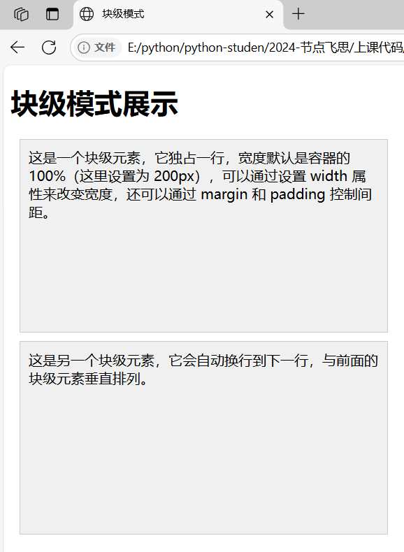
- 应用场景 :用于构建页面的整体布局结构,比如页面的主要内容区域、标题块等。
行内模式(Inline)
-
特点 :
-
元素不会独占一行,会与相邻的行内元素在同一行显示,直到一行排满才会换行。
-
宽度由其内容决定,不能通过设置
width属性来改变宽度。 -
只能通过
margin和padding的左右方向来设置间距,上下方向的设置一般不会产生预期效果(在标准盒模型下)。 -
常见的行内元素如
<span>、<a>、<img>等。
-
html
<!DOCTYPE html>
<html lang="en">
<head>
    <meta charset="UTF-8">
    <meta name="viewport" content="width=device-width, initial-scale=1.0">
    <title>行内模式</title>
    <style>
        .inline-demo {
            display: inline; /* 行内显示 */
            width: 100px; /* 尝试设置宽度,但在标准盒模型下无效 */
            height: 50px; /* 尝试设置高度,但在标准盒模型下无效 */
            background-color: #e0e0e0; /* 背景颜色 */
            margin: 5px; /* 外边距 */
            padding: 5px; /* 内边距 */
            border: 1px solid #ccc; /* 边框 */
        }
    </style>
</head>
<body>
    <h1>行内模式展示</h1>
    <div>
        <span class="inline-demo">
            这是一个行内元素,它不会独占一行,宽度由内容决定,不能通过 width 改变宽度,只能设置左右方向的间距。
        </span>
        <span class="inline-demo">
            这是另一个行内元素,它会和前面的行内元素在同一行显示,直到一行排满才会换行。
        </span>
    </div>
</body>
</html>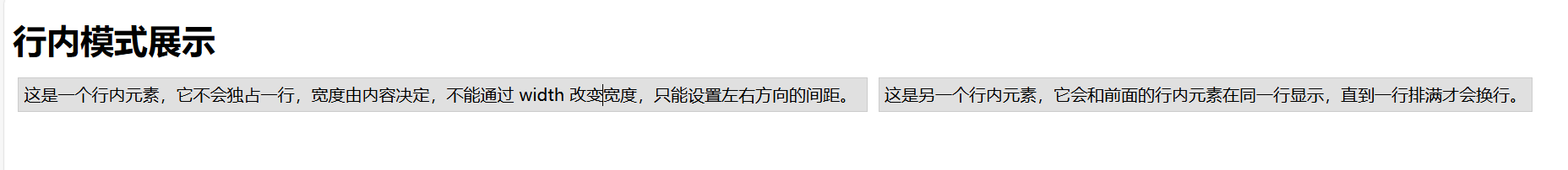
- 应用场景 :适合用于页面中一些较小的、连续性的内容,如文本中的超链接、图片插入在文字中间等。
行内块模式(Inline - Block)
-
特点 :
-
兼具了行内和块级的特点,在水平方向上像行内元素一样可以与其他元素并排显示,但在垂直方向上又像块级元素,可以设置自己的宽度和高度。
-
可以通过
margin和padding的所有方向来控制间距。 -
常见的可以通过设置
display为 inline - block 的元素应用此模式,比如让某些原本是行内或块级的元素以这种方式显示。
-
html
<!DOCTYPE html>
<html lang="en">
<head>
    <meta charset="UTF-8">
    <meta name="viewport" content="width=device-width, initial-scale=1.0">
    <title>行内块模式</title>
    <style>
        .inline-block-demo {
            display: inline-block; /* 行内块显示 */
            width: 300px; /* 设置宽度 */
            height: 170px; /* 设置高度 */
            background-color: #d0d0d0; /* 背景颜色 */
            margin: 8px; /* 外边距 */
            padding: 8px; /* 内边距 */
            border: 1px solid #ccc; /* 边框 */
        }
    </style>
</head>
<body>
    <h1>行内块模式展示</h1>
    <div>
        <span class="inline-block-demo">
            这是一个行内块元素,它像行内元素一样可以和其他元素并排显示,但又能像块级元素一样设置宽度和高度。
        </span>
        <span class="inline-block-demo">
            这是另一个行内块元素,可以通过设置所有方向的 margin 和 padding 来控制间距,适用于需要在一行中排列但又能控制自身尺寸的场景。
        </span>
    </div>
</body>
</html>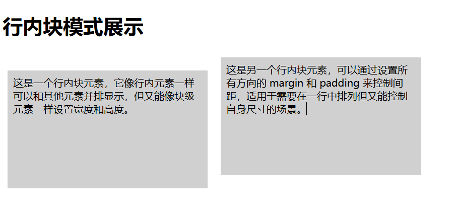
- 应用场景 :当需要元素既能在一行中排列又需要能控制自身的宽度高度时使用,例如一排导航按钮、一些排列紧密的小图标等。
| 显示模式 | 特点 | 布局表现 | 默认宽度 | 间距设置 | 常见应用元素 |
|---|---|---|---|---|---|
| 块级模式 | 元素独占一行,在前后自动换行,与其他块级元素垂直排列 | 宽度默认 100% ,通过设置 width 可改变,可通过 margin 和 padding 控制与其它元素间距及内部内容与边框间距 | 所在容器的 100% | 可通过 margin 和 padding 的所有方向设置间距 | <div>、<p>、<h1> - <h6> 等用于页面整体布局结构构建,如页面主要内容区域、标题块等 |
| 行内模式 | 不独占一行,与相邻行内元素在同一行显示,直到一行排满换行 | 宽度由内容决定,不能通过 width 改变宽度,只能通过 margin 和 padding 左右方向设置间距,上下方向设置一般无预期效果(标准盒模型下) | 由内容决定 | 仅能设置左右方向的 margin 和 padding | <span>、<a>、<img> 等用于页面较小、连续性内容,如文本中超链接、图片插入文字中间等 |
| 行内块模式 | 兼具行内和块级特点,水平方向像行内元素并排显示,垂直方向像块级元素可设置宽度高度 | 可通过 margin 和 padding 所有方向设置间距 | 可设置的宽度和高度 | 可设置所有方向的 margin 和 padding | 可通过设置 display 为 inline - block 的元素应用此模式用于元素需要在一行排列又能控制自身宽度高度的场景,如一排导航按钮、排列紧密的小图标等 |
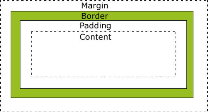
盒子模型:
1.简介
盒子模型是网页布局的基础,将页面中所有元素都看作是一个盒子,盒子都包含以下几个属性:
width 宽度 height高度 border边框 padding内边距 margin 外边距
2.盒子模型
分为四个方向:
上top、右right、下bottom、左left
border-top、border-right、border-bottom、border-left
每个边框包含三种样式:
border-top-color、border-top-width、border-top-style
border-right-color、border-right-width、border-right-style
border-bottom-color、border-bottom-width、border-bottom-style
border-left-color、border-left-width、border-left-style
html
div {
    width: 220px;
    padding: 10px;
    border: 5px solid gray;
    margin: 0;
}
最终元素的总宽度计算公式是这样的:
总元素的宽度=宽度+左填充+右填充+左边框+右边框+左边距+右边距
元素的总高度最终计算公式是这样的:
总元素的高度=高度+顶部填充+底部填充+上边框+下边框+上边距+下边距
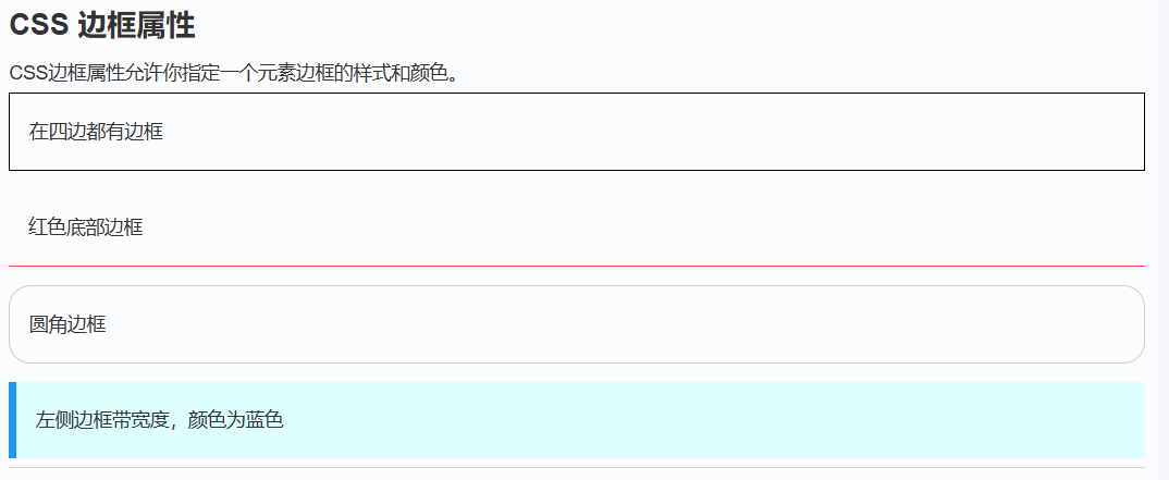
3.边框(border)
-
定义 :边框位于内边距和外边距之间,是一个围绕在内边距和内容周围的边框,用于分隔元素与其他元素。
-
特点 :
-
可以通过
border-width(宽度)、border-style(样式,如实线、虚线等)、border-color(颜色)等属性来设置。 -
边框的宽度会增加元素的总尺寸,即元素的总宽度 = 内容宽度 + 内边距左右值 + 边框左右值 + 外边距左右值,总高度同理。
-
边框样式
边框样式属性指定要显示什么样的边界。
border-style 属性用于指定要显示的边框类型。
允许的值如下:
- dotted:定义点状边框。
- dashed:定义虚线边框。
- solid:定义实线边框。
- double:定义双线边框。
- groove:定义三维沟槽边框。效果取决于 border-color 的值。
- ridge:定义三维脊状边框。效果取决于 border-color 的值。
- inset:定义三维嵌入边框。效果取决于 border-color 的值。
- outset:定义三维突出边框。效果取决于 border-color 的值。
- none:定义无边框。
- hidden:定义隐藏边框。
边框颜色
border-color属性用于设置边框的颜色。可以设置的颜色:
- name - 指定颜色的名称,如 "red"
- RGB - 指定 RGB 值, 如 "rgb(255,0,0)"
- Hex - 指定16进制值, 如 "#ff0000"
您还可以设置边框的颜色为"transparent"。
注意: border-color单独使用是不起作用的,必须得先使用border-style来设置边框样式。
html
<!DOCTYPE html>
<html lang="en">
<head>
    <meta charset="UTF-8">
    <meta name="viewport" content="width=device-width, initial-scale=1.0">
    <title>边框示例</title>
    <style>
        .border-demo {
            width: 200px;
            height: 100px;
            border-style: solid; /* 实线边框样式 */
            border-width: 5px; /* 边框宽度 */
            border-color: #ff0000; /* 边框颜色 */
            padding: 20px; /* 内边距 */
            background-color: #f0f0f0; /* 背景颜色 */
            margin: 20px; /* 外边距 */
        }
    </style>
</head>
<body>
    <div class="border-demo">
        这是一个带有边框的元素
    </div>
</body>
</html>
border-style属性可以有1-4个值:
- border-style:dotted solid double dashed;
- 上边框是 dotted
- 右边框是 solid
- 底边框是 double
- 左边框是 dashed
- border-style:dotted solid double;
- 上边框是 dotted
- 左、右边框是 solid
- 底边框是 double
- border-style:dotted solid;
- 上、底边框是 dotted
- 右、左边框是 solid
- border-style:dotted;
- 四面边框是 dotted
上面的例子用了border-style。然而,它也可以和border-width 、 border-color一起使用。
html
p
{
    border-top-style:dotted;
    border-right-style:solid;
    border-bottom-style:dotted;
    border-left-style:solid;
}
4.内边距(padding)
-
定义 :内边距位于元素内容和边框之间,是元素内容与边框之间的空白区域。
-
特点 :
-
可以通过
padding-top(上内边距)、padding-right(右内边距)、padding-bottom(下内边距)、padding-left(左内边距)等属性单独设置,也可以通过padding属性一次性设置上下左右的内边距。 -
内边距的设置会影响元素内容的显示区域大小,增加内边距会使内容显示区域变大,但元素的总尺寸也会相应增加。
-
html
<!DOCTYPE html>
<html lang="en">
<head>
    <meta charset="UTF-8">
    <meta name="viewport" content="width=device-width, initial-scale=1.0">
    <title>内边距示例</title>
    <style>
        .padding-demo {
            width: 200px;
            height: 100px;
            padding-top: 20px;
            padding-right: 30px;
            padding-bottom: 20px;
            padding-left: 30px;
            border: 1px solid #ccc; /* 边框 */
            background-color: #f0f0f0; /* 背景颜色 */
            margin: 20px; /* 外边距 */
        }
    </style>
</head>
<body>
    <div class="padding-demo">
        这是一个带有内边距的元素
    </div>
</body>
</html>
5.外边距(margin)
margin 清除周围的(外边框)元素区域。margin 没有背景颜色,是完全透明的。
margin 可以单独改变元素的上,下,左,右边距,也可以一次改变所有的属性。
-
定义 :外边距位于元素边框之外,是元素与其他元素之间的空白区域,用于控制元素之间的间距。
-
特点 :
-
可以通过
margin-top(上外边距)、margin-right(右外边距)、margin-bottom(下外边距)、margin-left(左外边距)等属性单独设置,也可以通过margin属性一次性设置上下左右的外边距。 -
外边距具有塌陷现象,即相邻两个元素的垂直外边距会重叠,取最大值。可以通过设置元素的
overflow属性为hidden或其他值来清除外边距塌陷。
-
| 值 | 说明 |
|---|---|
| auto | 设置浏览器边距。 这样做的结果会依赖于浏览器 |
| length | 定义一个固定的margin(使用像素,pt,em等) |
| % | 定义一个使用百分比的边距 |
html
<!DOCTYPE html>
<html lang="en">
<head>
    <meta charset="UTF-8">
    <meta name="viewport" content="width=device-width, initial-scale=1.0">
    <title>外边距示例</title>
    <style>
        .margin-demo {
            width: 200px;
            height: 100px;
            padding: 20px;
            border: 1px solid #ccc;
            background-color: #f0f0f0;
            margin-top: 30px;
            margin-right: 40px;
            margin-bottom: 30px;
            margin-left: 40px;
        }
    </style>
</head>
<body>
    <div class="margin-demo">
        这是一个带有外边距的元素
    </div>
</body>
</html>
margin属性可以有一到四个值。
- margin:25px 50px 75px 100px;
- 上边距为25px
- 右边距为50px
- 下边距为75px
- 左边距为100px
- margin:25px 50px 75px;
- 上边距为25px
- 左右边距为50px
- 下边距为75px
- margin:25px 50px;
- 上下边距为25px
- 左右边距为50px
- margin:25px;
- 所有的4个边距都是25px
浮动和清除:
概念
浮动(float)是 CSS 中一种重要的布局方式,它可以使元素向左(left)或向右(right)移动,直到它的外边缘碰到包含框或另一个浮动框的边框为止。浮动元素会脱离正常的文档流,但仍然会影响页面上其他元素的布局。
语法:
html
selector {
    float: none | left | right | inherit;
}-
none:默认值,元素不浮动。 -
left:元素向左浮动。 -
right:元素向右浮动。 -
inherit:元素从父元素继承float属性值。
浮动的作用
-
图像环绕文本 :可以让文本围绕图像或其他元素显示。
-
创建多列布局 :通过浮动多个元素可以创建多列布局。
-
导航菜单 :可以用来水平排列导航菜单项。
| 属性 | 描述 | 值 |
|---|---|---|
| clear | 指定不允许元素周围有浮动元素。 | left right both none inherit |
| float | 指定一个盒子(元素)是否可以浮动。 | left right none inherit |
1.图像围绕文本:
html
<!DOCTYPE html>
<html lang="en">
<head>
    <meta charset="UTF-8">
    <meta name="viewport" content="width=device-width, initial-scale=1.0">
    <title>图像环绕文本</title>
    <style>
        .container {
            width: 500px;
            border: 1px solid #ccc;
            padding: 20px;
        }
        .image {
            float: left;
            width: 150px;
            height: 100px;
            margin-right: 20px;
            background-color: #f0f0f0;
        }
        .text {
            font-size: 16px;
            line-height: 1.5;
        }
    </style>
</head>
<body>
    <div class="container">
        <div class="image"></div>
        <div class="text">
            这是一段环绕图像的文本。111111111111111111111111111111111
11111111111111111111111111111111111111111111111111111111111111111111111111
11111111111111111111111111111111111111111111111111111
        </div>
    </div>
</body>
</html>2.创建多列布局:
html
<!DOCTYPE html>
<html lang="en">
<head>
    <meta charset="UTF-8">
    <meta name="viewport" content="width=device-width, initial-scale==1.0">
    <title>多列布局</title>
    <style>
        .container {
            width: 800px;
            border: 1px solid #ccc;
            overflow: hidden; /* 清除浮动 */
        }
        .column {
            float: left;
            width: 200px;
            padding: 15px;
            background-color: #f0f0f0;
            margin: 10px;
            border: 1px solid #ccc;
        }
    </style>
</head>
<body>
    <div class="container">
        <div class="column">
            <h3>第一列</h3>
            <p>这是第一列的内容。这是第一列的内容。</p>
        </div>
        <div class="column">
            <h3>第二列</h3>
            <p>这是第二列的内容。这是第二列的内容。</p>
        </div>
        <div class="column">
            <h3>第三列</h3>
            <p>这是第三列的内容。这是第三列的内容。</p>
        </div>
        <div class="column">
            <h3>第四列</h3>
            <p>这是第四列的内容。这是第四列的内容。</p>
        </div>
    </div>
</body>
</html>
3.导航菜单:
html
<!DOCTYPE html>
<html lang="en">
<head>
    <meta charset="UTF-8">
    <meta name="viewport" content="width=device-width, initial-scale=1.0">
    <title>导航菜单</title>
    <style>
        .nav {
            border: 1px solid #ccc;
            padding: 10px;
            background-color: #f0f0f0;
            height: 30px;
        }
        .nav-item {
            float: left;
            margin-right: 20px;
            padding: 5px 10px;
            background-color: #000000;
            border-radius: 5px;
            color: white;
        }
    </style>
</head>
<body>
    <div class="nav">
        <div class="nav-item">首页</div>
        <div class="nav-item">关于我们</div>
        <div class="nav-item">产品</div>
        <div class="nav-item">服务</div>
        <div class="nav-item">联系我们</div>
    </div>
</body>
</html>
清除浮动属性:
浮动会使父元素的高度塌陷(即父元素的高度可能无法正确包含浮动子元素),可以通过清除浮动来解决这个问题。
html
<!DOCTYPE html>
<html lang="en">
<head>
    <meta charset="UTF-8">
    <title>浮动</title>
    <style>
        .box{
            width: 200px;
            height: 200px;
            background-color: red;
          float: left;
        }
        .box1{
            width: 200px;
            height: 200px;
            background-color: blue;
          float: right;
        }
        h1{
          width: 1000px;
          height: 300px;
          background-color: green;
        }

        .box2{
          background-color: #ffa500;
          /*height: 250px;*/
          /*overflow: hidden;*/

          /*display: flex;*/
        }

        /*清除浮动干扰的方法*/
        .clearfix:after{
          content: '';
          display: block;
          clear: both;
        }
    </style>
</head>
<body>
<!--看浮动-->
<!--    <div class="box"></div>-->
<!--    <div class="box1"></div>-->

<!--用clear: both清除浮动的效果-->
<!--    <div class="box2">-->
<!--          <div class="box"></div>-->
<!--          <div class="box1"></div>-->
<!--          <div style="clear: both"></div>-->
<!--    </div>-->

<!--用clearfix清除浮动的效果-->
<!--    <div class="box2 clearfix">-->
<!--          <div class="box"></div>-->
<!--          <div class="box1"></div>-->
<!--    </div>-->

<!--用overflow: hidden清除浮动的效果-->
<!--    <div class="box2">-->
<!--          <div class="box"></div>-->
<!--          <div class="box1"></div>-->
<!--    </div>-->

用display 清除浮动的效果
    <div class="box2">
          <div class="box"></div>
          <div class="box1"></div>
    </div>

    <h1>浮动</h1>
</body>
</html>
以上包含了多种清除浮动效果的方法。
清除浮动的原理
清除浮动主要是为了防止父元素的高度塌陷,确保父元素能够正确地包含所有浮动子元素。clear 属性可以取以下值:
-
none:默认值,允许浮动元素位于左右两侧。 -
left:不允许左侧有浮动元素。 -
right:不允许右侧有浮动元素。 -
both:不允许左右两侧有浮动元素。 -
inherit:从父元素继承clear属性值。
通过清除浮动,可以有效地控制布局,避免因浮动引起的各种问题。
定位:
定位的概念
CSS 定位机制有三种:标准文档流、浮动和定位(position)。定位(position)属性允许我们精确地控制元素在页面上的位置,使元素可以相对于其正常位置、父元素、页面或其他元素进行定位。
定位的类型
static(静态定位)
-
这是元素的默认定位方式,元素按照标准文档流进行布局,不会以任何特殊的方式进行定位。
-
不会受到
left、right、top、bottom、z-index等定位属性的影响。html<!DOCTYPE html> <html lang="en"> <head> <meta charset="UTF-8"> <meta name="viewport" content="width=device-width, initial-scale=1.0"> <title>静态定位</title> <style> .static-demo { position: static; margin: 20px; padding: 15px; border: 1px solid #ccc; background-color: #f0f0f0; } </style> </head> <body> <div class="static-demo"> 这是一个静态定位的元素 </div> </body> </html>
relative(相对定位)
-
元素相对于其正常位置进行定位,即在元素的原始位置上进行偏移。
-
可以通过
left、right、top、bottom属性来设置元素的偏移量。 -
元素的定位不会影响文档流中其他元素的位置,它只是在视觉上发生了偏移,原来的空间仍然被保留。
html<!DOCTYPE html> <html lang="en"> <head> <meta charset="UTF-8"> <meta name="viewport" content="width=device-width, initial-scale=1.0"> <title>相对定位</title> <style> .relative-demo { position: relative; width: 200px; height: 100px; margin: 20px; padding: 15px; border: 1px solid #ccc; background-color: #f0f0f0; top: 20px; left: 20px; } </style> </head> <body> <div class="relative-demo"> 这是一个相对定位的元素,它相对于原始位置向右偏移了 20 像素,向下偏移了 20 像素。 </div> </body> </html>
absolute(绝对定位)
-
元素脱离标准文档流,相对于最近的已定位祖先元素进行定位。
-
如果元素没有已定位的祖先元素,则相对于初始包含框(通常是浏览器窗口)进行定位。
-
元素的定位会通过
left、right、top、bottom属性来精确指定位置。 -
绝对定位的元素不会影响文档流中其他元素的布局,其他元素会像它不存在一样进行排列。
html<!DOCTYPE html> <html lang="en"> <head> <meta charset="UTF-8"> <meta name="viewport" content="width=device-width, initial-scale=1.0"> <title>绝对定位</title> <style> .container { position: relative; width: 500px; height: 300px; border: 1px solid #ccc; margin: 20px; padding: 10px; background-color: #f0f0f0; } .absolute-demo { position: absolute; width: 100px; height: 50px; border: 1px solid #ccc; background-color: #e0e0e0; top: 50px; left: 100px; } </style> </head> <body> <div class="container"> <div class="absolute-demo"> 这是一个绝对定位的元素 </div> </div> </body> </html>
fixed(固定定位)
-
元素脱离标准文档流,相对于浏览器窗口进行定位。
-
无论页面如何滚动,元素都会固定在浏览器窗口的某个位置。
-
元素的定位通过
left、right、top、bottom属性来设置位置。 -
与绝对定位类似,固定定位的元素也不会影响文档流中其他元素的布局。
html<!DOCTYPE html> <html lang="en"> <head> <meta charset="UTF-8"> <meta name="viewport" content="width=device-width, initial-scale=1.0"> <title>固定定位</title> <style> .fixed-demo { position: fixed; width: 200px; height: 100px; border: 1px solid #ccc; background-color: #f0f0f0; padding: 10px; top: 20px; right: 20px; } .content { height: 1000px; padding: 20px; border: 1px solid #ccc; } </style> </head> <body> <div class="fixed-demo"> 这是一个固定定位的元素,无论页面如何滚动,它都会固定在浏览器窗口的右上角。 </div> <div class="content"> 这是页面的内容区域,可以滚动查看。 </div> </body> </html>
sticky(粘性定位)
-
粘性定位是一种特殊的定位方式,它在滚动超出目标区域时会切换回相对定位。
-
元素在跨越特定阈值前表现为相对定位,之后表现为固定定位。
-
需要结合
left、right、top、bottom属性来设置位置。html<!DOCTYPE html> <html lang="en"> <head> <meta charset="UTF-8"> <meta name="viewport" content="width=device-width, initial-scale=1.0"> <title>粘性定位</title> <style> .container { width: 500px; height: 300px; border: 1px solid #ccc; margin: 20px; padding: 10px; background-color: #f0f0f0; overflow: auto; } .sticky-demo { position: sticky; top: 20px; width: 200px; height: 50px; border: 1px solid #ccc; background-color: #e0e0e0; margin: 10px; padding: 10px; } </style> </head> <body> <div class="container"> <div class="sticky-demo"> 这是一个粘性定位的元素,当滚动到特定位置时会固定在浏览器窗口的顶部。 </div> <div style="height: 500px;"></div> </div> </body> </html>
定位中的 z-index 属性
z-index 属性用于控制重叠元素的堆叠顺序,取值为整数(可以是正数、负数或零)。z-index 只对定位元素(position 值不为 static 的元素)有效。
-
正值会使元素位于其他元素之上。
-
负值会使元素位于其他元素之下。
html
<!DOCTYPE html>
<html lang="en">
<head>
    <meta charset="UTF-8">
    <meta name="viewport" content="width=device-width, initial-scale=1.0">
    <title>z-index 示例</title>
    <style>
        .container {
            position: relative;
            width: 300px;
            height: 200px;
            border: 1px solid #ccc;
            margin: 20px;
            padding: 10px;
            background-color: #f0f0f0;
        }
        .box1 {
            position: absolute;
            width: 100px;
            height: 100px;
            background-color: red;
            top: 50px;
            left: 50px;
            z-index: 2;
        }
        .box2 {
            position: absolute;
            width: 100px;
            height: 100px;
            background-color: blue;
            top: 80px;
            left: 80px;
            z-index: 1;
        }
    </style>
</head>
<body>
    <div class="container">
        <div class="box1"></div>
        <div class="box2"></div>
    </div>
</body>
</html>
总结:
| 定位方式 | 特点 | 常见用途 | z-index |
|---|---|---|---|
static(静态定位) |
元素按照标准文档流进行布局,不会以任何特殊的方式进行定位。left、right、top、bottom、z-index 等属性对其无效。 |
适用于不需要特殊定位的普通文档流元素。 | 无,z-index 对其无效 |
relative(相对定位) |
元素相对于其正常位置进行偏移,可通过 left、right、top、bottom 设置偏移量。元素仍保留原始文档流中的空间。 |
适用于需要在原始位置上微调元素位置的场景。 | 可设置,控制元素的堆叠顺序 |
absolute(绝对定位) |
元素脱离标准文档流,相对于最近的已定位祖先元素进行定位。若无已定位祖先,则相对于浏览器窗口。通过 left、right、top、bottom 精确设置位置。 |
适用于需要精确控制元素位置,且不影响其他元素布局的场景,如弹出框、悬浮按钮等。 | 可设置,控制元素的堆叠顺序 |
fixed(固定定位) |
元素脱离标准文档流,相对于浏览器窗口进行定位。无论页面如何滚动,元素都保持固定位置。通过 left、right、top、bottom 设置位置。 |
适用于需要固定在页面可视区域的元素,如固定的导航栏、回到顶部按钮等。 | 可设置,控制元素的堆叠顺序 |
sticky(粘性定位) |
元素在跨越特定阈值前表现为相对定位,之后表现为固定定位。需结合 left、right、top、bottom 设置位置。 |
适用于需要在滚动到特定位置时固定元素的场景,如表格标题固定等。 | 可设置,控制元素的堆叠顺序 |
z-index |
控制定位元素的堆叠顺序,取值为整数(正数、负数或零)。仅对定位元素(position 值不为 static 的元素)有效。 |
用于控制重叠元素的前后顺序,正值使元素位于上方,负值使元素位于下方。 | - |
这是对定位的一份总结的代码:
html
<!DOCTYPE html>
<html lang="en">
<head>
<meta charset="UTF-8">
<meta name="viewport" content="width=device-width, initial-scale=1.0">
<title>CSS 定位方式示例</title>
<style>
body {
font-family: Arial, sans-serif;
margin: 0;
padding: 20px;
}
.container {
width: 800px;
margin: 0 auto;
border: 2px solid #333;
padding: 20px;
background-color: #f9f9f9;
}
h1 {
text-align: center;
}
.section {
margin-bottom: 40px;
}
.section-title {
color: #333;
border-bottom: 1px solid #ccc;
padding-bottom: 10px;
}
.demo-box {
border: 1px solid #ccc;
margin: 10px 0;
padding: 15px;
background-color: #fff;
min-height: 100px;
}
.code-example {
background-color: #f4f4f4;
padding: 10px;
margin: 10px 0;
border-left: 3px solid #333;
font-family: monospace;
}
/* Static Positioning */
.static-demo {
position: static;
background-color: #ffeaea;
}
/* Relative Positioning */
.relative-demo {
position: relative;
background-color: #eaf1fe;
width: 200px;
height: 100px;
}
.relative-demo span {
position: relative;
top: 20px;
left: 20px;
background-color: #d4e6ff;
padding: 5px;
}
/* Absolute Positioning */
.absolute-demo {
position: relative;
background-color: #e6f7ea;
height: 150px;
}
.absolute-child {
position: absolute;
top: 20px;
right: 20px;
background-color: #d4efd9;
padding: 10px;
}
/* Fixed Positioning */
.fixed-demo {
position: fixed;
top: 20px;
right: 20px;
background-color: #fefae6;
padding: 10px;
border: 1px solid #e6db55;
z-index: 1000;
}
/* Sticky Positioning */
.sticky-demo {
position: sticky;
top: 10px;
background-color: #fefae6;
padding: 10px;
border: 1px solid #e6db55;
}
/* z-index Example */
.z-index-demo {
position: relative;
height: 200px;
background-color: #f0f0f0;
}
.box1 {
position: absolute;
top: 50px;
left: 50px;
width: 100px;
height: 100px;
background-color: rgba(255, 0, 0, 0.5);
z-index: 2;
}
.box2 {
position: absolute;
top: 80px;
left: 80px;
width: 100px;
height: 100px;
background-color: rgba(0, 0, 255, 0.5);
z-index: 1;
}
</style>
</head>
<body>
<div class="container">
<h1>CSS 定位方式示例</h1>
<div class="section" id="static">
<h2 class="section-title">1. static(静态定位)</h2>
<div class="demo-box static-demo">
<p>这是静态定位的元素,默认的定位方式,遵循标准文档流。</p>
<p class="code-example">.static-demo {<br> position: static;<br>}</p>
</div>
</div>
<div class="section" id="relative">
<h2 class="section-title">2. relative(相对定位)</h2>
<div class="demo-box">
<p>这是相对定位的容器。</p>
<div class="relative-demo">
<span>这是相对定位的元素,相对于原始位置偏移了 20px。</span>
</div>
<p class="code-example">.relative-demo span {<br> position: relative;<br> top: 20px;<br> left: 20px;<br>}</p>
</div>
</div>
<div class="section" id="absolute">
<h2 class="section-title">3. absolute(绝对定位)</h2>
<div class="demo-box absolute-demo">
<p>这是绝对定位的容器。</p>
<div class="absolute-child">这是绝对定位的元素,相对于最近的已定位祖先元素。</div>
<p class="code-example">.absolute-child {<br> position: absolute;<br> top: 20px;<br> right: 20px;<br>}</p>
</div>
</div>
<div class="section" id="fixed">
<h2 class="section-title">4. fixed(固定定位)</h2>
<div class="demo-box">
<p>这是固定定位的元素,固定在浏览器窗口的右上角。</p>
<div class="fixed-demo">这是固定定位的元素</div>
<p class="code-example">.fixed-demo {<br> position: fixed;<br> top: 20px;<br> right: 20px;<br> z-index: 1000;<br>}</p>
</div>
</div>
<div class="section" id="sticky">
<h2 class="section-title">5. sticky(粘性定位)</h2>
<div class="demo-box">
<p>滚动以下内容区域,查看粘性定位的效果。</p>
<div style="height: 300px; overflow: auto; background-color: #f0f0f0;">
<div class="sticky-demo">这是粘性定位的元素,滚动时会固定在顶部。</div>
<div style="height: 600px;"></div>
</div>
<p class="code-example">.sticky-demo {<br> position: sticky;<br> top: 10px;<br>}</p>
</div>
</div>
<div class="section" id="z-index">
<h2 class="section-title">6. z-index 示例</h2>
<div class="demo-box">
<p>这是 z-index 属性的示例。</p>
<div class="z-index-demo">
<div class="box1">box1 (z-index: 2)</div>
<div class="box2">box2 (z-index: 1)</div>
</div>
<p class="code-example">.box1 {<br> position: absolute;<br> top: 50px;<br> left: 50px;<br> z-index: 2;<br>}<br><br>.box2 {<br> position: absolute;<br> top: 80px;<br> left: 80px;<br> z-index: 1;<br>}</p>
</div>
</div>
</div>
</body>
</html>css样式基础就到这里啦