目录
[1. 下划线滑入动画](#1. 下划线滑入动画)
[2. 背景色填充效果](#2. 背景色填充效果)
[3. 3D 翻转效果](#3. 3D 翻转效果)
[1. 按钮式链接](#1. 按钮式链接)
[2. 图标链接](#2. 图标链接)
[3. 卡片式链接](#3. 卡片式链接)
[1. 当前页面链接高亮](#1. 当前页面链接高亮)
一、链接的四种状态
链接在不同交互阶段有四种伪类状态,必须按特定顺序声明:
:link- 未访问的链接(默认状态):visited- 已访问的链接:hover- 鼠标悬停时的链接:active- 鼠标点击时的链接
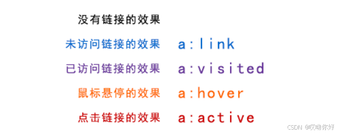
记忆口诀 :LoVe HAte (:link → :visited → :hover → :active)
示例代码:
css
a:link {
  color: #0066cc;        /* 未访问链接:蓝色 */
  text-decoration: none;  /* 移除默认下划线 */
}

a:visited {
  color: #663399;        /* 已访问链接:紫色 */
}

a:hover {
  color: #ff6600;        /* 悬停时:橙色 */
  text-decoration: underline;  /* 添加下划线 */
}

a:active {
  color: #cc0000;        /* 点击时:红色 */
}
二、基础链接样式设计
移除默认下划线(最常见的样式调整):
css
a {
  text-decoration: none;  /* 移除下划线 */
  transition: color 0.3s; /* 添加颜色过渡动画 */
}

a:hover {
  text-decoration: underline;  /* 悬停时显示下划线 */
}添加悬停效果:
css
a {
  color: #333;
  padding-bottom: 2px;
  border-bottom: 1px solid transparent;  /* 透明边框占位 */
  transition: all 0.3s;
}

a:hover {
  border-bottom-color: #333;  /* 悬停时显示边框 */
}
三、高级链接交互效果
1. 下划线滑入动画
css
a {
  position: relative;
  color: #007bff;
  text-decoration: none;
}

a::after {
  content: '';
  position: absolute;
  width: 0;
  height: 2px;
  bottom: -2px;
  left: 0;
  background-color: #007bff;
  transition: width 0.3s ease;
}

a:hover::after {
  width: 100%;  /* 悬停时宽度从0到100% */
}
2. 背景色填充效果
css
a {
  display: inline-block;
  padding: 5px 10px;
  background:
    linear-gradient(to right, #ff6b6b, #ff8e8e)
    no-repeat 0 100%;
  background-size: 100% 0px;  /* 初始高度为0 */
  transition: background-size 0.3s;
  color: #333;
}

a:hover {
  background-size: 100% 100%;  /* 悬停时填充背景 */
  color: white;
}
3. 3D 翻转效果
css
a {
  position: relative;
  display: inline-block;
  padding: 8px 15px;
  color: #333;
  transform-style: preserve-3d;
  transition: transform 0.3s;
}

a:hover {
  transform: translateY(-5px) rotateX(10deg);
}

a::before {
  content: '';
  position: absolute;
  top: 100%;
  left: 0;
  width: 100%;
  height: 10px;
  background: rgba(0,0,0,0.2);
  transform: rotateX(90deg);
  transform-origin: top;
  transition: all 0.3s;
}

a:hover::before {
  transform: rotateX(90deg) translateY(5px);
}
四、特殊类型链接样式
1. 按钮式链接
css
.btn-link {
  display: inline-block;
  padding: 10px 20px;
  background-color: #007bff;
  color: white;
  border-radius: 4px;
  text-decoration: none;
  transition: background-color 0.3s;
}

.btn-link:hover {
  background-color: #0056b3;  /* 深一点的蓝色 */
}

.btn-link:active {
  transform: translateY(1px);  /* 点击时轻微下沉 */
}
2. 图标链接
css
.icon-link {
  display: inline-flex;
  align-items: center;
  color: #333;
  text-decoration: none;
}

.icon-link i {
  margin-right: 8px;
  transition: transform 0.3s;
}

.icon-link:hover i {
  transform: translateX(-5px);  /* 图标向左移动 */
}
3. 卡片式链接
css
.card-link {
  display: block;
  width: 300px;
  border: 1px solid #eee;
  border-radius: 8px;
  overflow: hidden;
  text-decoration: none;
  color: #333;
  transition: all 0.3s;
}

.card-link:hover {
  box-shadow: 0 10px 20px rgba(0,0,0,0.1);
  transform: translateY(-5px);
}

.card-link img {
  width: 100%;
  height: 200px;
  object-fit: cover;
}

.card-content {
  padding: 15px;
}
五、链接状态管理
1. 当前页面链接高亮
css
/* HTML结构 */
<nav>
  <a href="#" class="active">首页</a>
  <a href="#">产品</a>
  <a href="#">关于</a>
</nav>

/* CSS */
nav a.active {
  color: #ff6600;
  font-weight: bold;
  border-bottom: 2px solid #ff6600;
}
2. 禁用链接
css
.disabled-link {
  pointer-events: none;  /* 禁用点击事件 */
  opacity: 0.5;          /* 降低透明度 */
  cursor: not-allowed;   /* 改变鼠标样式 */
}
六、无障碍设计考虑
-
足够的颜色对比度:链接文本与背景的对比度应至少为 3:1(WCAG AA 标准)
-
明确的焦点状态 :
css
a:focus { outline: 3px solid #2196f3; /* 蓝色焦点轮廓 */ outline-offset: 2px; /* 轮廓与元素边缘的距离 */ } -
键盘可访问性:所有交互状态应能通过键盘(Tab 键)触发
七、性能优化
- 减少伪类数量:避免为每个链接单独定义样式,使用类名复用样式
- 使用过渡而非动画:简单的过渡效果(如颜色变化)性能优于复杂动画
- 避免过多重排 :悬停效果尽量使用
transform而非position或margin变化
八、完整案例:响应式导航链接
css
/* 导航容器 */
nav {
  display: flex;
  justify-content: center;
  background-color: #333;
  padding: 15px 0;
}

/* 基本链接样式 */
nav a {
  color: white;
  text-decoration: none;
  margin: 0 15px;
  padding: 10px 15px;
  position: relative;
  transition: all 0.3s;
}

/* 下划线效果 */
nav a::after {
  content: '';
  position: absolute;
  width: 0;
  height: 2px;
  bottom: 0;
  left: 0;
  background-color: #ff6600;
  transition: width 0.3s;
}

/* 悬停和焦点状态 */
nav a:hover,
nav a:focus {
  color: #ff6600;
}

nav a:hover::after,
nav a:focus::after {
  width: 100%;
}

/* 当前页面链接 */
nav a.active {
  color: #ff6600;
}

nav a.active::after {
  width: 100%;
}

/* 移动端适配 */
@media (max-width: 768px) {
  nav {
    flex-direction: column;
    text-align: center;
  }

  nav a {
    margin: 5px 0;
  }
}
通过精心设计链接样式,可以显著提升用户体验和网站的视觉吸引力。建议根据品牌风格统一链接样式,并确保在各种设备和交互场景下保持一致的用户体验。