1、概 述
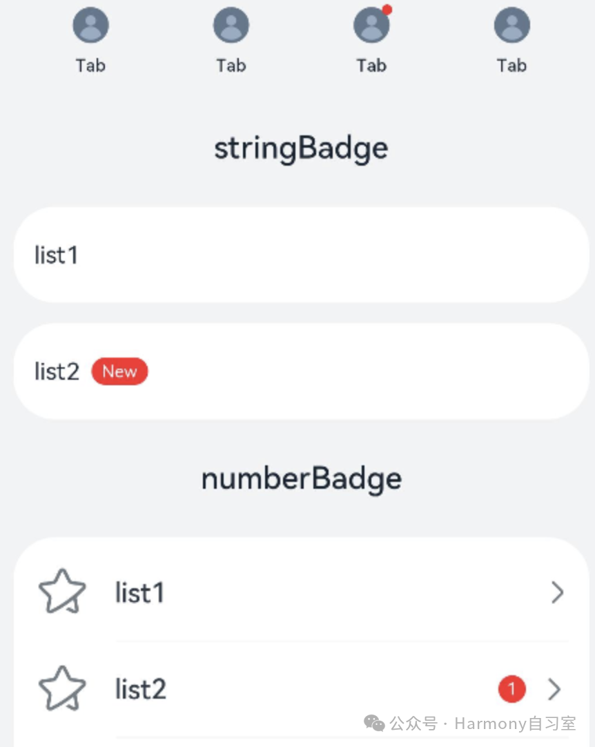
badge小红点角标是我们项目开发中常见的需求,信息标记组件,可以附加在单个组件上用于信息提醒的容器组件。效果如下:
2、Badge
接口定义如下:
👉🏻 根据数字创建标记组件;
Badge(value: BadgeParamWithNumber)效果如下:

👉🏻 根据字符串创建标记组件。
Badge(value: BadgeParamWithString)效果如下:

其中BadgeParamWithNumber与BadgeParamWithString都继承自BadgeParam,BadgeParam属性定义如下:
|----------|------------|------------------------------------------------------------------------------------------------|
| 名称 | 类型 | 说明 |
| position | Position | 设置提示点显示位置。默认值:BadgePosition.RightTop 说明:Position作为入参,不支持设置百分比;设置为非法值时,默认(0,0)处理。(0,0)为组件左上角位置。 |
| style | BadgeStyle | Badge组件可设置样式,支持设置文本颜色、尺寸、圆点颜色和尺寸。 |
其中,Position是枚举,定义如下:
RightTop = 0 // 圆点显示在右上角。Right = 1 // 圆点显示在右侧纵向居中。Left = 2 // 圆点显示在左侧纵向居中。BadgeStyle定义如下:
|-------------|-------------------------------|----------------------------------------------------|
| 名称 | 类型 | 说明 |
| color | ResourceColor | 文本颜色。默认值:Color.White |
| fontSize | number | string | 文本大小。默认值:10单位:fp 说明:不支持设置百分比。 |
| badgeSize | number | string | Badge的大小。默认值:16单位:vp 说明:不支持设置百分比。当设置为非法值时,按照默认值处理。 |
| badgeColor | ResourceColor | Badge的颜色。默认值:Color.Red |
| fontWeight | number |FontWeight | string | 设置文本的字体粗细。默认值:FontWeight.Normal 说明:不支持设置百分比。 |
| borderColor | ResourceColor | 底板描边颜色。默认值:Color.Red |
| borderWidth | Length | 底板描边粗细。默认值:1单位:vp 说明:不支持设置百分比。 |
3、案 例
由于BadgeParamWithNumber与BadgeParamWithString的区别只是显示的是数字还是字符串,因此以数字做简单示例。
演示效果如下(角标数值为0时,将不会显示角标):
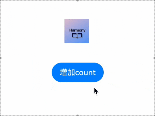
代码如下(8 ~ 12行):
// 该示例实现了Badge组件显隐时缩放@Entry@Componentstruct Index { @State badgeCount: number = 0 build() { Column({ space: 40 }) { Badge({ count: this.badgeCount, style: {}, position: BadgePosition.RightTop, }) { Image($r("app.media.startIcon")) .width(50) .height(50) } .width(55) Button('增加count').onClick(() => { this.badgeCount++; }) } .margin({ top: 20 }) .width('100%') }}