案例项目开源地址:https://atomgit.com/nutpi/wanandroid_rn_openharmony
刷资讯的时候,你肯定希望第一时间看到最新的内容。但文章列表那么长,怎么知道哪些是新发布的?
最简单的办法就是给新文章打个标签。一个醒目的"新"字,用户扫一眼就知道这篇文章是刚发布的。
今天来聊聊 WanAndroid 项目里这个"新"标签是怎么实现的。
需求分析
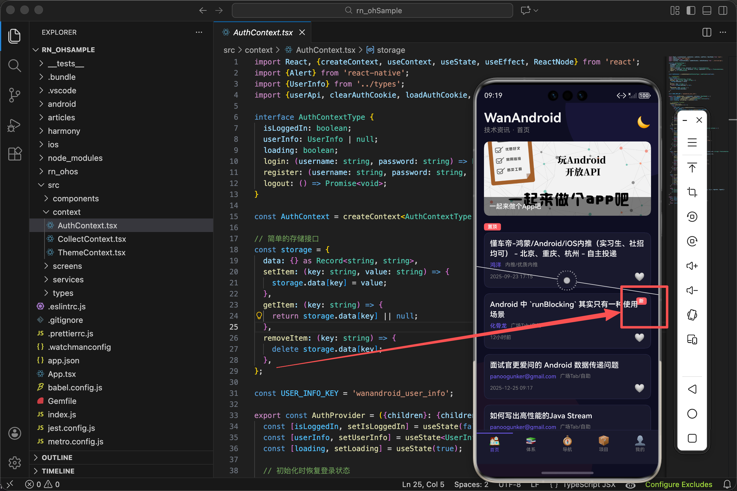
WanAndroid 的 API 返回的文章数据里有一个 fresh 字段,布尔值,true 表示是新文章。
我们要做的就是:当 fresh 为 true 时,在文章卡片上显示一个红色的"新"标签。
看起来很简单,但要做好还是有些细节要考虑:
- 标签放在哪个位置?
- 用什么颜色?
- 标签的大小和样式?
- 怎么不遮挡文章标题?
数据结构
先看看 API 返回的文章数据:
tsx
interface Article {
  id: number;
  title: string;
  author: string;
  niceDate: string;
  link: string;
  fresh: boolean;  // 是否是新文章
  // ... 其他字段
}
fresh 字段就是我们要用的。API 会根据文章发布时间自动判断,一般 24 小时内发布的文章 fresh 为 true。
这个逻辑在服务端处理,我们前端只需要根据这个字段显示标签就行。
基本实现
tsx
export const ArticleCard = ({item}: Props) => {
  const {theme} = useTheme();

  return (
    <TouchableOpacity style={[styles.card, {backgroundColor: theme.card}]}>
      <View style={styles.content}>
        {item.fresh && (
          <View style={[styles.freshTag, {backgroundColor: theme.danger}]}>
            <Text style={styles.freshText}>新</Text>
          </View>
        )}
        <Text style={[styles.title, {color: theme.text}]} numberOfLines={2}>
          {item.title}
        </Text>
        {/* 其他内容 */}
      </View>
    </TouchableOpacity>
  );
};核心就是这个条件渲染:{item.fresh && (...)}。
当 item.fresh 为 true 时,&& 后面的 JSX 会被渲染;为 false 时,什么都不渲染。
这是 React 里最常用的条件渲染方式,简洁明了。
为什么用 && 而不是三元表达式
三元表达式是这样写:
tsx
{item.fresh ? <View>...</View> : null}效果一样,但 && 更简洁。当"不满足条件时什么都不显示"的场景,用 && 就够了。
三元表达式适合"满足条件显示 A,不满足显示 B"的场景。
标签的样式
tsx
freshTag: {
  position: 'absolute',
  top: 8,
  right: 8,
  paddingHorizontal: 6,
  paddingVertical: 2,
  borderRadius: 4
},
freshText: {
  color: '#fff',
  fontSize: 10,
  fontWeight: 'bold'
},
绝对定位
position: 'absolute' 让标签脱离文档流,可以自由定位。
top: 8, right: 8 把标签放在卡片内容区域的右上角,距离边缘 8 像素。
为什么放右上角?因为用户阅读习惯是从左到右、从上到下。标题在左边,标签放右边不会遮挡标题,同时又在视线范围内。
内边距
paddingHorizontal: 6 左右各 6 像素内边距。
paddingVertical: 2 上下各 2 像素内边距。
水平方向的内边距比垂直方向大,因为"新"是一个汉字,宽度比高度小,加大水平内边距让标签看起来更协调。
圆角
borderRadius: 4 给标签加 4 像素的圆角。
完全的直角看起来太生硬,加一点圆角更柔和。4 像素是一个小圆角,不会太圆,保持了标签的"方正感"。
文字样式
color: '#fff' 白色文字,在红色背景上清晰可见。
fontSize: 10 很小的字号。标签只是辅助信息,不需要太大,10 像素刚好能看清。
fontWeight: 'bold' 加粗。小字号加粗后更清晰,不会显得太细弱。
主题色的使用
tsx
<View style={[styles.freshTag, {backgroundColor: theme.danger}]}>标签背景色用 theme.danger,这是主题里定义的"危险/警告"色,通常是红色。
为什么用 danger 而不是直接写红色?
-
统一管理。所有需要红色的地方都用
theme.danger,想改颜色只需要改一处。 -
主题适配。深色模式和浅色模式的红色可能略有不同,用主题色可以自动适配。
-
语义化。
danger表示"需要注意",比直接写颜色值更有意义。
theme.danger 的定义
在 ThemeContext 里,danger 的定义大概是这样:
tsx
const lightTheme = {
  danger: '#ff6b6b',
  // ...
};

const darkTheme = {
  danger: '#ff7675',
  // ...
};
浅色模式用稍深的红色,深色模式用稍亮的红色,保证在不同背景下都醒目。
标签位置的考量
我们把标签放在 content 容器里,用绝对定位。还有另一种方案:放在卡片最外层。
tsx
// 方案一:放在 content 里(我们的实现)
<TouchableOpacity style={styles.card}>
  <View style={styles.content}>
    {item.fresh && <View style={styles.freshTag}>...</View>}
    <Text>标题</Text>
  </View>
</TouchableOpacity>

// 方案二:放在卡片最外层
<TouchableOpacity style={styles.card}>
  {item.fresh && <View style={styles.freshTag}>...</View>}
  <View style={styles.content}>
    <Text>标题</Text>
  </View>
</TouchableOpacity>
两种方案效果类似,但有细微差别:
方案一:标签相对于 content 定位,会受到 content 的 padding 影响。
方案二:标签相对于整个卡片定位,可以贴着卡片边缘。
我们选择方案一,因为 content 有 12 像素的 padding,标签放在 content 里,top: 8 实际上是距离 content 顶部 8 像素,视觉上更协调。
完整的文章卡片代码
tsx
import React from 'react';
import {View, Text, TouchableOpacity, StyleSheet, Linking, Alert} from 'react-native';
import {Article} from '../types';
import {useTheme} from '../context/ThemeContext';

interface Props {
  item: Article;
}

export const ArticleCard = ({item}: Props) => {
  const {theme} = useTheme();

  const openLink = (url: string) => {
    Linking.openURL(url).catch(() => Alert.alert('错误', '无法打开链接'));
  };

  return (
    <TouchableOpacity
      style={[styles.card, {backgroundColor: theme.card, borderColor: theme.border}]}
      onPress={() => openLink(item.link)}
      activeOpacity={0.7}
    >
      <View style={styles.content}>
        {/* 新文章标签 */}
        {item.fresh && (
          <View style={[styles.freshTag, {backgroundColor: theme.danger}]}>
            <Text style={styles.freshText}>新</Text>
          </View>
        )}

        {/* 文章标题 */}
        <Text style={[styles.title, {color: theme.text}]} numberOfLines={2}>
          {item.title.replace(/<[^>]+>/g, '')}
        </Text>

        {/* 作者和分类 */}
        <View style={styles.meta}>
          <Text style={[styles.author, {color: theme.accent}]}>
            {item.author || item.shareUser || '匿名'}
          </Text>
          <Text style={[styles.chapter, {color: theme.subText}]}>
            {item.superChapterName}/{item.chapterName}
          </Text>
        </View>

        {/* 日期 */}
        <View style={styles.footer}>
          <Text style={[styles.date, {color: theme.subText}]}>{item.niceDate}</Text>
        </View>
      </View>
    </TouchableOpacity>
  );
};

const styles = StyleSheet.create({
  card: {
    borderRadius: 12,
    borderWidth: 1,
    marginBottom: 12,
    overflow: 'hidden'
  },
  content: {
    padding: 12
  },
  freshTag: {
    position: 'absolute',
    top: 8,
    right: 8,
    paddingHorizontal: 6,
    paddingVertical: 2,
    borderRadius: 4
  },
  freshText: {
    color: '#fff',
    fontSize: 10,
    fontWeight: 'bold'
  },
  title: {
    fontSize: 16,
    fontWeight: '600',
    lineHeight: 22,
    marginBottom: 6,
    paddingRight: 30  // 给标签留出空间
  },
  meta: {
    flexDirection: 'row',
    alignItems: 'center',
    marginBottom: 8,
    flexWrap: 'wrap',
    gap: 8
  },
  author: {
    fontSize: 12,
    fontWeight: '500'
  },
  chapter: {
    fontSize: 11
  },
  footer: {
    flexDirection: 'row',
    justifyContent: 'space-between',
    alignItems: 'center'
  },
  date: {
    fontSize: 11
  },
});
paddingRight: 30 的作用
注意 title 样式里有 paddingRight: 30。这是为了给标签留出空间。
标签用绝对定位放在右上角,如果标题太长,可能会和标签重叠。加上右边距,标题就不会延伸到标签下面。
30 像素大概是标签的宽度(6 + 一个汉字宽度 + 6 + 一点余量)。
其他标签的扩展
除了"新"标签,还可以加其他标签,比如"置顶"、"热门"等。
tsx
{/* 置顶标签 */}
{item.isTop && (
  <View style={[styles.topTag, {backgroundColor: theme.accent}]}>
    <Text style={styles.tagText}>置顶</Text>
  </View>
)}

{/* 新文章标签 */}
{item.fresh && (
  <View style={[styles.freshTag, {backgroundColor: theme.danger}]}>
    <Text style={styles.tagText}>新</Text>
  </View>
)}
多个标签可以用不同颜色区分:置顶用主题色(紫色),新文章用警告色(红色)。
位置也可以错开:置顶放左上角,新文章放右上角。或者都放右上角,垂直排列。
标签的动态效果
如果想让标签更醒目,可以加一些动态效果,比如闪烁或脉冲。
tsx
const pulseAnim = useRef(new Animated.Value(1)).current;

useEffect(() => {
  if (item.fresh) {
    Animated.loop(
      Animated.sequence([
        Animated.timing(pulseAnim, {toValue: 1.1, duration: 500, useNativeDriver: true}),
        Animated.timing(pulseAnim, {toValue: 1, duration: 500, useNativeDriver: true}),
      ])
    ).start();
  }
}, [item.fresh]);

// 使用
<Animated.View style={[styles.freshTag, {transform: [{scale: pulseAnim}]}]}>
  <Text style={styles.freshText}>新</Text>
</Animated.View>
这样标签会有一个轻微的放大缩小效果,更吸引眼球。
不过要注意,动画会消耗性能。如果列表很长,每个卡片都有动画,可能会影响滚动流畅度。所以动画要谨慎使用,或者只在可见区域的卡片上启用。
小结
一个小小的"新"标签,涉及到的知识点还不少:
- 条件渲染(
&&运算符) - 绝对定位(
position: 'absolute') - 主题色的使用
- 样式的细节调整
这些都是 React Native 开发中的基础技能,掌握了就能做出各种各样的 UI 效果。
好的 UI 不是堆砌复杂的效果,而是把简单的元素做到位。一个标签,位置对、颜色对、大小对,就能起到很好的引导作用。
欢迎加入开源鸿蒙跨平台社区:https://openharmonycrossplatform.csdn.net