一、 2D转换
1.1 transform: translate( )
转换(transform) 是CSS3中具有颠覆性的特征之一,可以实现元素的位移、旋转、缩放等效果
移动:translate
旋转:rotate
缩放:scale
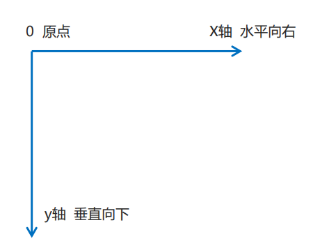
下图为2D转换的坐标系
回忆:移动盒子位置的三种方法:1. margin 2.position 3.2D转换
注意:盒子经过变化后,本来拥有的位置也会进行保留。也不是说不会影响其他的元素
1.2. transform: translatex. (50%)
移动的数值改为百分数则代表了盒子本身宽度乘50%。但是对于行内标签无效。
//最简单的实现盒子居中显示效果的方法
 position:absolute;
        top: 50%;
            left: 50%;
        width: 100px;
        height: 100px;
        background-color: red;
        transform: translate(-50%,-50%);
1.3 旋转
transform: translate(x deg) x为正,则顺时针旋转。默认旋转点是元素的中心位置
transform-origin:x y; x y 可以是像素或者也可以是方位名词top bottom left right
旋转中心动画案例:
<!DOCTYPE html>
<html lang="en">
<head>
    <meta charset="UTF-8">
    <meta name="viewport" content="width=device-width, initial-scale=1.0">
    <title>Document</title>
</head>
<style>
    .box{
        margin: 200px auto;
        width: 200px;
        height: 200px;
        background-color: pink;
        border: 1px solid black;
        overflow: hidden;
    }
.box::before{
    display: block;
    content: '温教授讲三农';
    width: 100%;
    height: 100%;
    background-color: hotpink;
    transform: rotate(180deg);
    transform-origin:left bottom;
    /* 谁做过渡给谁加 */
transition: all .7s;
}

/* 鼠标经过div盒子盒子复原 */
.box:hover::before{
    transform: rotate(0deg);
}
</style>
<body>
    <div class="box"></div>
</body>
</html>
1.4 Scale
transform: scale(x,y) x轴变为x倍,y变y倍
transform:scale(2) 宽、高都变成两倍
scale的优势:1. 可以设置缩放的中心点 2.不会影响其他的盒子
二、CSS动画
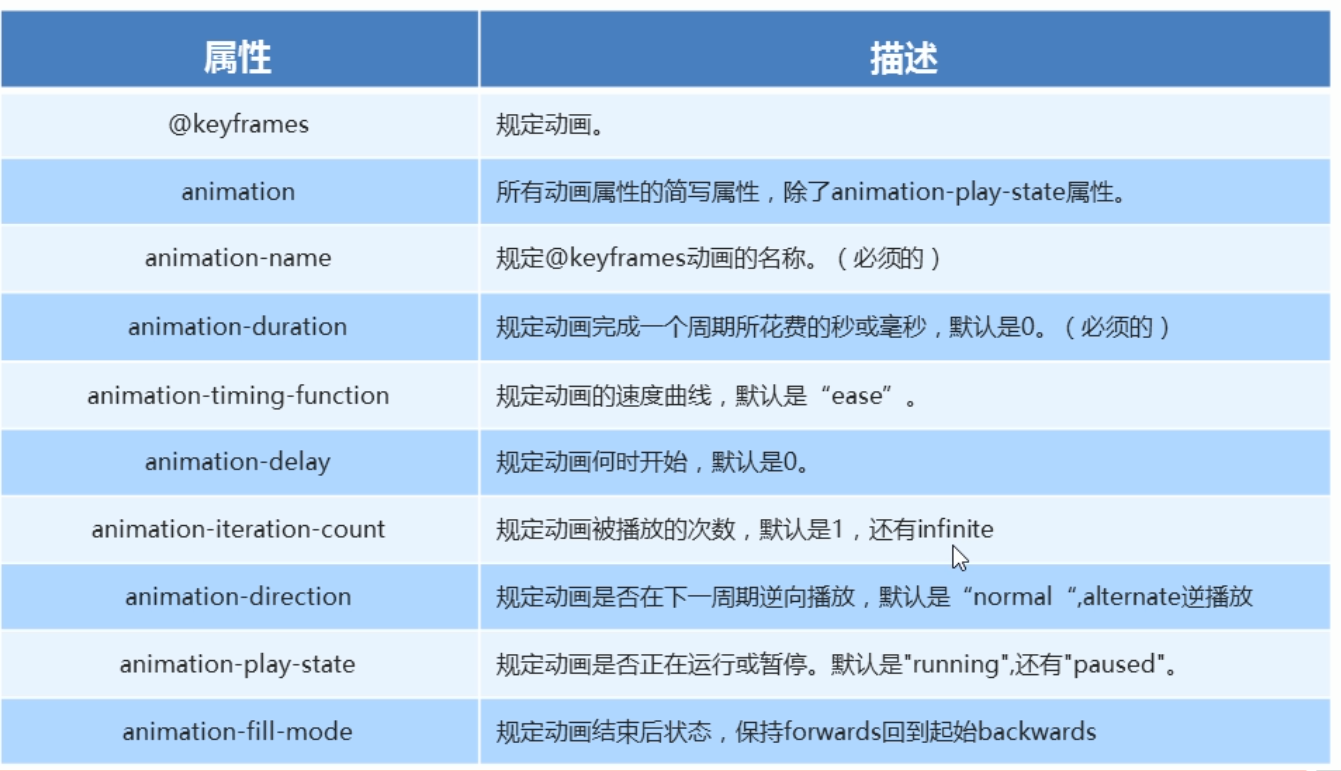
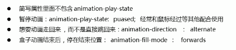
动画简写
前两个属性不可省略
奔跑的熊,旧百度浏览器

<!DOCTYPE html>
<html lang="en">
<head>
    <meta charset="UTF-8">
    <meta name="viewport" content="width=device-width, initial-scale=1.0">
    <title>Document</title>
</head>
<style>
    body{
        background-color: #ccc;
    }

    div{
        position: absolute;
        width: 200px;
        height: 100px;
        background: url(media/bear.png)no-repeat;
        animation: bear 1s steps(8) infinite,move 2s linear forwards;
    }

    @keyframes bear{
        0% {
            background-position: 0 0;
        }

        100% {
            background-position: -1600px 0;
        }
    }

    @keyframes move {
        0% {
            left: 0;
        }

        100% {
            left: 50%;
            margin-left: -100px;
        }

    }
</style>
<body>
    <div></div>
</body>
</html>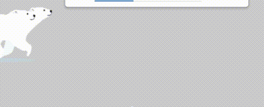
定义动画
@keyframes 动画名称 {
0%{
width:100px;
}
100%{
width:200px;
}
}

/* 调用动画 */
animation-name: 动画名称;
/* 持续时间 */
animation-duration: 持续时间;
动画的常用属性
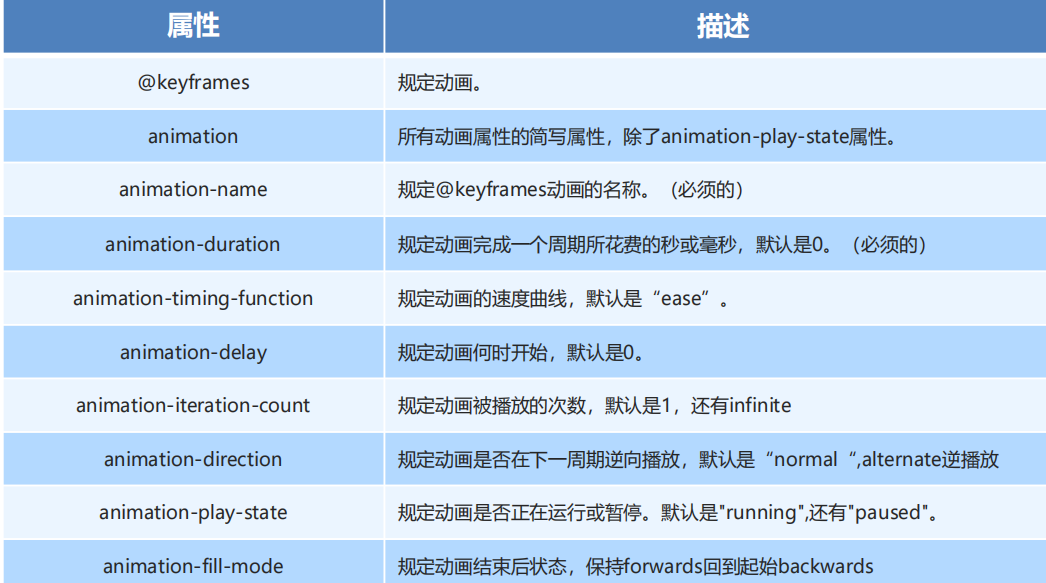
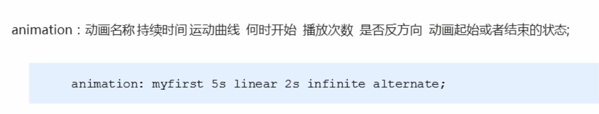
动画的简写形式:类似background
animation: myfirst 5s linear 2s infinite alternate;
前两个一般不可以省略
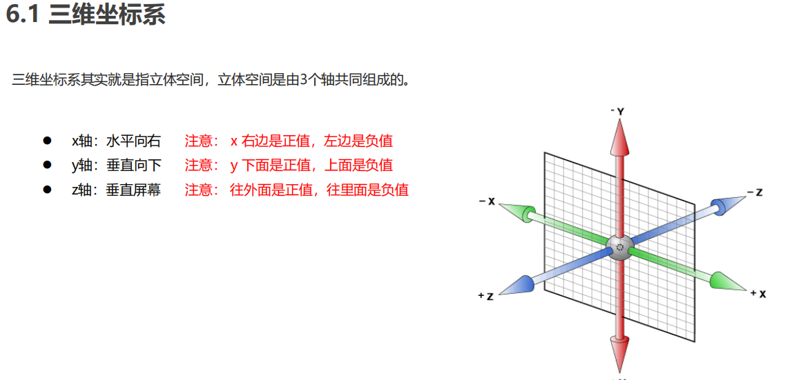
三、3D动画
动画视角的三维坐标系
3D位移: translate3d(x,y,z)
3D旋转: rotate3d(x,y,z)
透视: perspective
3D呈现 transfrom-style
带有xyz的都不可以省略掉
可以使用左手定责来确定该向什么方向进行旋转
3D导航栏项目代码示例
<!DOCTYPE html>
<html lang="en">
<head>
<meta charset="UTF-8">
<meta name="viewport" content="width=device-width, initial-scale=1.0">
<title>Document</title>
</head>
<style>
*{
padding: 0;
margin: 0;
}
ul {
margin: 100px;
}
ul li{
width: 120px;
height: 35px;
list-style:none;
perspective: 300px;
}
.box{
position: relative;
width: 100%;
height: 100%;
transform-style: preserve-3d;
transition: all .6s;
}
.box:hover{
transform: rotateX(90deg);
}
.front,
.back{
position: absolute;
left: 0;
top:0;
width: 100%;
height: 100%;
}
.front{
background-color:pink;
z-index: 1;
transform: translateZ(17.5px);
}
.back{
/* transform: rotateX('90deg'); */
background-color: aquamarine;
transform: translateY(17.5px) rotateX(-90deg);
}
</style>
<body>
<ul>
<li>
<div class="box">
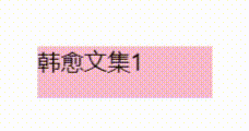
<div class="front">韩愈文集1</div>
<div class="back">感二鸟赋</div>
</div>
</li>
</ul>
</body>
</html>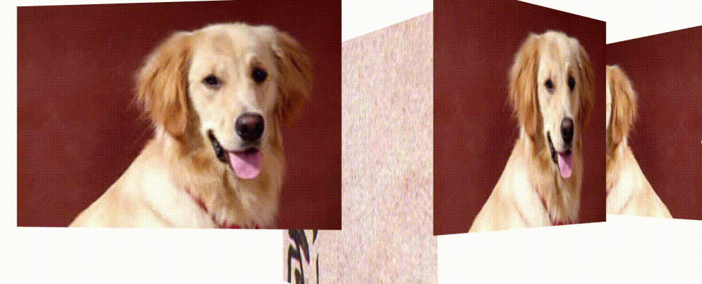
<!DOCTYPE html>
<html lang="en">
<head>
    <meta charset="UTF-8">
    <meta name="viewport" content="width=device-width, initial-scale=1.0">
    <title>3D旋转案例之旋转木马</title>
</head>
<style>
    body{
        perspective: 1200px;
    }
    section{
        position: relative;
        width: 500px;
        height: 300px;
        margin: 50px auto;
        transform-style: preserve-3d;
        animation: rotate 4s linear infinite;
        background: url(media/dezoomify-result\(50\).jpg) no-repeat;
    }

    @keyframes rotate{
        0%{
            transform: rotateY(0);
        }
        100%{
            transform: rotateY(360deg);
        }
    }

    section div{
        position: absolute;
        left: 0;
        top: 0;
        width: 100%;
        height: 100%;
        background: url(media/dog.jpg) no-repeat;
    }

    section div:nth-child(1){
        transform: translateZ(300px);
    }

    section div:nth-child(2){
        transform: rotateY(60deg) translateZ(300px);

    }

    section div:nth-child(3){
        transform: rotateY(120deg) translateZ(300px);

    }

    section div:nth-child(4){
        transform: rotateY(180deg) translateZ(300px);

    }
    section div:nth-child(5){
        transform: rotateY(240deg) translateZ(300px);

    }
    section div:nth-child(6){
        transform: rotateY(300deg) translateZ(300px);

    }
    section div:nth-child(7){
        transform: rotateY(360deg) translateZ(300px);

    }
</style>
<body>
    <section>
        <div></div>
        <div></div>
        <div></div>
        <div></div>
        <div></div>
        <div></div>
    </section>
</body>
</html>