<view class="">
<view class="circle-chart">
<view v-if="!!num" class="pie-item" :style="{
background: `conic-gradient(var(--one-color) 0%,#E9E6F1 ${num}%)`,
}"></view>
<view v-else class="pie-item-copy" :style="{
background:'#E9E6F1',
}"></view>
<view v-if="!!degNum" class="pie-item" :style="{
background: `conic-gradient(var(--two-color) 0%,transparent ${20}%)`,
transform: `scaleX(-1) rotate(${degNum}deg)`,
}"></view>
<view class="biaopan">
<view class="biaopanCot">
<view class="">
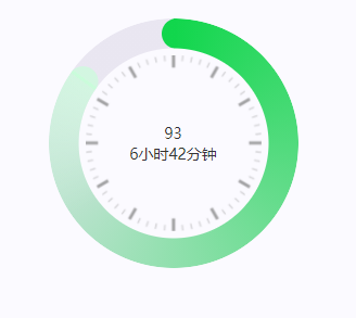
93
</view>
<view class="">
6小时42分钟
</view>
</view>
</view>
</view>
</view>
<script>
export default {
data() {
return {
num: 85, //圆环数值百分比
degNum: '', //旋转的角度
}
},
watch: {
num: {
handler(newValue) {
if (!!this.num) {
this.degNum = 360 * (100 - newValue) / 100
} else {
this.degNum = ''
}
},
deep: true,
immediate: true,
},
},
}
</script>
<style scoped lang="scss">
.circle-chart {
position: relative;
--one-color: #11D64C;
--two-color: #c5ffd7a1;
width: 460rpx;
height: 460rpx;
margin: 0 auto;
}
.circle-chart .pie-item-copy {
position: absolute;
width: 100%;
height: 100%;
border-radius: 50%;
mask: radial-gradient(transparent,
transparent 174rpx,
#000 176rpx,
#000 176rpx,
#000 100%);
}
.circle-chart .pie-item {
position: absolute;
width: 100%;
height: 100%;
border-radius: 50%;
mask: radial-gradient(transparent,
transparent 174rpx,
#000 176rpx,
#000 176rpx,
#000 100%);
}
.pie-item:nth-child(1)::before {
background: linear-gradient(90deg,
var(--one-color) 50%,
transparent 51%,
transparent 100%);
}
.pie-item:nth-child(2)::before {
background: linear-gradient(90deg,
var(--two-color) 50%,
transparent 51%,
transparent 100%);
}
.pie-item::before {
content: '';
position: absolute;
inset: 0;
width: 56rpx;
height: 56rpx;
top: 0;
left: 202rpx;
border-radius: 50%;
}
.biaopan {
position: absolute;
left: 68rpx;
right: 68rpx;
top: 68rpx;
bottom: 68rpx;
border-radius: 50%;
display: flex;
align-items: center;
justify-content: center;
}
.biaopanCot{
text-align: center;
}
< /style>