前言
本文基于Api13
绘制卡片就非常的简单了,和平时的应用开发是一样的,但是并不是所有的组件都支持卡片,这里,在官方文档中,每个组件也都有明确的标记,如果支持,那么就会有一个卡片能力显示。

上篇文章,我们默认创建了一个卡片,所有的UI绘制,都是在widget中pages下的WidgetCard中进行绘制的,当然了,由于创建的文件名不一样,文件路径也有区别,我们可以从resources->base->profile->form_config.json中的src字段查看,这个就是我们的卡片UI视图。

代码呢,也是非常的简单,和一个普通的UI页面差不多,都是通过@Component装饰器所修饰,在build里面来绘制组件。
TypeScript
@Entry
@Component
struct WidgetCard {
  /*
   * The title.
   */
  readonly title: string = 'Hello World';
  /*
   * The action type.
   */
  readonly actionType: string = 'router';
  /*
   * The ability name.
   */
  readonly abilityName: string = 'EntryAbility';
  /*
   * The message.
   */
  readonly message: string = 'add detail';
  /*
   * The width percentage setting.
   */
  readonly fullWidthPercent: string = '100%';
  /*
   * The height percentage setting.
   */
  readonly fullHeightPercent: string = '100%';

  build() {
    Row() {
      Column() {
        Text(this.title)
          .fontSize($r('app.float.font_size'))
          .fontWeight(FontWeight.Medium)
          .fontColor($r('sys.color.font_primary'))
      }
      .width(this.fullWidthPercent)
    }
    .height(this.fullHeightPercent)
    .onClick(() => {
      postCardAction(this, {
        action: this.actionType,
        abilityName: this.abilityName,
        params: {
          message: this.message
        }
      });
    })
  }
}
绘制呢,非常简单,本篇文章,除了基本的绘制,也会重点从修改卡片外观,多个卡片实现等业务中常见的需求来概述。
卡片外观更改
在我们创建服务卡片的时候,是不是还记得,有一个卡片外观规格的选择,默认的有以下几种。

比如选择了1 * 2,那么就表示展示的规格大小为:1行2列的二宫格;2 * 2,就是表示2行2列的四宫格,前边是行,后面是列,这个比较简单,没什么好说的。
除了默认的创建时更改卡片外观之外,我们还可以通过form_config.json来手动进行更改。

比如,我改成1*2,运行之后效果如下:

2*4效果如下:

目前支持的规格有8个,如下图所示,大家可以根据需求选择合适的那个。

多个卡片设置
鸿蒙服务卡片和其他系统一样,也是支持多个卡片设置的,设置的话,也是非常的简单,首先创建一个服务卡片的UI视图,在form_config.json配置中进行配置即可。
比如,我把卡片一复制了一份:

然后在form_config.json中的forms数组中按照卡片1的配置,复制了一份为卡片2,如下:
json
{
  "forms": [
    {
      "name": "widget",
      "displayName": "$string:widget_display_name",
      "description": "$string:widget_desc",
      "src": "./ets/widget/pages/WidgetCard.ets",
      "uiSyntax": "arkts",
      "window": {
        "designWidth": 720,
        "autoDesignWidth": true
      },
      "colorMode": "auto",
      "isDynamic": true,
      "isDefault": true,
      "updateEnabled": false,
      "scheduledUpdateTime": "10:30",
      "updateDuration": 1,
      "defaultDimension": "2*2",
      "supportDimensions": [
        "2*2"
      ]
    },
    {
      "name": "widget2",
      "displayName": "$string:widget_display_name2",
      "description": "$string:widget_desc2",
      "src": "./ets/widget/pages/WidgetCard2.ets",
      "uiSyntax": "arkts",
      "window": {
        "designWidth": 720,
        "autoDesignWidth": true
      },
      "colorMode": "auto",
      "isDynamic": true,
      "isDefault": false,
      "updateEnabled": false,
      "scheduledUpdateTime": "10:30",
      "updateDuration": 1,
      "defaultDimension": "2*4",
      "supportDimensions": [
        "2*4"
      ]
    }
  ]
}
以上的信息,只是用来测试,在实际的开发中,请以真实的数据为主,isDefault是默认的卡片,记住,只能存在一个,每个卡片其规格大小都可以进行改变,设置完之后,我们再次运行,就会有两个卡片供我们选择了。

每个卡片,都可以进行添加桌面上。
卡片UI绘制
UI绘制,没有多大的限制,凡是标注支持卡片能力的组件都可以进行使用,可以随意的进行绘制;本身卡片也开放了自定义绘制的能力,也就是说,你可以通过Canvas组件创建画布,然后结合CanvasRenderingContext2D对象,进行自定义图形绘制。
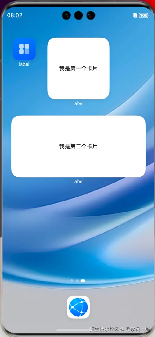
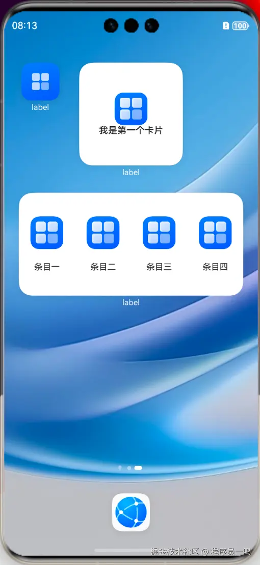
比如以上的案例,我给两个组件做了简单的修改:
当然了,你也可以通过Canvas进行绘制,比如简单绘制一个圆:
定义CanvasRenderingContext2D
TypeScript
 private canvasWidth: number = 0;
  private canvasHeight: number = 0;
  // 初始化CanvasRenderingContext2D和RenderingContextSettings
  private settings: RenderingContextSettings = new RenderingContextSettings(true);
  private context: CanvasRenderingContext2D = new CanvasRenderingContext2D(this.settings);
Canvas组件绘制圆,直接加载到build函数中即可。
TypeScript
Canvas(this.context)
        .width('100%')
        .height('100%')
        .onReady(() => {
          // 在onReady回调中获取画布的实际宽和高
          this.canvasWidth = this.context.width;
          this.canvasHeight = this.context.height;
          // 绘制画布的背景
          this.context.fillStyle = '#ffffff';
          this.context.fillRect(0, 0, this.canvasWidth, this.canvasHeight);
          // 在画布的中心绘制一个圆
          this.context.beginPath();
          let radius = this.context.width / 3;
          let circleX = this.context.width / 2;
          let circleY = this.context.height / 2;
          this.context.moveTo(circleX - radius, circleY);
          this.context.arc(circleX, circleY, radius, 2 * Math.PI, 0, true);
          this.context.closePath();
          this.context.fillStyle = '#000000';
          this.context.fill();
        })
效果如下:

相关总结
服务卡片的绘制,和正常的UI绘制一样,需要注意是否支持卡片的标识,还有一点需要注意的,服务卡片虽然可以设置多个,但是最多只支持配置16个卡片,按照官方解读,若超过16个,则保留配置的前16个。
本文标签:HarmonyOS/服务卡片