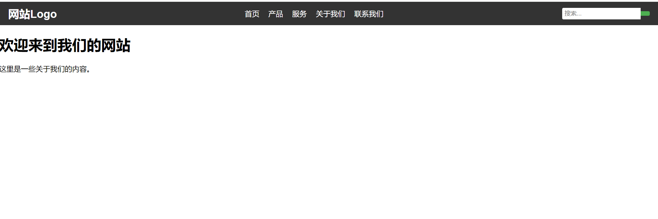
使用flex弹性布局页面效果图(源代码在文章末尾):
目录
flex弹性布局
一、基本容器
Flexbox 是 CSS3 引入的一种一维布局模型,旨在提供更高效的方式来布局、对齐和分配容器内项目的空间。其核心概念包括:
1、容器与项目:采用 Flex 布局的元素称为 Flex 容器,其内部的子元素称为 Flex 项目。
2、主轴与交叉轴:Flex 容器有两根轴,主轴由flex-direction定义,交叉轴垂直于主轴。
3、空间分配:通过 flex-basis、flex-grow 和 flex-shrink 控制项目在主轴上的初始大小、放大和缩小比例。
4、对齐方式:justify-content 控制主轴对齐,align-items 和 align-content 控制交叉轴对齐。
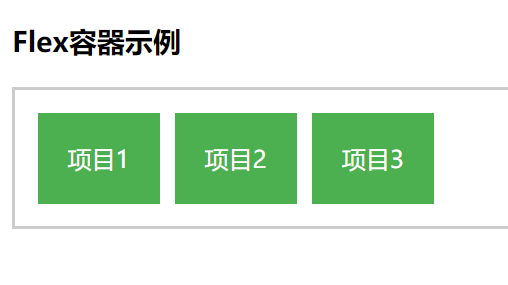
举例源代码:
css
<style>
        .container {
            display: flex;
            border: 2px solid #ccc;
            padding: 10px;
        }

        .item {
            background-color: #4CAF50;
            color: white;
            margin: 5px;
            padding: 20px;
            text-align: center;
        }
    </style>
html
<body>
    <h3>Flex容器示例</h3>
    <div class="container">
        <div class="item">项目1</div>
        <div class="item">项目2</div>
        <div class="item">项目3</div>
    </div>
</body>
效果图:
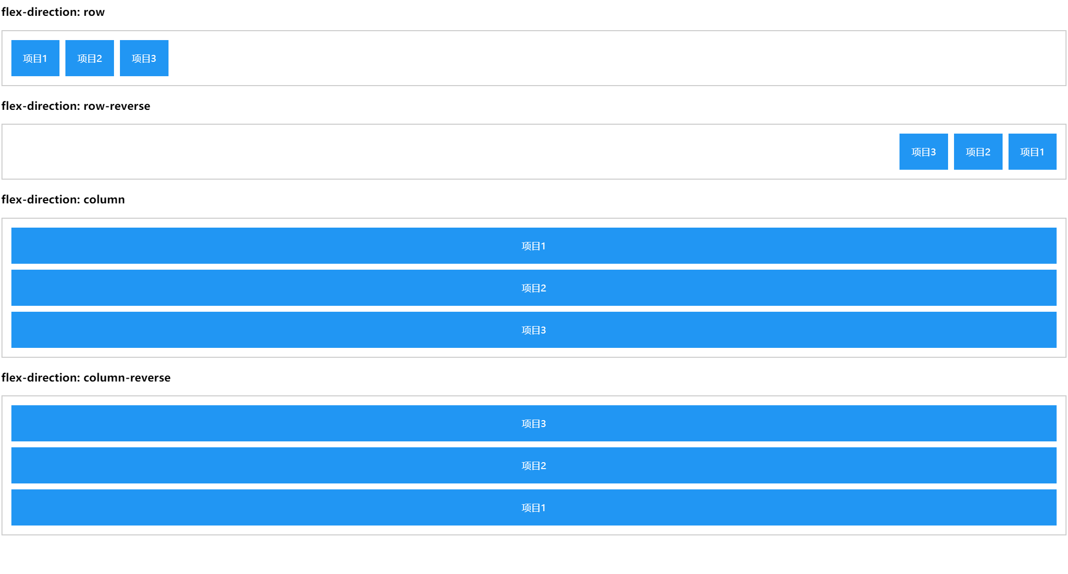
二、设置主轴方向
flex-direction属性的四种取值,决定了主轴的方向和项目的排列方式。
1、将从左到右的箭头,设置为主轴
flex-direction: row; 默认值,水平排列(从左到右)
2、将从右到左的箭头,设置为主轴
flex-direction: row-reverse; 水平反向排列(从右到左)
3、将从上到下的箭头,设置为主轴
flex-direction: column; 垂直排列(从上到下)
4、将从下到上的箭头,设置为主轴
flex-direction: column-reverse; 垂直反向排列(从下到上)
举例源代码:
css
<style>
        .container {
            display: flex;
            border: 2px solid #ccc;
            padding: 10px;
            margin-bottom: 20px;
        }

        .item {
            background-color: #2196F3;
            color: white;
            margin: 5px;
            padding: 20px;
            text-align: center;
        }


        .row {
            flex-direction: row;
        }

        .row-reverse {
            flex-direction: row-reverse;
        }

        .column {
            flex-direction: column;
        }

        .column-reverse {
            flex-direction: column-reverse;
        }
html
<body>
    <h3>flex-direction: row</h3>
    <div class="container row">
        <div class="item">项目1</div>
        <div class="item">项目2</div>
        <div class="item">项目3</div>
    </div>

    <h3>flex-direction: row-reverse</h3>
    <div class="container row-reverse">
        <div class="item">项目1</div>
        <div class="item">项目2</div>
        <div class="item">项目3</div>
    </div>

    <h3>flex-direction: column</h3>
    <div class="container column">
        <div class="item">项目1</div>
        <div class="item">项目2</div>
        <div class="item">项目3</div>
    </div>

    <h3>flex-direction: column-reverse</h3>
    <div class="container column-reverse">
        <div class="item">项目1</div>
        <div class="item">项目2</div>
        <div class="item">项目3</div>
    </div>
</body>
效果图:
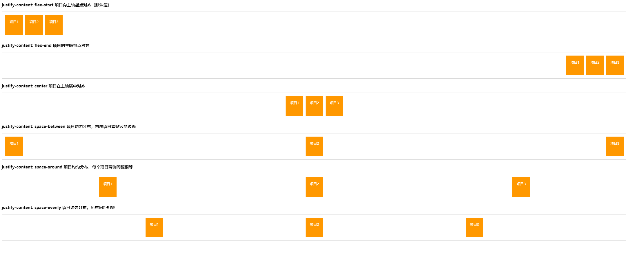
三、设置主轴对齐方式
justify-content属性的六种取值,控制项目在主轴上的对齐方式和间距分布。
1、justify-content: flex-start; 默认值,项目向主轴起点对齐
2、justify-content: flex-end; 项目向主轴终点对齐
3、justify-content: center; 项目在主轴居中对齐
4、justify-content: space-between; 项目均匀分布,首尾项目紧贴容器边缘
5、justify-content: space-around; 项目均匀分布,每个项目两侧间距相等
6、 justify-content: space-evenly; 项目均匀分布,所有间距相等
举例源代码:
css
    <style>
        .container {
            display: flex;
            border: 2px solid #ccc;
            padding: 10px;
            margin-bottom: 20px;
            height: 100px;
        }

        .item {
            background-color: #FF9800;
            color: white;
            margin: 5px;
            padding: 20px;
            text-align: center;
        }

        .justify-start {
            justify-content: flex-start;
        }

        .justify-end {
            justify-content: flex-end;
        }

        .justify-center {
            justify-content: center;
        }

        .justify-between {
            justify-content: space-between;
        }

        .justify-around {
            justify-content: space-around;
        }

        .justify-evenly {
            justify-content: space-evenly;
        }

    </style>
html
<body>
    <h3>justify-content: flex-start 项目向主轴起点对齐(默认值)</h3>
    <div class="container justify-start">
        <div class="item">项目1</div>
        <div class="item">项目2</div>
        <div class="item">项目3</div>
    </div>

    <h3>justify-content: flex-end 项目向主轴终点对齐</h3>
    <div class="container justify-end">
        <div class="item">项目1</div>
        <div class="item">项目2</div>
        <div class="item">项目3</div>
    </div>

    <h3>justify-content: center 项目在主轴居中对齐</h3>
    <div class="container justify-center">
        <div class="item">项目1</div>
        <div class="item">项目2</div>
        <div class="item">项目3</div>
    </div>

    <h3>justify-content: space-between 项目均匀分布,首尾项目紧贴容器边缘</h3>
    <div class="container justify-between">
        <div class="item">项目1</div>
        <div class="item">项目2</div>
        <div class="item">项目3</div>
    </div>

    <h3>justify-content: space-around   项目均匀分布,每个项目两侧间距相等</h3>
    <div class="container justify-around">
        <div class="item">项目1</div>
        <div class="item">项目2</div>
        <div class="item">项目3</div>
    </div>

    <h3>justify-content: space-evenly   项目均匀分布,所有间距相等</h3>
    <div class="container justify-evenly">
        <div class="item">项目1</div>
        <div class="item">项目2</div>
        <div class="item">项目3</div>
    </div>
</body>
效果图:
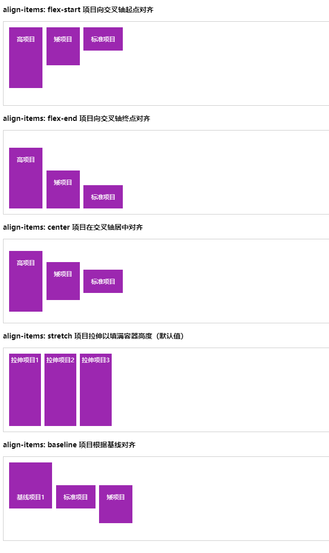
四、设置交叉轴上的对齐方式
align-items属性的五种取值,控制项目在交叉轴上的对齐方式。
1、 align-items: flex-start; /项目向交叉轴起点对齐
2、align-items: flex-end; 项目向交叉轴终点对齐
3、align-items: center; 项目在交叉轴居中对齐
4、align-items: stretch; 项目拉伸以填满容器高度(默认值)
5、align-items: baseline;
举例源代码:
css
    <style>
        .container {
            display: flex;
            border: 2px solid #ccc;
            padding: 10px;
            margin-bottom: 20px;
            height: 200px;
        }


        .align-start {
            align-items: flex-start;        }

        .align-end {
            align-items: flex-end;
        }

        .align-center {
            align-items: center;
        }

        .align-stretch {
            align-items: stretch;         }

        .align-baseline {

            align-items: baseline;
        }

        .item {
            background-color: #9C27B0;
            color: white;
            margin: 5px;
            padding: 20px;
            text-align: center;
        }

        .tall {
            height: 120px;
        }

        .short {
            height: 60px;
        }

        .baseline {
            padding-top: 80px;
        }
    </style>
html
<body>
    <h3>align-items: flex-start 项目向交叉轴起点对齐</h3>
    <div class="container align-start">
        <div class="item tall">高项目</div>
        <div class="item short">矮项目</div>
        <div class="item">标准项目</div>
    </div>

    <h3>align-items: flex-end 项目向交叉轴终点对齐</h3>
    <div class="container align-end">
        <div class="item tall">高项目</div>
        <div class="item short">矮项目</div>
        <div class="item">标准项目</div>
    </div>

    <h3>align-items: center 项目在交叉轴居中对齐</h3>
    <div class="container align-center">
        <div class="item tall">高项目</div>
        <div class="item short">矮项目</div>
        <div class="item">标准项目</div>
    </div>

    <h3>align-items: stretch 项目拉伸以填满容器高度(默认值)</h3>
    <div class="container align-stretch">
        <div class="item" style="padding: 5px;">拉伸项目1</div>
        <div class="item" style="padding: 5px;">拉伸项目2</div>
        <div class="item" style="padding: 5px;">拉伸项目3</div>
    </div>

    <h3>align-items: baseline 项目根据基线对齐</h3>
    <div class="container align-baseline">
        <div class="item baseline">基线项目1</div>
        <div class="item">标准项目</div>
        <div class="item short">矮项目</div>
    </div>
</body>
效果图:
效果图源代码:
html
<!DOCTYPE html>
<html lang="zh-CN">
<head>
    <meta charset="UTF-8">
    <title>Flex布局练习</title>
    <style>

        body {
            font-family: Arial, sans-serif;
            margin: 0;
            padding: 0;
        }


        .navbar {


            display: flex;
            justify-content: space-between;
            align-items: center;


            background-color: #333;
            color: white;
            padding: 10px 20px;
        }

        .logo {
            font-size: 24px;
            font-weight: bold;
        }


        .nav-links {
            display: flex;


            list-style: none;
            margin: 0;
            padding: 0;
        }

        .nav-links li {
            margin-left: 20px;
        }

        .nav-links a {
            color: white;
            text-decoration: none;
        }


        .search-box {
            display: flex;
            align-items: center;
        }

        .search-box input {
            padding: 5px;
            border: none;
            border-radius: 3px 0 0 3px;
        }

        .search-box button {
            padding: 5px 10px;
            background-color: #4CAF50;
            color: white;
            border: none;
            border-radius: 0 3px 3px 0;
            cursor: pointer;
        }
    </style>
</head>
<body>

    <nav class="navbar">
        <div class="logo">网站Logo</div>

        <ul class="nav-links">
            <li><a href="#">首页</a></li>
            <li><a href="#">产品</a></li>
            <li><a href="#">服务</a></li>
            <li><a href="#">关于我们</a></li>
            <li><a href="#">联系我们</a></li>
        </ul>

        <div class="search-box">
            <input type="text" placeholder="搜索...">
            <button><i class="fa fa-search"></i></button>
        </div>
    </nav>

    <div class="container">
        <h1>欢迎来到我们的网站</h1>
        <p>这里是一些关于我们的内容。</p>
    </div>
</body>
</html>