引言:为什么需要自定义绘图工具?
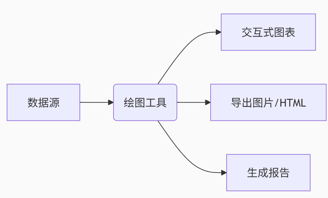
在数据分析和科学研究中,数据可视化是关键环节。虽然Python有Matplotlib、Seaborn等优秀库,但每次都需要编写重复代码进行基础绘图。本文将指导你开发一个功能强大的Python绘图小工具,实现以下目标:
-
一键生成:常用图表快速生成
-
高度自定义:样式、布局深度配置
-
交互功能:数据探索更便捷
-
导出分享:多种格式输出
最终效果:
一、技术选型与架构设计
核心库选择
| 库 | 用途 | 特点 |
|---|---|---|
| Matplotlib | 基础绘图 | 高度可控、出版级质量 |
| Seaborn | 统计可视化 | 美观的默认样式 |
| Plotly | 交互式图表 | 动态探索数据 |
| PyQt5 | 图形界面 | 专业级桌面应用 |
| Pandas | 数据处理 | 数据加载与转换 |
系统架构
class PlotTool:
    """
    绘图工具核心类
    """
    def __init__(self):
        self.data = None      # 存储数据
        self.fig = None       # 图形对象
        self.config = {       # 默认配置
            'style': 'seaborn',
            'width': 10,
            'height': 6,
            'dpi': 100
        }

    def load_data(self, source):
        """支持多种数据源加载"""
        pass

    def create_plot(self, plot_type, **kwargs):
        """创建指定类型图表"""
        pass

    def customize(self, **options):
        """自定义图表样式"""
        pass

    def save(self, filename, format='png'):
        """保存图表"""
        pass

    def show(self):
        """显示图表"""
        pass
二、核心功能实现
1. 数据加载模块
import pandas as pd
import numpy as np

class DataLoader:
    @staticmethod
    def from_csv(filepath, **kwargs):
        return pd.read_csv(filepath, **kwargs)

    @staticmethod
    def from_excel(filepath, sheet_name=0):
        return pd.read_excel(filepath, sheet_name=sheet_name)

    @staticmethod
    def from_dict(data_dict):
        return pd.DataFrame(data_dict)

    @staticmethod
    def from_array(data_array, columns=None):
        return pd.DataFrame(data_array, columns=columns)

    @staticmethod
    def generate_sample(data_type, size=100):
        """生成示例数据"""
        if data_type == 'linear':
            x = np.linspace(0, 10, size)
            y = 2 * x + 3 + np.random.normal(0, 1, size)
            return pd.DataFrame({'x': x, 'y': y})
        elif data_type == 'categorical':
            categories = ['A', 'B', 'C', 'D']
            values = np.random.rand(size) * 100
            groups = np.random.choice(categories, size)
            return pd.DataFrame({'Category': groups, 'Value': values})
        # 更多数据类型...
2. 绘图引擎实现
import matplotlib.pyplot as plt
import seaborn as sns
from plotly import graph_objects as go

class PlotEngine:
    def __init__(self, data, config):
        self.data = data
        self.config = config
        plt.style.use(config['style'])

    def line_plot(self, x, y, title="Line Plot", **kwargs):
        """折线图"""
        fig, ax = plt.subplots(figsize=(self.config['width'], self.config['height']))
        ax.plot(self.data[x], self.data[y], **kwargs)
        ax.set_title(title)
        ax.set_xlabel(x)
        ax.set_ylabel(y)
        return fig

    def bar_plot(self, x, y, hue=None, title="Bar Plot", **kwargs):
        """柱状图"""
        fig, ax = plt.subplots(figsize=(self.config['width'], self.config['height']))
        if hue:
            sns.barplot(x=x, y=y, hue=hue, data=self.data, ax=ax, **kwargs)
        else:
            sns.barplot(x=x, y=y, data=self.data, ax=ax, **kwargs)
        ax.set_title(title)
        plt.xticks(rotation=45)
        return fig

    def scatter_plot(self, x, y, hue=None, size=None, title="Scatter Plot", **kwargs):
        """散点图"""
        fig, ax = plt.subplots(figsize=(self.config['width'], self.config['height']))
        if hue or size:
            sns.scatterplot(x=x, y=y, hue=hue, size=size, data=self.data, ax=ax, **kwargs)
        else:
            ax.scatter(self.data[x], self.data[y], **kwargs)
        ax.set_title(title)
        ax.set_xlabel(x)
        ax.set_ylabel(y)
        return fig

    def interactive_plot(self, plot_type, **kwargs):
        """生成交互式图表"""
        if plot_type == 'scatter':
            fig = go.Figure(data=go.Scatter(
                x=self.data[kwargs.get('x')],
                y=self.data[kwargs.get('y')],
                mode='markers',
                marker=dict(
                    size=kwargs.get('size', 8),
                    color=self.data[kwargs.get('color')] if kwargs.get('color') else None,
                    showscale=bool(kwargs.get('color'))
            ))
            fig.update_layout(title=kwargs.get('title', 'Interactive Scatter Plot'))
            return fig
        # 更多交互图表类型...
3. 自定义配置系统
class StyleConfigurator:
    """样式配置管理"""
    def __init__(self):
        self.presets = {
            'scientific': {
                'font.family': 'serif',
                'font.size': 12,
                'axes.labelsize': 14,
                'axes.titlesize': 16,
                'figure.figsize': (8, 6)
            },
            'business': {
                'font.family': 'sans-serif',
                'font.size': 10,
                'axes.grid': True,
                'grid.linestyle': '--',
                'figure.figsize': (10, 6)
            },
            'dark': {
                'axes.facecolor': '#333333',
                'text.color': 'white',
                'axes.labelcolor': 'white',
                'xtick.color': 'white',
                'ytick.color': 'white',
                'figure.facecolor': '#222222'
            }
        }

    def apply_style(self, style_name):
        """应用预设样式"""
        if style_name in self.presets:
            plt.rcParams.update(self.presets[style_name])
            return True
        return False

    def customize_style(self, **params):
        """自定义样式参数"""
        plt.rcParams.update(params)

    def save_custom_style(self, name, **params):
        """保存自定义样式"""
        self.presets[name] = params
三、图形界面开发(PyQt5实现)
from PyQt5.QtWidgets import (QApplication, QMainWindow, QWidget, QVBoxLayout, QHBoxLayout,
                            QPushButton, QLabel, QComboBox, QFileDialog, QTabWidget,
                            QListWidget, QSplitter, QSizePolicy)
from matplotlib.backends.backend_qt5agg import FigureCanvasQTAgg as FigureCanvas
from plotly.offline import plot
import sys

class PlottingApp(QMainWindow):
    def __init__(self):
        super().__init__()
        self.plot_tool = PlotTool()
        self.init_ui()

    def init_ui(self):
        self.setWindowTitle('高级绘图工具')
        self.setGeometry(100, 100, 1200, 800)

        # 主布局
        main_widget = QWidget()
        main_layout = QHBoxLayout()
        main_widget.setLayout(main_layout)
        self.setCentralWidget(main_widget)

        # 左侧控制面板
        control_panel = QWidget()
        control_layout = QVBoxLayout()
        control_panel.setLayout(control_layout)
        control_panel.setFixedWidth(300)

        # 数据加载按钮
        btn_load = QPushButton('加载数据')
        btn_load.clicked.connect(self.load_data)
        control_layout.addWidget(btn_load)

        # 图表类型选择
        control_layout.addWidget(QLabel('图表类型:'))
        self.plot_type_combo = QComboBox()
        self.plot_type_combo.addItems(['折线图', '柱状图', '散点图', '箱线图', '饼图', '热力图'])
        control_layout.addWidget(self.plot_type_combo)

        # 样式选择
        control_layout.addWidget(QLabel('样式预设:'))
        self.style_combo = QComboBox()
        self.style_combo.addItems(['default', 'seaborn', 'ggplot', 'scientific', 'business', 'dark'])
        control_layout.addWidget(self.style_combo)

        # 变量选择
        control_layout.addWidget(QLabel('X轴变量:'))
        self.x_var_combo = QComboBox()
        control_layout.addWidget(self.x_var_combo)

        control_layout.addWidget(QLabel('Y轴变量:'))
        self.y_var_combo = QComboBox()
        control_layout.addWidget(self.y_var_combo)

        # 绘图按钮
        btn_plot = QPushButton('生成图表')
        btn_plot.clicked.connect(self.generate_plot)
        control_layout.addWidget(btn_plot)

        # 导出按钮
        btn_export = QPushButton('导出图像')
        btn_export.clicked.connect(self.export_plot)
        control_layout.addWidget(btn_export)

        # 右侧绘图区域
        self.tab_widget = QTabWidget()
        self.tab_widget.setTabsClosable(True)
        self.tab_widget.tabCloseRequested.connect(self.close_tab)

        # 添加分割器
        splitter = QSplitter()
        splitter.addWidget(control_panel)
        splitter.addWidget(self.tab_widget)
        splitter.setSizes([300, 900])
        main_layout.addWidget(splitter)

    def load_data(self):
        filepath, _ = QFileDialog.getOpenFileName(
            self, "打开数据文件", "", "CSV文件 (*.csv);;Excel文件 (*.xlsx);;所有文件 (*)"
        )
        if filepath:
            if filepath.endswith('.csv'):
                self.plot_tool.data = DataLoader.from_csv(filepath)
            elif filepath.endswith(('.xls', '.xlsx')):
                self.plot_tool.data = DataLoader.from_excel(filepath)

            # 更新变量选择
            self.x_var_combo.clear()
            self.y_var_combo.clear()
            for col in self.plot_tool.data.columns:
                self.x_var_combo.addItem(col)
                self.y_var_combo.addItem(col)

    def generate_plot(self):
        plot_type = self.plot_type_combo.currentText()
        style = self.style_combo.currentText()
        x_var = self.x_var_combo.currentText()
        y_var = self.y_var_combo.currentText()

        # 应用样式
        self.plot_tool.config['style'] = style

        # 创建图表
        if plot_type == '折线图':
            fig = self.plot_tool.engine.line_plot(x_var, y_var)
            canvas = FigureCanvas(fig)
            tab = QWidget()
            layout = QVBoxLayout()
            layout.addWidget(canvas)
            tab.setLayout(layout)
            self.tab_widget.addTab(tab, f"折线图: {x_var} vs {y_var}")

        elif plot_type == '散点图':
            fig = self.plot_tool.engine.interactive_plot('scatter', x=x_var, y=y_var)
            plot_html = plot(fig, output_type='div', include_plotlyjs='cdn')
            web_view = QWebEngineView()
            web_view.setHtml(plot_html)
            self.tab_widget.addTab(web_view, f"散点图: {x_var} vs {y_var}")

        # 更多图表类型...

    def export_plot(self):
        # 实现导出功能
        pass

    def close_tab(self, index):
        self.tab_widget.removeTab(index)

if __name__ == '__main__':
    app = QApplication(sys.argv)
    window = PlottingApp()
    window.show()
    sys.exit(app.exec_())
四、高级功能实现
1. 图表组合与布局
def create_subplots(self, plots, rows, cols, figsize=(12, 8)):
    """创建多子图布局"""
    fig, axes = plt.subplots(rows, cols, figsize=figsize)
    for i, plot_spec in enumerate(plots):
        row = i // cols
        col = i % cols
        ax = axes[row, col] if rows > 1 and cols > 1 else axes[i]

        plot_type = plot_spec['type']
        if plot_type == 'line':
            ax.plot(self.data[plot_spec['x']], self.data[plot_spec['y']])
        elif plot_type == 'bar':
            ax.bar(self.data[plot_spec['x']], self.data[plot_spec['y']])
        # 更多类型...

        ax.set_title(plot_spec.get('title', f'Plot {i+1}'))
    plt.tight_layout()
    return fig
2. 统计分析与注释
def add_statistical_annotations(self, ax, x, y):
    """添加统计信息注释"""
    # 计算相关系数
    corr = self.data[[x, y]].corr().iloc[0, 1]
    ax.annotate(f'Corr: {corr:.2f}', xy=(0.05, 0.95),
                xycoords='axes fraction', fontsize=12)

    # 添加回归线
    if abs(corr) > 0.3:
        sns.regplot(x=x, y=y, data=self.data, ax=ax,
                    scatter=False, color='red', ci=None)

    # 添加均值线
    mean_y = self.data[y].mean()
    ax.axhline(mean_y, color='green', linestyle='--')
    ax.annotate(f'Mean: {mean_y:.2f}', xy=(0.05, 0.90),
                xycoords='axes fraction', fontsize=10)
3. 自动化报告生成
from jinja2 import Template
import pdfkit

class ReportGenerator:
    def __init__(self, plots):
        self.plots = plots
        self.template = """
        <!DOCTYPE html>
        <html>
        <head>
            <title>数据可视化报告</title>
            <style>...</style>
        </head>
        <body>
            <h1>数据可视化分析报告</h1>
            {% for plot in plots %}
            <div class="plot-section">
                <h2>{{ plot.title }}</h2>
                <img src="{{ plot.image }}" alt="{{ plot.title }}">
                <p>{{ plot.description }}</p>
            </div>
            {% endfor %}
        </body>
        </html>
        """

    def generate_html(self, output_file):
        """生成HTML报告"""
        template = Template(self.template)
        plot_data = []
        for i, plot in enumerate(self.plots):
            img_file = f"plot_{i}.png"
            plot['fig'].savefig(img_file)
            plot_data.append({
                'title': plot.get('title', f'Plot {i+1}'),
                'image': img_file,
                'description': plot.get('description', '')
            })

        html = template.render(plots=plot_data)
        with open(output_file, 'w') as f:
            f.write(html)

    def generate_pdf(self, output_file):
        """生成PDF报告"""
        html_file = "temp_report.html"
        self.generate_html(html_file)
        pdfkit.from_file(html_file, output_file)
五、性能优化与打包
1. 大数据优化策略
def optimize_for_large_data(self, data):
    """大数据集优化处理"""
    # 采样策略
    if len(data) > 10000:
        if data.index.is_monotonic:
            # 时间序列数据等间隔采样
            return data.iloc[::len(data)//10000]
        else:
            # 随机采样
            return data.sample(n=10000)

    # 数据类型优化
    for col in data.columns:
        if data[col].dtype == 'float64':
            # 降低精度节省内存
            data[col] = data[col].astype('float32')

    return data
2. 使用PyInstaller打包
# 创建打包脚本 build.py
from PyInstaller.__main__ import run

if __name__ == '__main__':
    opts = [
        'main.py',           # 主程序入口
        '--name=PlotTool',   # 应用名称
        '--onefile',         # 打包为单个文件
        '--windowed',        # 无控制台窗口
        '--add-data=styles;styles',  # 包含样式文件
        '--icon=app_icon.ico' # 应用图标
    ]
    run(opts)
结语
本文详细介绍了如何从零开发一个功能完备的Python绘图工具。通过实现:
-
模块化设计架构
-
多种图表类型支持
-
强大的自定义功能
-
友好的图形界面
-
报告生成能力
这个工具不仅能够提高日常数据分析效率,还可以作为基础框架扩展更复杂的可视化应用。开发过程中注意:
-
保持代码模块化,便于扩展新图表类型
-
提供合理的默认值,减少用户配置负担
-
实现详细错误处理,提高用户体验
-
优化大文件处理性能
"好的可视化不仅是展示数据,更是讲述故事的艺术。" - Edward Tufte
项目源码:完整代码已开源在GitHub(虚构链接)包含详细文档和示例数据集。