按钮是任何用户界面的基本组成部分,因为它们允许用户通过触发操作或导航到新屏幕来与应用程序进行交互。
看看官方的定义:
Button 是一个控制项(control),用于触发某个动作(action)。 你创建按钮时需要两个参数:一个 动作(action) 和一个 标签(label)。 action 是方法或闭包,在按钮被点击时执行。 label 是一个描述按钮用途的视图,可以是文字、图标或两者结合。 SwiftUI 提供多种按钮样式和自定义选项以适合你的应用程序的设计。
本教程将深入探讨不同类型的SwiftUI 按钮,并回答以下问题:
如何在 SwiftUI 中创建按钮?如何在 SwiftUI 中添加按钮?以及如何自定义 SwiftUI 按钮?
-> Check our SwiftUI Picker Tutorial
-> Check our SwiftUI GeometryReader Tutorial
-> Check our SwiftUI List Tutorial
默认 SwiftUI 按钮 and 自定义文本
你可以在任何用户界面中使用按钮去开始一个任务,所以可能需要回答的第一个问题是如何在 SwiftUI 中创建按钮? 只需提供操作和文本即可轻松创建 SwiftUI 按钮。SwiftUI 按钮操作是一种在用户点击按钮时执行某些操作的方法。
官方源码中基础的按钮定义是:
swift
@available(iOS 13.0, macOS 10.15, tvOS 13.0, watchOS 6.0, *)
public struct Button<Label> : View where Label : View {

    /// Creates a button that displays a custom label.
    ///
    /// - Parameters:
    ///   - action: The action to perform when the user triggers the button.
    ///   - label: A view that describes the purpose of the button's `action`.
    @preconcurrency public init(action: @escaping @MainActor () -> Void, @ViewBuilder label: () -> Label)

    /// The content and behavior of the view.
    ///
    /// When you implement a custom view, you must implement a computed
    /// `body` property to provide the content for your view. Return a view
    /// that's composed of built-in views that SwiftUI provides, plus other
    /// composite views that you've already defined:
    ///
    ///     struct MyView: View {
    ///         var body: some View {
    ///             Text("Hello, World!")
    ///         }
    ///     }
    ///
    /// For more information about composing views and a view hierarchy,
    /// see <doc:Declaring-a-Custom-View>.
    @MainActor @preconcurrency public var body: some View { get }

    /// The type of view representing the body of this view.
    ///
    /// When you create a custom view, Swift infers this type from your
    /// implementation of the required ``View/body-swift.property`` property.
    @available(iOS 13.0, tvOS 13.0, watchOS 6.0, macOS 10.15, *)
    public typealias Body = some View
}
这意味着,操作参数和标签参数都是闭包,标签参数符合结果构造器可以包裹多个视图。
下面是基础示例,
swift
Button(action: {
                    print("按钮被点击了!")
                }) {
                    Text("hello")
                    Text("点击我")
                        .padding()
                        .background(Color.blue)
                        .foregroundColor(.white)
                        .cornerRadius(10)
                }
当标签是本地化字符串时或是字面量时:
swift
@available(iOS 13.0, macOS 10.15, tvOS 13.0, watchOS 6.0, *)
extension Button where Label == Text {

    /// Creates a button that generates its label from a localized string key.
    ///
    /// This initializer creates a ``Text`` view on your behalf, and treats the
    /// localized key similar to ``Text/init(_:tableName:bundle:comment:)``. See
    /// ``Text`` for more information about localizing strings.
    ///
    /// - Parameters:
    ///   - titleKey: The key for the button's localized title, that describes
    ///     the purpose of the button's `action`.
    ///   - action: The action to perform when the user triggers the button.
    @preconcurrency nonisolated public init(_ titleKey: LocalizedStringKey, action: @escaping @MainActor () -> Void)

    /// Creates a button that generates its label from a string.
    ///
    /// This initializer creates a ``Text`` view on your behalf, and treats the
    /// title similar to ``Text/init(_:)``. See ``Text`` for more
    /// information about localizing strings.
    ///
    /// - Parameters:
    ///   - title: A string that describes the purpose of the button's `action`.
    ///   - action: The action to perform when the user triggers the button.
    @preconcurrency nonisolated public init<S>(_ title: S, action: @escaping @MainActor () -> Void) where S : StringProtocol
}
两者在书写方式上没有区别,因为 Swift 的类型推断会自动选择匹配的初始化器,但我们要知道,推荐在国际化多语言,显示标签不会改变时才使用本地化的方法,下面是示例,
swift
@available(iOS 13.0, macOS 10.15, tvOS 13.0, watchOS 6.0, *)
struct ComprehensiveButtonExample: View {
    @State private var counter = 0

    var body: some View {
        VStack(spacing: 30) {
            // 示例1:静态字符串
            Button("点击增加", action: incrementCounter)

            // 示例2:本地化字符串键
            Button("settings_button_title", action: openSettings)
                .buttonStyle(.bordered)

            // 示例3:字符串变量
            let dynamicTitle = counter > 5 ? "重置" : "继续增加"
            Button(dynamicTitle, action: counter > 5 ? resetCounter : incrementCounter)
                .foregroundColor(counter > 5 ? .red : .blue)

            Text("计数: \(counter)")
                .font(.title)
        }
        .padding()
    }

    @MainActor
    private func incrementCounter() {
        counter += 1
    }

    @MainActor
    private func resetCounter() {
        counter = 0
    }

    @MainActor
    private func openSettings() {
        print("打开设置界面")
    }
}

// 在 Localizable.strings 中需要:
// "settings_button_title" = "设置";以下SwiftUI 按钮示例展示了如何自定义按钮文本。请注意,我们应该使用不同的按钮初始化器来自定义按钮文本样式。
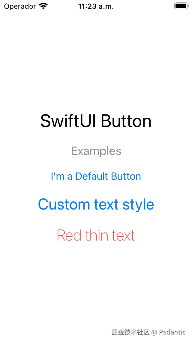
swift
//按钮
import SwiftUI

struct ContenView: View {
  var body: some View {
    VStack(spacing: 20) {
      Text("SwiftUI Button")
        .font(.largeTitle)
      Text("Examples")
        .font(.title2)
        .foregroundColor(.gray)

      /* Default Button */
      Button("默认按钮") {
        // Your code here
      }

      /* Customizing the Text */
      Button(action: {
        // Your code here
      }) {
        Text("自定义按钮")
          .font(.title)
      }

      Button(action: {
        // Your code here
      }) {
        Text("Red thin text")
          .font(.title)
          .fontWeight(.thin)
          .foregroundColor(.red)
      }
    }
  }
}

#Preview {
    ContenView()
}
SwiftUI Button 样式
你可以使用SwiftUI 按钮样式快速将一组预定义的视觉属性应用于按钮。SwiftUI按钮样式可让你在整个应用中保持按钮外观的一致性,而无需手动调整每个按钮。
SwiftUI 提供了多种内置按钮样式供你使用,包括default、borderless或plain。此外,你还可以创建自己的自定义按钮样式,以匹配你的应用设计。
要应用SwiftUI 按钮样式,你可以使用**buttonStyle()**修饰符。
让我们看一些例子:
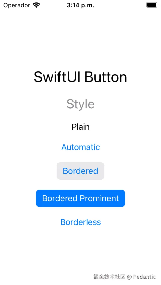
swift
import SwiftUI

struct ContentView: View {
  var body: some View {
    VStack(spacing: 20) {
      Text("SwiftUI Button")
        .font(.largeTitle)
      Text("Style")
        .font(.title)
        .foregroundColor(.gray)

      /* Button Styles */
      Button("Plain") {}
        .buttonStyle(.plain)

      Button("Automatic") {}
        .buttonStyle(.automatic)

      Button("Bordered") {}
        .buttonStyle(.bordered)

      Button("Bordered Prominent") {}
        .buttonStyle(.borderedProminent)

      Button("Borderless") {}
        .buttonStyle(.borderless)
    }
  }
}
SwiftUI 按钮 背景颜色
除了使用自定义文本自定义 SwiftUI 按钮标签外,您还可以修改按钮的背景。调整背景可以让您创建无缝融入应用设计并提供引人入胜的视觉用户体验的 SwiftUI 按钮。
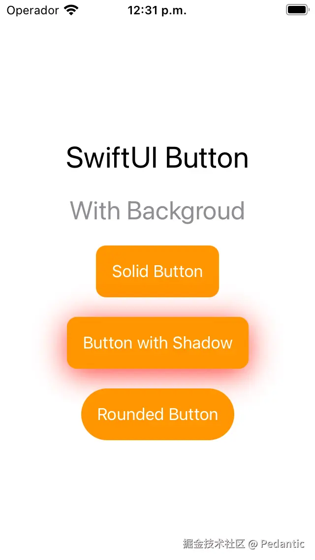
SwiftUI 提供了多种自定义按钮背景的方法。您可以使用background() 修饰符来应用纯色或渐变色。此外,您还可以调整背景的不透明度和圆角半径,以进一步自定义按钮的外观。
swift
import SwiftUI

struct ContentView: View {
  var body: some View {
    VStack(spacing: 20) {
      Text("SwiftUI Button")
        .font(.largeTitle)
      Text("Style")
        .font(.title)
        .foregroundColor(.gray)

      /* Button Styles */
      Button("Plain") {}
        .buttonStyle(.plain)

      Button("Automatic") {}
        .buttonStyle(.automatic)

      Button("Bordered") {}
        .buttonStyle(.bordered)

      Button("Bordered Prominent") {}
        .buttonStyle(.borderedProminent)

      Button("Borderless") {}
        .buttonStyle(.borderless)
    }
  }
}
SwiftUI 按钮禁用
您可以禁用 SwiftUI 按钮,以阻止用户在满足特定条件时与其交互。禁用按钮是一种向用户提供反馈并阻止其执行当前不可用操作的有效方法。
要禁用 SwiftUI 按钮,请使用disabled()修饰符并传入一个布尔值。当布尔值为 true 时,按钮将被禁用,用户将无法与其交互。当布尔值为 false 时,按钮将被启用,用户可以正常与其交互。
当按钮被禁用时,其外观也可以自定义,以向用户指示该按钮当前不可用。默认情况下,禁用的按钮会显示为灰色,并且文本颜色会更改为显示该按钮已被禁用。
您还可以通过对按钮应用其他修饰符(例如调整其不透明度或更改其背景颜色)来自定义禁用按钮的外观。
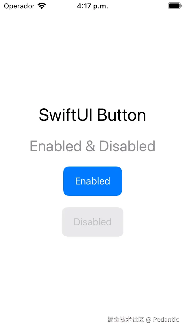
swift
import SwiftUI
struct ContentView: View {
var body: some View {
VStack(spacing: 20) {
Text("SwiftUI Button")
.font(.largeTitle)
Text("Enabled & Disabled")
.font(.title)
.foregroundColor(.gray)
/* Disabled */
Button("Enabled") {}
.buttonStyle(.borderedProminent)
.tint(.blue)
.controlSize(.large)
Button("Disabled") {}
.buttonStyle(.borderedProminent)
.tint(.blue)
.controlSize(.large)
.disabled(true)
}
}
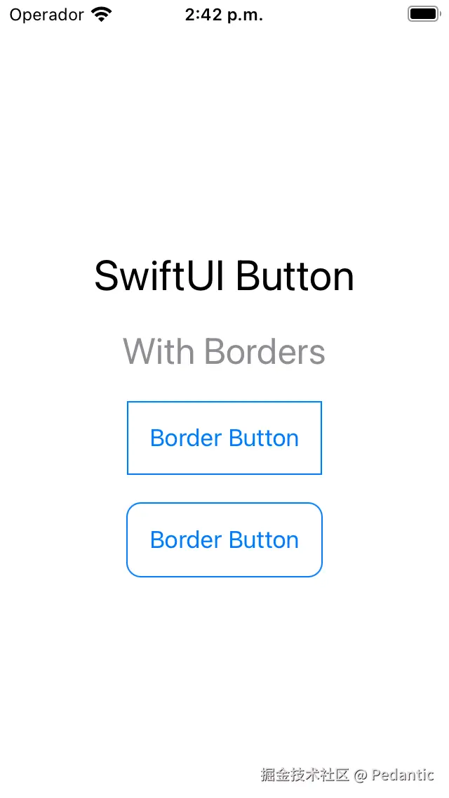
}SwiftUI 按钮和文本边框
除了自定义SwiftUI 按钮的文本和背景之外,您还可以添加边框以创建更明确、视觉上更具吸引力的按钮。
SwiftUI 提供了多种自定义按钮边框的方法。您可以使用**border()**修饰符为按钮背景或文本添加边框。
此外,您还可以调整边框的粗细、颜色和角半径来进一步定制按钮的外观。
swift
import SwiftUI

struct ContentView: View {
  var body: some View {
    VStack(spacing: 20) {
      Text("SwiftUI Button")
        .font(.largeTitle)
      Text("With Borders")
        .font(.title)
        .foregroundColor(.gray)

      /* Square Border Button */
      Button(action: {}) {
        Text("Border Button")
          .padding()
          .border(.blue)
      }

      /* Square Border Button */
      Button(action: {}) {
        Text("Border Button")
          .padding()
          .background(
            RoundedRectangle(cornerRadius: 10)
              .stroke(.blue, lineWidth: 1)
          )
      }
    }
  }
}
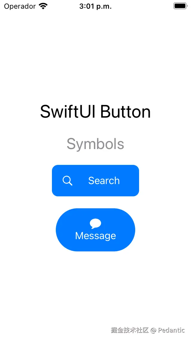
SwiftUI 按钮带 Image (Symbols)图片或图标
在 SwiftUI 中,您可以使用SF Symbols为按钮添加图标和符号。SF Symbols 是一个包含 3,000 多个图标和符号的库,专为 Apple 平台设计。
通过将 SF 符号合并到您的 SwiftUI 按钮中,您可以提供更直观、更具视觉吸引力的用户体验。
让我们看看在 SwiftUI 按钮中使用 SF Symbols 的一些示例。此外,您还可以自定义符号的大小和颜色,以进一步增强按钮的外观
swift
struct ContentView: View {
  var body: some View {
    VStack(spacing: 20) {
      Text("SwiftUI Button")
        .font(.largeTitle)
      Text("Symbols")
        .font(.title)
        .foregroundColor(.gray)

      /* Button with Symbols */
      Button(action: {}) {
        Image(systemName: "magnifyingglass")
        Text("Search")
          .padding(.horizontal)
      }
      .padding()
      .background(.blue)
      .foregroundColor(.white)
      .cornerRadius(10)

      Button(action: {}) {
        VStack {
          Image(systemName: "message.fill")
          Text("Message")
            .padding(.horizontal)
        }
      }
      .padding()
      .background(.blue)
      .foregroundColor(.white)
      .cornerRadius(.infinity)
    }
  }
}
这里的代码就可以看出标签参数是被结果构造器修饰的。
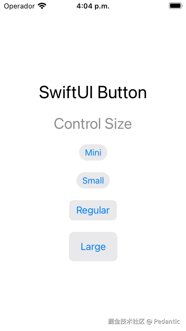
SwiftUI Button 控件大小
控件大小是指按钮及其文本的大小,可以进行调整以适应不同的屏幕尺寸和用户偏好。
SwiftUI 提供了几种可用的内置控件尺寸,包括mini、small、regular 和large。
要调整 SwiftUI 按钮的控件大小,可以使用**controlSize()**修饰符。
让我们看一些例子:
swift
import SwiftUI

struct ContentView: View {
  var body: some View {
    VStack(spacing: 20) {
      Text("SwiftUI Button")
        .font(.largeTitle)
      Text("Control Size")
        .font(.title)
        .foregroundColor(.gray)

      /* Control Size */
      Button("很小") {}
        .buttonStyle(.bordered)
        .controlSize(.mini)

      Button("小") {}
        .buttonStyle(.bordered)
        .controlSize(.small)

      Button("标准") {}
        .buttonStyle(.bordered)
        .controlSize(.regular)

      Button("大") {}
        .buttonStyle(.bordered)
        .controlSize(.large)
    }
  }
}
SwiftUI Button 边框形状
SwiftUI按钮边框形状是指按钮边框的形状,可以调整以创建不同的视觉效果。
SwiftUI 提供了几种可用的内置边框形状,包括胶囊形、自动形和圆形。
要调整 SwiftUI 按钮的边框形状,您可以使用buttonStyle() 修饰符和指定所需边框形状的自定义按钮样式。
swift
//
//  01.swift
//  wallet
//
//  Created by luckly on 2025/7/27.
//

//按钮
import SwiftUI

struct ContenView: View {
  var body: some View {
    VStack(spacing: 20) {
      Text("SwiftUI Button")
        .font(.largeTitle)
      Text("Border Shape")
        .font(.title)
        .foregroundColor(.gray)

      /* Border Shape */
      Button("自动") {}
        .buttonStyle(.bordered)
        .controlSize(.large)
        .buttonBorderShape(.automatic)

      Button("胶囊") {}
        .buttonStyle(.bordered)
        .controlSize(.large)
        .buttonBorderShape(.capsule)

      Button("圆角矩形") {}
        .buttonStyle(.bordered)
        .controlSize(.large)
        .buttonBorderShape(.roundedRectangle)

      Button("圆形") {}
        .buttonStyle(.bordered)
        .controlSize(.large)
        .buttonBorderShape(.circle)

    Button("矩形") {}
        .buttonStyle(.bordered)
        .controlSize(.large)
        .buttonBorderShape(.roundedRectangle(radius: 20))

        let shape1: ButtonBorderShape = .capsule
        let shape2: ButtonBorderShape = .circle


        if shape1 == shape2 {
          Text("The border shapes are equal.")

        } else {
            Text("The border shapes are not equal.")
        }
    }
  }
}
#Preview {
    ContenView()
}
SwiftUI Button 边框样式
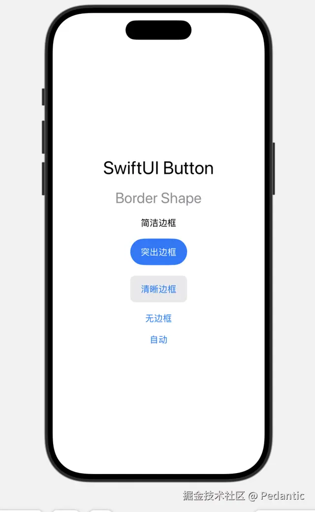
swift
//
//  01.swift
//  wallet
//
//  Created by luckly on 2025/7/27.
//

//按钮
import SwiftUI

struct ContenView: View {
  var body: some View {
    VStack(spacing: 20) {
      Text("SwiftUI Button")
        .font(.largeTitle)
      Text("Border Shape")
        .font(.title)
        .foregroundColor(.gray)

      /* Border Shape */
      Button("简洁边框") {}
        .buttonStyle(.plain)
        .controlSize(.large)
        .buttonBorderShape(.automatic)

      Button("突出边框") {}
        .buttonStyle(.borderedProminent)
        .controlSize(.large)
        .buttonBorderShape(.capsule)

      Button("清晰边框") {}
        .buttonStyle(.bordered)
        .controlSize(.large)
        .buttonBorderShape(.roundedRectangle)

        Button("无边框") {}
            .buttonStyle(.borderless)
          .controlSize(.large)
          .buttonBorderShape(.roundedRectangle)

        Button("自动") {}
            .buttonStyle(.automatic)
          .controlSize(.large)
          .buttonBorderShape(.roundedRectangle)

    }
  }
}

#Preview {
    ContenView()
}
SwiftUI Button 自定义样式
我们可以使用这个官方提供的自定义样式的方法来组合复用一些样式,减少重复的代码。
swift
@available(iOS 13.0, macOS 10.15, tvOS 13.0, watchOS 6.0, *)
extension Button where Label == PrimitiveButtonStyleConfiguration.Label {

    /// Creates a button based on a configuration for a style with a custom
    /// appearance and custom interaction behavior.
    ///
    /// Use this initializer within the
    /// ``PrimitiveButtonStyle/makeBody(configuration:)`` method of a
    /// ``PrimitiveButtonStyle`` to create an instance of the button that you
    /// want to style. This is useful for custom button styles that modify the
    /// current button style, rather than implementing a brand new style.
    ///
    /// For example, the following style adds a red border around the button,
    /// but otherwise preserves the button's current style:
    ///
    ///     struct RedBorderedButtonStyle: PrimitiveButtonStyle {
    ///         func makeBody(configuration: Configuration) -> some View {
    ///             Button(configuration)
    ///                 .border(Color.red)
    ///         }
    ///     }
    ///
    /// - Parameter configuration: A configuration for a style with a custom
    ///   appearance and custom interaction behavior.
    @available(iOS 13.0, macOS 10.15, tvOS 13.0, watchOS 6.0, *)
    nonisolated public init(_ configuration: PrimitiveButtonStyleConfiguration)
}
示例:
swift
struct RedBorderedButtonStyle: PrimitiveButtonStyle {
    func makeBody(configuration: Configuration) -> some View {
        Button(configuration)  // 使用提供的配置创建基础按钮
            .padding(10)
            .background(
                RoundedRectangle(cornerRadius: 8)
                    .stroke(Color.red, lineWidth: 2)
            )
            .onTapGesture {
                configuration.trigger()  // 手动触发按钮动作
            }
    }
}

// 使用示例
struct ContentView: View {
    var body: some View {
        Button("删除项目", action: deleteItem)
            .buttonStyle(RedBorderedButtonStyle())
    }

    private func deleteItem() {
        print("项目已删除")
    }
}
示例2
swift
struct PressableButtonStyle: PrimitiveButtonStyle {
    @State private var isPressed = false

    func makeBody(configuration: Configuration) -> some View {
        let longPress = LongPressGesture(minimumDuration: 0.1)
            .onChanged { _ in
                withAnimation(.easeInOut(duration: 0.1)) {
                    isPressed = true
                }
            }
            .onEnded { _ in
                withAnimation(.spring()) {
                    isPressed = false
                }
                configuration.trigger()  // 手势结束时触发
            }

        return configuration.label
            .padding()
            .background(Color.blue)
            .foregroundColor(.white)
            .cornerRadius(10)
            .scaleEffect(isPressed ? 0.95 : 1.0)
            .opacity(isPressed ? 0.8 : 1.0)
            .gesture(longPress)
    }
}

// 使用示例
struct AdvancedView: View {
    var body: some View {
        VStack {
            Button("长按触发", action: showAlert)
                .buttonStyle(PressableButtonStyle())

            Button(action: {}) {
                Label("收藏", systemImage: "heart")
            }
            .buttonStyle(PressableButtonStyle())
        }
    }

    private func showAlert() {
        print("警告触发!")
    }
}
需要解释的是,
Button(configuration) 是一个真正的按钮容器,会自动处理可访问性(VoiceOver)、键盘导航、焦点系统等。
configuration.label 是你传入的内容视图,什么都不处理,纯裸视图。
所以如果要搭配长按,点两次等行为就选第二个,需要实现可访问性VoiceOver就用第一个。
SwiftUI Button 角色
看看源码
swift
@available(iOS 15.0, macOS 12.0, tvOS 15.0, watchOS 8.0, *)
extension Button {

    /// Creates a button with a specified role that displays a custom label.
    ///
    /// - Parameters:
    ///   - role: An optional semantic role that describes the button. A value of
    ///     `nil` means that the button doesn't have an assigned role.
    ///   - action: The action to perform when the user interacts with the button.
    ///   - label: A view that describes the purpose of the button's `action`.
    @preconcurrency nonisolated public init(role: ButtonRole?, action: @escaping @MainActor () -> Void, @ViewBuilder label: () -> Label)
}
在 SwiftUI 中,角色(ButtonRole) 是一个用于语义化描述按钮用途的枚举类型,它通过预定义的角色类别让系统自动适配不同平台的交互规范和视觉样式
示例
swift
import SwiftUI

struct RoleButtonsExample: View {
    var body: some View {
        VStack(spacing: 20) {
            // 默认角色 (nil)
            Button(role: nil, action: { print("常规操作") }) {
                Text("普通按钮")
            }

            // 取消按钮 (自动适配平台样式)
            Button(role: .cancel, action: { print("取消操作") }) {
                Label("取消", systemImage: "xmark.circle")
            }

            // 破坏性按钮 (红色强调)
            Button(role: .destructive, action: deleteItem) {
                Text("删除所有数据")
            }
        }
        .buttonStyle(.bordered)
        .padding()
    }

    @MainActor
    private func deleteItem() {
        print("执行危险操作")
    }
}
对于定义一个swiftUI的button来说,就有那么一些方式的组合,标签参数包括任何视图类型,纯字符,本地化字符串。加上资源图片,系统图标,执行操作,还有角色。这些组合就构成了很多按钮的类型。
| 标签形式 | 示例代码 | 说明 |
|---|---|---|
Text |
Button("确定") {} |
最常见的文字按钮 |
LocalizedStringKey |
Button("submit_button_key") {} |
支持本地化的键 |
Image |
Button { } label: { Image(systemName: "trash") } |
图标按钮 |
Text + Image |
Button { } label: { Label("删除", systemImage: "trash") } |
图文组合标签 |
| 自定义 View | Button { } label: { HStack { Text("编辑"); IconView() } } |
任意复杂组合视图 |
最后
SwiftUI 提供了一种强大而灵活的方式,可在 iOS、macOS、watchOS 和 tvOS app 中创建按钮。借助其声明式语法和直观的修饰符,您可以轻松自定义按钮的外观和行为,以匹配 app 的设计和功能。
在本指南中,我们介绍了在 SwiftUI 中创建按钮的几个重要方面,包括自定义按钮的文本、背景、边框、控件大小和禁用状态。我们还探讨了如何使用 SF Symbols 和按钮样式来创建外观精美且易于访问的按钮。
在应用中创建按钮时,务必考虑应用的整体设计和功能,以及用户的无障碍需求。遵循按钮设计和行为的最佳实践和指南,您可以打造更加用户友好且无障碍的应用。
总体而言,SwiftUI 提供了一种强大而直观的方式来在您的应用程序中创建按钮,使您能够创建独特且视觉上吸引人的设计,从而增强用户体验。