这份 HTML 页面通过精心设计的结构和样式,实现了一个具有科技感的登录界面。左侧品牌展示区和右侧登录表单通过 flex 布局实现响应式设计,确保在不同设备上的良好显示效果。页面使用了多种视觉效果,如渐变背景、网格背景、光效、粒子背景和动画效果,增强了用户体验。此外,页面中的交互元素,如输入框、按钮和链接,都添加了过渡动画,提高了界面的动态响应能力。
大家复制代码时,可能会因格式转换出现错乱,导致样式失效。建议先少量复制代码进行测试,若未能解决问题,私信回复源码两字,我会发送完整的压缩包给你。
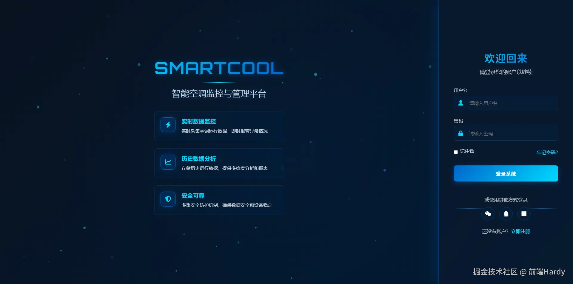
演示效果
HTML&CSS
html
<!DOCTYPE html>
<html lang="zh-CN">
<head>
<meta charset="UTF-8">
<meta name="viewport" content="width=device-width, initial-scale=1.0">
<title>Smartcool | 智能监控平台登录</title>
<link rel="stylesheet" href="https://cdnjs.cloudflare.com/ajax/libs/font-awesome/6.4.0/css/all.min.css">
<link
href="https://fonts.googleapis.com/css2?family=Orbitron:wght@400;500;600;700&family=Exo+2:wght@300;400;500;600&display=swap"
rel="stylesheet">
<style>
* {
margin: 0;
padding: 0;
box-sizing: border-box;
font-family: 'Exo 2', 'Segoe UI', 'Microsoft YaHei', sans-serif;
}
:root {
--primary: #0066cc;
/* 公司主题色 */
--secondary: #00c1d5;
--accent: #00d9ff;
--light: #f8f9fc;
--dark: #0a1220;
--gray: #6c757d;
}
body {
display: flex;
min-height: 100vh;
background: linear-gradient(135deg, var(--dark) 0%, #001a33 100%);
color: white;
overflow: hidden;
position: relative;
}
/* 科技感网格背景 */
.grid-bg {
position: absolute;
top: 0;
left: 0;
width: 100%;
height: 100%;
background:
linear-gradient(rgba(0, 102, 204, 0.05) 1px, transparent 1px),
linear-gradient(90deg, rgba(0, 102, 204, 0.05) 1px, transparent 1px);
background-size: 30px 30px;
z-index: -2;
}
/* 科技感光效 */
.glow-effect {
position: absolute;
width: 100%;
height: 100%;
background: radial-gradient(circle at center, rgba(0, 102, 204, 0.15) 0%, transparent 70%);
z-index: -1;
animation: glowPulse 8s infinite alternate;
}
.container {
display: flex;
width: 100%;
height: 100vh;
}
/* 左侧品牌展示区 - 增强科技感 */
.brand-section {
flex: 1;
position: relative;
display: flex;
flex-direction: column;
justify-content: center;
align-items: center;
padding: 40px;
z-index: 1;
overflow: hidden;
border-right: 1px solid rgba(0, 102, 204, 0.3);
}
.particles-background {
position: absolute;
top: 0;
left: 0;
width: 100%;
height: 100%;
z-index: -1;
}
.brand-content {
max-width: 600px;
text-align: center;
z-index: 2;
}
.logo {
display: flex;
align-items: center;
justify-content: center;
margin-bottom: 30px;
position: relative;
}
.logo h1 {
font-size: 3.5rem;
font-weight: 700;
letter-spacing: 2px;
font-family: 'Orbitron', sans-serif;
text-transform: uppercase;
background: linear-gradient(to right, var(--accent), var(--primary));
-webkit-background-clip: text;
-webkit-text-fill-color: transparent;
text-shadow: 0 0 15px rgba(0, 102, 204, 0.5);
position: relative;
}
.logo::after {
content: '';
position: absolute;
bottom: -15px;
left: 50%;
transform: translateX(-50%);
width: 120px;
height: 3px;
background: linear-gradient(90deg, transparent, var(--accent), transparent);
}
.slogan {
font-size: 1.8rem;
margin: 30px 0;
font-weight: 300;
line-height: 1.4;
color: rgba(255, 255, 255, 0.85);
text-shadow: 0 0 10px rgba(0, 102, 204, 0.5);
}
.features {
text-align: left;
max-width: 500px;
margin: 40px auto;
}
.feature {
display: flex;
align-items: flex-start;
margin-bottom: 25px;
padding: 20px;
background: rgba(0, 33, 66, 0.3);
border-radius: 10px;
backdrop-filter: blur(5px);
transition: all 0.4s ease;
border: 1px solid rgba(0, 102, 204, 0.2);
position: relative;
overflow: hidden;
}
.feature::before {
content: '';
position: absolute;
top: 0;
left: -100%;
width: 100%;
height: 100%;
background: linear-gradient(90deg, transparent, rgba(0, 102, 204, 0.2), transparent);
transition: 0.6s;
}
.feature:hover {
background: rgba(0, 33, 66, 0.5);
transform: translateY(-5px);
box-shadow: 0 10px 30px rgba(0, 102, 204, 0.2);
}
.feature:hover::before {
left: 100%;
}
.feature-icon {
min-width: 50px;
height: 50px;
background: rgba(0, 102, 204, 0.2);
border-radius: 12px;
display: flex;
align-items: center;
justify-content: center;
font-size: 20px;
margin-right: 20px;
color: var(--accent);
border: 1px solid var(--primary);
box-shadow: 0 0 15px rgba(0, 102, 204, 0.3);
}
.feature-text h3 {
font-size: 1.2rem;
margin-bottom: 8px;
color: var(--accent);
font-weight: 600;
}
.feature-text p {
font-size: 0.95rem;
opacity: 0.8;
line-height: 1.6;
}
/* 右侧登录表单 - 增强科技感 */
.login-section {
width: 450px;
background: rgba(10, 25, 47, 0.7);
backdrop-filter: blur(12px);
padding: 60px 50px;
display: flex;
flex-direction: column;
justify-content: center;
box-shadow: 0 0 50px rgba(0, 102, 204, 0.3);
z-index: 2;
position: relative;
overflow-y: auto;
border-left: 1px solid rgba(0, 102, 204, 0.3);
}
.login-header {
text-align: center;
margin-bottom: 40px;
}
.login-header h2 {
font-size: 2.2rem;
margin-bottom: 10px;
background: linear-gradient(to right, var(--accent), var(--primary));
-webkit-background-clip: text;
-webkit-text-fill-color: transparent;
font-family: 'Orbitron', sans-serif;
letter-spacing: 1px;
}
.login-header p {
color: rgba(255, 255, 255, 0.7);
font-size: 1.1rem;
}
.login-form .form-group {
margin-bottom: 25px;
position: relative;
}
.login-form label {
display: block;
margin-bottom: 8px;
font-size: 0.95rem;
color: rgba(255, 255, 255, 0.8);
font-weight: 500;
}
.input-with-icon {
position: relative;
}
.input-with-icon i {
position: absolute;
left: 15px;
top: 50%;
transform: translateY(-50%);
color: var(--accent);
font-size: 18px;
z-index: 2;
}
.login-form input {
width: 100%;
padding: 14px 20px 14px 50px;
border: 1px solid rgba(0, 102, 204, 0.3);
background: rgba(0, 33, 66, 0.3);
border-radius: 8px;
color: white;
font-size: 16px;
transition: all 0.3s ease;
position: relative;
z-index: 1;
}
.login-form input:focus {
border-color: var(--accent);
outline: none;
background: rgba(0, 33, 66, 0.5);
box-shadow: 0 0 0 3px rgba(0, 193, 213, 0.3);
}
.remember-forgot {
display: flex;
justify-content: space-between;
align-items: center;
margin-bottom: 30px;
}
.remember {
display: flex;
align-items: center;
}
.remember input {
width: auto;
margin-right: 8px;
accent-color: var(--primary);
}
.forgot-password {
color: var(--accent);
text-decoration: none;
transition: all 0.3s ease;
font-weight: 500;
}
.forgot-password:hover {
text-decoration: underline;
color: #4ddbff;
}
.btn-login {
width: 100%;
padding: 15px;
background: linear-gradient(135deg, var(--primary) 0%, var(--accent) 100%);
border: none;
border-radius: 8px;
color: white;
font-size: 16px;
font-weight: 600;
cursor: pointer;
transition: all 0.3s ease;
margin-bottom: 25px;
position: relative;
overflow: hidden;
letter-spacing: 1px;
font-family: 'Orbitron', sans-serif;
box-shadow: 0 5px 15px rgba(0, 102, 204, 0.4);
}
.btn-login::before {
content: '';
position: absolute;
top: 0;
left: -100%;
width: 100%;
height: 100%;
background: linear-gradient(90deg, transparent, rgba(255, 255, 255, 0.3), transparent);
transition: 0.5s;
}
.btn-login:hover {
transform: translateY(-3px);
box-shadow: 0 10px 25px rgba(0, 102, 204, 0.6);
}
.btn-login:hover::before {
left: 100%;
}
.social-login {
text-align: center;
margin: 25px 0;
position: relative;
}
.social-login::before,
.social-login::after {
content: '';
position: absolute;
top: 50%;
width: 30%;
height: 1px;
background: linear-gradient(90deg, transparent, var(--primary), transparent);
}
.social-login::before {
left: 0;
}
.social-login::after {
right: 0;
}
.social-login p {
margin-bottom: 15px;
color: rgba(255, 255, 255, 0.7);
}
.social-icons {
display: flex;
justify-content: center;
gap: 15px;
}
.social-icon {
width: 45px;
height: 45px;
border-radius: 50%;
display: flex;
align-items: center;
justify-content: center;
background: rgba(0, 33, 66, 0.3);
color: white;
font-size: 18px;
transition: all 0.3s ease;
border: 1px solid rgba(0, 102, 204, 0.3);
}
.social-icon:hover {
transform: translateY(-5px);
background: var(--primary);
box-shadow: 0 5px 15px rgba(0, 102, 204, 0.4);
}
.register-link {
text-align: center;
margin-top: 20px;
color: rgba(255, 255, 255, 0.7);
}
.register-link a {
color: var(--accent);
text-decoration: none;
font-weight: 600;
margin-left: 5px;
transition: all 0.3s ease;
}
.register-link a:hover {
text-decoration: underline;
color: #4ddbff;
}
/* 粒子动画 */
.particle {
position: absolute;
border-radius: 50%;
background: rgba(0, 102, 204, 0.5);
z-index: -1;
}
/* 响应式设计 */
@media (max-width: 992px) {
.container {
flex-direction: column;
height: auto;
}
.brand-section {
padding: 30px 20px;
flex: none;
height: auto;
border-right: none;
border-bottom: 1px solid rgba(0, 102, 204, 0.3);
}
.login-section {
width: 100%;
padding: 40px 30px;
border-radius: 0;
border-left: none;
}
.logo h1 {
font-size: 2.8rem;
}
.slogan {
font-size: 1.5rem;
}
.features {
margin: 30px auto;
}
}
@media (max-width: 576px) {
.remember-forgot {
flex-direction: column;
align-items: flex-start;
gap: 15px;
}
.feature {
padding: 15px;
}
.login-section {
padding: 35px 20px;
}
.login-header h2 {
font-size: 1.8rem;
}
.social-login::before,
.social-login::after {
width: 25%;
}
}
/* 动画效果 */
@keyframes glowPulse {
0% {
opacity: 0.3;
}
100% {
opacity: 0.7;
}
}
@keyframes float {
0%,
100% {
transform: translate(0, 0) rotate(0deg);
}
25% {
transform: translate(15px, -15px) rotate(5deg);
}
50% {
transform: translate(-10px, 10px) rotate(-5deg);
}
75% {
transform: translate(5px, -5px) rotate(2deg);
}
}
/* 加载动画 */
.spinner {
animation: spin 1s linear infinite;
display: inline-block;
margin-right: 10px;
}
@keyframes spin {
0% {
transform: rotate(0deg);
}
100% {
transform: rotate(360deg);
}
}
/* 科技感扫描线效果 */
/* .scan-line {
position: absolute;
top: 0;
left: 0;
width: 100%;
height: 3px;
background: linear-gradient(90deg, transparent, var(--accent), transparent);
animation: scan 4s linear infinite;
opacity: 0.7;
z-index: 10;
} */
@keyframes scan {
0% {
top: 0;
}
100% {
top: 100%;
}
}
</style>
</head>
<body>
<div class="grid-bg"></div>
<div class="glow-effect"></div>
<!-- <div class="scan-line"></div> -->
<div class="container">
<!-- 左侧品牌展示区 -->
<div class="brand-section">
<div class="particles-background" id="particles"></div>
<div class="brand-content">
<div class="logo">
<h1>Smartcool</h1>
</div>
<div class="slogan">
智能空调监控与管理平台
</div>
<div class="features">
<div class="feature">
<div class="feature-icon">
<i class="fas fa-bolt"></i>
</div>
<div class="feature-text">
<h3>实时数据监控</h3>
<p>实时采集空调运行数据,即时报警异常情况</p>
</div>
</div>
<div class="feature">
<div class="feature-icon">
<i class="fas fa-chart-line"></i>
</div>
<div class="feature-text">
<h3>历史数据分析</h3>
<p>存储历史运行数据,提供多维度分析和报表</p>
</div>
</div>
<div class="feature">
<div class="feature-icon">
<i class="fas fa-shield-alt"></i>
</div>
<div class="feature-text">
<h3>安全可靠</h3>
<p>多重安全防护机制,确保数据安全和设备稳定</p>
</div>
</div>
</div>
</div>
</div>
<!-- 右侧登录表单 -->
<div class="login-section">
<div class="login-header">
<h2>欢迎回来</h2>
<p>请登录您的账户以继续</p>
</div>
<form class="login-form">
<div class="form-group">
<label for="username">用户名</label>
<div class="input-with-icon">
<i class="fas fa-user"></i>
<input type="text" id="username" placeholder="请输入用户名" required>
</div>
</div>
<div class="form-group">
<label for="password">密码</label>
<div class="input-with-icon">
<i class="fas fa-lock"></i>
<input type="password" id="password" placeholder="请输入密码" required>
</div>
</div>
<div class="remember-forgot">
<div class="remember">
<input type="checkbox" id="remember">
<label for="remember">记住我</label>
</div>
<a href="#" class="forgot-password">忘记密码?</a>
</div>
<button type="submit" class="btn-login">登录系统</button>
<div class="social-login">
<p>或使用其他方式登录</p>
<div class="social-icons">
<a href="#" class="social-icon">
<i class="fab fa-weixin"></i>
</a>
<a href="#" class="social-icon">
<i class="fab fa-qq"></i>
</a>
<a href="#" class="social-icon">
<i class="fab fa-microsoft"></i>
</a>
</div>
</div>
<div class="register-link">
还没有账户? <a href="#">立即注册</a>
</div>
</form>
</div>
</div>
<script>
// 创建粒子背景
function createParticles() {
const container = document.getElementById('particles');
const particleCount = 50;
for (let i = 0; i < particleCount; i++) {
const particle = document.createElement('div');
particle.classList.add('particle');
// 随机大小
const size = Math.random() * 8 + 2;
particle.style.width = `${size}px`;
particle.style.height = `${size}px`;
// 随机位置
particle.style.left = `${Math.random() * 100}%`;
particle.style.top = `${Math.random() * 100}%`;
// 随机透明度
const opacity = Math.random() * 0.5 + 0.2;
particle.style.opacity = opacity;
// 随机动画
const animationDuration = Math.random() * 20 + 10;
particle.style.animation = `float ${animationDuration}s infinite ease-in-out`;
// 随机颜色变化
const hue = Math.floor(Math.random() * 40) + 180; // 蓝色调范围
particle.style.backgroundColor = `hsla(${hue}, 100%, 60%, ${opacity})`;
container.appendChild(particle);
}
}
// 添加浮动动画
function addFloatingAnimation() {
const style = document.createElement('style');
style.textContent = `
@keyframes float {
0%, 100% {
transform: translate(0, 0) rotate(0deg);
}
25% {
transform: translate(${Math.random() * 40 - 20}px, ${Math.random() * 40 - 20}px) rotate(${Math.random() * 20 - 10}deg);
}
50% {
transform: translate(${Math.random() * 80 - 40}px, ${Math.random() * 80 - 40}px) rotate(${Math.random() * 40 - 20}deg);
}
75% {
transform: translate(${Math.random() * 40 - 20}px, ${Math.random() * 40 - 20}px) rotate(${Math.random() * 20 - 10}deg);
}
}
`;
document.head.appendChild(style);
}
// 表单验证
function setupFormValidation() {
const form = document.querySelector('.login-form');
form.addEventListener('submit', function (e) {
e.preventDefault();
const username = document.getElementById('username').value;
const password = document.getElementById('password').value;
if (username.trim() === '' || password.trim() === '') {
showNotification('请输入用户名和密码', 'error');
return;
}
// 模拟登录过程
const loginBtn = document.querySelector('.btn-login');
loginBtn.innerHTML = '<i class="fas fa-spinner spinner"></i> 登录中...';
loginBtn.disabled = true;
setTimeout(() => {
loginBtn.innerHTML = '<i class="fas fa-check"></i> 登录成功! 跳转中...';
setTimeout(() => {
// 在实际应用中这里会跳转到主页面
showNotification('登录成功!欢迎使用Smartcool智能监控平台', 'success');
loginBtn.innerHTML = '登录系统';
loginBtn.disabled = false;
}, 1500);
}, 2000);
});
}
// 显示通知
function showNotification(message, type) {
// 移除现有通知
const oldNotif = document.querySelector('.notification');
if (oldNotif) oldNotif.remove();
const notification = document.createElement('div');
notification.className = `notification ${type}`;
notification.textContent = message;
document.body.appendChild(notification);
// 动画显示
setTimeout(() => {
notification.style.opacity = '1';
notification.style.transform = 'translateY(0)';
}, 10);
// 3秒后移除
setTimeout(() => {
notification.style.opacity = '0';
notification.style.transform = 'translateY(-20px)';
setTimeout(() => {
notification.remove();
}, 300);
}, 3000);
}
// 创建扫描线
function createScanLine() {
const scanLine = document.createElement('div');
scanLine.className = 'scan-line';
document.body.appendChild(scanLine);
}
// 页面加载完成后初始化
document.addEventListener('DOMContentLoaded', function () {
createParticles();
addFloatingAnimation();
setupFormValidation();
createScanLine();
// 添加通知样式
const style = document.createElement('style');
style.textContent = `
.notification {
position: fixed;
top: 20px;
right: 20px;
padding: 15px 25px;
border-radius: 8px;
color: white;
font-weight: 500;
box-shadow: 0 5px 15px rgba(0,0,0,0.3);
z-index: 1000;
opacity: 0;
transform: translateY(-20px);
transition: all 0.3s ease;
}
.notification.success {
background: linear-gradient(135deg, #00c853, #009624);
border-left: 4px solid #00e676;
}
.notification.error {
background: linear-gradient(135deg, #ff5252, #c50e29);
border-left: 4px solid #ff5252;
}
`;
document.head.appendChild(style);
});
</script>
</body>
</html>HTML
- login-section:定义右侧登录表单的容器。
- login-header:登录表单的头部,包含欢迎信息。
- login-form:登录表单主体,包含用户名和密码输入框、记住我选项、忘记密码链接、登录按钮、社交登录选项和注册链接。
- form-group:每个输入框的容器,包含标签和输入区域。
- input-with-icon:输入框区域,包含图标和输入框本身。
- remember-forgot:记住我选项和忘记密码链接的容器。
- btn-login:登录按钮,用户点击后提交表单。
- social-login:社交登录选项,提供微信、QQ 和微软登录方式。
- register-link:注册链接,引导用户注册新账户。
CSS
-
*:重置所有元素的外边距和内边距,并设置盒模型为 border-box,使元素的宽度和高度包括内边距和边框。font-family:设置全局字体为 Exo 2、Segoe UI、Microsoft YaHei 和 sans-serif。
-
:root:定义全局的颜色变量,方便在页面中统一使用。
-
body:设置页面的基本布局,使用 flex 布局,设置最小高度为视口高度(100vh),背景为从深蓝色到深青色的线性渐变,文本颜色为白色,并设置溢出隐藏和相对定位。
-
.grid-bg:定义网格背景,使用透明度较低的蓝色线条创建网格图案。
-
.glow-effect:定义光效,使用径向渐变创建中心发光效果,并添加动画使其脉动。
-
.logo h1:设置品牌名称的样式,使用较大的字体大小、加粗、字母间距调整、自定义字体 Orbitron、文本渐变背景和透明文本填充,以及阴影效果。
-
.feature:定义功能模块的样式,使用 flex 布局使图标和文本对齐,设置背景颜色、圆角、模糊背景效果、过渡动画、边框和相对定位,并允许内容溢出显示。
-
.login-section:定义登录表单的样式,设置固定宽度、半透明白色背景、模糊背景效果、内边距、flex 布局、垂直居中内容、阴影效果、堆叠顺序、相对定位和垂直方向的滚动条。
-
backdrop-filter: blur(12px):为背景添加模糊效果,增强视觉层次。
-
.login-form .form-group:每个表单组的样式,设置下边距和相对定位。
-
.input-with-icon:输入框与图标的组合样式,使用相对定位。
-
.input-with-icon i:图标的样式,使用绝对定位将其放置在输入框内左侧中间位置,设置颜色和大小。
-
.login-form input:输入框的样式,设置宽度、内边距、边框、背景颜色、圆角、文本颜色、字体大小、过渡动画、相对定位和堆叠顺序。
-
.btn-login:登录按钮的样式,设置宽度为 100%、内边距、背景渐变、无边框、圆角、文本颜色、字体大小和粗细、光标样式、过渡动画、下边距、相对定位、允许内容溢出、字母间距、自定义字体 Orbitron 和阴影效果。
-
.social-icons:社交登录图标的容器,使用 flex 布局居中对齐图标,并设置间隔。
-
.social-icon:每个社交登录图标的样式,设置大小、圆角、flex 布局居中对齐内容、背景颜色、文本颜色、字体大小、过渡动画和边框。
JavaScript
- 粒子背景:创建动态的粒子效果,增强页面的科技感。
- 浮动动画:为页面元素添加浮动动画效果。
- 表单验证:验证用户输入,并模拟登录过程。
- 通知系统:显示登录成功或失败的通知。
各位互联网搭子,要是这篇文章成功引起了你的注意,别犹豫,关注、点赞、评论、分享走一波,让我们把这份默契延续下去,一起在知识的海洋里乘风破浪!