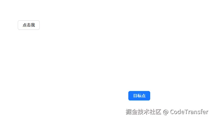
场景⚡
假如我们有一个按钮以及一个终点目标,在点击按钮的时候出现一个类似于购物车的小球入库的动画效果
js
<template>
  <div ref="boxWrapRef" class="animation_demo">
    <div>
      <a-button @click="handleClick" class="btn_class">点击我</a-button>
    </div>
    <div class="destination_wrap" ref="divRef">
      <a-button type="primary" class="destination_btn">目标点</a-button>
    </div>
  </div>
</template>

<script setup lang="ts">
import { computed, ref } from "vue";
const divRef = ref();
const boxWrapRef = ref();
</script>

<style lang="scss">
.animation_demo {
  padding: 80px;
  width: 800px;
  height: 600px;
  display: flex;
  flex-direction: column;
  justify-content: space-between;
  position: relative;
}
.destination_wrap {
  align-self: flex-end;
}
.box {
  width: 20px;
  height: 20px;
  position: absolute;
  border-radius: 50%;
  background: red;
}
</style>
步骤分解✨
1️⃣获取小球需要到达的目标终点endX、endY坐标.
2️⃣创建2个一个X方向一个Y方向的关键帧动画.
3️⃣在点击的时候获取小球初始化的startX、startY坐标并创建小球应用动画
第1步-获取目标终点坐标
js
const getStartXY = computed(() => {
  return {
    left: divRef.value.getBoundingClientRect().left,
    top: divRef.value.getBoundingClientRect().top,
    width: destinationRef.value.getBoundingClientRect().width,
    height: destinationRef.value.getBoundingClientRect().height,
  };
})
const left = computed(() => {
  return getStartXY.value.left + getStartXY.value.width / 2 - 10 + "px";
});
const top = computed(() => {
  return getStartXY.value.top + getStartXY.value.height / 2 - 10 + "px";
});
第2步-创建X和Y方向2个关键帧动画
js
@keyframes leftChange {
  to {
    left: v-bind(left);
  }
}
@keyframes topChange {
  to {
    top: v-bind(top);
  }
}
第3步-点击创建小球并且应用上动画
js
<script setup lang="ts">
...
const handleClick = (e: MouseEvent) => {
const target = e.target as HTMLImageElement;
const { x, y, width, height } = target.getBoundingClientRect();
const startX = x + width / 2;//在中间创建小球需要加上宽度和高度的一般
const startY = y + height / 2;
useAnimation(startX, startY);
};
const useAnimation = (startX: number, startY: number) => {
const div = document.createElement("div");
div.style.top = startY - 10 + "px";
div.style.left = startX - 10 + "px";
div.classList.add("box");
boxWrapRef.value.appendChild(div);
div.onanimationend = () => {
div.remove();
};
};
...
<script>
<style>
...
.box {
width: 20px;
height: 20px;
position: absolute;
border-radius: 50%;
background: red;
animation: leftChange 1s linear forwards,
topChange 1s linear forwards;
}
...
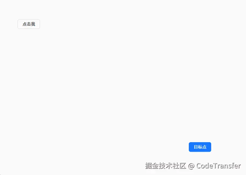
</style>效果♦️
最后一步实现抛物线⭐
将Y轴方向的动画函数换成贝塞尔函数,抛物线就是先上后下,把animationend先注释掉,用谷歌浏览器工作实时调整下
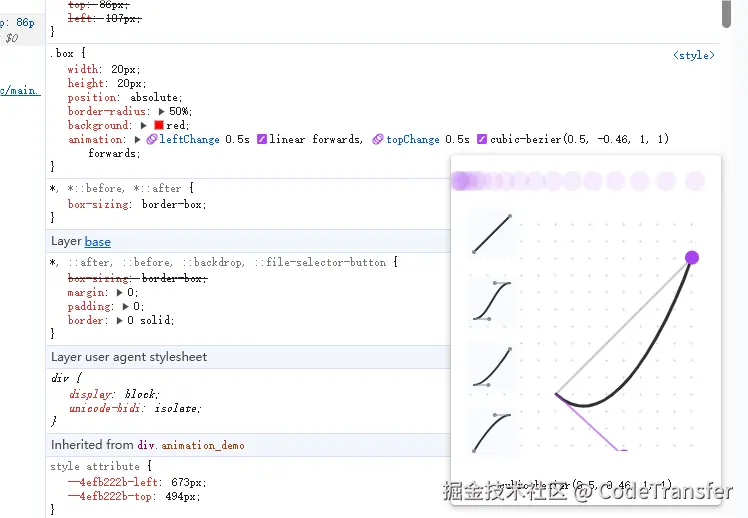
大概调整为cubic-bezier(0.5, -0.5, 1, 1)就差不多了
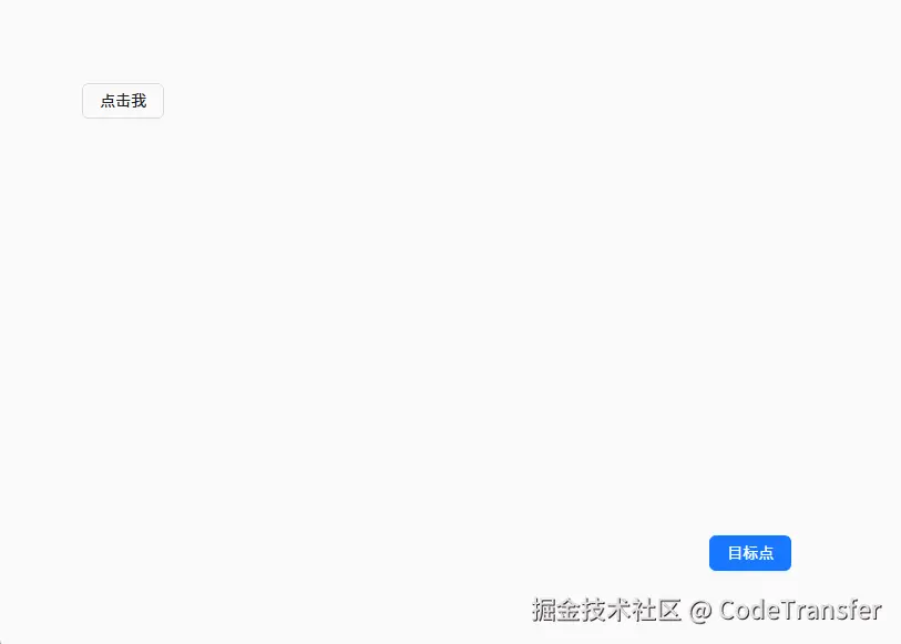
效果❤️
全部代码
js
<template>
  <div ref="boxWrapRef" class="animation_demo">
    <div>
      <a-button @click="handleClick" class="btn_class">点击我</a-button>
    </div>
    <div class="destination_wrap" ref="destinationRef">
      <a-button type="primary" class="destination_btn">目标点</a-button>
    </div>
  </div>
</template>

<script setup lang="ts">
import { computed, ref } from "vue";
const destinationRef = ref();
const boxWrapRef = ref<HTMLDivElement>();
const getStartXY = computed(() => {
  return {
    left: destinationRef.value.getBoundingClientRect().left,
    top: destinationRef.value.getBoundingClientRect().top,
    width: destinationRef.value.getBoundingClientRect().width,
    height: destinationRef.value.getBoundingClientRect().height,
  };
});
const left = computed(() => {
  return getStartXY.value.left + getStartXY.value.width / 2 - 10 + "px";
});
const top = computed(() => {
  return getStartXY.value.top + getStartXY.value.height / 2 - 10 + "px";
});
const handleClick = (e: MouseEvent) => {
  const target = e.target as HTMLImageElement;
  const { x, y, width, height } = target.getBoundingClientRect();
  const startX = x + width / 2;
  const startY = y + height / 2;
  useAnimation(startX, startY);
};
const useAnimation = (startX: number, startY: number) => {
  const div = document.createElement("div");
  div.style.top = startY - 10 + "px";
  div.style.left = startX - 10 + "px";
  div.classList.add("box");
  boxWrapRef.value.appendChild(div);
  div.onanimationend = () => {
    div.remove();
  };
};
</script>

<style lang="scss">
.animation_demo {
  padding: 80px;
  width: 800px;
  height: 600px;
  display: flex;
  flex-direction: column;
  justify-content: space-between;
  position: relative;
}
.destination_wrap {
  align-self: flex-end;
}
.box {
  width: 20px;
  height: 20px;
  position: absolute;
  border-radius: 50%;
  background: red;
  animation: leftChange 0.5s linear forwards,
    topChange 0.5s cubic-bezier(0.5, -0.5, 1, 1) forwards;
}
@keyframes leftChange {
  to {
    left: v-bind(left);
  }
}
@keyframes topChange {
  to {
    top: v-bind(top);
  }
}
</style>