📖 前言
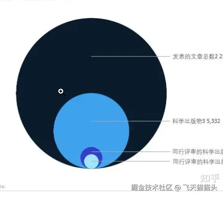
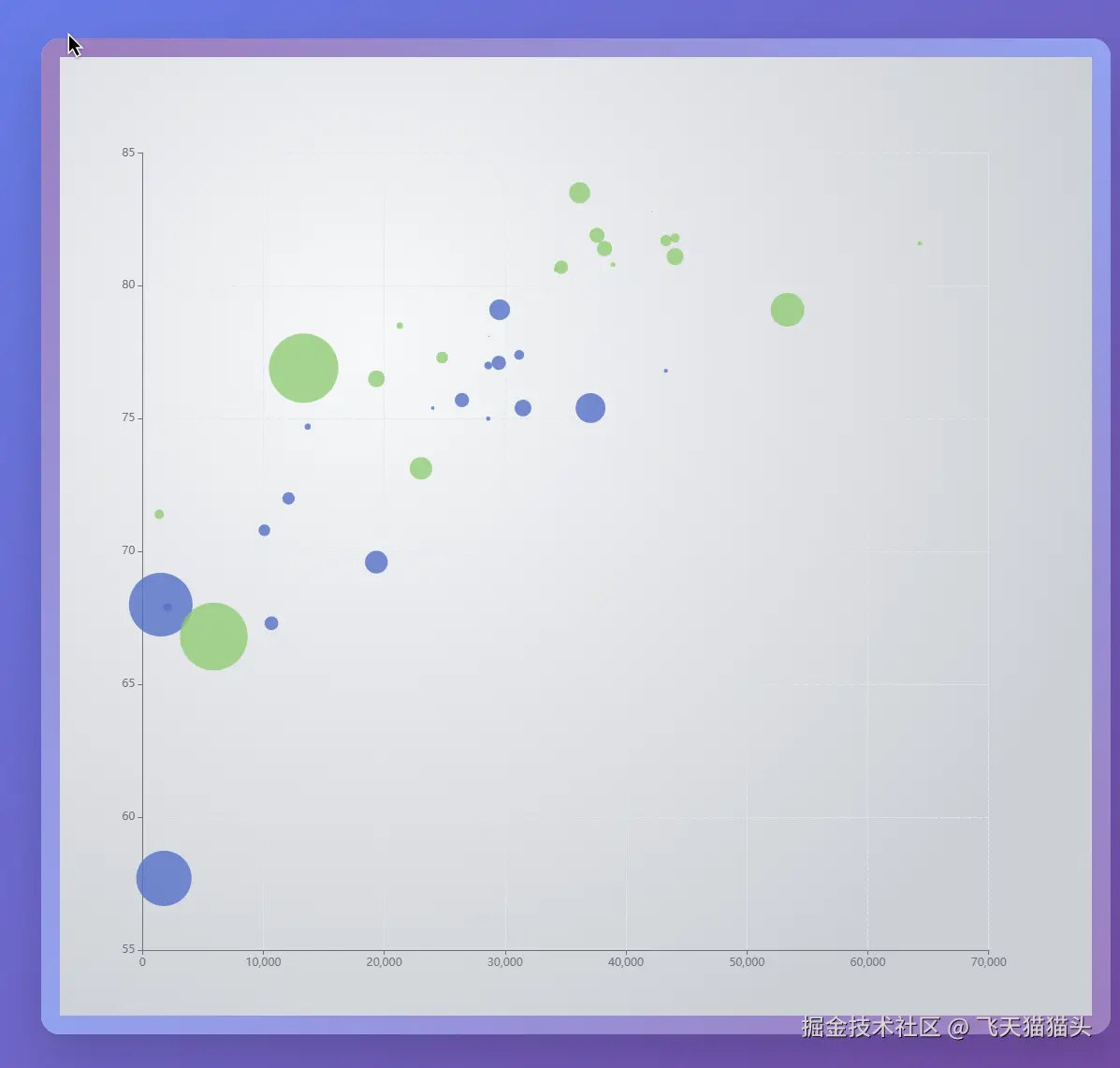
之前我遇到一个需求,需要用echarts实现下面这样的图,这篇文章就记录一下我的实现过程
🛠️ 实现过程
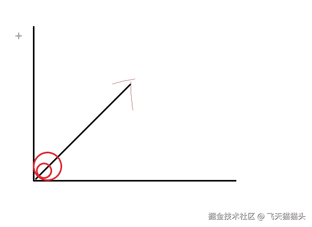
实现的思路非常的简单,将echarts中的气泡图,按照对角线排列,就可以了,类似下面这样
那我这里就选择使用echarts中的气泡图来实现,通过修改气泡的坐标来实现
先创建一个气泡图出来
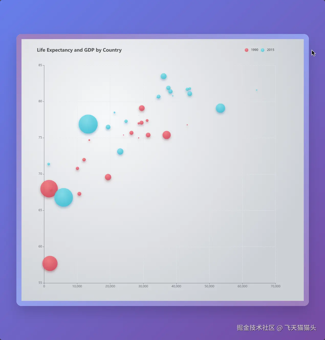
这里我直接复制官网的例子进行修改
删除一些不必要的配置之后效果如下
配置如下
json
{
        backgroundColor: new echarts.graphic.RadialGradient(0.3, 0.3, 0.8, [
          {
            offset: 0,
            color: '#f7f8fa'
          },
          {
            offset: 1,
            color: '#cdd0d5'
          }
        ]),

        grid: {
          left: '8%',
          top: '10%'
        },
        xAxis: {
          splitLine: {
            lineStyle: {
              type: 'dashed'
            }
          }
        },
        yAxis: {
          splitLine: {
            lineStyle: {
              type: 'dashed'
            }
          },
          scale: true
        },
        series: [
          {
            name: '1990',
            data: data[0],
            type: 'scatter',
            symbolSize: function (data) {
              return Math.sqrt(data[2]) / 5e2
            },
            emphasis: {
              focus: 'series',
              label: {
                show: true,
                formatter: function (param) {
                  return param.data[3]
                },
                position: 'top'
              }
            }
          },
          {
            name: '2015',
            data: data[1],
            type: 'scatter',
            symbolSize: function (data) {
              return Math.sqrt(data[2]) / 5e2
            },
            emphasis: {
              focus: 'series',
              label: {
                show: true,
                formatter: function (param) {
                  return param.data[3]
                },
                position: 'top'
              }
            }
          }
        ]
} 之前的数据是这样的,比较复杂,里面还有一些数据没什么用, 稍微修改一下,只保留3个
修改后
js
const data = [
    [0, 0, 200, 'rgb(83, 116, 137)'],
    [0, 0, 150, 'rgb(251, 118, 123)'],
    [0, 0, 100, 'rgb(253, 159, 198)']
]
这里解释一下这些数据的意义
格式是这样的: [x,y,圆的大小, 颜色]
这样我们就相当于创建了3个圆圈
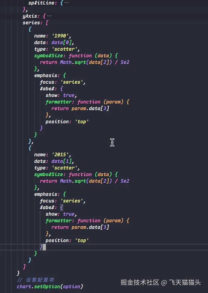
之前的配置series是写死的,我们修改一下,通过data循环出来
js
const data = [
    [0, 0, 200, 'rgb(83, 116, 137)'],
    [0, 0, 150, 'rgb(251, 118, 123)'],
    [0, 0, 100, 'rgb(253, 159, 198)']
]
series: data.map((item) => ({
  data: [item],
  type: 'scatter',
  symbolSize: item[2],
  itemStyle: {
    color: item[3]
  }
}))
效果如下
这时候我们的图表上面就只剩下3个气泡了
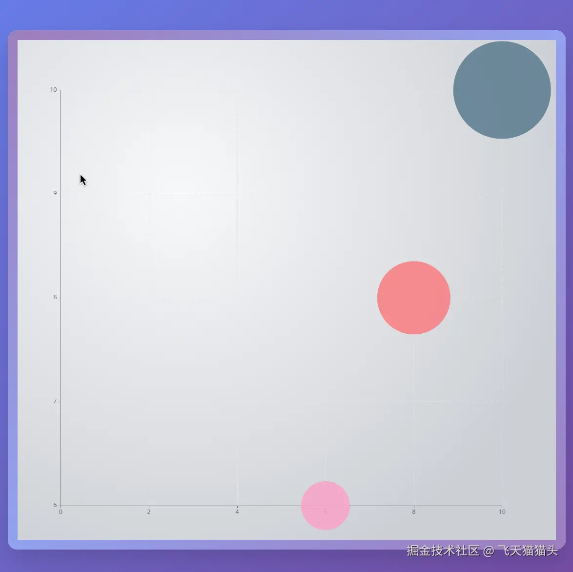
为了更好的定位气泡的位置,还需要改造一下x轴和y轴的数据
js
xAxis: {
  data: Array.from({ length: 100 }, (_, i) => `${i + 1}`),
  splitLine: {
    lineStyle: {
      type: 'dashed'
    }
  }
},
yAxis: {
  data: Array.from({ length: 100 }, (_, i) => `${i + 1}`),
  splitLine: {
    lineStyle: {
      type: 'dashed'
    }
  },
  scale: true
}
这里根据我的前面的数据大小, 我用循环给x和y轴各生成了100个刻度
这样做的目的是方便我们用整数去定位气泡位置
效果如下
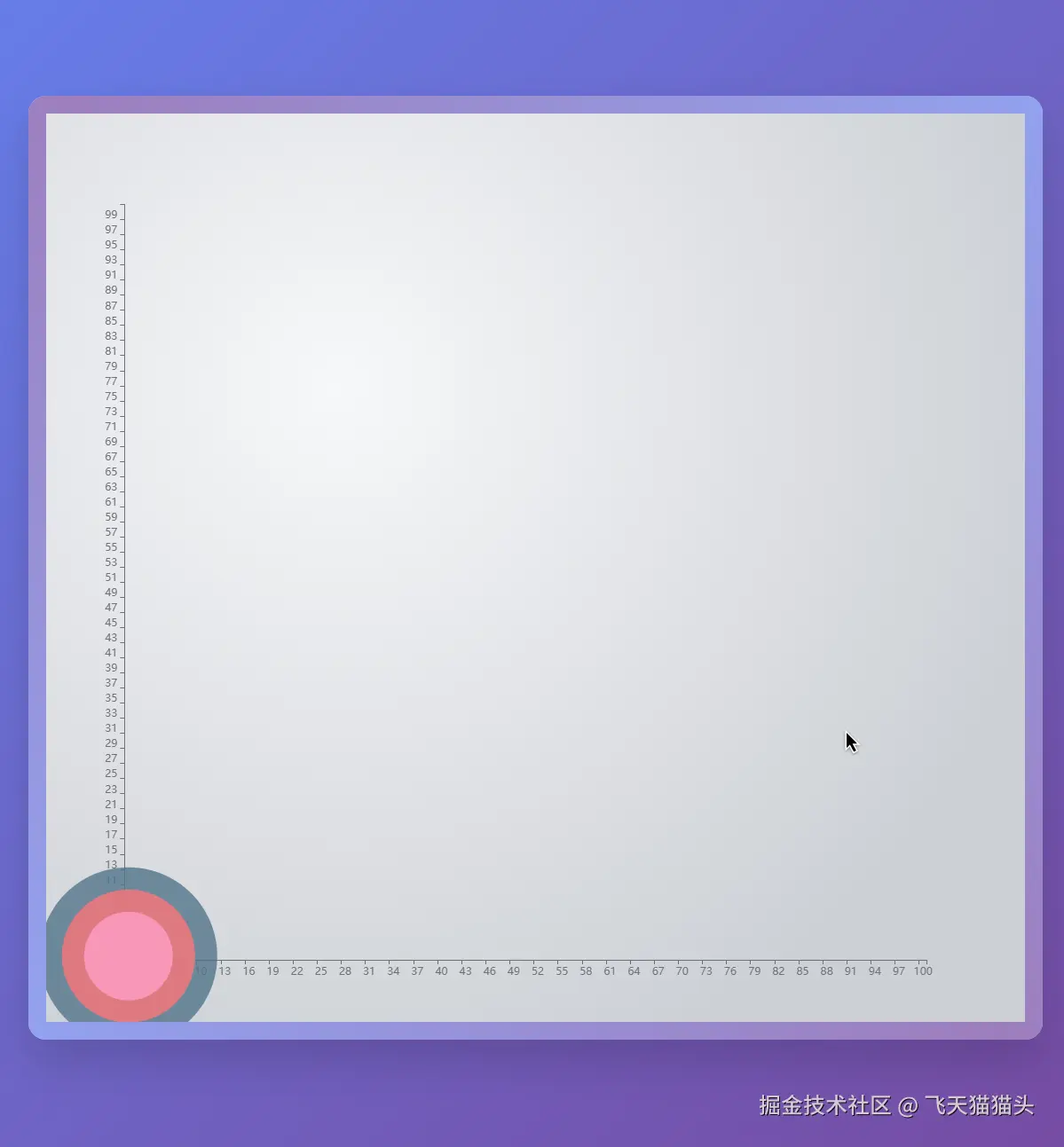
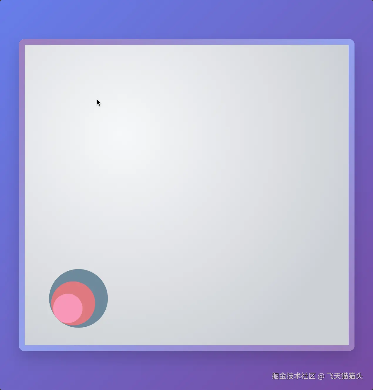
到这里就很像前面的嵌套气泡图的效果了,只是底部没有对齐
稍微修改一下数据,并且将x和y轴隐藏之后
效果就如下图
💻 完整代码
html
<!DOCTYPE html>
<html lang="zh-CN">
  <head>
    <meta charset="UTF-8" />
    <meta name="viewport" content="width=device-width, initial-scale=1.0" />
    <title>水平嵌套气泡图</title>
    <style>
      * {
        margin: 0;
        padding: 0;
        box-sizing: border-box;
      }

      body {
        background: linear-gradient(135deg, #667eea 0%, #764ba2 100%);
        min-height: 100vh;
        display: flex;
        align-items: center;
        justify-content: center;
        font-family: 'Arial', sans-serif;
      }

      .chart-container {
        width: 90vw;
        max-width: 1200px;
        height: 80vh;
        min-height: 600px;
        background: rgba(255, 255, 255, 0.95);
        border-radius: 20px;
        box-shadow: 0 25px 50px rgba(0, 0, 0, 0.15);
        backdrop-filter: blur(10px);
        padding: 20px;
        position: relative;
        overflow: hidden;
      }

      .chart-container::before {
        content: '';
        position: absolute;
        top: -2px;
        left: -2px;
        right: -2px;
        bottom: -2px;
        background: linear-gradient(45deg, #667eea, #764ba2, #667eea);
        border-radius: 22px;
        z-index: -1;
        opacity: 0.7;
      }

      #main {
        width: 100%;
        height: 100%;
        border-radius: 15px;
      }

      @media (max-width: 768px) {
        .chart-container {
          width: 95vw;
          height: 70vh;
          min-height: 500px;
          padding: 15px;
          border-radius: 15px;
        }

        .chart-container::before {
          border-radius: 17px;
        }

        #main {
          border-radius: 10px;
        }
      }
    </style>
    <script src="https://cdn.jsdelivr.net/npm/echarts@5.5.0/dist/echarts.min.js"></script>
  </head>
  <body>
    <div class="chart-container">
      <div id="main"></div>
    </div>

    <script>
      // 初始化 ECharts 实例
      const chart = echarts.init(document.getElementById('main'))
      const data = [
        [10, 10, 200, 'rgb(83, 116, 137)'],
        [8, 8, 150, 'rgb(251, 118, 123)'],
        [6, 6, 100, 'rgb(253, 159, 198)']
      ]
      // 配置项
      const option = {
        backgroundColor: new echarts.graphic.RadialGradient(0.3, 0.3, 0.8, [
          {
            offset: 0,
            color: '#f7f8fa'
          },
          {
            offset: 1,
            color: '#cdd0d5'
          }
        ]),
        grid: {
          left: '8%',
          top: '10%'
        },
        xAxis: {
          data: Array.from({ length: 100 }, (_, i) => `${i + 1}`),
          splitLine: {
            lineStyle: {
              type: 'dashed'
            }
          },
          show: false
        },
        yAxis: {
          data: Array.from({ length: 100 }, (_, i) => `${i + 1}`),
          splitLine: {
            lineStyle: {
              type: 'dashed'
            }
          },
          show: false,
          scale: true
        },
        series: data.map((item) => {
          return {
            name: '1990',
            data: [item],
            type: 'scatter',
            symbolSize: item[2],
            itemStyle: {
              color: item[3]
            }
          }
        })
      }

      // 设置配置项
      chart.setOption(option)

      // 响应式处理
      window.addEventListener('resize', () => {
        chart.resize()
      })
    </script>
  </body>
</html>
🎉 结尾
这里实现过程数据都是固定的,如果你在实际开发中要实现这样的效果,你需要对数据做一个排序,让小的在上面,并且计算出数据之间的间距,其实很简单直接计算当前圆和下一个圆的直径之差,你就可以得到你的圆心需要偏移的位置.具体可以自己实践一下