CSS概念:
CSS(Cascading Style Sheets)层叠样式表,又叫级联样式表,简 称样式表
CSS文件的后缀名为**.css**
**用法:**CSS用于HTML文档中元素样式的定义
语法:
CSS规则由两个主要的部分构成:选择器,以及一条或者多条的声明(样式)
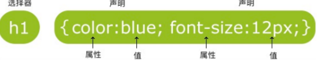
选择器通常是您需要改变样式的 HTML 元素
每条声明由一个属性和一个值组成
属性(property)是您希望设置的样式属性(style attribute)。每 个属性有一个值。属性和值被冒号分开
html
<style>
    h1{
        color: blue;
        font-size: 12px;
   }
</style>
CSS的引入方式:
内联样式(行内样式):
要使用内联样式,你需要在相关的标签内使用样式(style)属性。 Style 属性可以包含任何 CSS 属性
温馨提示 缺乏整体性和规划性,不利于维护,维护成本高
html
<p style="background: orange; font-size:
24px;">CSS<p>
内部样式
当单个文档需要特殊的样式时,就应该使用内部样式表。你可以使用**<style>**标签在文档头部定义内部样式
温馨提示:
单个页面内的CSS代码具有统一性和规划性,便于维护,但是在 多个页面之间容易混乱
html
<head>
    <style>
       h1 {
           background: red;
       }
    </style>
</head>
外部样式(推荐)
当样式需要应用于很多页面时,外部样式表将是理想的选择。在使 用外部样式表的情况下,你可以通过改变一个文件来改变整个站点 的外观。每个页面使用 <link> 标签链接到样式表。<link> 标签在 (文档的)头部。
**rel:**是告诉浏览器这个文件是CSS样式,
href: 是css样式的文件地址。
html
<link rel="stylesheet" type="text/css"href="xxx.css">CSS文件:
css
p{
    color: green;
    font-size: 30px;
}
HTML:
html
<!DOCTYPE html>
<html lang="en">
<head>
    <meta charset="UTF-8">
    <meta http-equiv="X-UA-Compatible" content="IE=edge">
    <meta name="viewport" content="width=device-width, initial-scale=1.0">
    <title>Document</title>
    <link rel="stylesheet" href="./public.css">
</head>
<body>

    <p>首页</p>
    <a href="./product.html">产品</a>

</body>
</html>
选择器一:
CSS语法 规则由两个主要的部分构成:选择器,以及一条或多条声 明(样式)
全局选择器:
可以与任何元素匹配,优先级最低,一般做样式初始化
html
*{
     margin: 0;
     padding: 0;
 }
样例:
html
<!DOCTYPE html>
<html lang="en">
<head>
    <meta charset="UTF-8">
    <meta http-equiv="X-UA-Compatible" content="IE=edge">
    <meta name="viewport" content="width=device-width, initial-scale=1.0">
    <title>Document</title>
    <style>

       *{
           font-size: 30px;
           color: red;
       }

       h3{
           color: green;
       }

    </style>
</head>
<body>

    <p>Hello</p>
    <h3>World</h3>
    <ul>
        <li>列表1</li>
        <li>列表2</li>
    </ul>

</body>
</html>
元素选择器:
HTML文档中的元素,p,b,div,a,img,body等。
标签选择器,选择的是页面上所有这种类型的标签,所以经常描述 "共性",无法描述某一个元素的"个性"
html
p{
    font-size:14px;
}
再比如说,我想让"学完前端,继续学Java"这句话中的"前端"两个变 为红色字体,那么我可以用 标签把"前端"这两个字围起来,然 后给 标签加一个标签选择器
html
<!DOCTYPE html>
<html lang="en">
<head>
    <meta charset="UTF-8">
    <meta http-equiv="X-UA-Compatible" content="IE=edge">
    <meta name="viewport" content="width=device-width, initial-scale=1.0">
    <title>Document</title>
    <style>

        span{
            color: red;
        }

        p{
            color: blue;
        }

    </style>
</head>
<body>

    <p>我是第一个</p>
    <p>我是第二个</p>
    <h3>标题</h3>
    <p>我是第三个</p>

    <p>学完<span>前端</span>,继续学Java</p>

    <div>
        <ul>
            <li>
                <p>你好</p>
            </li>
        </ul>
    </div>

</body>
</html>
温馨提示
1 所有的标签,都可以是选择器。比如ul、li、label、dt、dl、input、div等
2 无论这个标签藏的多深,一定能够被选择上
3 选择的所有,而不是一个
类选择器:
规定用圆点**". "**来定义,针对你想要的所有标签使用
优点灵活
html
<h2 class="oneclass">你好</h2>
/*定义类选择器*/
.oneclass{
 width:800px;
}
class属性的特点
1 类选择器可以被多种标签使用
2 类名不能以数字开头
3 同一个标签可以使用多个类选择器。用空格隔开
html
<h3 class="classone classtwo">我是一个h3啊</h3>Class类可以拥有多个不同类 不过需要用空格隔开如上。
但是有两个Class就会错误!
html
<h3 class="teshu" class="zhongyao">我是一个h3啊
</h3> // 错误
选择器二:
ID选择器:
针对某一个特定的标签来使用,只能使用一次。css 中的 ID选择器 以**#** 来定义
html
<h2 id="mytitle">你好</h2>
#mytitle{
   border:3px dashed green;
}
特别强调
1 ID是唯一的
2 ID不能以数字开头
合并选择器
**语法:**选择器1,选择器2,...{ }
**作用:**提取共同的样式,减少重复代码
html
.header, .footer{
    height:300px;
}
选择器的优先级:
CSS中,权重用数字衡量
- 元素选择器的权重为: 1
- class选择器的权重为: 10
- id选择器的权重为: 100
- 内联样式的权重为: 1000
优先级从高到低: 行内样式 > ID选择器 > 类选择器 > 元素选择器
字体属性
CSS字体属性定义字体,颜色、大小,加粗,文字样式
color:
规定文本的颜色
在style里面设置:
css
div{ color:red;}
div{ color:#ff0000;}
div{ color:rgb(255,0,0);}
div{ color:rgba(255,0,0,.5);}
font-size:
设置文本的大小 能否管理文字的大小,在网页设计中是非常重要的。但是,你不能 通过调整字体大小使段落看上去像标题,或者使标题看上去像段 落。
css
h1 {font-size:40px;}
h2 {font-size:30px;}
p {font-size:14px;}
温馨提示
chrome浏览器接受最小字体是12px
font-weight:
设置文本的粗细
|---------|--------------------------|
| 值 | 描述 |
| bold | 定义粗体字符 |
| bolder | 定义更粗的字符 |
| lighter | 更细的字符 |
| 100-900 | 定义由细到粗400等同默认,而700等同bold |
css
H1 {font-weight:normal;}
div{font-weight:bold;}
p{font-weight:900;}
font-style:
指定文本的字体样式
|--------|-------|
| 值 | 描述 |
| normal | 默认值 |
| italic | 定义斜体字 |
font-family:
font-family属性指定一个元素的字体
温馨提示:
每个值用逗号分开
如果字体名称包含空格,它必须加上引号
css
font-family:"Microsoft
YaHei","Simsun","SimHei";
样例:
html
<!DOCTYPE html>
<html lang="en">
<head>
    <meta charset="UTF-8">
    <meta http-equiv="X-UA-Compatible" content="IE=edge">
    <meta name="viewport" content="width=device-width, initial-scale=1.0">
    <title>Document</title>
    <style>

        p{
            color: rgba(0,0,0,1);
            font-size: 30px;
            font-weight: 700;
            font-style: normal;
            font-family: "Microsoft YaHei";
        }


    </style>
</head>
<body>

    <p>我来学习字体属性</p>
    <h3>我是标题</h3>

</body>
</html>
背景属性:
CSS背景属性主要有以下几个:
|---------------------|------------|
| 属性 | 描述 |
| background-color | 设置背景颜色 |
| background-image | 设置背景图片 |
| background-position | 设置背景图片显示位置 |
| background-repeat | 设置背景图片如何填充 |
| background-size | 设置背景图片大小属性 |
background-color属性:
该属性设置背景颜色
html
div class="box"></div>style:
css
.box{
    width: 300px;
    height: 300px;
    background-color: palevioletred;
}background-image属性:
设置元素的背景图像:
元素的背景是元素的总大小,包括填充和边界(不包括外边距)。 默认情况下background-image属性放置在元素的左上角,如果图 像不够大的话会在垂直和水平方向平铺图像,如果图像大小超过元 素大小从图像的左上角显示元素大小的那部分
html
<div class="box"></div>
css
.box{
    width: 600px;
    height: 600px;
    background-image: url("images/img1.jpg");
}
background-repeat属性
该属性设置如何平铺背景图像:
|-----------|----------|
| 值 | 说明 |
| repeat | 默认值 |
| repeat:x | 只向水平方向平铺 |
| repeat-y | 只向垂直方向平铺 |
| no-repeat | 不平铺 |
css
box{
    width: 600px;
    height: 600px;
    background-color: #fcc;
    background-image: url("images/img1.jpg");
    background-repeat: no-repeat;
}
background-size属性:
该属性设置背景图像的大小
|------------|-----------------------------------------------|
| 值 | 说明 |
| length | 设置背景图片的宽度和高度,第一个值宽度,第二个值高度,如果只是设置一个, 第二个值auto |
| percentage | 计算相对位置区域的百分比,第一个值宽度,第二个值高度,如果只是设置一个, 第二个值auto |
| cover | 保持图片纵横比并将图片缩放成完全覆盖背景区域的最小大小 |
| contain | 保持图片纵横比并将图像缩放成适合背景定位区域的最大大小 |
css
.box{
    width: 600px;
    height: 600px;
    background-image: url("images/img1.jpg");
    background-repeat: no-repeat;
    background-size: 100% 100%;
}
background-position属性
该属性设置背景图像的起始位置,其默认值是:0% 0%
|---------------|---------------------------------------------------------------------------|
| 值 | 说明 |
| left top | 左上角 |
| left center | 左中 |
| left bottom | 左下 |
| right top | 右上角 |
| right center | 右中 |
| right bottom | 右下 |
| center top | 中上 |
| center center | 中中 |
| center bottom | 中下 |
| x% y% | 第一个值是水平位置,第二个值是垂直位置,左上角是0% 0%,右下角是100% 100% 。如果只指定了一个值,其他值默认是50%。默认是0% 0% |
| xpos ypos | 单位是像素 |
css
.box{
    width: 600px;
    height: 600px;
    background-color: #fcc;
    background-image: url("images/img1.jpg");
    background-repeat: no-repeat;
    background-position: center;
}
文本属性
text-align
指定元素文本的水平对齐方式
|--------|------------|
| 值 | 描述 |
| left | 文本居左排列,默认值 |
| right | 把文本排列到右边 |
| center | 把文本排列到中间 |
css
h1 {text-align:center}
h2 {text-align:left}
h3 {text-align:right}
text-decoration:
text-decoration 属性规定添加到文本的修饰,下划线、上划线、删 除线等
|--------------|-------|
| 值 | 描述 |
| underline | 定义下划线 |
| overline | 定义上划线 |
| line-through | 定义删除线 |
css
h1 {text-decoration:overline}
h2 {text-decoration:line-through}
h3 {text-decoration:underline}
text-transform
text-transform 属性控制文本的大小写
|------------|------------|
| 值 | 描述 |
| captialize | 定义每个单词开头大写 |
| uppercase | 定义全部大写字母 |
| lowercase | 定义全部小写字母 |
css
h1 {text-transform:uppercase;}
h2 {text-transform:capitalize;}
p {text-transform:lowercase;}
text-indent:
text-indent 属性规定文本块中首行文本的缩进
css
p{
 text-indent:50px;
}
表格属性
使用 CSS 可以使 HTML 表格更美观
表格边框
指定CSS表格边框,使用border属性
css
table, td {
    border: 1px solid black;
}
折叠边框
border-collapse 属性设置表格的边框是否被折叠成一个单一的边框 或隔开
css
table { border-collapse:collapse; }
table,td { border: 1px solid black; }
表格宽度和高度
width和height属性定义表格的宽度和高度
css
table { width:100%; }
td { height:50px; }
表格文字对齐
表格中的文本对齐和垂直对齐属性
text-align属性设置水平对齐方式,向左,右,或中心
css
td { text-align:right; }垂直对齐属性设置垂直对齐
css
td { height:50px; vertical-align:bottom; }表格填充
下面的例子指定边框的颜色,和th元素的文本和背景颜色
css
table, td, th { border:1px solid green; }
td { background-color:green; color:white; }
关系选择器
关系选择器分类:
- 后代选择器
- 子代选择器
- 相邻兄弟选择器
- 通用兄弟选择器
后代选择器
定义:
选择所有被E元素包含的F元素,中间用空格隔开
语法:
css
E F{}
css
<ul>
     <li>宝马</li>
     <li>奔驰</li>
</ul>
<ol>
     <li>奥迪</li>
</ol>
css
ul li{
    color:green;
}
子代选择器:
定义:
选择所有作为E元素的直接子元素F,对更深一层的元素不起作用, 用>表示
css
E>F{}
css
<div>
    <a href="#">子元素1</a>
    <p> <a href="#">孙元素</a> </p>
    <a href="#">子元素2</a>
</div>
css
div>a{
    color:red
}
相邻兄弟选择器
定义
选择紧跟E元素后的F元素,用加号表示,选择相邻的第一个兄弟元 素,只能向下选择
语法
css
E+F{}
css
<h1>h1元素</h1>
<p>第一个元素</p>
<p>第二个元素</p>
css
h1+p{
    color:red;
}
通用兄弟选择器
定义
选择E元素之后的所有兄弟元素F,作用于多个元素,用~隔开,只能 向下选择
语法
css
E~F{}
css
<h1>h1元素</h1>
<p>第一个元素</p>
<p>第二个元素</p>
css
h1~p{
    color:red;
}
CSS 盒子模型(Box Model)
概念
所有HTML元素可以看作盒子,在CSS中,"box model"这一术语是 用来设计和布局时使用
CSS盒模型本质上是一个盒子,封装周围的HTML元素,它包括: 外边距(margin),边框(border),内边距(padding),和实 际内容(content)
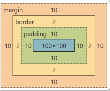
- Margin(外边距) - 清除边框外的区域,外边距是透明的(两个值:第一个值上下,第二个值左右)
- Border(边框) - 围绕在内边距和内容外的边框
- Padding(内边距) - 清除内容周围的区域(两个值:第一个值上下,第二个值左右
- Content(内容) - 盒子的内容,显示文本和图像
如果把盒子模型看作是一个生活中的快递,那么内容部分等同于你 买的实物,内边距等同于快递盒子中的泡沫,边框等同于快递盒 子,外边距等同于两个快递盒子之间的距离
弹性盒模型(flex box)
定义
弹性盒子是 CSS3 的一种新的布局模式 CSS3 弹性盒是一种当页面需要适应不同的屏幕大小以及设备类型时 确保元素拥有恰当的行为的布局方式 引入弹性盒布局模型的目的是提供一种更加有效的方式来对一个容 器中的子元素进行排列、对齐和分配空白空间
CSS3弹性盒内容
弹性盒子由弹性容器(Flex container)和弹性子元素(Flex item)组成 弹性容器通过设置 display 属性的值为flex 将其定义为弹性容器
弹性容器内包含了一个或多个弹性子元素
温馨提示
弹性容器外及弹性子元素内是正常渲染的。弹性盒子只定义了 弹性子元素如何在弹性容器内布局
html
<div class="flex-container">
    <div class="flex-item">flex item 1</div>
    <div class="flex-item">flex item 2</div>
    <div class="flex-item">flex item 3</div>
</div>
css
<style>
    .flex-container {
        display: flex;
        width: 400px;
        height: 250px;
        background-color: lightgrey;
   }
    .flex-item {
        background-color: cornflowerblue;
        width: 100px;
        height: 100px;
        margin: 10px;
   }
</style>
温馨提示
默认弹性盒里内容横向摆放
父元素上的属性
display 属性
display:flex; 开启弹性盒
display:flex; 属性设置后子元素默认水平排列
flex-direction属性
定义
flex-direction 属性指定了弹性子元素在父容器中的位置
语法:
css
flex-direction: row | row-reverse | column |
column-reverse- row:横向从左到右排列(左对齐),默认的排列方式
- row-reverse:反转横向排列(右对齐,从后往前排,最后一项 排在最前面
- column:纵向排列
- column-reverse:反转纵向排列,从后往前排,最后一项排在 最上面
css
.flex-container {
    display: flex;
    flex-direction: column;
    width: 400px;
    height: 250px;
    background-color: lightgrey;
}
justify-content 属性
定义:
内容对齐(justify-content)属性应用在弹性容器上,把弹性项沿 着弹性容器的主轴线(main axis)对齐
语法
css
justify-content: flex-start | flex-end |
center- flex-start 弹性项目向行头紧挨着填充。这个是默认值。第一个弹性项的main-start外边距边线被 放置在该行的main-start边线,而后续弹性项依次平齐摆放
- flex-end弹性项目向行尾紧挨着填充。第一个弹性项的main-end外边距边线被放置在该行的 main-end边线,而后续弹性项依次平齐摆放
- center弹性项目居中紧挨着填充。(如果剩余的自由空间是负的,则弹性项目将在两个方向上同 时溢出)
css
。flex-container {
    display: flex;
    justify-content: center;
    width: 400px;
    height: 250px;
    background-color: lightgrey;
}
align-items 属性
定义:
align-items设置或检索弹性盒子元素在侧轴(纵轴)方向上的对齐方 式
语法:
css
align-items: flex-start | flex-end | center- flex-start 弹性盒子元素的侧轴(纵轴)起始位置的边界紧靠住该行的侧轴起始边界
- flex-end 弹性盒子元素的侧轴(纵轴)起始位置的边界紧靠住该行的侧轴结束边界
- center弹性盒子元素在该行的侧轴(纵轴)上居中放置。(如果该行的尺寸小于弹性盒子元素的 尺寸,则会向两个方向溢出相同的长度)
子元素上的属性
flex
flex 根据弹性盒子元素所设置的扩展因子作为比率来分配剩余空间 默认为0,即如果存在剩余空间,也不放大 如果只有一个子元素设置,那么按扩展因子转化的百分比对其分配 剩余空间。0.1即10%,1即100%,超出按100%
html
<div class="flex-container">
   <div class="flex-item1">flex item
1</div>
   <div class="flex-item2">flex item
2</div>
   <div class="flex-item3">flex item
3</div>
</div>
css
<style>
 .flex-container {
        display: flex;
        width: 400px;
        height: 250px;
        background-color: gold;
   }
    .flex-item1 {
        height: 150px;
        background-color: red;
        flex: 1;
   }
    .flex-item2 {
        height: 150px;
        background-color: green;
        flex: 2;
   }
    .flex-item3 {
        height: 150px;
        background-color: blue;
        flex: 1;
   }
</style>
文档流
文档流是文档中可显示对象在排列时所占用的位置/空间 例如:块元素自上而下摆放,内联元素,从左到右摆放 标准流里面的限制非常多,导致很多页面效果无法实现
- 高矮不齐,底边对齐
- 空白折叠现象
- 无论多少个空格、换行、tab,都会折叠为一个空格
- 如果我们想让img标签之间没有空隙,必须紧密连接
文档流产生的问题:
高矮不齐,底边不齐
css
<span>我是文本内容</span>
<img src="1.jpg" alt="">
css
img{
    width: 200px;
}
空格折叠
html
<span>我是文本       内容</span>
<img src="1.jpg" alt="">
html
img{
    width: 200px;
}
元素无空隙
html
<span>我是文本内容</span>
<img src="1.jpg" alt=""><img src="1.jpg"
alt="">
html
img{
    width: 200px;
}
脱离文档流
使⼀个元素脱离标准文档流有三种方式
- 浮动
- 绝对定位
- 固定定位
浮动
浮动的定义
float 属性定义元素在哪个方向浮动,任何元素都可以浮动。
|-------|--------|
| 值 | 描述 |
| left | 元素向左浮动 |
| right | 元素向右浮动 |
浮动的原理
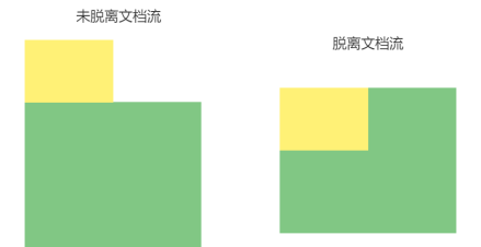
- 浮动以后使元素脱离了文档流
- 浮动只有左右浮动,没有上下浮动
元素向左浮动
脱离文档流之后,元素相当于在页面上面增加一个浮层来放置内 容。此时可以理解为有两层页面,一层是底层的原页面,一层是脱 离文档流的上层页面,所以会出现折叠现象
html
<div class="box"></div>
<div class="container"></div>
css
.container{
    width: 200px;
    height: 200px;
    background-color: #81c784;
}
.box{
    width: 100px;
    height: 100px;
    background-color: #fff176;
    float: left;
}
元素向右浮动
css
<div class="box"></div>
<div class="container"></div>
css
.container{
    width: 200px;
    height: 200px;
    background-color: #81c784;
}
.box{
    width: 100px;
    height: 100px;
    background-color: #fff176;
    float: right;
}
所有元素向左浮动
当所有元素同时浮动的时候,会变成水平摆放,向左或者向右
css
<div class="box"></div>
<div class="box"></div>
<div class="box"></div>
css
.box{
    width: 100px;
    height: 100px;
    background-color: #fff176;
    float: left;
    margin: 0 5px;
}
当容器不足时
当容器不足以横向摆放内容时候,会在下一行摆放
清除浮动:
浮动副作用
当元素设置float浮动后,该元素就会脱离文档流并向左/向右浮动,
- 浮动元素会造成父元素高度塌陷
- 后续元素会受到影响
css
<div class="container">
   <div class="box"></div>
   <div class="box"></div>
   <div class="box"></div>
</div>
css
.container{
    border: 1px solid red;
}
.box{
    width: 100px;
    height: 100px;
    background-color: #fff176;
    float: left;
    margin: 5px;
}
css
<div class="box"></div>
<div class="box"></div>
<div class="box"></div>
<div class="nav"></div>
css
.box{
    width: 100px;
    height: 100px;
    background-color: #fff176;
    float: left;
    margin: 5px;
}
.nav{
    width: 100px;
    height: 100px;
    background-color: red;
}
清除浮动
当父元素出现塌陷的时候,对布局是不利的,所以我们必须清除副 作用 解决方案有很多种
- 1 父元素设置高度
- 2 受影响的元素增加clear属性
- 3 overflow清除浮动
- 4 伪对象方式
父元素设置高度
如果父元素高度塌陷,可以给父元素设置高度,撑开元素本身大小
overflow清除浮动
如果有父级塌陷,并且同级元素也收到了影响,可以使用 overflow 清 除浮动
这种情况下,父布局不能设置高度
父级标签的样式里面加: overflow:hidden;clear: both;
css
<div class="container">
    <div class="box"></div>
    <div class="box"></div>
    <div class="box"></div>
</div>
<div class="nav"></div>
css
.container{
    width: 350px;
    border: 1px solid red;
    overflow: hidden;
    clear: both;
}
.box{
    width: 100px;
    height: 100px;
    background-color: #fff176;
    float: left;
    margin: 5px;
}
.nav{
    width: 100px;
    height: 100px;
    background-color: red;
}
伪对象方式
如果有父级塌陷,并且同级元素也收到了影响,还可以使用伪对象 方式处理
为父标签添加伪类 after ,设置空的内容,并且使用 clear:both ;
这种情况下,父布局不能设置高度
css
div class="container">
    <div class="box"></div>
    <div class="box"></div>
    <div class="box"></div>
</div>
<div class="nav"></div>
css
.container {
  width: 350px;
    border: 1px solid red;
}
.container::after {
    content: "";
    display: block;
    clear: both;
}
.box {
    width: 100px;
    height: 100px;
    background-color: #fff176;
    float: left;
    margin: 5px;
}
.nav {
    width: 100px;
    height: 100px;
    background-color: red;
}
定位
position 属性指定了元素的定位类型
|----------|------|
| 值 | 描述 |
| relative | 相对定位 |
| absolute | 绝对定位 |
| fixed | 固定定位 |
其中,绝对定位和固定定位会脱离文档流
设置定位之后:可以使用四个方向值进行调整位置: left、top、right、 bottom
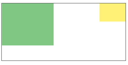
相对定位:
css
<div class="box"></div>
css
.box{
    width: 200px;
    height: 200px;
    background-color: red;
    position: relative;
    left: 100px;
}
绝对定位
css
<div class="box1"></div>
<div class="box2"></div>
css
.box1{
    width: 200px;
    height: 200px;
    background-color: red;
    position:absolute;
    left: 50px;
}
.box2{
    width: 300px;
    height: 300px;
    background-color: green;
}
固定定位
css
<div class="box1"></div>
<div class="box2"></div>
css
.box1{
    width: 200px;
    height: 200px;
    background-color: red;
    position:fixed;
    left: 50px;
}
.box2{
    width: 300px;
    height: 300px;
    background-color: green;
}
温馨提示
设置定位之后,相对定位和绝对定位他是相对于具有定位的父 级元素进行位置调整,如果父级元素不存在定位,则继续向上 逐级寻找,直到顶层文档
css
<div class="container">
    <div class="box"></div>
</div>
css
.container{
    width: 300px;
    height: 300px;
    background-color: #666;
    position: relative;
    left: 200px;
}
.box{
    width: 200px;
    height: 200px;
    background-color: red;
    position:absolute;
}
Z-index:
z-index 属性设置元素的堆叠顺序。拥有更高堆叠顺序的元素总是会处 于堆叠顺序较低的元素的前面
css
<div class="box1"></div>
<div class="box2"></div>
css
.box1{
    width: 200px;
    height: 200px;
    background-color: red;
    position:absolute;
    z-index: 2;
}
.box2{
    width: 300px;
    height: 300px;
  background-color: green;
    position:absolute;
    z-index: 1;
}
CSS3新特性
圆角
使用 CSS3 border-radius 属性,你可以给任何元素制作 "圆角" border-radius 属性,可以使用以下规则:
- 四个值: 第一个值为左上角,第二个值为右上角,第三个值为右下角,第四个值为左下角
- 三个值: 第一个值为左上角, 第二个值为右上角和左下角,第三个值为右下角
- 两个值: 第一个值为左上角与右下角,第二个值为右上角与左下角
- 一个值: 四个圆角值相同
css
<div class="box1"></div>
<div class="box2"></div>
<div class="box3"></div>
css
div{
    margin: 10px;
}
.box1 {
    border-radius: 15px 50px 30px 5px;
    background: #8AC007;
    padding: 20px;
    width: 200px;
    height: 150px;
}
.box2 {
    border-radius: 15px 50px 30px;
    background: #8AC007;
    padding: 20px;
    width: 200px;
    height: 150px;
}
.box3 {
    border-radius: 15px 50px;
    background: #8AC007;
    padding: 20px;
    width: 200px;
    height: 150px;
}
阴影
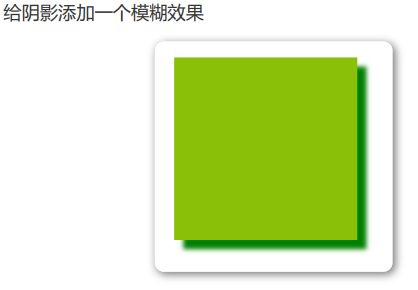
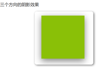
box-shadow 向框添加一个或多个阴影
css
box-shadow: h-shadow v-shadow blur color;|----------|------------|
| 值 | 描述 |
| h-shadow | 必选,水平阴影的位置 |
| v-shadow | 必选,垂直阴影的位置 |
| blur | 可选,模糊距离 |
| color | 可选,阴影的颜色 |
css
<div class="box"></div>
css
box {
    width: 200px;
    height: 200px;
    background-color: #8ac007;
    margin: 50px;
    box-shadow: 10px 10px green;
}
css
box {
    width: 200px;
    height: 200px;
    background-color: #8ac007;
    margin: 50px;
    box-shadow: 10px 10px 5px green;
}
css
.box {
    width: 200px;
    height: 200px;
    background-color: #8ac007;
    margin: 50px;
    box-shadow: 0 10px 30px rgba(0,0,0,.5);
}
动画
动画是使元素从一种样式逐渐变化为另一种样式的效果
您可以改变任意多的样式任意多的次数
请用百分比来规定变化发生的时间,或用关键词 "from" 和 "to",等 同于 0% 和 100%
0% 是动画的开始,100% 是动画的完成。
@keyframes创建动画
使用 @keyframes 规则,你可以创建动画
css
@keyframes name {
    from|0%{
   css样式
   }
    percent{
   css样式
   }
    to|100%{
   css样式
   }
}
name:动画名称,开发人员自己命名;
percent:为百分比值,可以添加多个百分比值;
animation执行动画:
css
animation: name duration timing-function
delay iteration-count direction;| 属性 | 描述 |
|---|---|
| name | 设置动画的名称,需配合 @keyframes 定义的关键帧使用 |
| duration | 设置动画的持续时间,如 3s(3 秒)、1.5s 等 |
| timing-function | 设置动画效果的速率,控制动画在执行过程中速度变化规律 |
| delay | 设置动画的开始时间(延时执行),如 1s 表示延迟 1 秒开始 |
| iteration-count | 设置动画循环的次数,infinite 为无限次数循环 |
| direction | 设置动画播放的方向 |
| animation-play-state | 控制动画的播放状态:running 代表播放,paused 代表停止播放 |
| timing-function 值 | 描述 |
|---|---|
| ease | 逐渐变慢(默认) |
| linear | 匀速 |
| ease-in | 加速(动画开始时加速) |
| ease-out | 减速(动画结束时减速) |
| ease-in-out | 先加速后减速 |
| direction 值 | 描述 |
|---|---|
| normal | 默认值,动画向前播放(按照关键帧定义顺序执行) |
| alternate | 偶数次向前播放,奇数次向反方向播放(往返循环效果) |
切换背景颜色:
css
<div class="animation"></div>
css
.animation {
    width: 300px;
    height: 300px;
    background-color: red;
    animation: anima 5s linear 5s infinite;
}
.animation:hover {
    animation-play-state: paused;
}
@keyframes anima {
    0% {
        background-color: red;
   }
    50% {
        background-color: green;
   }
  100% {
        background-color: blueviolet;
   }
}
呼吸效果
css
<div class="box"></div>
css
.box {
    width: 500px;
    height: 400px;
    margin: 40px auto;
    background-color: #2b92d4;
    border-radius: 5px;
    box-shadow: 0 1px 2px rgba(0, 0, 0, .3);
    animation: breathe 2700ms ease-in-out
infinite alternate;
}
@keyframes breathe {
    0% {
        opacity: .2;
        box-shadow: 0 1px 2px rgba(255, 255,
255, 0.1)
   }
    50% {
        opacity: .5;
        box-shadow: 0 1px 2px rgba(18, 190,
84, 0.76)
   }
    100% {
   opacity: 1;
        box-shadow: 0 1px 30px rgba(59, 255,
255, 1)
   }
}
媒体查询:
媒体查询能使页面在不同在终端设备下达到不同的效果
媒体查询会根据设备的大小自动识别加载不同的样式
设置meta标签
使用设备的宽度作为视图宽度并禁止初始的缩放。在标签里 加入这个meta标签。
css
<meta name="viewport" content="width=devicewidth,
initial-scale=1,maximum-scale=1, userscalable=no">
参数解释
- 1 width = device-width 宽度等于当前设备的宽度
- 2 initial-scale 初始的缩放比例(默认设置为1.0)
- 3 maximum-scale 允许用户缩放到的最大比例(默认设置为1.0)
- 4 user-scalable 用户是否可以手动缩放(默认设置为no)
媒体查询语法
css
@media screen and (max-width: 768px) {
 /* 设备小于768px加载样式 */
    body{
        background-color: red;
   }
}
@media screen and (max-width: 992px) and
(min-width: 768px) {
     /* 设备小于768px但小于992px加载样式 */
     body{
     background-color: pink;
     }
}
@media screen and (min-width: 992px) {
 /* 设备大于992px加载样式 */
    body{
   background-color: green;
   }
}
1
雪碧图
CSS Sprite也叫CSS精灵图、CSS雪碧图,是一种网页图片应用处理 方式。它允许你将一个页面涉及到的所有零星图片都包含到一张大 图中去
优点
- 减少图片的字节
- 减少网页的http请求,从而大大的提高页面的性能
原理
- 通过background-image引入背景图片
- 通过background-position把背景图片移动到自己需要的位置
示例:
css
<i class="icon1"></i>
<i class="icon2"></i>
css
.icon1 {
    display: block;
    background-image: url(1.png);
    background-position: -20px 0;
width: 45px;
    height: 70px;
}
.icon2 {
    display: block;
    background-image: url(1.png);
    background-position: -93px -84px;
    width: 45px;
    height: 70px;
}
字体图标:
我们会经常用到一些图标。但是我们在使用这些图标时,往往会遇 到失真的情况,而且图片数量很多的话,页面加载就越慢。所以, 我们可以使用字体图标的方式来显示图标,既解决了失真的问题, 也解决了图片占用资源的问题
常用字体图标库:阿里字体图标库
优点:
- 1 轻量性:加载速度快,减少http请求
- 2 灵活性:可以利用CSS设置大小颜色等
- 3 兼容性:网页字体支持所有现代浏览器,包括IE低版本
使用字体图标:
- 1 注册账号并登录
- 2 选取图标或搜索图标
- 3 添加购物车
- 4 下载代码
- 5 选择 font-class 引用
css
<span class="iconfont icon-add-circle">
</span>
css
<link rel="stylesheet"
href="./css/iconfont.css">
.iconfont{
    font-size: 35px;
    color: red;
}