一、定义
clip-path属性用于定义元素的可见区域,可将元素裁剪成任意形状的多边形。
二、简单示例
1、画圆形
css
clip-path: circle(40px)40px代表圆的半径,其实这种是circle(40px at 50% 50%)的简写,50% 50%代表圆心位置,不写默认是几何图形的中心。
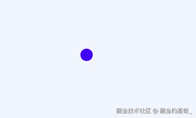
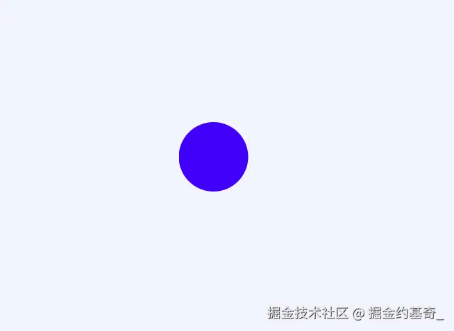
圆心稍做调整circle(40px at 10% 50%),可根据需要调整位置。
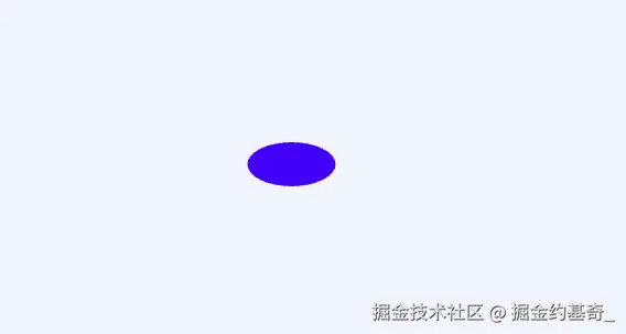
2、画椭圆形
css
clip-path: circle(40px 20px)代表主轴半径40px,侧轴半径20px,圆心在几何图形中心的椭圆。
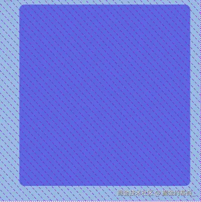
2、画矩形
css
clip-path: inset(10px 20px 30px 40px round 10px)矩形上边距顶部10排序,右边距右边20px,距底部30px,距左边40px,并且圆角是10px的矩形。
2、画多边形
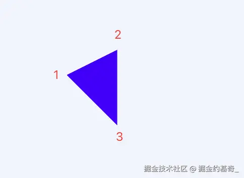
(1)、三角形
css
clip-path: polygon(0 50px, 100px 0, 100px 150px)分别代表1,2,3点的坐标位置。
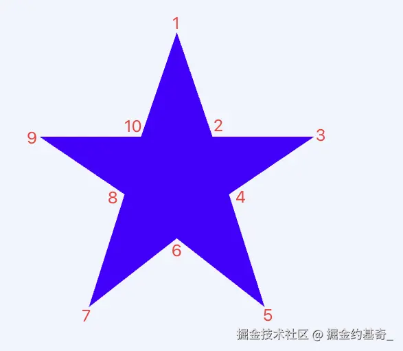
(2)、五角星
css
clip-path: polygon(
    50% 0%,
    63% 38%,
    100% 38%,
    69% 59%,
    82% 100%,
    50% 75%,
    18% 100%,
    31% 59%,
    0 38%,
    37% 38%
  )
只要坐标点足够多,可以画出任意类型的图形。
三、实战应用
开发一个调节音量大小的组件,ui稿如下: 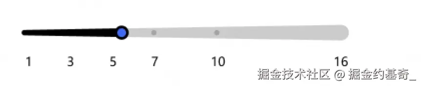
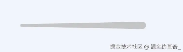
(1)、画多边形轨道
html
  <div class="box">
    <!-- 轨道 -->
    <div class="slider"></div>
</div>使用clip-path: polygon()函数定位四个坐标点,并设置圆角。
css
.box {
  width: 400px;
  position: relative;
  .slider {
    width: 400px;
    height: 24px;
    background-color: #ccc;
    // background: #000;
    border-radius: 50px;
    // polygon画四边形,需要四个点位
    clip-path: polygon(0 8px, 0 16px, 100% 100%, 100% 0);
  }
}
(2)、添加滑块和刻度
html
  <div class="box">
    <!-- 轨道 -->
    <div class="slider"></div>
          <!-- 滑块 -->
      <div class="block"></div>
      <!-- 刻度 -->
      <div class="scale">
        <div
          v-for="(point, index) in scalePoints"
          :key="index"
          class="scale-point"
          :style="{ left: `${(point / 16) * 100}%` }"
        >
          {{ point }}
        </div>
      </div>
  </div>
js
  data() {
    return {
      // 刻度尺
      scalePoints: [0, 1, 3, 5, 7, 16],
    };
  },
css
.box {
  width: 400px;
  position: relative;
  .slider {
    width: 400px;
    height: 24px;
    background-color: #ccc;
    // background: #000;
    border-radius: 50px;
    // polygon画四边形,需要四个点位
    clip-path: polygon(0 8px, 0 16px, 100% 100%, 100% 0);
  }
  .block {
    width: 24px;
    height: 24px;
    background: #409eff;
    border: 2px solid #000000;
    border-radius: 50%;
    position: absolute;
    left: 0;
    top: 0;
    cursor: grab;
    &:active {
      cursor: grabbing;
    }
  }
  .scale {
    position: relative;
    margin-top: 10px;
    height: 20px;
    &-point {
      position: absolute;
    }
  }
}
(3)、事件绑定
这里面的背景色不能写死,需根据滑动过的轨迹的百分比动态计算,使用linear-gradient css渐变函数实现。
js
methods: {
    handleSliderClick(e) {
      const slider = this.$el.querySelector(".slider");
      const block = this.$el.querySelector(".block");
      const sliderRect = slider.getBoundingClientRect();
      const maxLeft = slider.offsetWidth - block.offsetWidth;

      // 计算点击位置相对轨道的水平坐标
      const clickX = e.clientX - sliderRect.left - block.offsetWidth / 2;
      const newLeft = Math.max(0, Math.min(clickX, maxLeft));

      // 更新滑块位置
      block.style.left = `${newLeft}px`;

      // 同步更新背景渐变
      const progress = (newLeft / maxLeft) * 100;
      slider.style.background = `linear-gradient(to right, #000 ${progress}%, #ccc ${progress}%)`;
    },
    startDrag(e) {
      const box = this.$el;
      const block = this.$el.querySelector(".block");
      const slider = this.$el.querySelector(".slider");
      // 计算滑块最大移动距离=(轨道宽度-滑块宽度)
      const maxLeft = slider.offsetWidth - block.offsetWidth;
      // 开始滑动
      const handleMove = (e) => {
        console.log(e.clientX, "e.clientX");

        // 计算滑块距左边位置的距离
        let newLeft =
          e.clientX - box.getBoundingClientRect().left - block.offsetWidth / 2;
        newLeft = Math.max(0, Math.min(newLeft, maxLeft));
        block.style.left = `${newLeft}px`;
        // 动态改变进度条背景色
        const progress = (newLeft / maxLeft) * 100;
        slider.style.background = `linear-gradient(to right, #000 ${progress}%, #ccc ${progress}%)`;
      };

      // 滑动结束
      const handleUp = () => {
        document.removeEventListener("mousemove", handleMove);
        document.removeEventListener("mouseup", handleUp);
      };

      document.addEventListener("mousemove", handleMove);
      document.addEventListener("mouseup", handleUp);
    },
  },
效果图:

完整代码:
vue
<template>
  <!-- <div class="container"> -->
  <div class="box">
    <!-- 轨道 -->
    <div class="slider" @click="handleSliderClick"></div>
    <!-- 滑块 -->
    <div class="block" @mousedown="startDrag"></div>
    <!-- 刻度 -->
    <div class="scale">
      <div
        v-for="(point, index) in scalePoints"
        :key="index"
        class="scale-point"
        :style="{ left: `${(point / 16) * 100}%` }"
      >
        {{ point }}
      </div>
    </div>
  </div>
  <!-- </div> -->
</template>

<script>
export default {
  data() {
    return {
      // 刻度尺
      scalePoints: [0, 1, 3, 5, 7, 16],
    };
  },
  methods: {
    handleSliderClick(e) {
      const slider = this.$el.querySelector(".slider");
      const block = this.$el.querySelector(".block");
      const sliderRect = slider.getBoundingClientRect();
      const maxLeft = slider.offsetWidth - block.offsetWidth;

      // 计算点击位置相对轨道的水平坐标
      const clickX = e.clientX - sliderRect.left - block.offsetWidth / 2;
      const newLeft = Math.max(0, Math.min(clickX, maxLeft));

      // 更新滑块位置
      block.style.left = `${newLeft}px`;

      // 同步更新背景渐变
      const progress = (newLeft / maxLeft) * 100;
      slider.style.background = `linear-gradient(to right, #000 ${progress}%, #ccc ${progress}%)`;
    },
    startDrag(e) {
      const box = this.$el;
      const block = this.$el.querySelector(".block");
      const slider = this.$el.querySelector(".slider");
      // 计算滑块最大移动距离=(轨道宽度-滑块宽度)
      const maxLeft = slider.offsetWidth - block.offsetWidth;
      // 开始滑动
      const handleMove = (e) => {
        console.log(e.clientX, "e.clientX");

        // 计算滑块距左边位置的距离
        let newLeft =
          e.clientX - box.getBoundingClientRect().left - block.offsetWidth / 2;
        newLeft = Math.max(0, Math.min(newLeft, maxLeft));
        block.style.left = `${newLeft}px`;
        // 动态改变进度条背景色
        const progress = (newLeft / maxLeft) * 100;
        slider.style.background = `linear-gradient(to right, #000 ${progress}%, #ccc ${progress}%)`;
      };

      // 滑动结束
      const handleUp = () => {
        document.removeEventListener("mousemove", handleMove);
        document.removeEventListener("mouseup", handleUp);
      };

      document.addEventListener("mousemove", handleMove);
      document.addEventListener("mouseup", handleUp);
    },
  },
};
</script>

<style scoped lang="scss">
.container {
  width: 100%;
  height: 100vh;
  display: flex;
  justify-content: center;
  align-items: center;
}
.box {
  width: 400px;
  position: relative;
  .slider {
    width: 400px;
    height: 24px;
    background-color: #ccc;
    // background: #000;
    border-radius: 50px;
    // polygon画四边形,需要四个点位
    clip-path: polygon(0 8px, 0 16px, 100% 100%, 100% 0);
  }
  .block {
    width: 24px;
    height: 24px;
    background: #409eff;
    border: 2px solid #000000;
    border-radius: 50%;
    position: absolute;
    left: 0;
    top: 0;
    cursor: grab;
    &:active {
      cursor: grabbing;
    }
  }
  .scale {
    position: relative;
    margin-top: 10px;
    height: 20px;
    &-point {
      position: absolute;
    }
  }
}
</style>