引言

浪浪山札记:献给所有在暗夜里倔强发光的普通人
一、系统概述
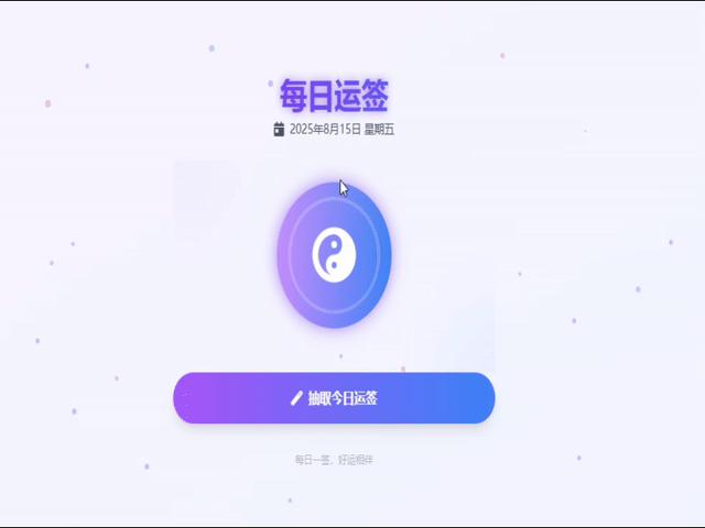
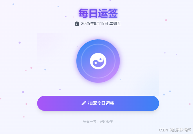
"每日运签"是一个基于现代Web技术构建的交互式运势抽取应用,结合了中国传统文化元素与现代UI设计理念。该系统采用HTML5、CSS3和JavaScript作为核心技术栈,并利用Tailwind CSS框架快速构建响应式界面。
二、核心技术特点
1. 响应式设计与UI框架
- Tailwind CSS集成:应用采用Tailwind CSS作为主要样式框架,通过实用类(utility classes)快速构建组件
- 移动优先策略:使用媒体查询(@media)确保在移动设备上的良好体验
- 动态装饰元素:通过绝对定位和模糊效果创建背景装饰元素增强视觉层次
2. 动画与交互效果
- CSS3过渡与动画:广泛应用transition和@keyframes实现平滑的视觉效果
- 3D变换:使用perspective和transform实现卡片翻转和3D悬停效果
- 微交互设计:按钮hover状态、点击涟漪反馈等细节增强用户体验
3. 数据管理与本地存储
- LocalStorage应用:记录用户抽签状态和结果
- 随机算法:Math.random()实现30种不同类型签文的随机抽取
- 状态管理:通过classList控制元素的显示/隐藏状态
三、主要功能实现
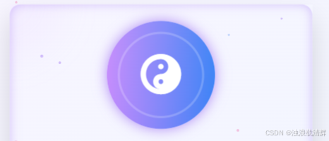
1. 运势轮盘系统
html
const fortuneWheel = document.getElementById('fortune-wheel');
fortuneWheel.classList.add('spinning'); // 添加旋转类
setTimeout(() => {
fortuneWheel.classList.remove('spinning');
// 2秒后停止
}, 2000);
//CSS旋转定义:
.spinning {
animation: spin 0.8s linear infinite;
}
@keyframes spin {
0% { transform: rotate(0deg); }
100% { transform: rotate(360deg); }
}- 旋转动画通过添加spinning类触发
- 使用setTimeout控制旋转时长(2000ms)
- 停止后随机选择签文并显示结果
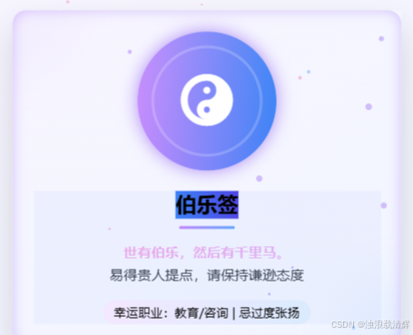
2. 签文展示系统
html
const randomFortune = fortunes[Math.floor(Math.random() * fortunes.length)];
const fortunes = [
{ title: "星移签", content: "闲云潭影日悠悠...", luck: "幸运星座:双子/水瓶", type:
"general" }, // 多种签文...
];
//分类逻辑:
let colorClass = '';
switch(randomFortune.type) {
case 'love': colorClass = 'bg-gradient-to-r from-pink-500 to-rose-500';
break;
case 'career': colorClass = 'bg-gradient-to-r from-blue-500 to-indigo-600';
break; // 其他类型处理... }- 30种预设签文存储在fortunes数组中
- 每种签文包含标题、内容、幸运提示和类型
- 根据类型(love/career/wealth/general)动态设置颜色主题
3. 用户状态管理
html
localStorage.setItem('lastFortuneDate', new Date().toDateString());- 记录用户最后一次抽签日期
- 防止同一天重复抽签
- 刷新页面后保持签文显示状态
4. 3D卡片悬停效果
html
.main-card {
    transform: perspective(1000px) translateZ(0);
    transition: all 0.5s cubic-bezier(0.25, 0.8, 0.25, 1);
}

.main-card:hover {
    transform: perspective(1000px) translateZ(20px);
    box-shadow: 0 20px 40px rgba(0,0,0,0.15);
}
5. 动态粒子背景
Canvas实现
html
function initParticles() {
    const canvas = document.createElement('canvas');
    const ctx = canvas.getContext('2d'); // 创建50个粒子
    const particles = Array(50).fill().map(() => ({
        x: Math.random() * canvas.width,
        y: Math.random() * canvas.height,
        size: Math.random() * 3 + 1,
        color: colors[Math.floor(Math.random() * colors.length)],
        speedX: Math.random() * 0.5 - 0.25, speedY: Math.random() * 0.5 - 0.25 }));

 function animate() {
    ctx.clearRect(0, 0, canvas.width, canvas.height);
    particles.forEach(p => {
        ctx.beginPath();
        ctx.arc(p.x, p.y, p.size, 0, Math.PI * 2);
        ctx.fillStyle = p.color; ctx.fill(); \
        // 更新位置
         p.x += p.speedX; p.y += p.speedY;
        // 边界检测
        if (p.x < 0 || p.x > canvas.width) p.speedX *= -1;
        if (p.y < 0 || p.y > canvas.height) p.speedY *= -1;
 });

     requestAnimationFrame(animate); } animate();
}
6. 文字特效系统
渐变文字:
html
.text-gradient {
    background: linear-gradient(135deg, #667eea 0%, #764ba2 100%);
    -webkit-background-clip: text; -webkit-text-fill-color: transparent;
}打字机效果:
html
.fortune-content {
    animation: typeIn 2s steps(40) forwards;
}

@keyframes typeIn {
    from { width: 0 } to { width: 100% }
}
四、创新设计亮点

1. 视觉特效
- 渐变文字:使用background-clip: text实现彩色文字效果
- 粒子背景:Canvas实现的动态粒子系统
- 光影效果:box-shadow和text-shadow增强视觉层次
2. 交互反馈
- 3D悬停效果:transform: perspective(1000px)实现立体感
- 点击涟漪:JavaScript动态创建span元素实现水波纹效果
- 卡片翻转:通过CSS transform-style: preserve-3d实现
3. 类型化签文系统
html
let colorClass = '';
switch(randomFortune.type)
{ case 'love': colorClass = 'bg-gradient-to-r from-pink-500 to-rose-500';
break;
// 其他类型处理
}- 四种签文类型(感情/事业/财富/通用)
- 每种类型对应不同配色方案
- 通过class动态切换视觉样式
五、性能优化策略
- 硬件加速:使用transform和opacity属性触发GPU加速
- 事件委托:减少事件监听器数量
- CSS动画优化:优先使用transform和opacity实现动画
- 资源按需加载:使用CDN引入Tailwind CSS和Font Awesom
- 硬件加速
transform: translateZ(0); /* 触发GPU加速 */
6.动画优化
- 优先使用CSS动画
- 减少重绘区域
- 使用will-change提示浏览器
html
<script src="https://cdn.tailwindcss.com"></script>
<link rel="stylesheet" href="https://cdnjs.cloudflare.com/ajax/libs/font-awesome/6.4.0/css/all.min.css">
六、部署与扩展
- 静态资源部署:纯前端应用可直接部署到任何Web服务器
- 扩展可能性 :
- 增加用户系统实现个性化签文
- 集成分享功能到社交平台
- 添加更多签文类型和内容
这个应用通过精心设计的交互细节和视觉效果,将传统文化元素与现代Web技术完美结合,展示了前端开发的多个高级技巧。,为用户提供愉悦的数字体验。其模块化结构和清晰的代码组织也使其成为学习现代前端开发的优秀示例。
七、全部代码
html
<!DOCTYPE html>
<html lang="zh-CN">
<head>
<meta charset="UTF-8">
<meta name="viewport" content="width=device-width, initial-scale=1.0">
<title>每日运签</title>
<script src="https://cdn.tailwindcss.com"></script>
<link rel="stylesheet" href="https://cdnjs.cloudflare.com/ajax/libs/font-awesome/6.4.0/css/all.min.css">
<style>
#fortune-wheel {
transition: all 0.5s ease;
box-shadow: 0 0 20px rgba(124, 58, 237, 0.6);
}
#fortune-wheel:hover {
transform: scale(1.05);
box-shadow: 0 0 30px rgba(124, 58, 237, 0.8);
}
/* 主卡篇特效 */
.main-card {
transition: all 0.5s cubic-bezier(0.25, 0.8, 0.25, 1);
transform: perspective(1000px) translateZ(0);
}
.main-card:hover {
transform: perspective(1000px) translateZ(20px);
box-shadow: 0 20px 40px rgba(0, 0, 0, 0.15);
}
.main-card {
position: relative;
overflow: hidden;
}
.main-card::after {
content: '';
position: absolute;
top: 0;
left: 0;
right: 0;
bottom: 0;
border-radius: 16px;
pointer-events: none;
box-shadow: inset 0 0 15px rgba(124, 58, 237, 0.3);
transition: all 0.5s ease;
opacity: 0;
}
.main-card:hover::after {
opacity: 1;
}
.ripple-effect {
position: absolute;
border-radius: 50%;
background: rgba(255, 255, 255, 0.7);
transform: scale(0);
animation: ripple 0.6s linear;
pointer-events: none;
}
@keyframes ripple {
to {
transform: scale(4);
opacity: 0;
}
}
/* 运势结果卡片特效增强 */
@keyframes cardAppear {
0% {
opacity: 0;
transform: translateY(20px) scale(0.95);
}
50% {
opacity: 1;
transform: translateY(-5px) scale(1.02);
}
100% {
transform: translateY(0) scale(1);
}
}
#fortune-result.show {
animation: cardAppear 0.8s cubic-bezier(0.175, 0.885, 0.32, 1.275) forwards;
}
/* 签文展示效果 */
#fortune-result {
position: relative;
overflow: hidden;
}
#fortune-result::before {
content: '';
position: absolute;
top: -50%;
left: -50%;
right: -50%;
bottom: -50%;
background: linear-gradient(45deg,
rgba(124, 58, 237, 0.05) 0%,
rgba(59, 130, 246, 0.05) 50%,
rgba(124, 58, 237, 0.05) 100%);
background-size: 200% 200%;
animation: gradientFlow 8s ease infinite;
z-index: -1;
}
@keyframes gradientFlow {
0% {
background-position: 0% 50%;
}
50% {
background-position: 100% 50%;
}
100% {
background-position: 0% 50%;
}
}
#fortune-title {
position: relative;
display: inline-block;
}
#fortune-title::after {
content: '';
position: absolute;
bottom: -5px;
left: 0;
width: 100%;
height: 2px;
background: currentColor;
transform: scaleX(0);
transform-origin: right;
transition: transform 0.5s ease;
}
#fortune-result:hover #fortune-title::after {
transform: scaleX(1);
transform-origin: left;
}
/* 签文内容特效 */
.fortune-content {
overflow: hidden;
white-space: nowrap;
animation: typeIn 2s steps(40) forwards;
line-height: 1.8;
font-size: 1.2rem;
font-weight: 500;
color: #374151;
text-align: justify;
position: relative;
padding: 1rem;
}
.fortune-content em {
color: #e2ad5e;
font-style: normal;
background: linear-gradient(135deg, #f1a1e4 0%, #d5b3f7 100%);
-webkit-background-clip: text;
background-clip: text;
-webkit-text-fill-color: transparent;
font-weight: 600;
}
.poem {
color: #e2ad5e;
font-style: normal;
background: linear-gradient(135deg, #f1a1e4 0%, #d5b3f7 100%);
-webkit-background-clip: text;
background-clip: text;
-webkit-text-fill-color: transparent;
font-weight: 600;
}
.fortune-content::before {
content: '';
position: absolute;
top: 0;
left: 0;
right: 0;
bottom: 0;
border: 2px solid transparent;
border-radius: 8px;
background: linear-gradient(135deg, rgba(124, 58, 237, 0.1), rgba(59, 130, 246, 0.1)) border-box;
-webkit-mask: linear-gradient(#fff 0 0) padding-box, linear-gradient(#fff 0 0);
-webkit-mask-composite: destination-out;
mask-composite: exclude;
animation: borderRotate 8s linear infinite;
}
.fortune-content::first-letter {
float: left;
font-size: 3em;
line-height: 0.8;
padding-right: 0.2em;
padding-top: 0.2em;
color: #7c3aed;
font-weight: bold;
}
@media (max-width: 640px) {
.fortune-content {
font-size: 1rem;
padding: 0.5rem;
}
.fortune-content::first-letter {
font-size: 2em;
}
}
@keyframes borderRotate {
100% {
--angle: 360deg;
}
}
@keyframes typeIn {
from {
width: 0
}
to {
width: 100%
}
}
@keyframes fadeInUp {
from {
opacity: 0;
transform: translateY(15px);
}
to {
opacity: 1;
transform: translateY(0);
}
}
/* 签文标题动画 */
@keyframes textGlow {
0% {
text-shadow: 0 0 5px rgba(255, 255, 255, 0.5);
}
50% {
text-shadow: 0 0 15px rgba(255, 255, 255, 0.8);
}
100% {
text-shadow: 0 0 5px rgba(255, 255, 255, 0.5);
}
}
.fortune-title {
animation: textGlow 2s ease-in-out infinite;
background: linear-gradient(135deg, #667eea 0%, #764ba2 50%, #ec4899 100%);
-webkit-background-clip: text;
background-clip: text;
-webkit-text-fill-color: transparent;
font-weight: 800;
letter-spacing: -0.03em;
}
/* 感情运势卡片 */
.love-card {
background: linear-gradient(135deg, rgba(255, 105, 180, 0.1) 0%, rgba(255, 20, 147, 0.1) 100%);
}
/* 事业运势卡片 */
.career-card {
background: linear-gradient(135deg, rgba(100, 149, 237, 0.1) 0%, rgba(0, 191, 255, 0.1) 100%);
}
/* 财富运势卡片 */
.wealth-card {
background: linear-gradient(135deg, rgba(255, 215, 0, 0.1) 0%, rgba(218, 165, 32, 0.1) 100%);
}
/* 页面加载动画 */
@keyframes fadeIn {
from {
opacity: 0;
transform: translateY(20px);
}
to {
opacity: 1;
transform: translateY(0);
}
}
.slide-up {
animation: fadeIn 0.6s ease-out forwards;
}
/* 基础动画 */
@keyframes spin {
0% {
transform: rotate(0deg);
}
100% {
transform: rotate(360deg);
}
}
@keyframes pulse {
0%,
100% {
transform: scale(1);
}
50% {
transform: scale(1.05);
}
}
.card-hover {
transition: all 0.4s cubic-bezier(0.25, 0.8, 0.25, 1);
transform: translateY(-8px);
box-shadow: 0 12px 28px rgba(0, 0, 0, 0.12);
filter: drop-shadow(0 4px 8px rgba(124, 58, 237, 0.2));
}
@keyframes float {
0%,
100% {
transform: translateY(0);
}
50% {
transform: translateY(-10px);
}
}
@keyframes slideUp {
from {
transform: translateY(20px);
opacity: 0;
}
to {
transform: translateY(0);
opacity: 1;
}
}
/* 应用类 */
.spinning {
animation: spin 0.8s linear infinite;
}
.pulse {
animation: pulse 2s ease-in-out infinite;
}
.float {
animation: float 3s ease-in-out infinite;
}
.fade-in {
animation: fadeIn 0.6s ease-out;
}
.slide-up {
animation: fadeIn 0.6s ease-out forwards;
}
/* 卡片翻转效果 */
.card-flip {
perspective: 1000px;
transition: all 0.6s;
}
.card-flip-inner {
position: relative;
width: 100%;
height: 100%;
transition: transform 0.6s;
transform-style: preserve-3d;
}
.card-flip:hover .card-flip-inner {
transform: rotateY(180deg);
}
.card-front,
.card-back {
position: absolute;
width: 100%;
height: 100%;
backface-visibility: hidden;
border-radius: 0.75rem;
display: flex;
flex-direction: column;
align-items: center;
justify-content: center;
padding: 1rem;
}
.card-back {
transform: rotateY(180deg);
background: linear-gradient(135deg, #667eea 0%, #764ba2 100%);
color: white;
}
/* 特殊效果 */
.glow {
box-shadow: 0 0 15px rgba(124, 58, 237, 0.5);
}
.text-glow {
text-shadow: 0 0 8px rgba(255, 255, 255, 0.7);
}
.text-gradient {
background: linear-gradient(135deg, #667eea 0%, #764ba2 100%);
-webkit-background-clip: text;
-webkit-text-fill-color: transparent;
}
/* 自定义滚动条 */
::-webkit-scrollbar {
width: 8px;
}
::-webkit-scrollbar-track {
background: #f1f1f1;
border-radius: 10px;
}
::-webkit-scrollbar-thumb {
background: #888;
border-radius: 10px;
}
::-webkit-scrollbar-thumb:hover {
background: #555;
}
/* 移动端适配 */
@media (max-width: 640px) {
.card-flip {
height: 100px;
}
#fortune-wheel {
width: 120px;
height: 120px;
}
}
.shadow-purple-3d {
text-shadow:
2px 2px 0 #7c3aed,
4px 4px 0 rgba(124, 58, 237, 0.5),
6px 6px 0 rgba(124, 58, 237, 0.2);
transform: perspective(500px) rotateX(10deg);
}
@keyframes glow {
0% {
text-shadow: 0 0 5px rgba(124, 58, 237, 0.5);
}
50% {
text-shadow: 0 0 20px rgba(124, 58, 237, 0.8);
}
100% {
text-shadow: 0 0 5px rgba(124, 58, 237, 0.5);
}
}
.animate-glow {
animation: glow 3s ease-in-out infinite;
}
</style>
</head>
<body
class="bg-gradient-to-br from-purple-50 to-blue-50 min-h-screen flex flex-col items-center justify-center p-4 font-sans">
<!-- 动态装饰元素 -->
<div class="absolute top-0 left-0 w-full h-full overflow-hidden opacity-10 pointer-events-none">
<div class="absolute -top-20 -left-20 w-40 h-40 rounded-full bg-purple-300 blur-xl"></div>
<div class="absolute -bottom-20 -right-20 w-40 h-40 rounded-full bg-blue-300 blur-xl"></div>
</div>
<div class="max-w-md w-full">
<!-- 标题部分 -->
<div class="text-center mb-6 slide-up">
<h1 class="text-4xl font-bold text-transparent bg-clip-text bg-gradient-to-r from-purple-600 to-blue-500 mb-2
hover:scale-105 transition-transform duration-300
animate-glow shadow-purple-3d relative">
每日运签
</h1>
<div class="flex items-center justify-center space-x-2 text-gray-600">
<i class="fas fa-calendar-day"></i>
<p class="text-sm">2025年8月15日 星期五</p>
</div>
</div>
<!-- 主卡片 -->
<div class="main-card">
<div class="p-6 text-center relative">
<!-- 装饰元素 -->
<div class="absolute top-0 left-0 w-full h-full overflow-hidden opacity-10 pointer-events-none">
<div class="absolute -top-20 -left-20 w-40 h-40 rounded-full bg-purple-300 blur-xl"></div>
<div class="absolute -bottom-20 -right-20 w-40 h-40 rounded-full bg-blue-300 blur-xl"></div>
</div>
<!-- 运势轮盘 -->
<div id="fortune-wheel"
class="w-40 h-40 mx-auto mb-6 rounded-full bg-gradient-to-r from-purple-400 to-blue-500 flex items-center justify-center shadow-lg relative overflow-hidden">
<div class="absolute inset-0 bg-gradient-to-br from-white/10 to-transparent"></div>
<i class="fas fa-yin-yang text-white text-6xl transform transition-all duration-1000"></i>
<div class="absolute inset-0 flex items-center justify-center">
<div class="w-32 h-32 rounded-full border-4 border-white/20"></div>
</div>
</div>
<!-- 运势结果 -->
<div id="fortune-result" class="hidden">
<div class="mb-4">
<h2 id="fortune-title" class="text-3xl font-bold mb-2"></h2>
<div class="w-16 h-1 bg-gradient-to-r from-purple-400 to-blue-400 mx-auto mb-3 rounded-full">
</div>
</div>
<p id="fortune-content em" class="poem"></p>
<p id="fortune-content" class="text-gray-700 mb-4 leading-relaxed px-4"></p>
<p id="fortune-luck"
class="text-sm font-medium bg-gradient-to-r from-purple-100 to-blue-100 inline-block px-3 py-1 rounded-full">
</p>
</div>
<!-- 占位文字 -->
<!-- <div id="fortune-placeholder" class="text-gray-500">
<i class="fas fa-hand-pointer text-2xl mb-2 text-purple-400 float"></i>
<p class="text-gray-600">点击下方按钮获取今日运势</p>
</div> -->
</div>
</div>
<!-- 抽签按钮 -->
<button id="draw-btn"
class="w-full py-4 px-6 bg-gradient-to-r from-purple-500 to-blue-500 hover:from-purple-600 hover:to-blue-600 text-white font-bold rounded-full shadow-lg transition-all duration-300 transform hover:scale-105 focus:outline-none focus:ring-4 focus:ring-purple-300 relative overflow-hidden group">
<span class="relative z-10 flex items-center justify-center space-x-2">
<i class="fas fa-magic"></i>
<span>抽取今日运签</span>
</span>
<span
class="absolute inset-0 bg-gradient-to-r from-purple-600 to-blue-600 opacity-0 group-hover:opacity-100 transition-opacity duration-300"></span>
</button>
<!-- 底部装饰 -->
<div class="mt-8 text-center text-xs text-gray-400 opacity-70">
<p>每日一签,好运相伴</p>
</div>
</div>
<script>
const fortunes = [
{ title: "星移签", content: "闲云潭影日悠悠,物换星移几度秋。变化中孕育新机,请保持开放心态。", luck: " 幸运星座:双子/水瓶", type: "general" },
{ title: "和合签", content: "万物负阴而抱阳,冲气以为和。人际关系和谐,矛盾自然化解。", luck: "幸运方式:团队协作", type: "general" },
{ title: "破茧签", content: "不经一番寒彻骨,怎得梅花扑鼻香。突破舒适区将获成长。", luck: "幸运行动:学习新技能", type: "general" },
{ title: "明镜签", content: "菩提本无树,明镜亦非台。宜自省修正,避免重复错误。", luck: "幸运物:镜子 | 宜写日记", type: "general" },
{ title: "开源签", content: "问渠那得清如许,为有源头活水来。副业机会显现,宜拓展人脉。", luck: " 幸运时段:15:00-17:00", type: "general" },
{ title: "聚宝签", content: "金玉满堂莫之能守,富贵而骄自遗其咎。有意外之财但需理性规划。", luck: "幸运投资:稳健型 | 忌冲动消费", type: "wealth" },
{ title: "伯乐签", content: "世有伯乐,然后有千里马。易得贵人提点,请保持谦逊态度。", luck: "幸运职业:教育/咨询 | 忌过度张扬", type: "career" },
{ title: "青云签", content: "好风凭借力,送我上青云。项目推进顺利,创意灵感迸发。", luck: "幸运方位:东南方 | 宜尝试新方法", type: "career" },
{ title: "比翼签", content: "在天愿作比翼鸟,在地愿为连理枝。今日宜与爱人深度交流,化解过往心结。", luck: "幸运提示:佩戴成对饰品 | 忌冷战", type: "love" },
{ title: "桃花签", content: "人面桃花相映红,春风拂槛露华浓。单身者易遇良缘,有伴者感情升温。", luck: " 幸运提示:宜穿粉色 | 幸运场所:公园/咖啡厅", type: "love" },
{ title: "泉涌签", content: "半亩方塘一鉴开,天光云影共徘徊。知识变现机会来临,经验即财富。", luck: "幸运方式:知识付费 | 宜:经验分享", type: "wealth" },
{ title: "珠藏签", content: "沧海月明珠有泪,蓝田日暖玉生烟。被低估的价值终将显现,请保持信心。", luck: "幸运策略:价值投资 | 忌:盲目跟风", type: "wealth" },
{ title: "金鳞签", content: "水不在深,有龙则灵。小众领域藏机遇,独特眼光带来财富。", luck: "幸运投资:新兴科技 | 宜:差异化竞争", type: "wealth" },
{ title: "比目签", content: "得成比目何辞死,愿作鸳鸯不羡仙。职场遇知己,志同道合者将出现。", luck: "幸运座位:朝东位置 | 忌:背后议论", type: "career" },
{ title: "锦书签", content: "云中谁寄锦书来,雁字回时,月满西楼。久未联系的老友将带来惊喜消息。", luck: "幸运操作:整理通讯录 | 宜:主动问候", type: "general" },
{ title: "连理签", content: "愿作深山木,枝枝连理生。合作关系将达新高度,宜签署重要协议。", luck: "幸运符号:双鱼图案 | 忌:单方面决策", type: "general" },
{ title: "种玉签", content: "此情可待成追忆,只是当时已惘然。往日付出将见回报,请保持耐心。", luck: "幸运投资:长期持有 | 忌:半途而废", type: "love" },
{ title: "鸣鹤签", content: "鹤鸣于九皋,声闻于野。真诚发声终会被听见,宜表达真实想法。", luck: "幸运媒介:音频创作 | 宜:公开演讲", type: "career" },
{ title: "韬光签", content: "良贾深藏若虚,君子盛德容貌若愚。暂敛锋芒可避是非,低调反能成事。", luck: "幸运策略:幕后工作 | 忌:争强好胜", type: "career" },
{ title: "孤舟签", content: "孤舟蓑笠翁,独钓寒江雪。暂时孤独是沉淀期,专注自有收获。", luck: "幸运提示:减少社交 | 宜:专业技能精进", type: "career" },
{ title: "松风签", content: "明月松间照,清泉石上流。心境澄明时,自能听见智慧的声音。", luck: "幸运物:山水画 | 宜:独处冥想", type: "general" },
{ title: "流萤签", content: "银烛秋光冷画屏,轻罗小扇扑流萤。暗夜中的微小光亮,预示创意灵感闪现。", luck: "幸运方式:夜间沉思 | 忌:过度照明", type: "general" },
{ title: "小满签", content: "麦穗初齐稚子娇,桑叶正肥蚕食饱。小有所成莫自满,留白处藏更大机遇。", luck: "幸运投资:农产品 | 宜:预留发展空间", type: "wealth" },
{ title: "谷雨签", content: "杨花落尽子规啼,闻道龙标过五溪。沟通效率提升,重要信息将如期而至。", luck: "幸运时段:9:00-11:00 | 忌:拖延回复", type: "career" },
{ title: "惊蛰签", content: "微雨众卉新,一雷惊蛰始。蛰伏之事将现转机,宜主动出击把握良机。", luck: "幸运物:种子 | 宜:开启新项目", type: "wealth" },
{ title: "鹏程签", content: "大鹏一日同风起,扶摇直上九万里。事业突破临界点,重大项目迎来关键进展。", luck: "幸运指引:佩戴鹰形饰品 | 宜:高空俯瞰思考", type: "career" },
{ title: "润物签", content: "随风潜入夜,润物细无声。隐性资源持续积累,量变即将引发质变。", luck: "幸运时段:凌晨3-5点 | 忌:急功近利", type: "general" },
{ title: "悬壶签", content: "但愿世间人无病,何妨架上药生尘。健康运势回升,旧疾有望找到根治方案。", luck: "幸运物:葫芦挂件 | 宜:中医调理", type: "general" },
{ title: "折桂签", content: "不是一番寒彻骨,争得梅花扑鼻香。考试竞赛需加倍努力,付出终有回报。", luck: "幸运方位:书房西北角 | 忌:临时抱佛脚", type: "general" },
{ title: "霓裳签", content: "虹裳霞帔步摇冠,钿璎累累佩珊珊。重要社交场合将遇关键人物,需注重仪表。", luck: "幸运色:虹彩渐变 | 宜:定制礼服", type: "career" },
{ title: "点犀签", content: "身无彩凤双飞翼,心有灵犀一点通。与特定对象产生深度共鸣,默契值达峰值。", luck: "幸运物:对称图案 | 忌:过度解释", type: "love" },
{ title: "云储签", content: "数据浩如烟海处,算法深处见真章。数字资产价值显现,宜备份关键资料。", luck: "幸运操作:云端加密 | 忌:共享密码", type: "career" },
{ title: "碳循签", content: "落叶不是无情物,化作春泥更护花。环保举措带来意外回报,绿色投资利好。", luck: "幸运行动:垃圾分类 | 宜:参与碳中和", type: "general" },
{ title: "弦歌签", content: "锦瑟无端五十弦,一弦一柱思华年。传统与现代碰撞产生创新火花。", luck: "幸运媒介:数字乐器 | 忌:固守成规", type: "career" },
{ title: "星链签", content: "坐地日行八万里,巡天遥看一千河。跨界合作打破次元壁,虚拟与现实交互。", luck: "幸运伙伴:科技文创从业者 | 宜:AR体验", type: "wealth" }
];
const drawBtn = document.getElementById('draw-btn');
const fortuneWheel = document.getElementById('fortune-wheel');
const fortuneResult = document.getElementById('fortune-result');
// const fortunePlaceholder = document.getElementById('fortune-placeholder');
const fortuneTitle = document.getElementById('fortune-title');
const fortuneContentEm = document.getElementById('fortune-content em');
const fortuneContent = document.getElementById('fortune-content');
const fortuneLuck = document.getElementById('fortune-luck');
// 抽签按钮动画增强
drawBtn.addEventListener('mouseenter', () => {
if (!drawBtn.disabled) {
drawBtn.style.boxShadow = '0 0 15px rgba(124, 58, 237, 0.7)';
}
});
drawBtn.addEventListener('mouseleave', () => {
drawBtn.style.boxShadow = '';
});
drawBtn.addEventListener('click', () => {
// 开始旋转动画
fortuneWheel.classList.add('spinning');
// fortunePlaceholder.classList.add('hidden');
fortuneResult.classList.add('hidden');
drawBtn.disabled = true;
drawBtn.classList.remove('hover:scale-105');
// 3秒后停止旋转并显示结果
setTimeout(() => {
fortuneWheel.classList.remove('spinning');
// 随机选择一个签文
const randomFortune = fortunes[Math.floor(Math.random() * fortunes.length)];
fortuneTitle.textContent = randomFortune.title;
fortuneContentEm.textContent = randomFortune.content.split('。')[0] + '。';
fortuneContent.textContent = randomFortune.content.split('。')[1];
fortuneLuck.textContent = randomFortune.luck;
// 根据签文类型设置不同颜色
let colorClass = '';
switch (randomFortune.type) {
case 'love':
colorClass = 'bg-gradient-to-r from-pink-500 to-rose-500';
break;
case 'career':
colorClass = 'bg-gradient-to-r from-blue-500 to-indigo-600';
break;
case 'wealth':
colorClass = 'bg-gradient-to-r from-amber-400 to-yellow-500';
break;
default:
colorClass = 'bg-gradient-to-r from-purple-500 to-blue-500';
}
fortuneTitle.className = `text-2xl font-bold mb-2 ${colorClass}`;
// 显示结果
fortuneResult.classList.remove('hidden');
fortuneResult.classList.add('fade-in');
// 重置按钮状态
setTimeout(() => {
drawBtn.disabled = false;
drawBtn.classList.add('hover:scale-105');
}, 1000);
// 保存今日已抽签状态
localStorage.setItem('lastFortuneDate', new Date().toDateString());
localStorage.setItem('lastFortune', JSON.stringify(randomFortune));
}, 2000);
});
// 检查是否今天已经抽过签
const lastFortuneDate = localStorage.getItem('lastFortuneDate');
if (lastFortuneDate === new Date().toDateString()) {
const lastFortune = JSON.parse(localStorage.getItem('lastFortune'));
if (lastFortune) {
fortuneTitle.textContent = lastFortune.title;
fortuneContent.textContent = lastFortune.content;
fortuneLuck.textContent = lastFortune.luck;
let colorClass = '';
if (lastFortune.type.includes('love')) colorClass = 'text-red-500';
else if (lastFortune.type.includes('career')) colorClass = 'text-orange-500';
else if (lastFortune.type.includes('general')) colorClass = 'text-blue-500';
else colorClass = 'text-gray-500';
fortuneTitle.className = `text-2xl font-bold mb-2 ${colorClass}`;
// fortunePlaceholder.classList.add('hidden');
fortuneResult.classList.remove('hidden');
drawBtn.textContent = "已抽取今日运签";
drawBtn.disabled = true;
drawBtn.classList.remove('hover:scale-105');
drawBtn.classList.remove('hover:from-purple-600', 'hover:to-blue-600');
drawBtn.classList.add('bg-gray-400', 'cursor-not-allowed');
}
}
// 卡片翻转效果
document.querySelectorAll('.card-flip').forEach(card => {
card.addEventListener('click', function () {
this.querySelector('.front').classList.toggle('hidden');
this.querySelector('.back').classList.toggle('hidden');
});
});
// 为主卡片添加点击涟漪反馈
document.querySelector('.main-card').addEventListener('click', function (e) {
const ripple = document.createElement('span');
ripple.className = 'ripple-effect';
ripple.style.left = `${e.clientX - this.getBoundingClientRect().left}px`;
ripple.style.top = `${e.clientY - this.getBoundingClientRect().top}px`;
this.appendChild(ripple);
setTimeout(() => {
ripple.remove();
}, 1000);
});
// 动态粒子背景
function initParticles() {
const canvas = document.createElement('canvas');
canvas.style.position = 'fixed';
canvas.style.top = '0';
canvas.style.left = '0';
canvas.style.width = '100%';
canvas.style.height = '100%';
canvas.style.pointerEvents = 'none';
canvas.style.zIndex = '-1';
document.body.appendChild(canvas);
const ctx = canvas.getContext('2d');
canvas.width = window.innerWidth;
canvas.height = window.innerHeight;
const particles = [];
const colors = ['rgba(124, 58, 237, 0.3)', 'rgba(59, 130, 246, 0.3)', 'rgba(236, 72, 153, 0.3)'];
for (let i = 0; i < 50; i++) {
particles.push({
x: Math.random() * canvas.width,
y: Math.random() * canvas.height,
size: Math.random() * 3 + 1,
color: colors[Math.floor(Math.random() * colors.length)],
speedX: Math.random() * 0.5 - 0.25,
speedY: Math.random() * 0.5 - 0.25
});
}
function animate() {
ctx.clearRect(0, 0, canvas.width, canvas.height);
particles.forEach(particle => {
ctx.beginPath();
ctx.arc(particle.x, particle.y, particle.size, 0, Math.PI * 2);
ctx.fillStyle = particle.color;
ctx.fill();
particle.x += particle.speedX;
particle.y += particle.speedY;
if (particle.x < 0 || particle.x > canvas.width) particle.speedX *= -1;
if (particle.y < 0 || particle.y > canvas.height) particle.speedY *= -1;
});
requestAnimationFrame(animate);
}
animate();
window.addEventListener('resize', () => {
canvas.width = window.innerWidth;
canvas.height = window.innerHeight;
});
}
// 在DOM加载完成后调用
document.addEventListener('DOMContentLoaded', initParticles);
</script>
</body>
</html>八、彩蛋