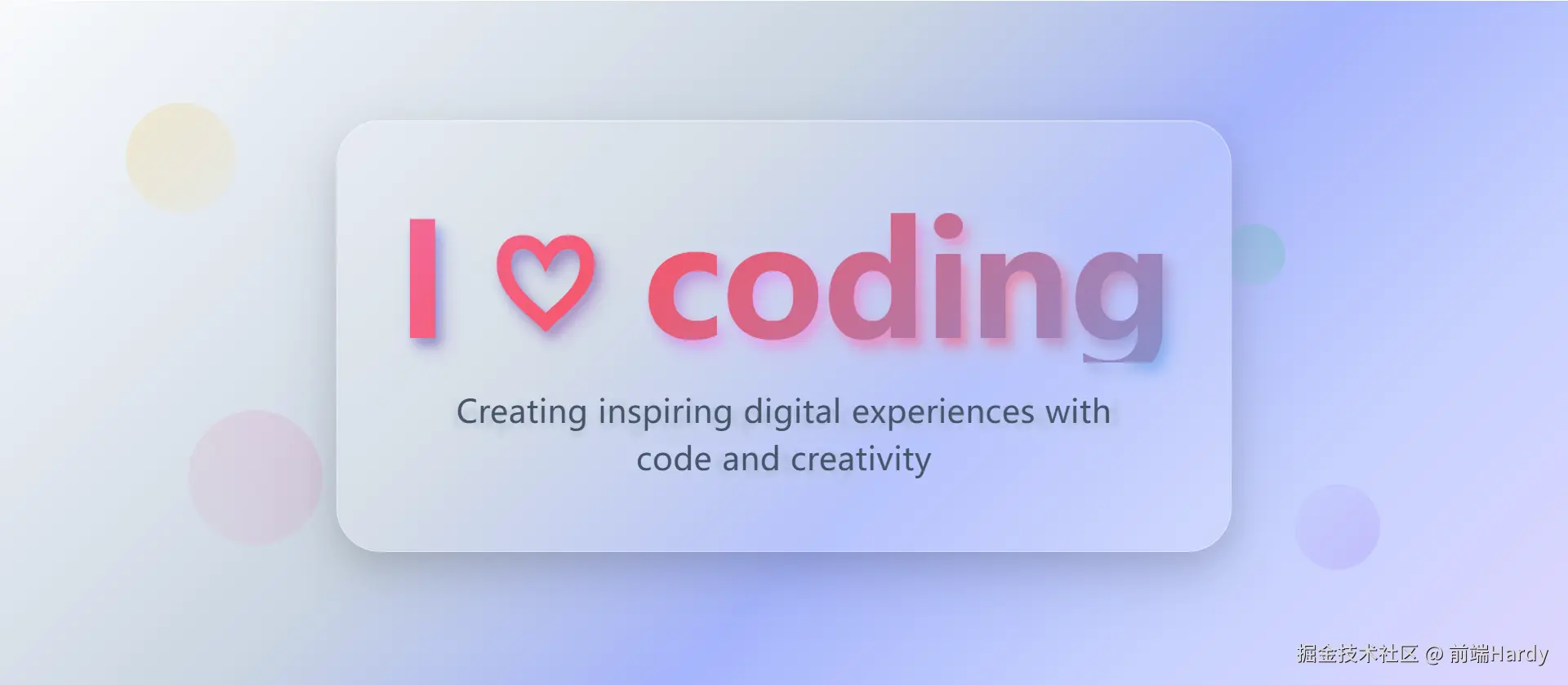
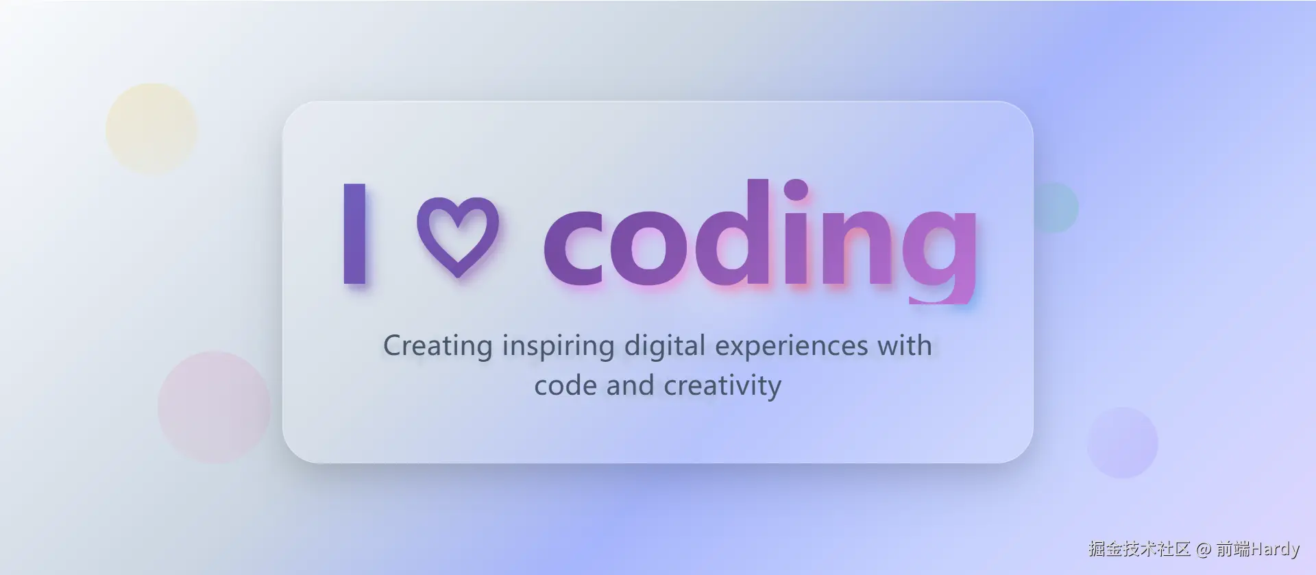
这个 HTML 文件通过 CSS 动画和 JavaScript 交互,创建了一个具有动态背景和 3D 效果的卡片页面。
大家复制代码时,可能会因格式转换出现错乱,导致样式失效。建议先少量复制代码进行测试,若未能解决问题,私信回复源码两字,我会发送完整的压缩包给你。
演示效果
HTML&CSS
html
<!DOCTYPE html>
<html lang="en">

<head>
    <meta charset="UTF-8">
    <meta name="viewport" content="width=device-width, initial-scale=1.0">
    <title>3D卡片</title>
    <style>
        * {
            margin: 0;
            padding: 0;
            box-sizing: border-box;
        }

        body {
            font-family: "Space Grotesk", sans-serif;
            min-height: 100vh;
            background: linear-gradient(135deg,
                    #f8fafc 0%,
                    #e2e8f0 20%,
                    #cbd5e1 40%,
                    #a5b4fc 60%,
                    #c7d2fe 80%,
                    #ddd6fe 100%),
                radial-gradient(circle at 20% 20%,
                    rgba(168, 162, 255, 0.15) 0%,
                    transparent 50%),
                radial-gradient(circle at 80% 80%,
                    rgba(251, 191, 36, 0.12) 0%,
                    transparent 50%),
                radial-gradient(circle at 40% 60%,
                    rgba(34, 197, 94, 0.08) 0%,
                    transparent 50%);
            display: flex;
            align-items: center;
            justify-content: center;
            position: relative;
            overflow: hidden;
            color: #1e293b;
        }

        .floating-shapes {
            position: absolute;
            top: 0;
            left: 0;
            width: 100%;
            height: 100%;
            pointer-events: none;
            z-index: 0;
        }

        .shape {
            position: absolute;
            border-radius: 50%;
            opacity: 0.6;
            animation: float 6s ease-in-out infinite;
        }

        .shape:nth-child(1) {
            width: 90px;
            height: 90px;
            background: linear-gradient(135deg,
                    rgba(251, 191, 36, 0.3),
                    rgba(252, 211, 77, 0.1));
            top: 15%;
            left: 8%;
            animation-delay: 0s;
        }

        .shape:nth-child(2) {
            width: 70px;
            height: 70px;
            background: linear-gradient(135deg,
                    rgba(139, 92, 246, 0.3),
                    rgba(167, 139, 250, 0.1));
            top: 75%;
            right: 12%;
            animation-delay: 2.5s;
        }

        .shape:nth-child(3) {
            width: 110px;
            height: 110px;
            background: linear-gradient(135deg,
                    rgba(236, 72, 153, 0.2),
                    rgba(251, 113, 133, 0.1));
            bottom: 18%;
            left: 12%;
            animation-delay: 4s;
        }

        .shape:nth-child(4) {
            width: 50px;
            height: 50px;
            background: linear-gradient(135deg,
                    rgba(34, 197, 94, 0.3),
                    rgba(74, 222, 128, 0.1));
            top: 35%;
            right: 18%;
            animation-delay: 1.2s;
        }

        @keyframes float {

            0%,
            100% {
                transform: translateY(0) rotate(0deg);
            }

            50% {
                transform: translateY(-25px) rotate(180deg);
            }
        }

        .container {
            text-align: center;
            position: relative;
            z-index: 1;
            padding: 56px 48px;
            border-radius: 36px;
            background: rgba(255, 255, 255, 0.2);
            backdrop-filter: blur(12px);
            border: 1px solid rgba(255, 255, 255, 0.3);
            box-shadow: 0 12px 40px rgba(0, 0, 0, 0.08), 0 4px 16px rgba(0, 0, 0, 0.05),
                inset 0 1px 0 rgba(255, 255, 255, 0.2);
            max-width: 800px;
            transition: transform 0.3s ease, box-shadow 0.3s ease;
        }

        .container:hover {
            transform: translateY(-6px);
            box-shadow: 0 20px 50px rgba(0, 0, 0, 0.12), 0 10px 24px rgba(0, 0, 0, 0.08),
                inset 0 1px 0 rgba(255, 255, 255, 0.2);
        }

        h1 {
            font-size: clamp(60px, 10vw, 136px);
            font-weight: 800;
            background: linear-gradient(135deg,
                    #667eea 0%,
                    #764ba2 25%,
                    #f093fb 50%,
                    #f5576c 75%,
                    #4facfe 100%);
            -webkit-background-clip: text;
            background-clip: text;
            -webkit-text-fill-color: transparent;
            background-size: 400% 400%;
            animation: gradientShift 4s ease infinite;
            letter-spacing: -1.5px;
            line-height: 1.1;
            margin: 0;
            position: relative;
        }

        h1::before {
            content: attr(data-text);
            position: absolute;
            top: 0;
            left: 0;
            z-index: -1;
            background: linear-gradient(135deg,
                    rgba(102, 126, 234, 0.5),
                    rgba(118, 75, 162, 0.5),
                    rgba(240, 147, 251, 0.5),
                    rgba(245, 87, 108, 0.5),
                    rgba(79, 172, 254, 0.5));
            -webkit-background-clip: text;
            background-clip: text;
            -webkit-text-fill-color: transparent;
            transform: translate(4px, 6px);
            filter: blur(4px);
        }

        h1::after {
            content: attr(data-text);
            position: absolute;
            top: 0;
            left: 0;
            z-index: -2;
            background: linear-gradient(135deg,
                    rgba(102, 126, 234, 0.35),
                    rgba(118, 75, 162, 0.35),
                    rgba(240, 147, 251, 0.35),
                    rgba(245, 87, 108, 0.35),
                    rgba(79, 172, 254, 0.35));
            -webkit-background-clip: text;
            background-clip: text;
            -webkit-text-fill-color: transparent;
            transform: translate(8px, 10px);
            filter: blur(8px);
            opacity: 0.8;
        }

        @keyframes gradientShift {

            0%,
            100% {
                background-position: 0% 50%;
            }

            50% {
                background-position: 100% 50%;
            }
        }

        .subtitle {
            font-family: "Inter", sans-serif;
            font-size: clamp(18px, 3vw, 26px);
            font-weight: 500;
            color: #475569;
            margin-top: 20px;
            opacity: 0;
            animation: fadeInUp 1.2s ease-out 0.7s forwards;
            letter-spacing: 0.3px;
            line-height: 1.5;
            max-width: 600px;
            margin-left: auto;
            margin-right: auto;
            position: relative;
        }

        .subtitle::before {
            content: attr(data-text);
            position: absolute;
            top: 0;
            left: 0;
            z-index: -1;
            color: rgba(148, 163, 184, 0.5);
            transform: translate(2px, 3px);
            filter: blur(2px);
            opacity: 0.8;
            pointer-events: none;
        }

        .subtitle::after {
            content: attr(data-text);
            position: absolute;
            top: 0;
            left: 0;
            z-index: -2;
            color: rgba(203, 213, 225, 0.4);
            transform: translate(4px, 6px);
            filter: blur(4px);
            opacity: 0.7;
            pointer-events: none;
        }

        @keyframes fadeInUp {
            from {
                opacity: 0;
                transform: translateY(25px);
            }

            to {
                opacity: 1;
                transform: translateY(0);
            }
        }

        .container::before {
            content: "";
            position: absolute;
            top: 0;
            left: 0;
            right: 0;
            bottom: 0;
            background: radial-gradient(circle 120px at var(--x, 50%) var(--y, 50%),
                    rgba(255, 255, 255, 0.2),
                    transparent 60%);
            border-radius: 36px;
            opacity: 0;
            transition: opacity 0.4s ease;
            pointer-events: none;
            z-index: -1;
        }

        .container:hover::before {
            opacity: 1;
        }
    </style>
</head>

<body>
    <div class="floating-shapes">
        <div class="shape"></div>
        <div class="shape"></div>
        <div class="shape"></div>
        <div class="shape"></div>
    </div>

    <div class="container" id="container">
        <h1 data-text="I ♡ coding">I <span>♡</span> coding</h1>
        <p class="subtitle" data-text="inspiring digital experiences with code and creativity">
            Creating inspiring digital experiences with code and creativity
        </p>
    </div>
    <script>
        const container = document.getElementById("container");
        container.addEventListener("mousemove", (e) => {
            const rect = container.getBoundingClientRect();
            const x = ((e.clientX - rect.left) / rect.width) * 100;
            const y = ((e.clientY - rect.top) / rect.height) * 100;
            container.style.setProperty("--x", x + "%");
            container.style.setProperty("--y", y + "%");
        });

    </script>
</body>

</html>
HTML
- floating-shapes:包含四个 shape,用于创建动态背景的圆形形状。
- container container:卡片容器,包含标题和副标题。
- h1:标题,显示"I ♡ coding",其中"♡"是一个心形图标。
- subtitle:副标题。
CSS
- *:重置所有元素的外边距和内边距,设置盒模型为 border-box。
- body:设置字体为"Space Grotesk",最小高度为视口高度,背景为多个渐变效果,使用 Flexbox 布局居中显示内容,设置颜色为#1e293b。
- .floating-shapes:绝对定位,覆盖整个页面,用于放置动态背景的形状。
- .shape:圆形形状,使用 border-radius: 50%,透明度为 0.6,应用 float 动画。
- .shape:nth-child(n):为每个形状设置不同的大小、位置、背景颜色和动画延迟。
- @keyframes float:定义形状的浮动动画,上下移动并旋转。
- .container:卡片容器,居中显示,带有圆角、模糊背景、边框和阴影效果,最大宽度为 800px,鼠标悬停时上升并增加阴影。
- .container:hover:鼠标悬停时的效果,卡片上升并增加阴影。
- h1:标题,使用 clamp 函数设置响应式字体大小,背景为渐变色,使用 background-clip 和 text-fill-color 实现渐变文字效果,动画 gradientShift 使背景渐变循环移动。
- h1::before 和 h1::after:伪元素,用于创建标题的模糊阴影效果,通过 transform 和 filter 实现。
- .subtitle:副标题,使用 clamp 函数设置响应式字体大小,初始透明度为 0,使用 fadeInUp 动画在页面加载后淡入并向上移动。
- .subtitle::before 和 .subtitle::after:伪元素,用于创建副标题的模糊阴影效果,通过 transform 和 filter 实现。
- @keyframes fadeInUp:定义副标题的淡入向上移动动画。
- .container::before:伪元素,用于创建卡片悬停时的圆形光晕效果,初始透明度为 0,鼠标悬停时变为透明度 1。
- .container:hover::before:鼠标悬停时的效果,光晕显示。
JavaScript 逻辑部分
JavaScript
const container = document.getElementById("container");
container.addEventListener("mousemove", (e) => {
    const rect = container.getBoundingClientRect();
    const x = ((e.clientX - rect.left) / rect.width) * 100;
    const y = ((e.clientY - rect.top) / rect.height) * 100;
    container.style.setProperty("--x", x + "%");
    container.style.setProperty("--y", y + "%");
});- const container = document.getElementById("container");:获取卡片容器元素。
- container.addEventListener("mousemove", (e) => { ... });:为卡片容器添加鼠标移动事件监听器。
- const rect = container.getBoundingClientRect();:获取卡片容器的边界矩形信息。
- const x = ((e.clientX - rect.left) / rect.width) * 100;:计算鼠标相对于卡片容器的水平位置百分比。
- const y = ((e.clientY - rect.top) / rect.height) * 100;:计算鼠标相对于卡片容器的垂直位置百分比。
- container.style.setProperty("--x", x + "%");:设置自定义 CSS 变量--x 为鼠标水平位置百分比。
- container.style.setProperty("--y", y + "%");:设置自定义 CSS 变量--y 为鼠标垂直位置百分比。
各位互联网搭子,要是这篇文章成功引起了你的注意,别犹豫,关注、点赞、评论、分享走一波,让我们把这份默契延续下去,一起在知识的海洋里乘风破浪!