Cesium 实现全球气压可视化与气象时序图的思路
在气象数据可视化领域,基于 Cesium 实现全球气压可视化和气象时序图是一个常见的需求。本文将详细分享实现这两种功能的具体思路和代码实现,希望能为相关开发提供参考。
全球气象时序图实现
气象时序图的核心是在地球表面展示一段时间内气象数据的变化过程,比如全球海水温度的变迁效果。其本质是通过不断替换不同时间段的热力图来实现动态展示效果。
实现方案对比
在开发过程中,尝试了两种不同的实现方案,各有优劣:
-
entity 实体 + CallbackProperty 方案
这种方式通过动态更新实体的图片材质来实现时序效果,但存在一些明显问题:
- 容易出现锯齿现象
- 运行时卡顿严重
- 若改用 primitive + CallbackProperty,会出现 shader 语言报错,需要额外编写 shader 代码,成本较高
具体实现代码如下:
js
window.viewer.entities.add({
    rectangle: {
      coordinates: cesium.Rectangle.fromDegrees(-180.0, -90.0, 180.0, 90.0),
      granularity: cesium.Math.RADIANS_PER_DEGREE * 10,
      material: new cesium.ImageMaterialProperty({
        image: new cesium.CallbackProperty(() => {
          let url = maps.shift()
          maps.push(url)
          return url
        }, false)
      })
    }
})-
SingleTileImageryProvider + ImageryLayer + setInterval 方案
这是最终采用的方案,通过控制图层透明度实现平滑切换效果,性能更优:
- 将气象可视化生成的图片作为贴图添加到图层
- 初始设置透明度为 0
- 使用 setInterval 循环更新图层透明度实现时序效果
需要注意图层添加顺序,以及处理不同地图切换时的图层冲突问题。
具体实现代码
添加时序图层
js
const timingMap = (maps) => {
  for (let i = 0, len = maps.length; i < len; i++) {
    var imageryProvider = new cesium.SingleTileImageryProvider({
      url: maps[i],
      tileHeight: 2700,
      tileWidth: 5400,
      rectangle: cesium.Rectangle.fromDegrees(-180, -90, 180, 90)
    })

    const imageryLayer = new cesium.ImageryLayer(imageryProvider, { alpha: 0 })
    window.viewer.imageryLayers.add(imageryLayer)
    mapLayer.push(imageryLayer)
  }
}
播放时序动画
js
const open = () => {
  close()
  interval = setInterval(() => {
    if (index > mapLayer.length) {
      index = 0
    }
    index++
    const layer1 = mapLayer[index - 1]
    if (layer1) {
      layer1.alpha = 0
    }
    const layer2 = mapLayer[index]
    if (layer2) {
      layer2.alpha = 1
    }
  }, 300)
}
停止播放
js
const close = () => {
  clearInterval(interval)
  try {
    mapLayer[index].alpha = 0
    index = 0
  } catch (error) {
    console.log('播放失败!', error)
  }
}
全球气压可视化实现
全球气压可视化的核心是绘制气压等值线,主要挑战在于数据预处理和高效绘制方式的选择,这直接影响到可视化性能。
实现思路
- 数据预处理:将原始气压数据转换为 GeoJSON 格式,便于 Cesium 加载。考虑到性能,可以将数据处理过程放到 webwork 线程中执行。
- 绘制方式:采用 Cesium.GeoJsonDataSource.load 方法统一加载绘制处理好的 GeoJSON 数据,这种方式能保证绘制效率。
具体实现代码
数据处理
js
// 等压线
const processIsolineData = (originalData) => {
  if (!originalData || !originalData.isoline || !Array.isArray(originalData.isoline)) {
    throw new Error('无效的输入数据格式,缺少isoline数组')
  }

  const lineFeatures = []

  originalData.isoline.forEach((isoline, index) => {
    // 验证点数据格式
    if (!isoline.points || !Array.isArray(isoline.points) || isoline.points.length % 2 !== 0) {
      console.warn(`跳过无效的等值线数据(索引:${index}):点数据格式不正确`)
      return
    }

    const { value } = isoline
    // 转换点数组为[[x1,y1], [x2,y2], ...]格式
    const coordinates = []
    for (let i = 0; i < isoline.points.length; i += 2) {
      const x = isoline.points[i]
      const y = isoline.points[i + 1]
      coordinates.push([x, y, value * 10])
    }
    // 创建线要素(每条等值线对应一条线)
    lineFeatures.push({
      type: 'Feature',
      properties: {
        pressure: value,
        color: getColorByPressure(value) // 存储颜色值
      },
      geometry: {
        type: 'LineString', // 线要素类型
        coordinates: coordinates // 线的坐标数组
      }
    })
  })
  return {
    type: 'FeatureCollection',
    features: lineFeatures
  }
}
气压颜色映射
js
// 气压数值
const breaks = [
  948, 950, 952, 954, 956, 958, 960, 962, 964, 966, 968, 970, 972, 974, 976, 978, 980, 982, 984,
  986, 988, 990, 992, 994, 996, 998, 1000, 1002, 1004, 1006, 1008, 1010, 1012, 1014, 1016, 1018,
  1020, 1022, 1024, 1026, 1028, 1030, 1032, 1034, 1036, 1038, 1040, 1042, 1044, 1046
]
const colors = [
  '#00FF00', // 亮绿
  '#33FF33', // 鲜绿
  '#66FF66', // 浅绿
  '#99FF99', // 淡绿
  '#CCFFCC', // 极浅绿
  '#FFFF99', // 浅黄
  '#FFCC66', // 浅橙
  '#FF9933', // 橙色
  '#FF6600', // 橙红
  '#FF3300', // 鲜红
  '#CC0000' // 深红
]
const getColorByPressure = (pressure) => {
  // 查找气压值在breaks数组中的索引
  const index = breaks.indexOf(pressure)

  // 如果找到索引,计算对应的颜色
  if (index !== -1) {
    // 计算每个颜色需要覆盖的气压值数量
    const colorStep = Math.ceil(breaks.length / colors.length)
    // 确定对应的颜色索引
    const colorIndex = Math.min(Math.floor(index / colorStep), colors.length - 1)
    return colors[colorIndex]
  } else {
    console.warn(`气压值 ${pressure} 不在已知范围内`)
    return '#808080' // 默认灰色
  }
}
绘制气压线
js
// 统一绘制气压线
const drawPressureLine = async (geojsonData) => {
// 直接加载处理后的线要素GeoJSON,为了加载速度贴地属性设置为false
const dataSource = await cesium.GeoJsonDataSource.load(geojsonData, {
clampToGround: false
})
try {
pressureLines = await window.viewer.dataSources.add(dataSource)
const entities = dataSource.entities.values
// 为每条线设置样式
entities.forEach((line) => {
const color = line.properties.color?._value
if (color) line.polyline.material = cesium.Color.fromCssColorString(color).withAlpha(0.6)
})
pressureLines.show = false
} catch (error) {
console.error('绘制等值线失败:', error)
}
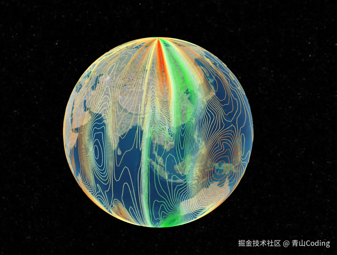
}实现效果
时序图的效果需要上传视频,没那条件录屏了,只上传个全球气压的看一看了,效果如下:
总结
通过本文介绍的方法,可以在 Cesium 中高效实现全球气象时序图和气压可视化功能。气象时序图采用图层透明度切换的方式,既能保证视觉效果又能兼顾性能;气压可视化则通过数据预处理为 GeoJSON 格式,再统一加载绘制,有效解决了大规模数据的展示问题。 在实际应用中,还可以根据具体需求进一步优化,比如添加交互控制、调整颜色映射方案等,以获得更好的用户体验。