这个 HTML 文件是一个漂流瓶效果网页,展示了一个动态的漂流瓶效果,包含液体、光影和动画效果。
大家复制代码时,可能会因格式转换出现错乱,导致样式失效。建议先少量复制代码进行测试,若未能解决问题,私信回复源码两字,我会发送完整的压缩包给你。
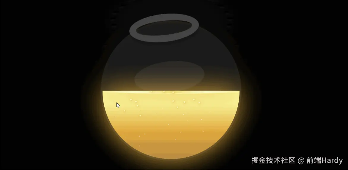
演示效果
HTML&CSS
html
<!DOCTYPE html>
<html lang="en">

<head>
    <meta charset="UTF-8">
    <meta http-equiv="X-UA-Compatible" content="IE=edge">
    <meta name="viewport" content="width=device-width, initial-scale=1.0">
    <title>Document</title>
    <style>
        :root {
            --gold-bright: #faf398;
            --gold-primary: #f9f295;
            --gold-medium: #e0aa3e;
            --gold-dark: #b88a44;

            --bg-dark-primary: #0a0a0a;
            --bg-dark-secondary: #000000;
            --bg-accent: rgba(224, 170, 62, 0.02);

            --bowl-size: clamp(180px, 65vw, 420px);
            --bowl-lip-thickness: max(8px, calc(var(--bowl-size) * 0.05));
            --bowl-glass: rgba(255, 255, 255, 0.08);
            --bowl-rim: #444444;
        }

        body {
            background:
                radial-gradient(1400px 700px at 50% 25%,
                    var(--bg-dark-primary) 0%,
                    var(--bg-dark-secondary) 50%,
                    #000000 80%),
                radial-gradient(ellipse 800px 400px at 50% 100%,
                    var(--bg-accent) 0%,
                    transparent 60%),
                radial-gradient(circle at 80% 20%,
                    rgba(212, 175, 55, 0.02) 0%,
                    transparent 50%),
                radial-gradient(circle at 20% 30%,
                    rgba(156, 175, 136, 0.008) 0%,
                    transparent 40%);
            background-attachment: fixed;
            min-height: 100vh;
            margin: 0;
            color-scheme: dark;
            -webkit-font-smoothing: antialiased;
            text-rendering: optimizeLegibility;
            overflow-x: hidden;
        }

        .container {
            display: flex;
            flex-direction: column;
            align-items: center;
            justify-content: center;
            min-height: 100vh;
            gap: 32px;
            padding: calc(16px + env(safe-area-inset-top)) 16px calc(24px + env(safe-area-inset-bottom));
        }

        @media (max-width: 899px) {
            .container {
                justify-content: flex-start;
                padding-top: max(60px, calc(15vh + env(safe-area-inset-top)));
                gap: 40px;
            }

            .bowl {
                margin: 0 auto;
                position: relative;
                z-index: 10;
                min-width: 180px;
                flex-shrink: 0;
            }

            .label {
                max-width: min(90vw, 380px);
                margin: 0 auto;
                padding: 16px 18px 14px;
                font-size: clamp(0.85rem, 0.8rem + 0.3vw, 0.95rem);
                transform: rotate(-0.2deg);
            }

            body {
                overflow-x: hidden;
            }
        }

        @media (min-width: 900px) {
            .container {
                flex-direction: row;
                justify-content: center;
                gap: 60px;
                padding: 20px;
            }

            .bowl {
                flex-shrink: 0;
            }

            .label {
                max-width: min(420px, 40vw);
                align-self: center;
            }
        }


        h1 {
            margin-top: 0;
            margin-bottom: 8px;
        }

        .bowl {
            position: relative;
            width: var(--bowl-size);
            height: var(--bowl-size);
            background: var(--bowl-glass);
            border-radius: 50%;
            animation: animateRocking 5s ease-in-out infinite;
            transform-origin: center center;
            z-index: 30;
            will-change: transform;
            backface-visibility: hidden;
            box-shadow: inset 0 0 20px rgba(212, 175, 55, 0.05),
                0 0 40px rgba(212, 175, 55, 0.08);
        }

        @keyframes animateRocking {

            0%,
            50%,
            100% {
                transform: rotate(0deg);
            }

            25% {
                transform: rotate(-10deg);
            }

            75% {
                transform: rotate(10deg);
            }
        }

        .bowl::before {
            content: "";
            position: absolute;
            top: calc(var(--bowl-lip-thickness) * -1);
            left: 50%;
            transform: translate(-50%);
            width: 40%;
            height: calc(var(--bowl-lip-thickness) * 2);
            border: var(--bowl-lip-thickness) solid var(--bowl-rim);
            border-radius: 50%;
            box-shadow: 0 10px rgba(0, 0, 0, 0.2), inset 0 0 5px rgba(212, 175, 55, 0.1);
        }

        .bowl::after {
            content: "";
            position: absolute;
            top: 40%;
            left: 50%;
            transform: translate(-50%, -50%);
            border-radius: 50%;
            width: calc(var(--bowl-size) * 0.5);
            height: calc(var(--bowl-size) * 0.22);
            background: rgba(255, 255, 255, 0.06);
        }

        .liquid {
            position: absolute;
            top: 50%;
            left: 5px;
            right: 5px;
            bottom: 5px;
            background: linear-gradient(180deg,
                    var(--gold-bright) 0%,
                    var(--gold-primary) 20%,
                    var(--gold-medium) 60%,
                    var(--gold-dark) 100%);
            border-bottom-left-radius: calc(var(--bowl-size) / 2);
            border-bottom-right-radius: calc(var(--bowl-size) / 2);
            filter: drop-shadow(0 0 40px var(--gold-medium));
            transform-origin: top center;
            animation: keepLevel 5s ease-in-out infinite;
            overflow: hidden;
            will-change: transform;
        }

        @keyframes keepLevel {

            0%,
            50%,
            100% {
                transform: rotate(0deg);
            }

            25% {
                transform: rotate(10deg);
            }

            75% {
                transform: rotate(-10deg);
            }
        }

        .liquid::before {
            content: "";
            position: absolute;
            top: -10px;
            width: 100%;
            height: 20px;
            background: var(--gold-bright);
            border-radius: 50%;
            filter: drop-shadow(0 0 30px var(--gold-medium));
        }

        .liquid-surface {
            position: absolute;
            top: -6px;
            left: -10%;
            width: 120%;
            height: 14px;
            border-radius: 50%;
            background: linear-gradient(90deg,
                    transparent 0%,
                    rgba(255, 255, 255, 0.65) 30%,
                    rgba(212, 175, 55, 0.4) 50%,
                    rgba(255, 255, 255, 0.65) 70%,
                    transparent 100%);
            filter: blur(0.5px);
            opacity: 0.75;
            animation: surfaceShift 6s ease-in-out infinite;
            pointer-events: none;
        }

        @keyframes surfaceShift {

            0%,
            100% {
                transform: translateX(0);
                opacity: 0.7;
            }

            50% {
                transform: translateX(6%);
                opacity: 0.9;
            }
        }

        .glitter {
            position: absolute;
            width: 6px;
            height: 6px;
            border-radius: 50%;
            background: radial-gradient(circle at 30% 30%,
                    #ffffff 0%,
                    var(--gold-primary) 40%,
                    var(--gold-medium) 100%);
            box-shadow: 0 0 8px rgba(224, 170, 62, 0.95);
            pointer-events: none;
            transform: translateY(0);
            animation-name: rise;
            animation-timing-function: cubic-bezier(0.2, 0.9, 0.2, 1);
            animation-iteration-count: infinite;
            opacity: 0.95;
        }

        @keyframes rise {
            0% {
                transform: translateY(0) scale(0.6);
                opacity: 0.9;
            }

            70% {
                opacity: 1;
            }

            100% {
                transform: translateY(-160px) scale(1);
                opacity: 0;
            }
        }

        .spark {
            position: absolute;
            width: 3px;
            height: 3px;
            border-radius: 50%;
            background: radial-gradient(circle at 40% 40%,
                    #fff 0%,
                    rgba(255, 255, 255, 0.85) 45%,
                    rgba(224, 170, 62, 0.9) 100%);
            box-shadow: 0 0 6px rgba(224, 170, 62, 0.85);
            pointer-events: none;
            animation-name: sparkle;
            animation-timing-function: ease-in-out;
            animation-iteration-count: infinite;
            opacity: 0.9;
        }

        @keyframes sparkle {
            0% {
                transform: translateY(0) scale(0.6);
                opacity: 0.8;
                filter: saturate(1);
            }

            40% {
                opacity: 1;
                filter: saturate(1.05);
            }

            100% {
                transform: translateY(-120px) scale(1);
                opacity: 0;
                filter: saturate(1);
            }
        }

        /* Bowl shadow */
        .shadow {
            position: absolute;
            bottom: -35px;
            z-index: -3;
            left: 50%;
            transform: translate(-50%, -50%);
            width: var(--bowl-size);
            height: max(24px, calc(var(--bowl-size) * 0.09));
            background: radial-gradient(closest-side,
                    rgba(0, 0, 0, 0.55),
                    rgba(0, 0, 0, 0.05) 70%,
                    transparent 100%);
            border-radius: 50%;
        }

        @media (prefers-reduced-motion: reduce) {

            .bowl,
            .liquid,
            .glitter,
            .spark,
            .liquid-surface {
                animation: none !important;
            }
        }
    </style>
</head>

<body>
    <div class="container">
        <div class="bowl" aria-hidden="true">
            <div class="liquid" id="liquid">
                <div class="liquid-surface"></div>
            </div>
            <div class="shadow" aria-hidden="true"></div>
        </div>
    </div>
    <script>
        document.addEventListener("DOMContentLoaded", function () {
            const liquid = document.getElementById("liquid");
            if (!liquid) return;

            const prefersReducedMotion =
                typeof window.matchMedia === "function"
                    ? window.matchMedia("(prefers-reduced-motion: reduce)").matches === true
                    : false;
            const isMobile =
                (typeof window.matchMedia === "function" &&
                    window.matchMedia("(max-width: 600px)").matches === true) ||
                ("ontouchstart" in window && navigator.maxTouchPoints > 0);

            const height =
                liquid.clientHeight || parseFloat(getComputedStyle(liquid).height) || 220;

            const glitterCount = prefersReducedMotion ? 0 : isMobile ? 18 : 36;
            const sparkCount = prefersReducedMotion ? 0 : isMobile ? 14 : 28;

            for (let i = 0; i < glitterCount; i++) {
                const glitter = document.createElement("div");
                glitter.className = "glitter";
                const leftPercent = Math.random() * 86 + 6;
                const bottomPx = Math.random() * (height * 0.6);
                glitter.style.left = leftPercent + "%";
                glitter.style.bottom = bottomPx + "px";
                glitter.style.animationDelay = Math.random() * 3 + "s";
                glitter.style.animationDuration = 2.2 + Math.random() * 2.6 + "s"; // single animation
                glitter.style.opacity = 0.6 + Math.random() * 0.4;
                liquid.appendChild(glitter);
            }

            for (let i = 0; i < sparkCount; i++) {
                const spark = document.createElement("div");
                spark.className = "spark";
                const leftPercent = Math.random() * 86 + 6;
                const bottomPx = Math.random() * (height * 0.7);
                spark.style.left = leftPercent + "%";
                spark.style.bottom = bottomPx + "px";
                spark.style.animationDelay = Math.random() * 2 + "s";
                spark.style.animationDuration = 2.0 + Math.random() * 2.0 + "s";
                spark.style.opacity = 0.45 + Math.random() * 0.5;
                liquid.appendChild(spark);
            }
        });

    </script>
</body>

</html>
HTML
- container:容器,用于居中显示内容。
- bowl:碗的容器,包含液体和阴影效果。
- liquid liquid:液体效果。
- liquid-surface:液体表面的波纹效果。
- shadow:碗的阴影效果。
CSS
:root
定义了 CSS 变量,用于在样式中重复使用颜色和尺寸。
body
设置了背景渐变、最小高度、边距、颜色方案等。 使用 background-attachment: fixed 固定背景,确保背景在滚动时不会移动。 设置了 min-height: 100vh 确保内容至少占满整个视口高度。 使用 color-scheme: dark 确保网页在暗色模式下显示。 使用-webkit-font-smoothing: antialiased 和 text-rendering: optimizeLegibility 优化文本渲染。
.container
使用 flex 布局,居中显示内容。 在不同屏幕尺寸下调整布局和间距。
.bowl
定义了碗的大小、背景、边框半径等。 使用 animation 创建摇摆动画。 使用 box-shadow 添加阴影效果。
.liquid
定义了液体的背景渐变、边框半径等。 使用 filter 添加阴影效果。 使用 animation 创建水平摇摆动画。
.liquid-surface
定义了液体表面的波纹效果。 使用 animation 创建水平移动动画。
.glitter 和 .spark
定义了闪光和火花的效果。 使用 animation 创建上升和闪烁动画。
.shadow
定义了碗的阴影效果。 使用 radial-gradient 创建圆形渐变阴影。
@keyframes
定义了动画的关键帧,用于创建摇摆、水平移动、上升和闪烁效果。
JS 逻辑部分
JavaScript
document.addEventListener("DOMContentLoaded", function () {
    const liquid = document.getElementById("liquid");
    if (!liquid) return;

    const prefersReducedMotion =
        typeof window.matchMedia === "function"
            ? window.matchMedia("(prefers-reduced-motion: reduce)").matches === true
            : false;
    const isMobile =
        (typeof window.matchMedia === "function" &&
            window.matchMedia("(max-width: 600px)").matches === true) ||
        ("ontouchstart" in window && navigator.maxTouchPoints > 0);

    const height =
        liquid.clientHeight || parseFloat(getComputedStyle(liquid).height) || 220;

    const glitterCount = prefersReducedMotion ? 0 : isMobile ? 18 : 36;
    const sparkCount = prefersReducedMotion ? 0 : isMobile ? 14 : 28;

    for (let i = 0; i < glitterCount; i++) {
        const glitter = document.createElement("div");
        glitter.className = "glitter";
        const leftPercent = Math.random() * 86 + 6;
        const bottomPx = Math.random() * (height * 0.6);
        glitter.style.left = leftPercent + "%";
        glitter.style.bottom = bottomPx + "px";
        glitter.style.animationDelay = Math.random() * 3 + "s";
        glitter.style.animationDuration = 2.2 + Math.random() * 2.6 + "s";
        glitter.style.opacity = 0.6 + Math.random() * 0.4;
        liquid.appendChild(glitter);
    }

    for (let i = 0; i < sparkCount; i++) {
        const spark = document.createElement("div");
        spark.className = "spark";
        const leftPercent = Math.random() * 86 + 6;
        const bottomPx = Math.random() * (height * 0.7);
        spark.style.left = leftPercent + "%";
        spark.style.bottom = bottomPx + "px";
        spark.style.animationDelay = Math.random() * 2 + "s";
        spark.style.animationDuration = 2.0 + Math.random() * 2.0 + "s";
        spark.style.opacity = 0.45 + Math.random() * 0.5;
        liquid.appendChild(spark);
    }
});
DOMContentLoaded 事件
确保文档加载完成后再执行脚本。
prefersReducedMotion 和 isMobile
检测用户是否偏好减少动画效果,以及是否在移动设备上。
glitterCount 和 sparkCount
根据用户偏好和设备类型动态调整闪光和火花的数量。
for 循环
动态生成闪光和火花元素。 使用 Math.random()生成随机位置、延迟时间和持续时间。 使用 appendChild 将生成的元素添加到液体容器中。
各位互联网搭子,要是这篇文章成功引起了你的注意,别犹豫,关注、点赞、评论、分享走一波,让我们把这份默契延续下去,一起在知识的海洋里乘风破浪!