文章的目的为了记录使用QT QML开发学习的经历。开发流程和要点有些记忆模糊,赶紧记录,防止忘记。
相关链接:
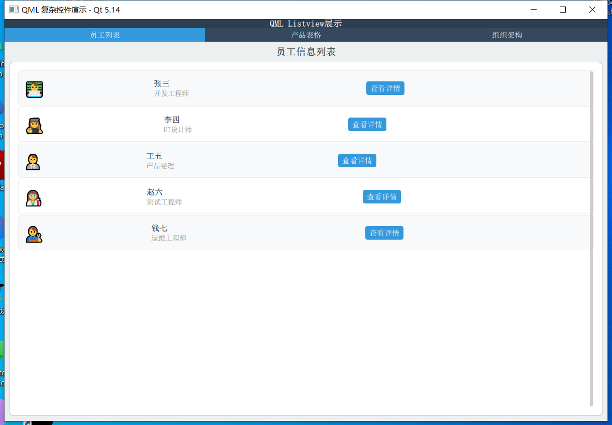
开源 C++ QT QML 开发(四)复杂控件--Listview
开源 C++ QT QML 开发(五)复杂控件--Gridview
推荐链接:
开源 C# 快速开发(十六)数据库--sqlserver增删改查
本章节主要内容是:介绍复杂控件Listview的使用方法,包括普通列表,表格,树形列表。
1.代码分析
2.所有源码
3.效果演示
一、代码分析
以下是对修正后代码的详细函数级分析:
-
主应用程序窗口 (ApplicationWindow)
ApplicationWindow {
id: window
width: 1200
height: 800
title: "QML 复杂控件演示 - Qt 5.14"
visible: true
功能分析:
ApplicationWindow 是应用程序的主窗口
id: window 为窗口创建唯一标识符,便于在其他组件中引用
width 和 height 设置窗口初始尺寸
visible: true 使窗口可见,如果为 false 则窗口隐藏
- 数据模型定义
ListModel - 员工列表数据
ListModel {
id: listModel
ListElement { name: "张三"; role: "开发工程师"; avatar: "👨💻" }
// ... 更多数据
}函数分析:
ListModel 是动态数据模型,支持运行时修改
每个 ListElement 创建一个数据项
数据通过 model.name、model.role 等方式在委托中访问
树形结构数据模型
ListModel {
    id: treeModel
    ListElement {
        name: "公司组织"; depth: 0; isExpanded: true; hasChildren: true; isCategory: true
    }
    // ... 更多层级数据
}
关键属性分析:
depth: 控制缩进层级,实现树形视觉效果
isExpanded: 控制节点展开状态
hasChildren: 标识是否有子节点,决定显示箭头还是圆点
isCategory: 区分分类节点和叶子节点,影响文字样式
- 员工列表页面 (ListView 实现)
ListView 配置
函数分析:
anchors.fill: parent - 填充父容器
ListView {
    id: listView
    anchors.fill: parent
    anchors.margins: 5
    model: listModel
    clip: true
    spacing: 2
}
anchors.margins: 5 - 设置边距
model: listModel - 绑定数据模型
clip: true - 启用裁剪,防止内容溢出
spacing: 2 - 设置项间距
委托函数 (Delegate)
delegate: Rectangle {
    width: listView.width
    height: 70
    color: index % 2 === 0 ? "#f8f9fa" : "#ffffff"
    radius: 5
    border.color: "#e9ecef"
}
函数分析:
width: listView.width - 宽度与 ListView 相同
height: 70 - 固定高度
color: index % 2 === 0 ? "#f8f9fa" : "#ffffff" - 交替背景色
index 是 ListView 提供的当前项索引
使用三元运算符实现奇偶行不同颜色
按钮点击处理
Button {
    // ... 样式配置
    onClicked: console.log("查看员工:", name)
}
函数分析:
onClicked - 按钮点击信号处理器
console.log("查看员工:", name) - 输出日志,实际应用中可替换为具体业务逻辑
name 来自数据模型的 name 字段
- 产品表格页面 (ListView 模拟 TableView)
表头实现
header: Row {
    width: tableView.width
    height: 50
    spacing: 1

    Repeater {
        model: ["产品名称", "分类", "价格", "库存"]

        Rectangle {
            width: {
                switch(modelData) {
                    case "产品名称": return 200;
                    case "分类": return 150;
                    case "价格": return 120;
                    case "库存": return 100;
                    default: return 100;
                }
            }
            // ... 其他配置
        }
    }
}
函数分析:
Repeater 根据字符串数组动态创建表头单元格
modelData 是 Repeater 中当前迭代的数据项
switch(modelData) 根据列名返回不同的列宽
使用函数表达式动态计算宽度表格数据行
delegate: Row {
    width: tableView.width
    height: 50
    spacing: 1

    property var columnData: [product, category, price, stock]
    property var columnWidths: [200, 150, 120, 100]

    Repeater {
        model: 4

        Rectangle {
            width: parent.columnWidths[index]
            height: 50
            color: {
                if (tableView.index % 2 === 0) {
                    return "#f8f9fa"
                } else {
                    return "#ffffff"
                }
            }
            // ... 文字颜色逻辑
        }
    }
}
关键函数分析:
property var columnData - 定义行数据数组
property var columnWidths - 定义列宽数组
Repeater { model: 4 } - 创建4个单元格
parent.columnWidthsindex - 根据索引获取对应列宽
tableView.index % 2 === 0 - 实现表格行的斑马纹效果
条件颜色设置
color: {
    if (index === 2) { // 价格列
        return "#e74c3c"
    } else if (index === 3) { // 库存列
        return parseInt(parent.parent.columnData[index]) < 50 ? "#e67e22" : "#27ae60"
    } else {
        return "#2c3e50"
    }
}
函数分析:
使用多条件判断设置不同列的文字颜色
parseInt(parent.parent.columnDataindex) - 将库存字符串转换为数字
三元运算符 ? : 根据库存数量返回不同颜色
- 组织架构页面 (ListView 模拟 TreeView)
可见性控制函数
function isItemVisible() {
    // 简单的可见性检查(实际项目中需要更复杂的逻辑)
    if (depth === 0) return true;
    // 这里简化处理,实际应该检查父级是否展开
    return true;
}
函数分析:
这个函数控制树节点是否显示
当前实现是简化版本,实际需要递归检查所有父级节点的展开状态
depth === 0 确保根节点始终显示
树形缩进实现
Row {
    anchors.fill: parent
    anchors.leftMargin: 10 + depth * 20  // 关键缩进计算
    spacing: 8
    // ... 图标和文字
}
函数分析:
anchors.leftMargin: 10 + depth * 20 - 根据深度计算缩进
depth 来自数据模型的层级信息
每增加一层,缩进增加20像素
基础缩进10像素
动态图标显示
Text {
    text: {
        if (hasChildren) {
            return isExpanded ? "▼" : "►"
        } else {
            return "•"
        }
    }
    // ... 样式
}
函数分析:
使用函数表达式动态返回图标字符
hasChildren 判断是否为父节点
isExpanded ? "▼" : "►" - 根据展开状态返回向下或向右箭头
叶子节点显示圆点符号
点击事件处理
MouseArea {
    anchors.fill: parent
    onClicked: {
        console.log("点击节点:", name, "深度:", depth)
        if (hasChildren) {
            // 切换展开状态
            treeModel.setProperty(index, "isExpanded", !isExpanded)
        }
    }
}
关键函数分析:
onClicked - 鼠标点击事件处理器
console.log - 调试输出,显示节点信息
treeModel.setProperty(index, "isExpanded", !isExpanded) - 动态修改模型数据
index - 当前项在模型中的索引
"isExpanded" - 要修改的属性名
!isExpanded - 取反当前值,实现切换
- 布局和样式函数
StackLayout 页面切换
StackLayout {
    currentIndex: tabBar.currentIndex
    // ... 三个页面
}
函数分析:
currentIndex 绑定到 TabBar 的当前选中索引
当用户切换选项卡时自动切换显示的页面
条件样式设置
qaml
background: Rectangle {
color: tabBar.currentIndex === 0 ? "#3498db" : "transparent"
}
函数分析:
使用条件表达式设置选中状态的背景色
当前选项卡显示蓝色,其他为透明
二、所有源码
main.qml文件源码
import QtQuick 2.14
import QtQuick.Controls 2.14
import QtQuick.Layouts 1.14
import Qt.labs.qmlmodels 1.0
ApplicationWindow {
id: window
width: 1200
height: 800
title: "QML 复杂控件演示 - Qt 5.14"
visible: true
// 模拟数据模型
ListModel {
id: listModel
ListElement { name: "张三"; role: "开发工程师"; avatar: "👨💻" }
ListElement { name: "李四"; role: "UI设计师"; avatar: "👩🎨" }
ListElement { name: "王五"; role: "产品经理"; avatar: "👨💼" }
ListElement { name: "赵六"; role: "测试工程师"; avatar: "👩🔬" }
ListElement { name: "钱七"; role: "运维工程师"; avatar: "👨🔧" }
}
ListModel {
id: tableModel
ListElement { product: "笔记本电脑"; category: "电子产品"; price: "¥5,999"; stock: "45" }
ListElement { product: "无线鼠标"; category: "电子产品"; price: "¥199"; stock: "120" }
ListElement { product: "机械键盘"; category: "电子产品"; price: "¥699"; stock: "78" }
ListElement { product: "办公椅"; category: "家具"; price: "¥1,299"; stock: "23" }
ListElement { product: "显示器"; category: "电子产品"; price: "¥2,499"; stock: "34" }
}
// 树形结构数据模型
ListModel {
id: treeModel
ListElement {
name: "公司组织"; depth: 0; isExpanded: true; hasChildren: true; isCategory: true
}
ListElement {
name: "技术部"; depth: 1; isExpanded: true; hasChildren: true; isCategory: true
}
ListElement {
name: "前端组"; depth: 2; isExpanded: false; hasChildren: false; isCategory: false
}
ListElement {
name: "后端组"; depth: 2; isExpanded: false; hasChildren: false; isCategory: false
}
ListElement {
name: "移动端组"; depth: 2; isExpanded: false; hasChildren: false; isCategory: false
}
ListElement {
name: "设计部"; depth: 1; isExpanded: false; hasChildren: true; isCategory: true
}
ListElement {
name: "UI设计"; depth: 2; isExpanded: false; hasChildren: false; isCategory: false
}
ListElement {
name: "UX设计"; depth: 2; isExpanded: false; hasChildren: false; isCategory: false
}
ListElement {
name: "产品部"; depth: 1; isExpanded: false; hasChildren: true; isCategory: true
}
ListElement {
name: "产品策划"; depth: 2; isExpanded: false; hasChildren: false; isCategory: false
}
ListElement {
name: "需求分析"; depth: 2; isExpanded: false; hasChildren: false; isCategory: false
}
}
// 自定义标题栏
header: ToolBar {
background: Rectangle {
color: "#2c3e50"
}
Label {
text: "QML Listview展示"
color: "white"
font.pixelSize: 18
font.bold: true
anchors.centerIn: parent
}
}
// 主内容区域
Page {
anchors.fill: parent
background: Rectangle {
color: "#ecf0f1"
}
TabBar {
id: tabBar
width: parent.width
background: Rectangle {
color: "#34495e"
}
TabButton {
text: "员工列表"
background: Rectangle {
color: tabBar.currentIndex === 0 ? "#3498db" : "transparent"
}
contentItem: Text {
text: parent.text
color: "white"
horizontalAlignment: Text.AlignHCenter
verticalAlignment: Text.AlignVCenter
}
}
TabButton {
text: "产品表格"
background: Rectangle {
color: tabBar.currentIndex === 1 ? "#3498db" : "transparent"
}
contentItem: Text {
text: parent.text
color: "white"
horizontalAlignment: Text.AlignHCenter
verticalAlignment: Text.AlignVCenter
}
}
TabButton {
text: "组织架构"
background: Rectangle {
color: tabBar.currentIndex === 2 ? "#3498db" : "transparent"
}
contentItem: Text {
text: parent.text
color: "white"
horizontalAlignment: Text.AlignHCenter
verticalAlignment: Text.AlignVCenter
}
}
}
StackLayout {
anchors {
top: tabBar.bottom
left: parent.left
right: parent.right
bottom: parent.bottom
margins: 10
}
currentIndex: tabBar.currentIndex
// ListView 页面
Rectangle {
color: "transparent"
ColumnLayout {
anchors.fill: parent
spacing: 10
Label {
text: "员工信息列表"
font.pixelSize: 20
font.bold: true
color: "#2c3e50"
Layout.alignment: Qt.AlignHCenter
}
Frame {
Layout.fillWidth: true
Layout.fillHeight: true
background: Rectangle {
color: "white"
radius: 8
border.color: "#bdc3c7"
}
ListView {
id: listView
anchors.fill: parent
anchors.margins: 5
model: listModel
clip: true
spacing: 2
delegate: Rectangle {
width: listView.width
height: 70
color: index % 2 === 0 ? "#f8f9fa" : "#ffffff"
radius: 5
border.color: "#e9ecef"
RowLayout {
anchors.fill: parent
anchors.margins: 10
spacing: 15
Text {
text: avatar
font.pixelSize: 30
Layout.alignment: Qt.AlignVCenter
}
ColumnLayout {
Layout.fillWidth: true
spacing: 5
Text {
text: name
font.pixelSize: 16
font.bold: true
color: "#2c3e50"
}
Text {
text: role
font.pixelSize: 14
color: "#7f8c8d"
}
}
Button {
text: "查看详情"
Layout.alignment: Qt.AlignVCenter
background: Rectangle {
color: "#3498db"
radius: 4
}
contentItem: Text {
text: parent.text
color: "white"
horizontalAlignment: Text.AlignHCenter
verticalAlignment: Text.AlignVCenter
}
onClicked: console.log("查看员工:", name)
}
}
}
ScrollBar.vertical: ScrollBar {
policy: ScrollBar.AlwaysOn
}
}
}
}
}
// TableView 页面
Rectangle {
color: "transparent"
ColumnLayout {
anchors.fill: parent
spacing: 10
Label {
text: "产品库存表格"
font.pixelSize: 20
font.bold: true
color: "#2c3e50"
Layout.alignment: Qt.AlignHCenter
}
Frame {
Layout.fillWidth: true
Layout.fillHeight: true
background: Rectangle {
color: "white"
radius: 8
border.color: "#bdc3c7"
}
ListView {
id: tableView
anchors.fill: parent
anchors.margins: 5
model: tableModel
clip: true
interactive: false
header: Row {
width: tableView.width
height: 50
spacing: 1
Repeater {
model: ["产品名称", "分类", "价格", "库存"]
Rectangle {
width: {
switch(modelData) {
case "产品名称": return 200;
case "分类": return 150;
case "价格": return 120;
case "库存": return 100;
default: return 100;
}
}
height: 50
color: "#34495e"
Text {
text: modelData
anchors.centerIn: parent
color: "white"
font.bold: true
font.pixelSize: 14
}
}
}
}
delegate: Row {
width: tableView.width
height: 50
spacing: 1
property var columnData: [product, category, price, stock]
property var columnWidths: [200, 150, 120, 100]
Repeater {
model: 4
Rectangle {
width: parent.columnWidths[index]
height: 50
color: {
if (tableView.index % 2 === 0) {
return "#f8f9fa"
} else {
return "#ffffff"
}
}
border.color: "#e9ecef"
Text {
text: parent.parent.columnData[index]
anchors.centerIn: parent
color: {
if (index === 2) { // 价格列
return "#e74c3c"
} else if (index === 3) { // 库存列
return parseInt(parent.parent.columnData[index]) < 50 ? "#e67e22" : "#27ae60"
} else {
return "#2c3e50"
}
}
font.pixelSize: 14
font.bold: index === 2 || index === 3
}
}
}
}
ScrollBar.vertical: ScrollBar {
policy: ScrollBar.AlwaysOn
}
}
}
}
}
// TreeView 页面 (使用 ListView 模拟)
Rectangle {
color: "transparent"
ColumnLayout {
anchors.fill: parent
spacing: 10
Label {
text: "公司组织架构"
font.pixelSize: 20
font.bold: true
color: "#2c3e50"
Layout.alignment: Qt.AlignHCenter
}
Frame {
Layout.fillWidth: true
Layout.fillHeight: true
background: Rectangle {
color: "white"
radius: 8
border.color: "#bdc3c7"
}
ListView {
id: treeListView
anchors.fill: parent
anchors.margins: 5
model: treeModel
clip: true
delegate: Item {
width: treeListView.width
height: 40
visible: isItemVisible()
function isItemVisible() {
// 简单的可见性检查(实际项目中需要更复杂的逻辑)
if (depth === 0) return true;
// 这里简化处理,实际应该检查父级是否展开
return true;
}
Rectangle {
anchors.fill: parent
color: index % 2 === 0 ? "#f8f9fa" : "#ffffff"
Row {
anchors.fill: parent
anchors.leftMargin: 10 + depth * 20
spacing: 8
Text {
text: {
if (hasChildren) {
return isExpanded ? "▼" : "►"
} else {
return "•"
}
}
color: "#3498db"
font.pixelSize: 12
anchors.verticalCenter: parent.verticalCenter
}
Text {
text: name
color: isCategory ? "#2c3e50" : "#7f8c8d"
font.pixelSize: 14
font.bold: isCategory
anchors.verticalCenter: parent.verticalCenter
}
}
}
MouseArea {
anchors.fill: parent
onClicked: {
console.log("点击节点:", name, "深度:", depth)
if (hasChildren) {
// 切换展开状态
treeModel.setProperty(index, "isExpanded", !isExpanded)
}
}
}
}
ScrollBar.vertical: ScrollBar {
policy: ScrollBar.AlwaysOn
}
}
}
}
}
}
}
}TreeElement.qml文件源码// TreeModel.qml
pragma Singleton
import QtQml 2.14
QtObject {
id: root
property list<TreeElement> children
function appendChild(element) {
children.push(element)
}
}TreeModel.qml文件源码
// TreeModel.qml
pragma Singleton
import QtQml 2.14

QtObject {
    id: root

    property list<TreeElement> children

    function appendChild(element) {
        children.push(element)
    }
}三、效果演示