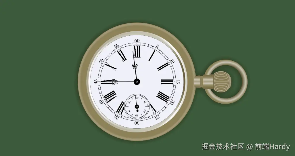
该 HTML 文件是一款基于 SVG 绘制的高精度实时同步时钟,通过 CSS 动画实现时针、分针、秒针的真实转速,搭配径向 / 线性渐变、模糊光影、精细刻度等视觉效果,同时通过 JavaScript 与系统时间同步,兼具技术实现性与视觉观赏性。
大家复制代码时,可能会因格式转换出现错乱,导致样式失效。建议先少量复制代码进行测试,若未能解决问题,私信回复源码两字,我会发送完整的压缩包给你。
演示效果

HTML&CSS
html
<!DOCTYPE html>
<html lang="en">

<head>
    <meta charset="UTF-8">
    <meta name="viewport" content="width=device-width, initial-scale=1.0">
    <title>公众号关注:前端Hardy</title>
    <style>
        @import url('https://fonts.googleapis.com/css2?family=Libre+Bodoni&display=swap');

        :root {
            --c0: #000;
            --c1: #fff;
            --c2: #f0f0f8;
            --s1: hsl(45, 30%, 30%);
            --s2: hsl(46, 23%, 45%);
            --s3: hsl(48, 20%, 60%);
            --s4: hsl(50, 15%, 75%);
        }

        body {
            margin: 0;
            height: 100vh;
            overflow: hidden;
            background: hsl(120, 20%, 30%);
            display: flex;
            align-items: center;
            justify-content: center;
        }

        svg {
            width: 50%;
            height: 50%;
            color-interpolation: sRGB;
            color-interpolation-filters: sRGB;
        }

        #hourly {
            animation: round 43200s var(--s) linear infinite;
        }

        #minutely {
            animation: round 3600s var(--s) linear infinite;
        }

        #secondly {
            animation: round 60s var(--s) linear infinite;
        }

        @keyframes round {
            from {
                transform: rotate(0deg)
            }

            to {
                transform: rotate(360deg)
            }
        }
    </style>
</head>

<body>
    <svg viewBox="-300 -300 850 600" style="filter:drop-shadow(#221c -2px 0px 10px)">
        <filter id="f1">
            <feFlood flood-color="var(--s1)" />
            <feComposite in2="SourceGraphic" operator="in" />
            <feGaussianBlur stdDeviation="2" result="a" />
            <feGaussianBlur in="SourceGraphic" stdDeviation="2" />
            <feComposite in2="SourceGraphic" operator="in" />
            <feMerge>
                <feMergeNode in="a" />
                <feMergeNode in="SourceGraphic" />
            </feMerge>
        </filter>
        <clipPath id="cp">
            <circle r="280" />
        </clipPath>
        <radialGradient id="rg1" cx="-40" cy="0" r="280" gradientUnits="userSpaceOnUse">
            <stop offset=".1" stop-color="var(--s1)" />
            <stop offset=".9" stop-color="var(--s4)" />
            <stop offset=".95" stop-color="var(--c1)" />
            <stop offset="1" stop-color="var(--s4)" />
        </radialGradient>
        <radialGradient id="rg2" cx="424" cy="-1" r="102" gradientUnits="userSpaceOnUse">
            <stop offset=".75" stop-color="var(--s1)" />
            <stop offset=".9" stop-color="var(--s4)" />
            <stop offset="1" stop-color="var(--s2)" />
        </radialGradient>
        <linearGradient id="lg1" x1="-230" x2="230" y1="20" y2="-20" gradientUnits="userSpaceOnUse">
            <stop offset="0" stop-color="var(--c1)" />
            <stop offset=".3" stop-color="var(--s4)" />
            <stop offset=".85" stop-color="var(--s4)" />
            <stop offset="1" stop-color="var(--s1)" />
        </linearGradient>
        <linearGradient id="lg2" x1="0" x2="0" y1="39" y2="-41" gradientUnits="userSpaceOnUse">
            <stop offset="0" stop-color="var(--s1)" />
            <stop offset=".25" stop-color="var(--s2)" />
            <stop offset=".39" stop-color="var(--s4)" />
            <stop offset=".48" stop-color="var(--s3)" />
            <stop offset=".52" stop-color="var(--s3)" />
            <stop offset=".61" stop-color="var(--s4)" />
            <stop offset=".75" stop-color="var(--s2)" />
            <stop offset="1" stop-color="var(--s1)" />
        </linearGradient>
        <circle r="280.5" style="fill:var(--s2)" />
        <circle r="274" cx="-1" style="fill:none;stroke:var(--c1);stroke-width:2;filter:blur(4px);clip-path:url(#cp)" />
        <circle r="92" cx="420" style="fill:none;stroke:url(#rg2);stroke-width:26" />
        <path d="M 300,-28 C 305,-26 310,-26 315,-30 V 30 C 310,26 305,26 300,28 Z"
            style="fill:var(--s2);stroke:var(--s1)" />
        <path
            d="M318 35H321A14 2 0 01349 35H365V-35H349A14 2 0 01321-35H318C316-35 315-34 315-32V32C315 34 316 35 318 35ZM297 30C299 30 300 29 300 27V-27C300-29 299-30 297-30L275-27C268-12 268,12 275,27Z"
            style="fill:url(#lg2)" />
        <g style="fill:var(--s2);stroke:var(--s4);stroke-width:2;stroke-opacity:0.7">
            <path d="M 365,-36A50 50 0 0 1 445,-18V18A50 50 0 0 1 365,36" style="fill:var(--s2);stroke:var(--s2)" />
            <path d="M 365,-36A50 50 0 0 1 445,-18V18A50 50 0 0 1 365,36" style="filter:url(#f1)" />
            <path d="M 365,-30A50 44 0 0 1 445,-15V15A50 44 0 0 1 365,30" style="filter:url(#f1)" />
            <path d="M 365,-24A50 38 0 0 1 445,-12V12A50 38 0 0 1 365,24" style="filter:url(#f1)" />
            <path d="M 365,-18A50 30 0 0 1 445,-9V9A50 30 0 0 1 365,18" style="filter:url(#f1)" />
            <path d="M 365,-12A50 21 0 0 1 445,-6V6A50 21 0 0 1 365,12" style="filter:url(#f1)" />
            <path d="M 365,-6A50 12 0 0 1 445,-3V3A50 12 0 0 1 365,6" style="filter:url(#f1)" />
            <path d="M 365,0 445,0" style="stroke-opacity:0.7;filter:blur(.8px)" />
        </g>
        <circle r="234" style="fill:var(--s4);stroke:url(#rg1);stroke-width:12" />
        <circle r="222" style="fill:var(--c2);stroke:#333" />
        <circle r="226" style="fill:none;stroke:url(#lg1);stroke-width:8" />
        <g style="text-anchor:middle;font-family:'Libre Bodoni';font-size:20px;letter-spacing:-.8px">
            <text y="-188">60</text>
            <text y="-188" transform="rotate(30)">5</text>
            <text y="-188" transform="rotate(60)">10</text>
            <text y="-188" transform="rotate(90)">15</text>
            <text y="-188" transform="rotate(120)">20</text>
            <text y="-188" transform="rotate(150)">25</text>
            <text y="-188" transform="rotate(180)">30</text>
            <text y="-188" transform="rotate(210)">35</text>
            <text y="-188" transform="rotate(240)">40</text>
            <text y="-188" transform="rotate(-90)">45</text>
            <text y="-188" transform="rotate(-60)">50</text>
            <text y="-188" transform="rotate(-30)">55</text>
            <animateTransform attributeName="transform" type="rotate" values="0;0;360;360;0"
                keyTimes="0;.4516;.5;.9516;1" begin="0s" dur="62s" repeatCount="indefinite" />
        </g>
        <g>
            <path
                d="M-17-171V-170H-14L-9.75-136.75-14-116H-17V-115H-10V-116H-13L-9.34-133.75-7-115H17V-116H14V-170H17V-171H-6V-170H-3L-6.6-152.25-9-171ZM-2-170H1V-116H-2L-6.25-149.25ZM6-170H9V-116H6Z" />
            <path d="M-5.5-171V-170H-2.5V-116H-5.5V-115H5.5V-116H2.5V-170H5.5V-171Z" transform="rotate(30)" />
            <path d="M-9.5-171V-170H-6.5V-116H-9.5V-115H9.5V-116H6.5V-170H9.5V-171ZM-1.5-170H1.5V-116H-1.5Z"
                transform="rotate(60)" />
            <path
                d="M-13.5-171V-170H-10.5V-116H-13.5V-115H13.5V-116H10.5V-170H13.5V-171ZM-5.5-170H-2.5V-116H-5.5ZM2.5-170H5.5V-116H2.5Z"
                transform="rotate(90)" />
            <path
                d="M-17.5-171V-170H-14.5V-116H-17.5V-115H17.5V-116H14.5V-170H17.5V-171ZM-9.5-170H-6.5V-116H-9.5ZM-1.5-170H1.5V-116H-1.5ZM6.5-170H9.5V-116H6.5Z"
                transform="rotate(120)" />
            <path d="M-12.5-171V-170H-9.5L-2.5-115H-1.5L5.5-170H8.5V-171H1.5V-170H4.5L0-134.6-4.5-170H-1.5V-171Z"
                transform="rotate(150)" />
            <path
                d="M-14.5-171V-170H-11.5L-4.5-115H-3.5L3.5-170H6.5V-116H3.5V-115H14.5V-116H11.5V-170H14.5V-171H-.5V-170H2.5L-2-134.6-6.5-170H-3.5V-171Z"
                transform="rotate(180)" />
            <path
                d="M-17-171V-170H-14L-8.5-115H-7.5L-2-170H1V-116H-2V-115H17V-116H14V-170H17V-171H-6V-170H-3L-5.9-138.8-9-171ZM6-170H9V-116H6Z"
                transform="rotate(210)" />
            <path
                d="M-20-171V-170H-17L-11.5-115H-10.5L-5-170H-2V-116H-5V-115H22V-116H19V-170H22V-171H-9V-170H-6L-8.9-138.8-12-171ZM3-170H6V-116H3ZM11-170H14V-116H11Z"
                transform="rotate(240)" />
            <path
                d="M-13-171V-170H-10V-116H-13V-115H2V-116H-1L2.66-133.75 5-115H13V-116H10L5.75-149.25 10-170H13V-171H6V-170H9L5.4-152.25 3-171ZM-5-170H-2L2.25-136.75-2-116H-5Z"
                transform="rotate(-90)" />
            <path
                d="M-9-171V-170H-6L-1.75-136.75-6-116H-9V-115H-2V-116H-5L-1.34-133.75 1-115H9V-116H6L1.75-149.25 6-170H9V-171H2V-170H5L1.4-152.25-1-171Z"
                transform="rotate(-60)" />
            <path
                d="M-13-171V-170H-10L-5.75-136.75-10-116H-13V-115H-6V-116H-9L-5.34-133.75-3-115H13V-116H10V-170H13V-171H-2V-170H1L-2.6-152.25-5-171ZM2-170H5V-116H2L-2.25-149.25Z"
                transform="rotate(-30)" />
            <animateTransform attributeName="transform" type="rotate" values="0;0;360;360;0"
                keyTimes="0;.4681;.5;.9681;1" begin="0s" dur="94s" repeatCount="indefinite" />
        </g>
        <circle r="185" style="fill:none;stroke:var(--c0)" />
        <circle r="175" style="fill:none;stroke:var(--c0)" />
        <circle pathLength="900" r="180"
            style="fill:none;stroke:var(--c0);stroke-width:10;stroke-dasharray:1, 14, 1, 14, 1, 14, 1, 29;stroke-dashoffset:-14.5" />
        <circle pathLength="900" r="180"
            style="fill:none;stroke:var(--c0);stroke-width:3;stroke-linecap:round;stroke-dasharray:0, 75" />
        <g transform="translate(0,118)"
            style="text-anchor:middle;font-family:'Libre Bodoni';font-size:12px;letter-spacing:-.8px">
            <circle r="60" style="fill:var(--c2);stroke:var(--c0)" />
            <circle pathLength="600" r="54"
                style="fill:none;stroke:var(--c0);stroke-width:6;stroke-dasharray:2, 8;stroke-dashoffset:1" />
            <path d="M58 0H40M29-50.2 20-34.6M-29-50.2-20-34.6M-58 0-40 0M-29 50.2-20 34.6M29 50.2 20 34.6"
                style="fill:none;stroke:var(--c0);stroke-width:1.2" />
            <text y="-38">60</text>
            <text y="-38" transform="rotate(60)">10</text>
            <text y="-38" transform="rotate(120)">20</text>
            <text y="-38" transform="rotate(180)">30</text>
            <text y="-38" transform="rotate(240)">40</text>
            <text y="-38" transform="rotate(-60)">50</text>
            <g>
                <path id="secondly" d="M1 15V-55A1 1 0 0 1-1-55V15A5 5 0 1 01 15" />
                <animateTransform attributeName="transform" type="rotate" values="0;0;360;360;0"
                    keyTimes="0;.4706;.5;.9706;1" begin="-15s" dur="34s" repeatCount="indefinite" />
            </g>
            <circle r="10" />
            <path
                d="M0-3.7A4.2 3.7 0 00-4.2 0 4.2 3.7 0 000 3.7 4.2 3.7 0 004.2 0 4.2 3.7 0 000-3.7 4.2 3.7 0 000-3.7ZM0-3.3A2.8 3.3 0 012.8 0 2.8 3.3 0 010 3.3 2.8 3.3 0 01-2.8 0 2.8 3.3 0 010-3.3Z"
                style="fill:var(--c1);filter:blur(0.6px)" />
        </g>
        <g>
            <path id="hourly"
                d="m1.7 0v-60c1.9 0 .3-2 .3-5v-6.2c1.1-.8 1.5-.8 2.2-.8-1 3 1 8 3 10 1 1 3 0 2-1-2-2-4-6-2-9 2 0 2-3 0-3-1-1-2.2-4 0-4.5 2-.5 2 5.1 4.5 5.1 3.5 0 .5-10.6-3.5-9.1-3 1.1-4 3.5-4 8.5-.7 0-1.3 0-2.4-.8V-85c0-1 .3-1 .3-2.5S2-89 1.9-90l-.7-10v-45a1.2 1.2 0 00-2.4 0v45c0 3.3-.7 6.7-.7 10 0 1-.2 1-.2 2.6 0 1.4.3 1.4.3 2.4v9.2c-1.1.8-1.7.8-2.4.8 0-5-1-7.4-4-8.5-4-1.5-7 9.1-3.5 9.1 2.5 0 2.5-5.6 4.5-5.1 2.2.5 1 3.5 0 4.5-2 0-2 3 0 3 2 3 0 7-2 9-1 1 1 2 2 1 2-2 4-7 3-10 .7 0 1.1 0 2.2.8v6.2c0 3-1.6 5 .3 5V0z" />
            <animateTransform attributeName="transform" type="rotate" values="0;0;360;360;0"
                keyTimes="0;.4545;.5;.9545;1" begin="0s" dur="22s" repeatCount="indefinite" />
        </g>
        <g>
            <path id="minutely"
                d="m1.2 0V-90c2 0 .4-2 .4-5v-6.2c1.1-.8 1.7-.8 2.4-.8-1 3 1 8 3 10 1 1 3 0 2-1-2-2-4-6-2-9 2 0 2-3 0-3-1-1-2.2-4 0-4.5 2-.5 2 5.1 4.5 5.1 3.5 0 .5-10.6-3.5-9.1-3 1.1-4 3.5-4 8.5-.7 0-1.5 0-2.6-.8v-9.2c0-1 .3-1 .3-2.5s-.2-1.5-.2-2.5L1-130v-64a1 1 0 00-2 0v64l-.5 10c0 1-.2 1-.2 2.6 0 1.4.3 1.4.3 2.4v9.2c-1.1.8-1.9.8-2.6.8 0-5-1-7.4-4-8.5-4-1.5-7 9.1-3.5 9.1 2.5 0 2.5-5.6 4.5-5.1 2.2.5 1 3.5 0 4.5-2 0-2 3 0 3 2 3 0 7-2 9-1 1 1 2 2 1 2-2 4-7 3-10 .7 0 1.3 0 2.4.8V-95c0 3-1.6 5 .4 5V0z" />
            <animateTransform attributeName="transform" type="rotate" values="0;0;360;360;0"
                keyTimes="0;.4783;.5;.9783;1" begin="0s" dur="46s" repeatCount="indefinite" />
        </g>
        <circle r="15" />
        <path
            d="M0-3.7A4.2 3.7 0 00-4.2 0 4.2 3.7 0 000 3.7 4.2 3.7 0 004.2 0 4.2 3.7 0 000-3.7 4.2 3.7 0 000-3.7ZM0-3.3A2.8 3.3 0 012.8 0 2.8 3.3 0 010 3.3 2.8 3.3 0 01-2.8 0 2.8 3.3 0 010-3.3Z"
            style="fill:var(--c1);filter:blur(.6px)" />
    </svg>
    <script>
        const d = new Date();
        const h = d.getHours() % 12;
        const m = d.getMinutes();
        const s = d.getSeconds();
        const totalSeconds = h * 3600 + m * 60 + s;
        document.querySelector('svg').style.setProperty('--s', -totalSeconds + 's');
    </script>
</body>

</html>
HTML
- svg 时钟核心载体:viewBox="-300 -300 850 600"定义坐标系,确保图形比例正确;filter:drop-shadow 添加整体阴影,增强立体感;内部包含时钟的所有视觉元素(背景、刻度、指针、动画),是页面功能的核心
- filter f1:SVG 滤镜:实现光影效果,通过 feFlood(填充颜色)、feGaussianBlur(高斯模糊)、feMerge(图层融合),为刻度和指针添加 "发光 + 模糊" 的立体效果
- clipPath cp:SVG 裁剪路径:定义圆形区域(circle r="280"),确保时钟背景和边框不超出圆形范围,形成 "圆形表盘"
- radialGradient 径向渐变:rg1:表盘主背景渐变(从深棕--s1 到浅灰--s4),模拟金属表盘质感; rg2:表盘右侧装饰区域渐变,丰富视觉层次
- linearGradient 线性渐变: lg1:表盘外圈边框渐变(从白到灰),增强边框立体感;lg2:表盘右侧装饰块渐变,模拟材质反光
- circle 圆形元素:绘制表盘不同层级的边框(外边框、内边框、小表盘边框)、表盘中心圆点,通过 fill(填充)、stroke(描边)控制样式
- path 路径元素:绘制时钟核心组件:时针(id="hourly")、分针(id="minutely")、秒针(id="secondly"),通过复杂路径定义指针的粗细和形状;表盘刻度线(大刻度、小刻度),确保时间读取清晰
- g 分组元素:将关联元素归类(如刻度文字组、指针组、小表盘组),便于统一控制(如整体旋转动画)
- text 文本元素:显示表盘刻度数字(0/5/10...60),使用引入的 "Libre Bodoni" 字体,位置通过 transform="rotate"分布在表盘圆周
- animateTransformSVG 动画:为刻度组、指针组添加旋转动画,通过 type="rotate"、dur(时长)、repeatCount="indefinite"实现循环旋转,模拟时钟运转
CSS
- body 样式:背景:hsl(120, 20%, 30%)(深绿色),与时钟的棕黄色调形成对比,突出时钟主体;布局:display: flex+align-items: center+justify-content: center,使 SVG 时钟在屏幕垂直 + 水平居中;溢出:overflow: hidden,避免页面滚动条,确保时钟完整显示。
- svg 样式:尺寸:width: 50%+height: 50%,自适应屏幕大小,确保在不同设备上比例一致;颜色插值:color-interpolation: sRGB,确保 SVG 内渐变与滤镜颜色显示准确,避免偏色。
- @keyframes round:从 rotate(0deg)到 rotate(360deg)的线性旋转,无加速 / 减速,模拟时钟匀速运转。
- #hourly(时针):animation: round 43200s var(--s) linear infinite,43200 秒 = 12 小时,转一圈 12 小时,符合真实时针转速;
- #minutely(分针):animation: round 3600s var(--s) linear infinite,3600 秒 = 1 小时,转一圈 1 小时,符合真实分针转速;
- #secondly(秒针):animation: round 60s var(--s) linear infinite,60 秒 = 1 分钟,转一圈 1 分钟,符合真实秒针转速;
- 其中 var(--s)是 JS 动态设置的初始偏移时间,确保指针从当前时间开始旋转,而非从 0 点(12 点)开始。
- 阴影与模糊:SVG 通过 filter:drop-shadow(#221c -2px 0px 10px)添加整体阴影,filter id="f1"为刻度和指针添加内阴影 + 模糊,模拟金属反光质感;
- 渐变应用:表盘背景用 radialGradient(径向渐变)模拟 "中心深、边缘浅" 的金属表盘,边框用 linearGradient(线性渐变)增强立体感;
- 细节优化:刻度线通过 stroke-dasharray 实现 "虚实交替"(如 stroke-dasharray:1, 14),小表盘添加额外秒针动画,提升时钟的精细度。
JavaScript
js
// 1. 获取当前系统时间
const d = new Date();
// 2. 提取时间组件:小时(取余12,转为12小时制)、分钟、秒
const h = d.getHours() % 12; // 如14点→2点
const m = d.getMinutes();
const s = d.getSeconds();
// 3. 计算从0点(12点)到当前时间的总秒数:小时*3600 + 分钟*60 + 秒
const totalSeconds = h * 3600 + m * 60 + s;
// 4. 将总秒数设为SVG的--s变量(负值),作为动画初始偏移
document.querySelector('svg').style.setProperty('--s', -totalSeconds + 's');-
CSS 动画的--s 参数是 "动画延迟时间":负值表示 "动画提前开始指定时间",例如当前时间已过 3600 秒(1 小时),设置--s: -3600s,时针动画会直接从 "旋转 30 度"(1 小时对应 30 度,360 度 / 12 小时)开始,而非从 0 度开始;
-
通过这种 "负延迟",时钟指针的初始位置与系统时间完全对齐,实现 "打开页面即显示当前时间" 的效果,后续通过 CSS 动画维持匀速运转,无需 JS 实时更新(降低性能消耗)。
各位互联网搭子,要是这篇文章成功引起了你的注意,别犹豫,关注、点赞、评论、分享走一波,让我们把这份默契延续下去,一起在知识的海洋里乘风破浪!