大家好,我是潘Sir,持续分享IT技术,帮你少走弯路。《鸿蒙应用开发从入门到项目实战》系列文章持续更新中,陆续更新AI+编程、企业级项目实战等原创内容、欢迎关注!
ArkUI提供了各种布局组件用于界面布局,本文研究使用Stack组件实现层叠布局。
一、布局基础
1.1 概述
布局是指对页面组件进行排列和定位的过程,其目的是有效地组织和展示页面内容,会涉及到组件的大小、位置以及它们之间的相互关系等等。
1.2 盒子模型
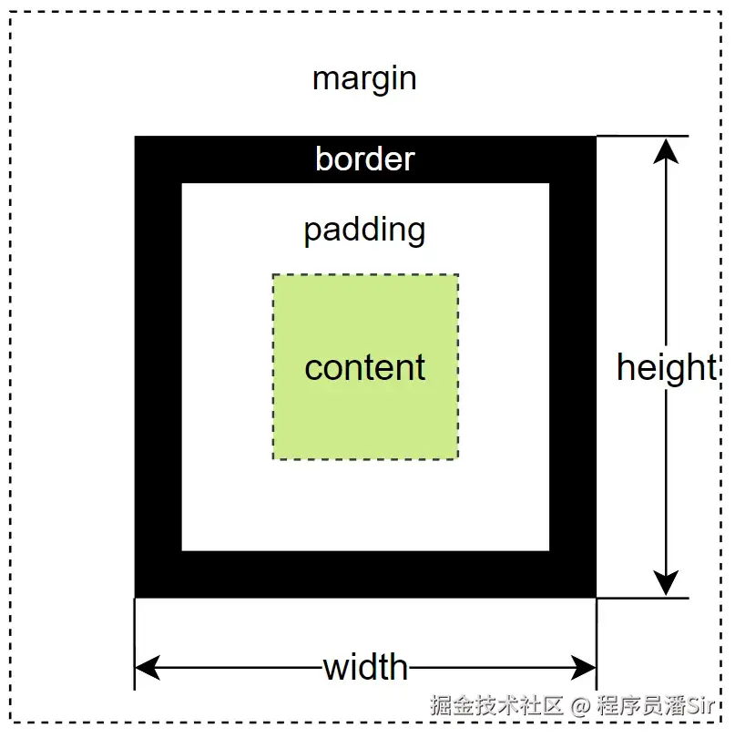
在鸿蒙应用中,页面上的每个组件都可以看做是一个矩形的盒子,这个盒子包含了内容区域 (content)、边框 (border)、内边距 (padding)和外边距(margin),各部分内容如下图所示
其中margin 、padding 和border均可使用同名的属性方法进行设置,各方法定义如下
- margin
css
margin(value: { top?:Length, right?:Length, bottom?:Length, left?:Length } | Length )说明:
Length=string | number | Resource- 当参数类型为
Length时,四个方向的边距同时生效
- padding
css
padding(value: { top?:Length, right?:Length, bottom?:Length, left?:Length } | Length )- border
css
border(value: {width?:Length, color?:ResourceColor, radius?:Length, style?:BorderStyle })各属性含义如下
-
- width
width属性表示边框宽度
-
- color
color属性表示边框颜色
-
- radius
radius属性表示边框圆角半径
-
- style
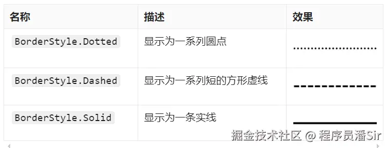
style属性表示边框样式,可通过BorderStyle这一枚举类型进行设置,可选的枚举值有
二、层叠布局Stack
2.1 概述
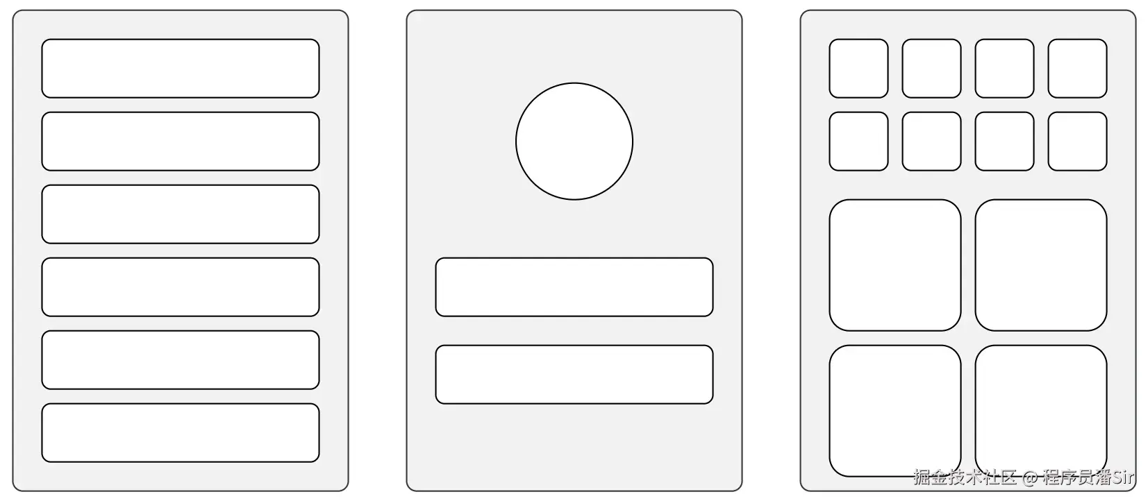
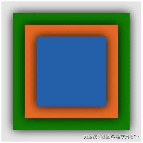
层叠布局是指将多个组件沿垂直于屏幕的方向堆叠在一起,类似于图层的叠加。以下效果都可以通过层叠布局实现

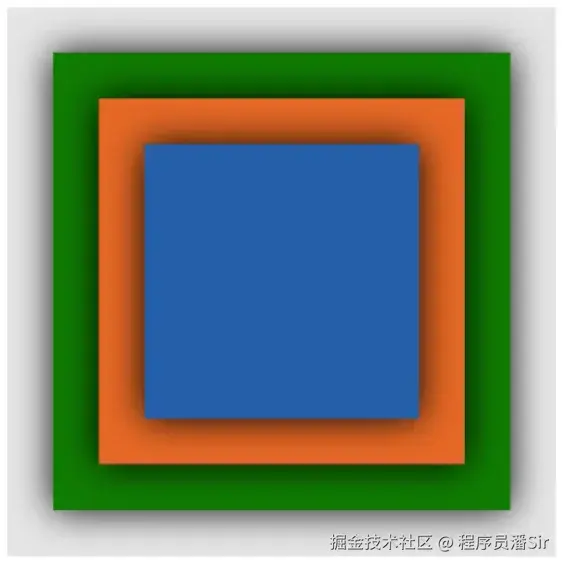
层叠布局可通过Stack容器组件实现,其子元素会按照其添加顺序依次叠加在一起,后添加的子元素位于先添加的子元素之上。具体效果如下
scss
Stack() {
  Row()
    .width(250)
    .height(250)
    .backgroundColor('#107B02') //绿色
    .shadow({radius:50})
  Row()
    .width(200)
    .height(200)
    .backgroundColor('#E66826') //橙色
    .shadow({radius:50})
  Row()
    .width(150)
    .height(150)
    .backgroundColor('#255FA7') //蓝色
    .shadow({radius:50})
}
.width(300)
.height(300)
.backgroundColor('#E5E5E5') //灰色
效果
示例代码
pages/component目录下新建stack目录,新建StackPage.ets文件
scss
@Entry
@Component
struct StackPage {
build() {
Column() {
Stack() {
Row()
.width(250)
.height(250)
.backgroundColor('#107B02') //绿色
.shadow({radius:50})
Row()
.width(200)
.height(200)
.backgroundColor('#E66826') //橙色
.shadow({radius:50})
Row()
.width(150)
.height(150)
.backgroundColor('#255FA7') //蓝色
.shadow({radius:50})
}
.width(300)
.height(300)
.backgroundColor('#E5E5E5')
}.width('100%')
.height('100%')
.justifyContent(FlexAlign.Center)
}
}2.2 参数
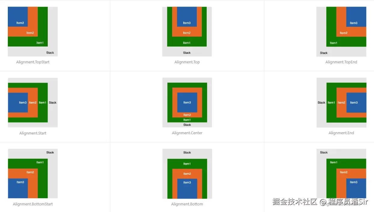
Stack 组件的参数类型为{ alignContent?: Alignment },alignContent用于设置子组件的对齐方式,该属性可通过枚举类型Alignment进行设置,可选的枚举值及其效果如下图所示
该参数的一个实际使用场景如下:

示例代码
拷贝icon_v.png和img_avatar.png文件到目录resources/base/media目录
pages/component/stack目录,新建AlignContentPage.ets文件
scss
@Entry
@Component
struct AlignmentContentPage {
build() {
Column() {
Stack({alignContent:Alignment.BottomEnd}) {
Image($r('app.media.img_avatar'))
.width('100%')
.height('100%')
Image($r('app.media.icon_v'))
.width(60)
.height(60)
}
.width(200)
.height(200)
}.width('100%')
.height('100%')
.justifyContent(FlexAlign.Center)
}
}2.3 使用技巧
2.3.1 子组件Z轴控制
Stack 容器中子组件的层级除了可按照添加顺序决定,还能通过zIndex()进行手动的设置,zIndex的值越大,层级越高。
scss
Stack() {
Row()
.width(150)
.height(150)
.backgroundColor('#255FA7') //蓝色
.shadow({ radius: 50 })
.zIndex(3)
Row()
.width(200)
.height(200)
.backgroundColor('#E66826') //橙色
.shadow({ radius: 50 })
.zIndex(2)
Row()
.width(250)
.height(250)
.backgroundColor('#107B02') //绿色
.shadow({ radius: 50 })
.zIndex(1)
}.width(300)
.height(300)
.backgroundColor('#E5E5E5') //灰色效果
 示例代码
示例代码
pages/component/stack目录,新建ZIndexPage.ets文件
scss
@Entry
@Component
struct ZIndexPage {
build() {
Column() {
Stack() {
Row()
.width(150)
.height(150)
.backgroundColor('#255FA7') //蓝色
.shadow({ radius: 50 })
.zIndex(3)
Row()
.width(200)
.height(200)
.backgroundColor('#E66826') //橙色
.shadow({ radius: 50 })
.zIndex(2)
Row()
.width(250)
.height(250)
.backgroundColor('#107B02') //绿色
.shadow({ radius: 50 })
.zIndex(1)
}.width(300)
.height(300)
.backgroundColor('#E5E5E5')
}.width('100%')
.height('100%')
.justifyContent(FlexAlign.Center)
}
}2.3.2 子组件精确定位
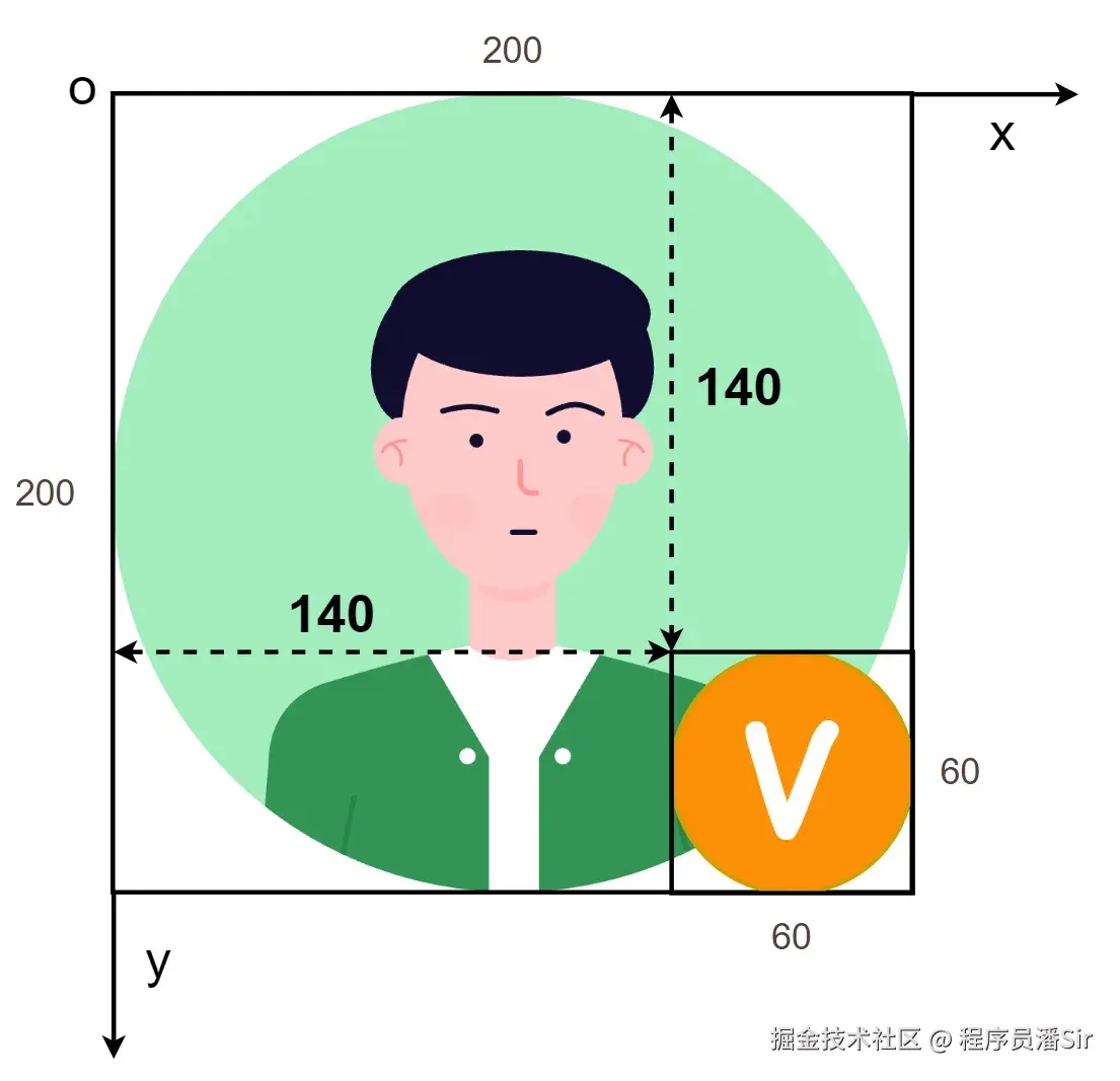
Stack 容器的子组件可使用position()方法进行更精确的定位,该方法可设置子组件左上角 相对于Stack 容器左上角的偏移量,具体效果如下
代码:
scss
Stack() {
  Image($r('app.media.img_avatar'))
    .width('100%')
    .height('100%')
  Image($r('app.media.icon_v'))
    .width(60)
    .height(60)
    .position({ x: 140, y: 140 })
}
.width(200)
.height(200)
效果
示例代码
pages/component/stack目录,新建PositionPage.ets文件
less
@Entry
@Component
struct PositionPage {
build() {
Column() {
Stack() {
Image($r('app.media.img_avatar'))
.width('100%')
.height('100%')
Image($r('app.media.icon_v'))
.width(60)
.height(60)
.position({ x: 140, y: 140 })
}
.width(200)
.height(200)
}.width('100%')
.height('100%')
.justifyContent(FlexAlign.Center)
}
}《鸿蒙应用开发从入门到项目实战》系列文章持续更新中,陆续更新AI+编程、企业级项目实战等原创内容,防止迷路,欢迎关注!