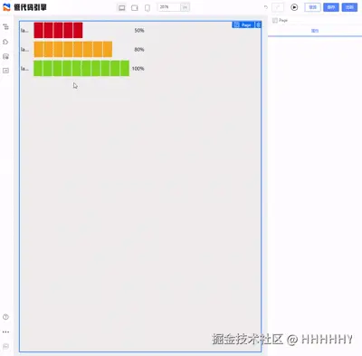
1、先看效果
2、上代码
components
ProgressSteps.tsx
tsx
import React, { createElement } from 'react';
import { Slider } from '@alifd/next';

export interface CarouselSlotProps {
  height?: number;
  width?: number;
  autoplay?: boolean;
  interval?: number;
  child?: React.ReactNode[]
  children?: any[];
}

const CarouselSlot: React.FC<CarouselSlotProps> = ({
  height = '100%',
  width = '100%',
  autoplay = true,
  interval = 3000,
  child = [1, 2],
  children,
}) => {

  const pages = Array.isArray(child) && child.length > 0 ? child : [1, 2];

  return (
    <div style={{ width, height }}>
      <Slider
        autoplay={autoplay}
        autoplaySpeed={interval}
        style={{ width: '100%', height: '100%' }}
        animation="slide"
        // arrows
        // dots
      >
        {pages.map((_, idx) => (
          <div key={idx} style={{ width: '100%', height: '100%' }}>
            {Array.isArray(children) ? children[idx] : children}
          </div>
        ))}
      </Slider>
    </div>
  );
};

export default CarouselSlot;
lowcode
meta:
ts
import { IPublicModelComponentMeta } from '@alilc/lowcode-types';

const CarouselSlotMeta: IPublicModelComponentMeta = {
  componentName: 'CarouselSlot',
  title: '走马灯容器',
  group: 'xxx组件',
  category: 'xxx',
  devMode: 'proCode',
  npm: {
    package: 'xxxxxx',
    version: '0.1.0',
    exportName: 'CarouselSlot',
    main: 'src/index.tsx',
    destructuring: true,
  },

  props: [
    {
      name: 'width',
      title: { label: '宽度', tip: '组件宽度' },
      setter: 'StringSetter',
      defaultValue: '400px',
    },
    {
      name: 'height',
      title: { label: '高度', tip: '组件高度' },
      setter: 'StringSetter',
      defaultValue: '180px',
    },
    {
      name: 'autoplay',
      title: { label: '自动播放', tip: '是否自动切换' },
      setter: 'BoolSetter',
      defaultValue: true,
    },
    {
      name: 'interval',
      title: { label: '切换间隔(ms)', tip: '单位毫秒' },
      setter: 'NumberSetter',
      defaultValue: 3000,
    },
    {
      name: 'child',
      title: { label: '走马灯页数', tip: '走马灯页数' },
      setter: {
        componentName: 'ArraySetter',
        props: {
          itemSetter: {
            componentName: 'NumberSetter',
          }
        }
      },
      defaultValue: [1,2],
    },
  ],

  configure: {
    // @ts-ignore
    component: {
      isContainer: true
    },
    supports: {
      style: true,
    },
  },

  snippets: [
    {
      title: '走马灯容器',
      schema: {
        componentName: 'CarouselSlot',
        props: {
          width: '400px',
          height: '300px',
          autoplay: true,
          interval: 3000,
        },
        child:[1,2],
      },
    },
  ],
};

export default CarouselSlotMeta;