图形函数详解
在CSS中,图形函数主要用于定义元素的形状,特别是在使用clip-path属性时。这些函数让我们能够创建各种几何形状,为网页设计带来更多的创意和可能性。CSS提供了多种图形函数,包括:
circle()圆形函数;ellipse()椭圆函数;inset()矩形函数;polygon()多边形函数;path()路径函数。
其中,前四种函数可以满足大部分常见形状的创建需求,而path()函数则提供了更强大的功能,允许我们使用SVG路径语法创建任意复杂的形状。
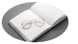
1. circle() 圆形函数
circle()函数用于创建圆形裁剪区域。
1.1 语法
css
clip-path: circle(radius at positionX positionY);1.2 参数说明
radius: 圆的半径,可以是具体数值(如50px)或百分比(如50%);positionX: 圆心的水平位置;positionY: 圆心的垂直位置。
1.3 实际应用示例
1.3.1 创建头像圆形效果
- 实现代码
html
<div class="avatar"></div>
css
.avatar {
  width: 100px;
  height: 100px;
  background-image: url('avatar.jpg');
  background-size: cover;
  clip-path: circle(50% at 50% 50%);
}- 实现效果
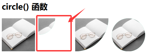
可以看到裁剪区域,其他部分的大小依然存在,不影响元素的占位。circle(50% at 50% 50%)实现的效果和border-radius:50%是一样的效果,对于头像来说。
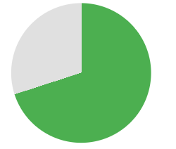
1.3.2 创建圆形进度指示器
- 实现代码
html
<div class="circular-progress"></div>
css
.circular-progress {
  width: 200px;
  height: 200px;
  background: conic-gradient(#4CAF50 70%, #e0e0e0 0);
  clip-path: circle(45% at 50% 50%);
}- 实现效果
2. ellipse() 椭圆函数
ellipse()函数用于创建椭圆或扁圆形状。
2.1 语法
css
clip-path: ellipse(radiusX radiusY at positionX positionY);2.2 参数说明
radiusX: 水平方向的半径;radiusY: 垂直方向的半径;positionX: 椭圆中心的水平位置;positionY: 椭圆中心的垂直位置。
2.3 实际应用示例
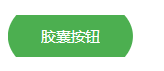
2.3.1 创建胶囊按钮
- 实现代码
html
<button class="capsule-button">胶囊按钮</button>
css
.capsule-button {
  padding: 10px 30px;
  background-color: #4CAF50;
  color: white;
  border: none;
  clip-path: ellipse(50% 100% at 50% 50%);
  outline: none;
  cursor: pointer;
}- 实现效果
2.3.2 创建椭圆形图片展示
- 实现代码
html
<div class="oval-image"></div>
css
.oval-image {
  width: 200px;
  height: 150px;
  background-image: url('landscape.jpg');
  background-size: cover;
  clip-path: ellipse(50% 40% at 50% 50%);
}- 实现效果
3. inset() 矩形函数
inset()函数用于创建带圆角的矩形裁剪区域。
3.1 语法
css
clip-path: inset(top right bottom left round top-radius right-radius bottom-radius left-radius);3.2 参数说明
top, right, bottom, left: 距离各边的距离;top-radius, right-radius, bottom-radius, left-radius: 各个角的圆角半径(可选)。
3.3 实际应用示例
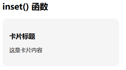
3.3.1 创建带圆角的卡片效果
- 实现代码
html
<div class="rounded-card">
  <h3>卡片标题</h3>
  <p>这是卡片内容</p>
</div>
css
.rounded-card {
  width: 300px;
  padding: 20px;
  background-color: #f5f5f5;
  clip-path: inset(0 round 15px);
}- 实现效果
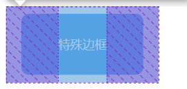
3.3.2 创建特殊边框效果
- 实现代码
html
<div class="special-border">特殊边框</div>
css
.special-border {
  width: 200px;
  height: 100px;
  background-color: #2196F3;
  color: white;
  display: flex;
  align-items: center;
  justify-content: center;
  clip-path: inset(10px 20px 10px 20px round 10px);
}- 实现效果
4. polygon() 多边形函数
polygon()函数用于创建自定义的多边形形状。
4.1 语法
css
clip-path: polygon(x1 y1, x2 y2, x3 y3, ...);4.2 参数说明
x1 y1, x2 y2, ...: 多边形各个顶点的坐标,第一个值是x轴位置,第二个值是y轴位置。
4.3 实际应用示例
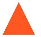
4.3.1 创建三角形元素
- 实现代码
html
<div class="triangle"></div>
css
.triangle {
  width: 100px;
  height: 100px;
  background-color: #FF5722;
  clip-path: polygon(50% 0%, 0% 100%, 100% 100%);
}- 实现效果
4.3.2 创建对话框气泡效果
- 实现代码
html
<div class="speech-bubble">这是一条消息</div>
css
.speech-bubble {
  width: 200px;
  padding: 15px;
  background-color: #00BCD4;
  color: white;
  position: relative;
  clip-path: polygon(0% 0%, 100% 0%, 100% 75%, 75% 75%, 70% 100%, 65% 75%, 0% 75%);
}- 实现效果

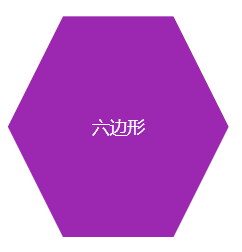
4.3.3 创建六边形布局
- 实现代码
html
<div class="hexagon">六边形</div>
css
.hexagon {
  width: 200px;
  height: 200px;
  background-color: #9C27B0;
  color: white;
  display: flex;
  align-items: center;
  justify-content: center;
  clip-path: polygon(25% 0%, 75% 0%, 100% 50%, 75% 100%, 25% 100%, 0% 50%);
}- 实现效果
5. path() 路径函数
path()函数允许我们使用SVG路径语法来定义复杂的裁剪形状,可以创建包括贝塞尔曲线在内的各种复杂形状。
5.1 语法
css
clip-path: path("SVG路径数据");5.2 参数说明
SVG路径数据: 使用SVG路径命令定义的路径数据,支持所有SVG绘图命令,如M(移动到)、L(直线)、C(贝塞尔曲线)、Z(闭合路径)等。
5.3 实际应用示例
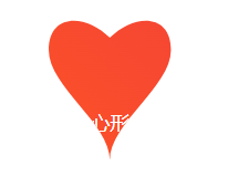
5.3.1 创建心形裁剪区域
- 实现代码
html
<div class="heart-shape">心形</div>
css
.heart-shape {
  width: 200px;
  height: 200px;
  background: linear-gradient(45deg, #FF5722, #F44336);
  color: white;
  display: flex;
  align-items: center;
  justify-content: center;
  clip-path: path("M100,30 C80,10 50,10 50,40 C50,70 100,100 100,130 C100,100 150,70 150,40 C150,10 120,10 100,30 Z");
}- 实现效果
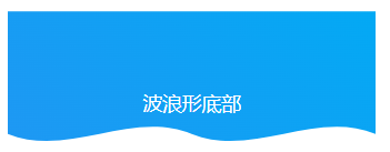
5.3.2 创建波浪形底部效果
- 实现代码
html
<div class="wave-bottom">波浪形底部</div>
css
.wave-bottom {
  width: 300px;
  height: 150px;
  background: linear-gradient(45deg, #2196F3, #03A9F4);
  color: white;
  display: flex;
  align-items: center;
  justify-content: center;
  clip-path: path("M0,0 L300,0 L300,100 C250,80 200,120 150,100 C100,80 50,120 0,100 Z");
}- 实现效果
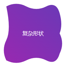
5.3.3 创建复杂的自定义形状
- 实现代码
html
<div class="custom-shape">复杂形状</div>
css
.custom-shape {
  width: 200px;
  height: 200px;
  background: linear-gradient(45deg, #9C27B0, #673AB7);
  color: white;
  display: flex;
  align-items: center;
  justify-content: center;
  clip-path: path("M20,20 Q50,5 80,20 T140,20 Q170,5 180,40 T180,100 Q195,130 180,160 Q170,195 140,180 T80,180 Q50,195 20,180 Q5,150 20,120 T20,20 Z");
}- 实现效果
6. 实际项目应用案例
6.1 创建不规则图片展示区域
html
<div class="gallery">
  <div class="gallery-item"></div>
  <div class="gallery-item"></div>
  <div class="gallery-item"></div>
</div>
css
.gallery {
  display: flex;
  gap: 20px;
  padding: 20px;
}

.gallery-item {
  width: 200px;
  height: 200px;
  background-size: cover;
  background-position: center;
}

.gallery-item:nth-child(1) {
  background-image: url('image1.jpg');
  clip-path: polygon(0% 0%, 100% 0%, 100% 75%, 75% 75%, 75% 100%, 50% 75%, 0% 75%);
}

.gallery-item:nth-child(2) {
  background-image: url('image2.jpg');
  clip-path: circle(40% at 50% 50%);
}

.gallery-item:nth-child(3) {
  background-image: url('image3.jpg');
  clip-path: polygon(50% 0%, 100% 25%, 100% 75%, 50% 100%, 0% 75%, 0% 25%);
}
6.2 创建动态形状变化效果
html
<div class="shape-animation">形状变化</div>
css
.shape-animation {
  width: 150px;
  height: 150px;
  background: linear-gradient(45deg, #FF5722, #9C27B0);
  color: white;
  display: flex;
  align-items: center;
  justify-content: center;
  margin: 50px auto;
  clip-path: circle(50% at 50% 50%);
  animation: shapeChange 4s infinite alternate;
}

@keyframes shapeChange {
  0% {
    clip-path: circle(50% at 50% 50%);
  }
  25% {
    clip-path: polygon(50% 0%, 0% 100%, 100% 100%);
  }
  50% {
    clip-path: ellipse(50% 30% at 50% 50%);
  }
  75% {
    clip-path: inset(10% round 20px);
  }
  100% {
    clip-path: polygon(25% 0%, 75% 0%, 100% 50%, 75% 100%, 25% 100%, 0% 50%);
  }
}
7. 浏览器兼容性注意事项
需要注意的是,clip-path属性在一些老版本浏览器中可能不被支持,特别是IE浏览器。在实际项目中,建议添加适当的降级方案:
css
.element {
  /* 降级方案 */
  border-radius: 50%;

  /* 现代浏览器支持 */
  clip-path: circle(50% at 50% 50%);
}
8. 总结
CSS图形函数为我们提供了强大的形状创建能力,可以实现许多以前需要图片或复杂JavaScript代码才能实现的效果。通过合理使用这些函数,我们可以:创建独特的视觉效果;减少图片资源的使用;提高页面加载性能;实现更灵活的响应式设计。