目录
[1.1 快捷导航区域(shortcut)](#1.1 快捷导航区域(shortcut))
[1.2 头部区域](#1.2 头部区域)
[1.3 banner区域](#1.3 banner区域)
[1.4 底部](#1.4 底部)
[2.1 项目目录](#2.1 项目目录)
[2.2 网页制作思路](#2.2 网页制作思路)
[2.3 logo](#2.3 logo)
[2.4 导航功能制作技巧](#2.4 导航功能制作技巧)
[2.5 banner区域](#2.5 banner区域)
[2.6 精品推荐区域](#2.6 精品推荐区域)
[2.7 推荐课程](#2.7 推荐课程)
[2.8 前端开发工程师区域](#2.8 前端开发工程师区域)
[2.9 版权区域](#2.9 版权区域)
一、小兔鲜儿
SEO 三大标签
SEO:搜索引擎优化,提升网站百度搜索排名
提升SEO的常见方法:
- 竞价排名
- 将网页制作成html后缀
- 标签语义化(在合适的地方使用合适的标签)
网页头部 SEO 标签:
-
title:网页标题标签
-
description:网页描述
-
keywords:网页关键词
小兔鲜儿-新鲜、惠民、快捷!
favicon图标
<link rel="shortcut icon" href="./favicon.ico" type="image/x-icon">1.1 快捷导航区域(shortcut)

<!-- 快捷导航区域 -->
<div class="shortcut">
<div class="wrapper">
<ul>
<li><a href="#" class="login">请先登录</a></li>
<li><a href="#">免费注册</a></li>
<li><a href="#">我的订单</a></li>
<li><a href="#">会员中心</a></li>
<li><a href="#">帮助中心</a></li>
<li><a href="#">在线客服</a></li>
<li><a href="#"><span class="iconfont icon-mobile-phone"></span>手机版</a></li>
</ul>
</div>
</div>
/* 头尾各个页面相同的样式 */
/* 版心 */
.wrapper {
margin: 0 auto;
width: 1240px;
}
.shortcut {
background-color: #333333;
height: 52px;
}
.shortcut .wrapper{
display: flex;
justify-content: flex-end;
height: 52px;
}
.shortcut ul {
display: flex;
line-height: 52px;
}
.shortcut li a {
padding: 0 15px;
border-right: 1px solid #999;
font-size: 14px;
color: #fff;
}
.shortcut li:last-child a {
border-right: 0;
}
.shortcut li .iconfont {
margin-right: 4px;
vertical-align: middle;
}
.shortcut li .login {
color: #5EB69C;
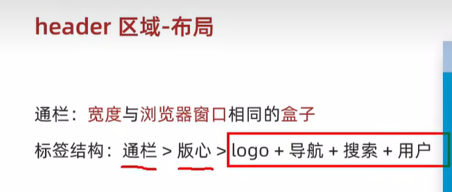
}1.2 头部区域

<!-- 头部 -->
  <div class="header">
    <div class="wrapper">
        <div class="logo">
            <h1><a>小兔鲜儿</a></h1>
        </div>
        <div class="nav">
          <ul>
              <li><a href="#">首页</a></li>
              <li><a href="#">生鲜</a></li>
              <li><a href="#">美食</a></li>
              <li><a href="#">餐厨</a></li>
              <li><a href="#">电器</a></li>
              <li><a href="#">居家</a></li>
              <li><a href="#">洗护</a></li>
              <li><a href="#">孕婴</a></li>
              <li><a href="#">服装</a></li>
          </ul>
        </div>
        <div class="search">
          <span class="iconfont icon-search"></span>
          <input type="text" placeholder="搜一搜">
        </div>
        <div class="cart">
            <span class="iconfont icon-cart-full"></span>
            <i>8</i>
        </div>
        </div>
    </div>
  </div>

/* 头部区域 */
.header .wrapper {
  margin-top: 22px;
  height: 88px;
  display: flex;
}

.logo  a {
  display: block;
  width: 200px;
  height: 88px;
  margin-right: 41px;
  background: url(../images/logo.png);
  font-size: 0;
}

.nav {
  margin-top: 33px;
  margin-right: 28px;
}

.nav ul {
  display: flex;
}

.nav ul li {
  margin-right: 47px;
}

.nav li a {
  padding-bottom: 10px;
}

.nav  li a:hover{
  color:#5EB69C;
  border-bottom: 2px solid #5EB69C;
}


.search {
  margin-top: 33px;
  margin-right: 33px;
  width: 170px;
  height: 34px;
  display: flex;
  border-bottom: 2px solid #F4F4F4;
}

.search .iconfont{
  font-size: 18px;
  color: #ccc;
  line-height: 32px;
  margin-right: 8px;
}

.search input{
  /* 浏览器优先生效 input 标签的默认宽度,所以 flex:1 不生效 */
  /* 解决办法:重置 input 默认宽度 -> width:0 */
  width: 0;
  flex:1;
}

.search input::placeholder{
  font-size: 16px;
  color: #ccc;
}

.header .cart {
  position: relative;
  margin-top: 33px;
}

.header .cart .iconfont{
  font-size: 25px;
}

.header .cart i{
  position: absolute;
  height: 15px;
  padding: 0 6px;
  /* right 定位右对齐 : 如果文字多了 向左撑开,可能盖住其他的内容 */
  /* left */
  left: 15px;
  top: 1px;
  background-color: #E26237;
  border-radius: 8px;
  font-size: 14px;
  color: #FFFEFE;
  line-height: 15px;
}
1.3 banner区域
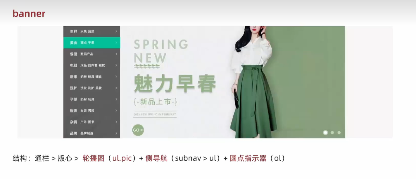
  <!-- banner -->
  <div class="banner">
    <div class="wrapper">
        <ul class="pic">
          <li><a href=""><img src="./uploads/banner1.png"></a> </li>
          <li><a href=""><img src="./uploads/banner1.png"></a> </li>
          <li><a href=""><img src="./uploads/banner1.png"></a> </li>
          </li>
        </ul>
      <!-- 测导航 -->
        <div class="subnav">
            <ul>
              <li>
                <div>
                  <a href="#">生鲜</a>
                  <a href="#">水果</a>
                  <a href="#">蔬菜</a>
                </div>
                <span class="iconfont icon-arrow-right-bold"></span>
              </li>
              <li>
                <div>
                  <a href="#">生鲜</a>
                  <a href="#">水果</a>
                  <a href="#">蔬菜</a>
                </div>
                <span class="iconfont icon-arrow-right-bold"></span>
              </li>
              <li>
                <div>
                  <a href="#">生鲜</a>
                  <a href="#">水果</a>
                  <a href="#">蔬菜</a>
                </div>
                <span class="iconfont icon-arrow-right-bold"></span>
              </li>
              <li>
                <div>
                  <a href="#">生鲜</a>
                  <a href="#">水果</a>
                  <a href="#">蔬菜</a>
                </div>
                <span class="iconfont icon-arrow-right-bold"></span>
              </li>
              <li>
                <div>
                  <a href="#">生鲜</a>
                  <a href="#">水果</a>
                  <a href="#">蔬菜</a>
                </div>
                <span class="iconfont icon-arrow-right-bold"></span>
              </li>
              <li>
                <div>
                  <a href="#">生鲜</a>
                  <a href="#">水果</a>
                  <a href="#">蔬菜</a>
                </div>
                <span class="iconfont icon-arrow-right-bold"></span>
              </li>
              <li>
                <div>
                  <a href="#">生鲜</a>
                  <a href="#">水果</a>
                  <a href="#">蔬菜</a>
                </div>
                <span class="iconfont icon-arrow-right-bold"></span>
              </li>
              <li>
                <div>
                  <a href="#">生鲜</a>
                  <a href="#">水果</a>
                  <a href="#">蔬菜</a>
                </div>
                <span class="iconfont icon-arrow-right-bold"></span>
              </li>
              <li>
                <div>
                  <a href="#">生鲜</a>
                  <a href="#">水果</a>
                  <a href="#">蔬菜</a>
                </div>
                <span class="iconfont icon-arrow-right-bold"></span>
              </li>
              <li>
                <div>
                  <a href="#">生鲜</a>
                  <a href="#">水果</a>
                  <a href="#">蔬菜</a>
                </div>
                <span class="iconfont icon-arrow-right-bold"></span>
              </li>
            </ul>
        </div>
        <ol>
            <li class="active"><i></i></li>
            <li><i></i></li>
            <li><i></i></li>
        </ol>
    </div>
  </div>

/* banner区域 */
.banner {
  height: 500px;
  background-color: #F5F5F5;
}

.banner .wrapper{
  position: relative;
  height: 500px;
  overflow: hidden;
}

.banner .pic {
  display: flex;
  /* flex布局 ,父级宽度不够,子级被挤小,不想被挤小,增大父级尺寸 */
  width: 3720px;
  height: 500px;
}


/* .banner .pic img {
  /* 也可以给图片设置宽度 */
  /* width: 1240px;
  height: 500px;
}  */

.subnav {
  position: absolute;
  top: 0;
  left: 0;
  width: 250px;
  height: 500px;
  background: rgba(0, 0, 0, 0.42);
}

.subnav li {
  padding-left: 30px;
  padding-right: 12px;
  height: 50px;
  line-height: 50px;
  display: flex;
  justify-content: space-between;
  color: #FFFFFF;
}

.subnav li a{
  font-size: 14px;
  color: #FFFFFF;
  margin-right: 5px;
}

.subnav li a:first-child{
  font-size: 16px;
  margin-right: 14px;
}

.subnav li:hover {
  background-color: #00BE9A ;
  cursor: pointer;
}

.subnav li .iconfont{
  font-size: 14px;
}

/* 原点指示器 */
.banner ol {
  position: absolute;
  bottom: 17px;
  right: 16px;
  display: flex;
}

.banner ol li {
  width: 22px;
  height: 22px;
  border-radius: 50%;
  margin-left: 8px;
  cur
}

/* 里边的小圆圈半透明 */
.banner ol i{
  display: block;
  width: 14px;
  height: 14px;
  background-color: rgba(255, 255, 255, 0.5);
  border-radius: 50%;
  margin: 4px;
}

/* 当前页面大圆圈 */
.banner ol .active{
  background-color: rgba(255, 255, 255, 0.5);
}

/* 当前页面小圆圈为白色 */
.banner ol .active i{
  background-color: #fff;
}
1.4 底部

<!-- 底部 -->
   <div class="footer">
    <div class="wrapper">
          <!-- 服务 -->
        <div class="service">
            <ul>
              <li>
                  <h5></h5>
                  <p>价格亲民</p>
              </li>
              <li>
                  <h5></h5>
                  <p>物流快捷</p>
              </li>
              <li>
                  <h5></h5>
                  <p>品质新鲜</p>
              </li>
              <li>
                  <h5></h5>
                  <p>售后无忧</p>
              </li>
            </ul>
        </div>
          <!-- 帮助中心 -->
        <div class="help">
          <div class="left">
              <dl>
                <dt>购物指南</dt>
                <dd><a href="#">购物流程</a></dd>
                <dd><a href="#">支付方式</a></dd>
                <dd><a href="#">售后规则</a></dd>
              </dl>
              <dl>
                <dt>配送方式</dt>
                <dd><a href="#">配送运费</a></dd>
                <dd><a href="#">配送范围</a></dd>
                <dd><a href="#">配送时间</a></dd>
              </dl>
              <dl>
                <dt>关于我们</dt>
                <dd><a href="#">平台规则</a></dd>
                <dd><a href="#">联系我们</a></dd>
                <dd><a href="#">问题反馈</a></dd>
              </dl>
              <dl>
                <dt>售后服务</dt>
                <dd><a href="#">售后政策</a></dd>
                <dd><a href="#">退款说明</a></dd>
                <dd><a href="#">取消订单</a></dd>
              </dl>
              <dl>
                <dt>服务热线</dt>
                <dd><a href="#">在线客服<span class="iconfont icon-customer-service"></span></a></dd>
                <dd><a href="#">客服电话 400-0000-000</a></dd>
                <dd><a href="#">工作时间 周一至周日 8:00-18:00</a></dd>
              </dl>
          </div>
          <div class="right">
              <ul>
                <li>
                  <div class="pic"><img src="./images/wechat.png" alt=""></div>
                  <p>微信公众号</p>
                </li>
                <li>
                  <div class="pic"><img src="./images/app.png" alt=""></div>
                  <p>APP下载二维码</p>
                </li>
              </ul>
          </div>
        </div>
          <!-- 版权 -->
          <div class="copyright">
            <p>
              <a href="#">关于我们</a>|
              <a href="#">帮助中心</a>|
              <a href="#">售后服务</a>|
              <a href="#">配送与验收</a>|
              <a href="#">商务合作</a>|
              <a href="#">搜索推荐</a>|
              <a href="#">友情链接</a>
            </p>
            <p>CopyRight © 小兔鲜</p>
          </div>
      </div>
    </div>
   </div>

/* 底部区域 */
.footer {
  height: 580px;
  background-color: #F5F5F5 ;
}

.footer .service  {
    height: 178px;
    padding: 60px 0;
}

.footer .service ul {
  display: flex;
  justify-content: space-evenly;
}

.footer .service ul li {
    display: flex;
    width: 190px;
    height: 58px;
}


.footer .service li h5 {
    width: 58px;
    height: 58px;
    background: url(../images/sprite.png);
    margin-right: 20px;
}

.footer .service li:nth-child(2) h5{
  /* 图标在下边 则应该将图片上移 图标就会露出来 */
    background-position: 0 -58px;
}

.footer .service li:nth-child(3) h5{
    background-position: 0 -116px;
}

.footer .service li:nth-child(4) h5{
    background-position: 0 -174px;
}


.footer .service li p {
    font-size: 28px;
    line-height: 58px;
}

/* 帮助中心区域 */
.help  {
    display: flex;
    justify-content: space-between;
    padding-top: 60px;
    height: 300px;
}

.help .left {
  display: flex;
  margin-right: 84px;
}

.help .left dl {
   margin-right: 84px;
}

.help .left dl:last-child {
   margin-right: 0;
}

.help .left dl dt {
  margin-bottom: 30px;
  font-size: 18px;
}
.help .left dl dd{
  margin-bottom: 10.5px;
}

/* a标签自带有颜色 直接给父级dd标签加颜色不生效 */
.help .left dl dd a{
  color: #969696 ;
}

.help .right ul{
  display: flex;
}

.help .right p {
  color: #969696 ;
  text-align: center;
}

.help .right .pic {
  width: 120px;
  height: 120px;
  margin-bottom: 10px;
}

.help .right li:first-child {
  margin-right: 55px;
}

/* 版权区域 */
.copyright {
  text-align: center;
  color: #A1A1A1 ;
}

.copyright p{
  margin-bottom: 10px;
}

.copyright a{
  color: #A1A1A1 ;
  margin-right: 10px;
}
二、学成在线练习
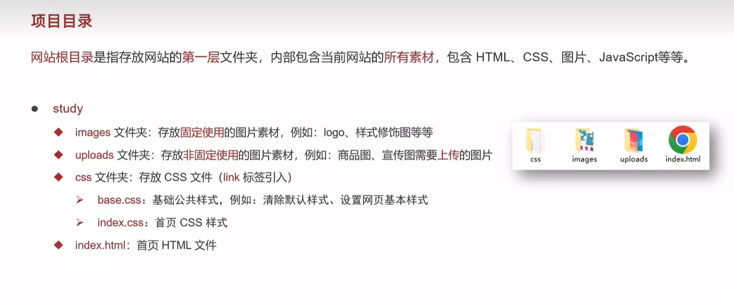
2.1 项目目录
项目目录中,images文件夹存放什么?
- 固定使用的图片素材
项目目录中,uploads文件夹存放什么?
- 非固定使用的图片素材(需要使用的)
HTML 中用什么标签引入单独的CSS文件
- link标签
2.2 网页制作思路
布局思路:先整体再局部,从外到内,从上到下,从左到右
CSS实现思路:
- 画盒子,调整盒子范围 -> 宽高背景色
- 调整盒子位置 -> flex布局、内外边距
- 控制图片、文字内容样式
通栏:宽度与浏览器窗口相同的盒子
2.3 logo
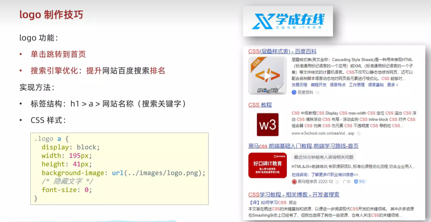
<!-- logo -->
<div class="logo">
<h1><a href="#">学成在线</a></h1>
</div>
/* logo */
.logo a{
display: block;
width: 195px;
height: 41px;
background-image: url("../images/logo.png");
font-size: 0;
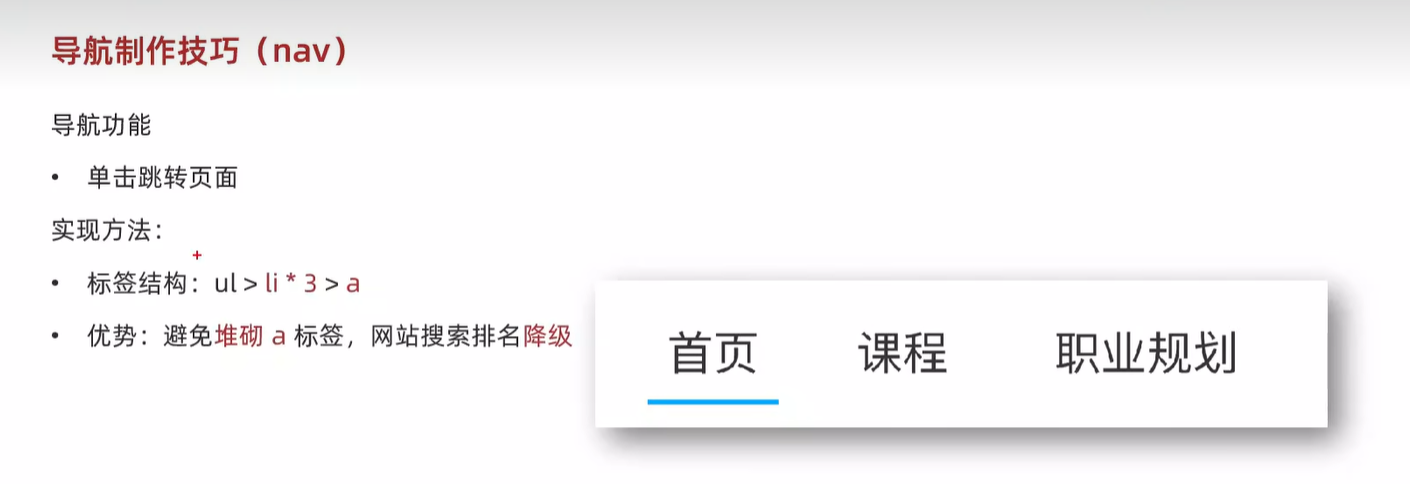
}2.4 导航功能制作技巧
/* 导航栏 */
.nav {
    margin-left: 102px;
}

/* 给需要flex布局元素的父级标签加上 display:flex */
.nav ul {
    display: flex;
}

.nav li {
    margin-right: 24px;
}

.nav li a{
    display: block;
    padding: 6px 8px;
    line-height: 27px;
    font-size: 19px;
}

/* 首页 a标签悬停 */
.nav li .active,
.nav li a:hover {
    border-bottom: 2px solid #00a4ff;
}

<div class="nav">
      <ul>
          <li><a href="#" class="active">首页</a></li>
          <li><a href="#">课程</a></li>
          <li><a href="#">职业规划</a></li>
      </ul>
</div>
2.5 banner区域
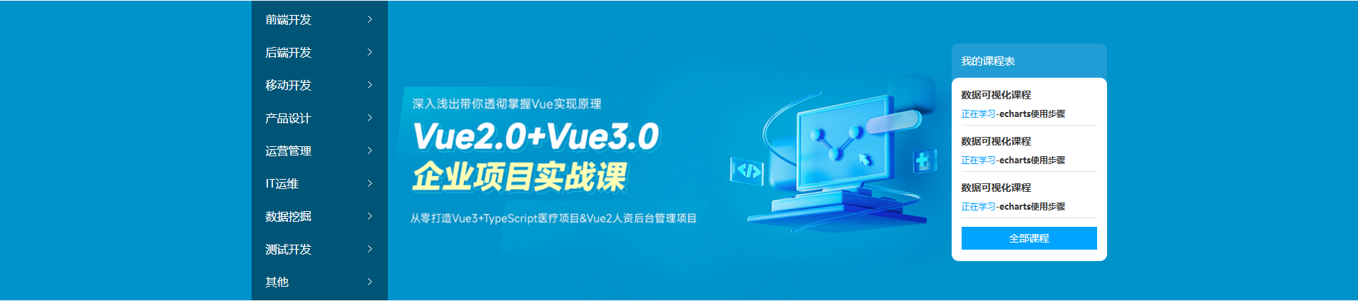
<!-- banner 区域 -->
     <div class="banner">
        <div class="wrapper">
            <div  class="left">
                <ul>
                    <li><a href="#">前端开发</a></li>
                    <li><a href="#">后端开发</a></li>
                    <li><a href="#">移动开发</a></li>
                    <li><a href="#">产品设计</a></li>
                    <li><a href="#">运营管理</a></li>
                    <li><a href="#">IT运维</a></li>
                    <li><a href="#">数据挖掘</a></li>
                    <li><a href="#">测试开发</a></li>
                    <li><a href="#">其他</a></li>
                </ul>
            </div>
            <div class="right">
                <h3>我的课程表</h3>
                <div class="content">
                    <dl>
                        <dt>数据可视化课程</dt>
                        <dd><span>正在学习</span>-<strong>echarts使用步骤</strong></dd>
                    </dl>
                    <dl>
                        <dt>数据可视化课程</dt>
                        <dd><span>正在学习</span>-<strong>echarts使用步骤</strong></dd>
                    </dl>
                    <dl>
                        <dt>数据可视化课程</dt>
                        <dd><span>正在学习</span>-<strong>echarts使用步骤</strong></dd>
                    </dl>
                    <a href="#">全部课程</a>
                </div>
            </div>
        </div>
    </div>

/* banner 区域 */
.banner {
  height: 420px;
  background-color: #0092cb;
}

.banner .wrapper {
  display: flex;
  justify-content: space-between;
  height: 420px;
  background-image: url(../uploads/banner.png);
}

/* 侧导航 */
.banner .left {
  padding: 3px 20px;
  width: 191px;
  height: 420px;
  background-color: rgba(0,0,0,0.42);
}

.banner .left a {
  /* 块级:宽度是父级的100% */
  display: block;
  height: 46px;
  background: url(../images/right.png) no-repeat right center;
  line-height: 46px;
  font-size: 16px;
  color: #fff;
}

.banner .left a:hover {
  background-image: url(../images/right-hover.png);
  color: #00a4ff;
}

/* 课程表 */
.banner .right {
  margin-top: 60px;
  width: 218px;
  height: 305px;
  background-color: #209dd5;
  border-radius: 10px;
}

.banner .right h3 {
  margin-left: 14px;
  height: 48px;
  line-height: 48px;
  font-size: 15px;
  color: #fff;
  font-weight: 400;
}

.banner .right .content {
  padding: 14px;
  height: 257px;
  background-color: #fff;
  border-radius: 10px;
}

.banner .right dl {
  margin-bottom: 12px;
  border-bottom: 1px solid #e0e0e0;
}

.banner .right dt {
  margin-bottom: 8px;
  font-size: 14px;
  line-height: 20px;
  font-weight: 700;
}

.banner .right dd {
  margin-bottom: 8px;
  font-size: 12px;
  line-height: 16px;
}

.banner .right dd span {
  color: #00a4ff;
}

.banner .right dd strong {
  color: #7d7d7d;
  font-weight: 400;
}

.banner .right a {
  display: block;
  height: 32px;
  background-color: #00a4ff;
  text-align: center;
  line-height: 32px;
  font-size: 14px;
  color: #fff;
  border-radius: 15px;
}
2.6 精品推荐区域

<!-- 精品推荐区域 -->
    <div class="recommend wrapper">
        <h3>精品推荐</h3>
        <ul>
            <li><a href="#">HTML</a></li>
            <li><a href="#">CSS</a></li>
            <li><a href="#">JavaScript</a></li>
            <li><a href="#">Node.js</a></li>
            <li><a href="#">Ajax</a></li>
            <li><a href="#">Vue2.0</a></li>
            <li><a href="#">Vue3.0</a></li>
            <li><a href="#">TypeScript</a></li>
            <li><a href="#">React</a></li>
        </ul>
        <a href="#" class="modify">修改兴趣</a>
    </div>

/* 精品推荐 */
.recommend {
  display: flex;
  margin-top: 11px;
  padding: 0 20px;
  height: 60px;
  background-color: #fff;
  box-shadow: 0px 1px 2px 0px rgba(211, 211, 211, 0.5);
  line-height: 60px;
}

.recommend h3 {
  font-size: 18px;
  color: #00a4ff;
  font-weight: 400;
}

.recommend ul {
  /* 除去标题和修改兴趣的尺寸,父级剩余尺寸都给ul,实现把修改兴趣挤到最右侧 */
  flex: 1;
  display: flex;
}

.recommend ul li a {
  padding: 0 24px;
  border-right: 1px solid #e0e0e0;
  font-size: 18px;
}

.recommend ul li:last-child a {
  border-right: 0;
}

.recommend .modify {
  font-size: 16px;
  color: #00a4ff;
}
2.7 推荐课程
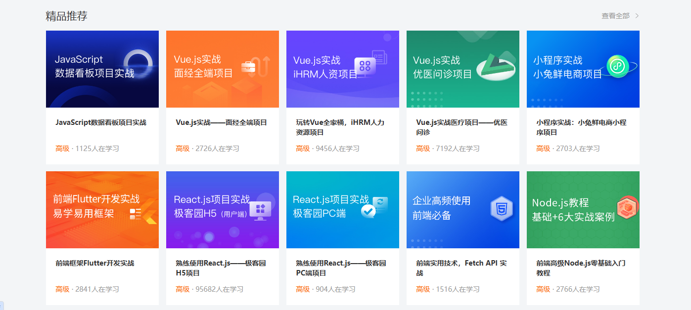
该精品推荐分为两个部分,一个是标题,一个是内容
标题部分精品推荐和查看全部在一行,应该为flex布局,中间没有距离,使用 justify-content: space-between 属性
内容部分在展示时使用一个ul标签,每个内容都是一个li。包括图片和介绍,使用两个div来显示
<!-- 精品推荐课程 -->
     <div class="course wrapper">
        <!-- 标题 -->
         <div class="hd">
            <h3>精品推荐</h3>
            <a href="#" class="more">查看全部</a>
         </div>
         <!-- 内容 -->
         <div class="bd">
            <ul>
                <li>
                <a href="#">
                    <div class="pic"><img src="./uploads/course01.png" alt=""></div>
                    <div class="text">
                    <h4>JavaScript数据看板项目实战</h4>
                    <p><span>高级</span> · <i>1125</i>人在学习</p>
                    </div>
                </a>
                </li>
                <li>
                <a href="#">
                    <div class="pic"><img src="./uploads/course02.png" alt=""></div>
                    <div class="text">
                    <h4>Vue.js实战------面经全端项目</h4>
                    <p><span>高级</span> · <i>2726</i>人在学习</p>
                    </div>
                </a>
                </li>
                <li>
                <a href="#">
                    <div class="pic"><img src="./uploads/course03.png" alt=""></div>
                    <div class="text">
                    <h4>玩转Vue全家桶,iHRM人力资源项目</h4>
                    <p><span>高级</span> · <i>9456</i>人在学习</p>
                    </div>
                </a>
                </li>
                <li>
                <a href="#">
                    <div class="pic"><img src="./uploads/course04.png" alt=""></div>
                    <div class="text">
                    <h4>Vue.js实战医疗项目------优医问诊</h4>
                    <p><span>高级</span> · <i>7192</i>人在学习</p>
                    </div>
                </a>
                </li>
                <li>
                <a href="#">
                    <div class="pic"><img src="./uploads/course05.png" alt=""></div>
                    <div class="text">
                    <h4>小程序实战:小兔鲜电商小程序项目</h4>
                    <p><span>高级</span> · <i>2703</i>人在学习</p>
                    </div>
                </a>
                </li>
                <li>
                <a href="#">
                    <div class="pic"><img src="./uploads/course06.png" alt=""></div>
                    <div class="text">
                    <h4>前端框架Flutter开发实战</h4>
                    <p><span>高级</span> · <i>2841</i>人在学习</p>
                    </div>
                </a>
                </li>
                <li>
                <a href="#">
                    <div class="pic"><img src="./uploads/course07.png" alt=""></div>
                    <div class="text">
                    <h4>熟练使用React.js------极客园H5项目</h4>
                    <p><span>高级</span> · <i>95682</i>人在学习</p>
                    </div>
                </a>
                </li>
                <li>
                <a href="#">
                    <div class="pic"><img src="./uploads/course08.png" alt=""></div>
                    <div class="text">
                    <h4>熟练使用React.js------极客园PC端项目</h4>
                    <p><span>高级</span> · <i>904</i>人在学习</p>
                    </div>
                </a>
                </li>
                <li>
                <a href="#">
                    <div class="pic"><img src="./uploads/course09.png" alt=""></div>
                    <div class="text">
                    <h4>前端实用技术,Fetch API 实战</h4>
                    <p><span>高级</span> · <i>1516</i>人在学习</p>
                    </div>
                </a>
                </li>
                <li>
                <a href="#">
                    <div class="pic"><img src="./uploads/course10.png" alt=""></div>
                    <div class="text">
                    <h4>前端高级Node.js零基础入门教程</h4>
                    <p><span>高级</span> · <i>2766</i>人在学习</p>
                    </div>
                </a>
                </li>
            </ul>
        </div>
     </div>

/* 课程内容区域 - 公共类 */
.bd ul {
    display: flex;
    flex-wrap: wrap;
    justify-content: space-between;
}

.bd li {
    margin-bottom: 14px;
    width: 228px;
    height: 271px;
}

.bd li .pic {
    height: 156px;
}

.bd li .text {
    height: 115px;
    padding: 20px;
    background-color: #fff;
}

.bd li .text h4 {
    height: 40px;
    margin-bottom: 13px;
    font-size: 14px;
    line-height: 20px;
}

.bd li .text p {
    font-size: 14px;
    line-height: 20px;
    color: #999;
}

.bd li .text p span {
    color: #fa6400;
}

/* 让i标签的字体正常显示 不斜体 */
.bd li .text p i {
   font-style: normal;
}
2.8 前端开发工程师区域
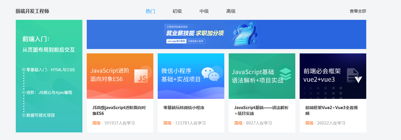
<!-- 前端 -->
      <div class="wrapper">
          <!-- 标题 -->
         <div class="hd">
            <h3>前端开发工程师</h3>
            <ul>
                <li><a href="#" class="active">热门</a></li>
                <li><a href="#">初级</a></li>
                <li><a href="#">中级</a></li>
                <li><a href="#">高级</a></li>
            </ul>
            <a href="#" class="more">查看全部</a>
        </div>
        <div class="bd">
            <div class="left">
                <img src="./uploads/web_left.png">
            </div>
            <div class="right">
                <div class="top">
                     <img src="./uploads/web_top.png">
                </div>
                <div class="bottom">
                     <ul>
                        <li>
                            <a href="#">
                                <div class="pic"><img src="./uploads/web01.png" alt=""></div>
                                <div class="text">
                                <h4>JS高级javaScript进阶面向对象ES6</h4>
                                <p><span>高级</span> · <i>101937</i>人在学习</p>
                                </div>
                            </a>
                        </li>
                        <li>
                            <a href="#">
                                <div class="pic"><img src="./uploads/web02.png" alt=""></div>
                                <div class="text">
                                <h4>零基础玩转微信小程序</h4>
                                <p><span>高级</span> · <i>133781</i>人在学习</p>
                                </div>
                            </a>
                        </li>
                        <li>
                            <a href="#">
                                <div class="pic"><img src="./uploads/web03.png" alt=""></div>
                                <div class="text">
                                <h4>JavaScript基础------语法解析+项目实战</h4>
                                <p><span>高级</span> · <i>8927</i>人在学习</p>
                                </div>
                            </a>
                        </li>
                        <li>
                            <a href="#">
                                <div class="pic"><img src="./uploads/web04.png" alt=""></div>
                                <div class="text">
                                <h4>前端框架Vue2+Vue3全套视频</h4>
                                <p><span>高级</span> · <i>26022</i>人在学习</p>
                                </div>
                            </a>
                        </li>
                    </ul>
                </div>
            </div>
        </div>
     </div>

/* 前端 */
.hd ul {
  display: flex;
}

.hd li {
  margin-right: 60px;
  font-size: 16px;
}

.hd li .active {
  color: #00a4ff;
}

.bd {
  display: flex;
  justify-content: space-between;
}

.bd .left {
  width: 228px;
  /* background-color: pink; */
}

.bd .right {
  width: 957px;
  /* background-color: pink; */
}

.bd .right .top {
  margin-bottom: 15px;
  height: 100px;
}
2.9 版权区域
<!-- 版权区域 -->
      <div class="footer">
            <div class="wrapper">
                <div class="left">
                    <a href="#"><img src="./images/logo.png" alt=""></a>
                    <p>学成在线致力于普及中国最好的教育它与中国一流大学和机构合作提供在线课程。
                    © 2017年XTCG Inc.保留所有权利。-沪ICP备15025210号</p>
                    <a href="#" class="download">下载APP</a>
                </div>
                <div class="right">
                    <dl>
                        <dt>关于学成网</dt>
                        <dd><a href="#">关于</a></dd>
                        <dd><a href="#">管理团队</a></dd>
                        <dd><a href="#">工作机会</a></dd>
                        <dd><a href="#">客户服务</a></dd>
                        <dd><a href="#">帮助</a></dd>
                    </dl>
                    <dl>
                        <dt>新手指南</dt>
                        <dd><a href="#">如何注册</a></dd>
                        <dd><a href="#">如何选课</a></dd>
                        <dd><a href="#">如何拿到毕业证</a></dd>
                        <dd><a href="#">学分是什么</a></dd>
                        <dd><a href="#">考试未通过怎么办</a></dd>
                    </dl>
                    <dl>
                        <dt>合作伙伴</dt>
                        <dd><a href="#">合作机构</a></dd>
                        <dd><a href="#">合作导师</a></dd>
                    </dl>
                </div>
            </div>
     </div>

/* 版权 */
.footer {
  margin-top: 60px;
  padding-top: 60px;
  height: 273px;
  background-color: #fff;
}

.footer .wrapper {
  display: flex;
  justify-content: space-between;
}

.footer .left {
  width: 440px;
  /* background-color: pink; */
}

.footer .left p {
  margin-top: 24px;
  margin-bottom: 14px;
  font-size: 12px;
  line-height: 17px;
  color: #666;
}

.footer .left .download {
  display: block;
  width: 120px;
  height: 36px;
  border: 1px solid #00a4ff;
  text-align: center;
  line-height: 34px;
  font-size: 16px;
  color: #00a4ff;
}

.footer .right {
  display: flex;
}

.footer .right dl {
  margin-left: 130px;
}

.footer .right dt {
  margin-bottom: 12px;
  font-size: 16px;
  line-height: 23px;
}

.footer .right a {
  font-size: 14px;
  color: #666;
  line-height: 24px;
}
三、轮播图
<!DOCTYPE html>
<html lang="en">
<head>
    <meta charset="UTF-8">
    <meta name="viewport" content="width=device-width, initial-scale=1.0">
    <title>Document</title>
    <link rel="stylesheet" href="./iconfont/iconfont.css"></link>
    <style>
        * {
            margin: 0;
            padding: 0;
            box-sizing: border-box;
        }

        li  {
            list-style: none;
        }

        .banner {
            position: relative;
            margin: 100px auto;
            width: 564px;
            height: 315px;
            /* 溢出盒子则隐藏 盒子大小刚好等于一张图片大小 */
            overflow: hidden;
        }

        .banner ul {
            display: flex;
        }

        .banner img {
            width: 564px;
            border-radius: 12px;
            vertical-align: middle;
        }

        .banner .prev,
        .banner .next {
            display: none;
            position: absolute;
            top: 50%;
            transform: translateY(-50%);

            width: 20px;
            height: 30px;
            background-color: rgba(0, 0, 0, 0.3);

            text-decoration: none;
            color: #fff;
            line-height: 30px;
        }

        /* 鼠标滑到banner区域,箭头要显示 display:block */
        .banner:hover .prev,
        .banner:hover .next {
            display: block;
        }

        .banner .prev {
            left: 0 ;
            border-radius: 0 15px 15px 0;
        }

        .banner .next {
            right: 0;
            border-radius: 15px 0 0 15px;
            text-align: center;
        }

        .banner ol{
            position: absolute;
            height: 13px;
            bottom: 20px;
            left: 50%;
            transform: translateX(-50%);
            background-color: rgba(255, 255, 255, 0.3);

            display: flex;

            border-radius: 10px;
        }

        .banner ol li {
            margin: 3px;
            width: 8px;
            height: 8px;
            background-color: #fff;
            border-radius: 50%;
            cursor: pointer;
        }

        .banner ol .active{
            background-color: #ff5000;
        }


    </style>
</head>
<body>
    <div class="banner">
        <!-- 图 ul > li -->
        <ul>
             <li><a href="#"><img src="./images/banner1.jpg" alt=""></a></li>
             <li><a href="#"><img src="./images/banner2.jpg" alt=""></a></li>
             <li><a href="#"><img src="./images/banner3.jpg" alt=""></a></li>
        </ul>
        <!-- 箭头 -->
        <a href="#" class="prev"><i class="iconfont icon-zuoce"></i></a>
        <a href="#" class="next"><i class="iconfont icon-youce"></i></a>
         <!-- 原点 -->
          <ol>
            <li class="active"></li>
            <li></li>
            <li></li>
          </ol>
    </div>
</body>
</html>
四、hover和display
<!DOCTYPE html>
<html lang="en">
<head>
    <meta charset="UTF-8">
    <meta name="viewport" content="width=device-width, initial-scale=1.0">
    <link rel="stylesheet" href="css/day03-01.css">
    <title>Document</title>
</head>
<body>
    <div>
        <a href="#">HTML</a>
        <a href="#">CSS</a>
        <a href="#">JavaScript</a>
        <a href="#">Vue</a>
        <a href="#">React</a>
    </div>
</body>
</html>

a {
    width: 200px;
    height: 80px;
    font-size: 18px;
    background: #3064bb;
    color:white;
    text-align: center;/* 文字水平居中 */
    line-height: 80px;
    text-decoration: none;
    display: block;
}

/* 鼠标悬停时背景颜色为蓝色 */
a:hover {
    background-color: #608dd9;
}
效果
五、banner
收获:
-
在用选择器找标签的时候,不要直接使用标签选择器,因为网页标签多,会造成样式冲突,应使用后代选择器
banner .banner {
height: 500px;
background-image: url(../image/bk.png);
background-repeat: no-repeat;
background-color: #f3f3f4;
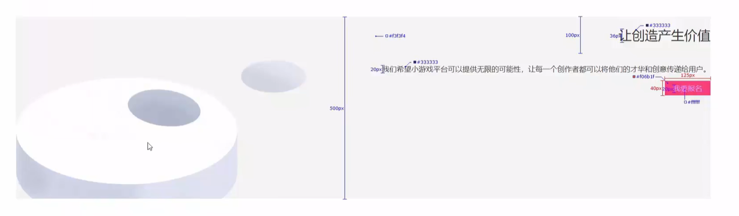
background-position: left bottom;/* 文字控制属性,继承给子集 */ text-align: right; color: #333333;}
.banner p {
font-size: 20px;
}.banner h2 {
font-size: 36px;
font-weight: 400;
line-height: 100px;
}.banner a {
width: 125px;
height: 40px;
color: #ffffff;
background-color: #f06b1f;/* 转块级无法右对齐 因为块元素独占一行*/ display: inline-block; text-align: center; /* line-height 决定了文本行的高度,即每一行占据的垂直空间 */ /* 在只有一行时,当 line-height 设置为和 height 一样时文字垂直居中 */ line-height: 40px;}
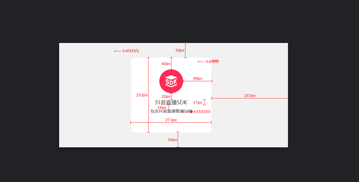
六、产品卡片
.
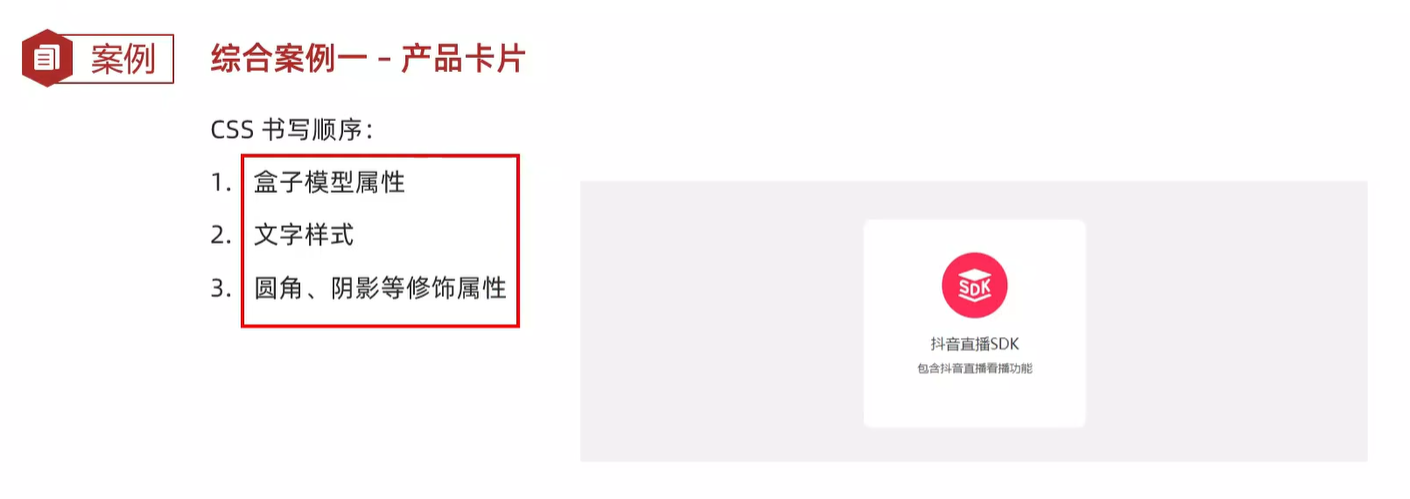
在写css样式的时候,先写盒子模型的,再写文字样式的,最后写圆角、阴影的,可以提高浏览器的效率
<!DOCTYPE html>
<html lang="en">
<head>
<meta charset="UTF-8">
<meta name="viewport" content="width=device-width, initial-scale=1.0">
<title>产品卡片</title>
<style>
* {
margin: 0;
padding: 0;
box-sizing: border-box;
}
body {
background-color: #f1f1f1;
}
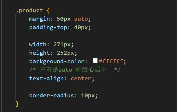
.product {
margin: 50px auto;
padding-top: 40px;
width: 271px;
height: 252px;
background-color: #ffffff;
/* 左右是auto 则版心居中 */
text-align: center;
border-radius: 10px;
}
#first {
font-size: 17px;
margin-top: 20px;
margin-bottom: 12px;
}
#second {
font-size: 12px;
color: #555555;
}
</style>
</head>
<body>
<div class="product">
<div class="card">
<img src="image/liveSDK.svg">
<p id="first">抖音直播SDK</p>
<p id="second">包含抖音直播看播功能</p>
</div>
</div>
</body>
</html>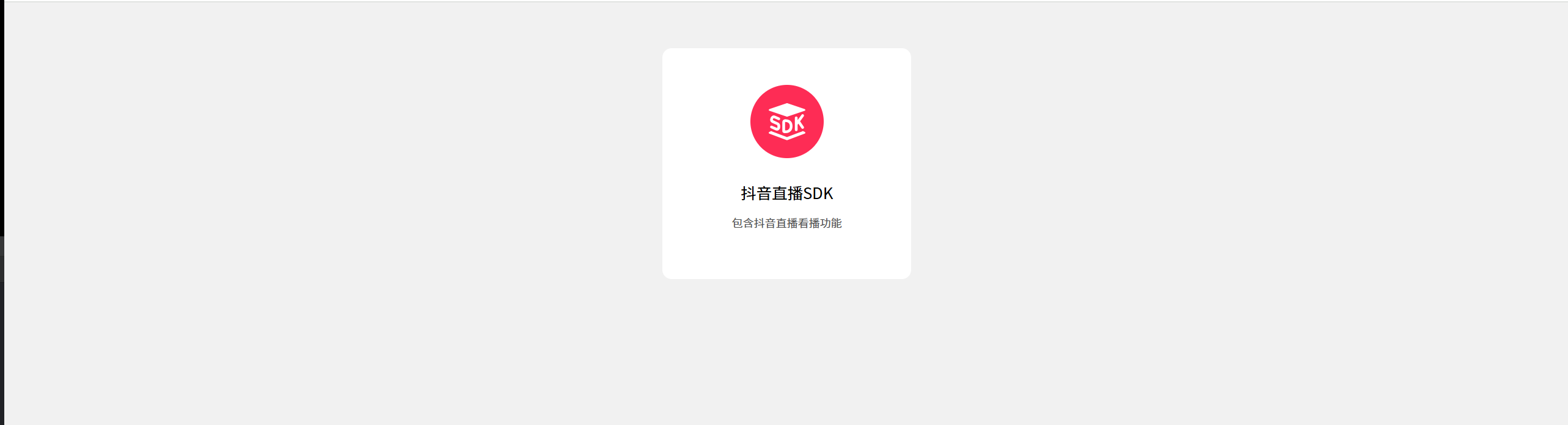
七、新浪新闻
<!DOCTYPE html>
<html lang="en">
<head>
    <meta charset="UTF-8">
    <meta name="viewport" content="width=device-width, initial-scale=1.0">
    <title>Document</title>
    <style>
        * {
            margin: 0;
            padding: 0;
            box-sizing: border-box;
        }

        .xinwen{
            width: 360px;
            height: 200px;
            margin: 100px auto;
        }

        .xinwen .hd{
            height: 34px;
            background-color: #eeeeee;
            border: 1px solid #dbdee1;
            border-left: 0;
        }

        .xinwen .hd a {
            margin-top: -1px;
            width: 48px;
            height: 34px;
            /* 将a标签转为块级元素 可以调整高度 */
            display: inline-block;
            background-color: #fff;
            text-align: center;
            border-top: 3px solid #ff8400;
            border-right: 1px solid #dbdee1;
            line-height: 30px;

            font-size: 14px;
            color: #333;
            text-decoration: none;
        }

        .content{
            padding: 5px;
        }

        .content li{
            padding-left: 10px;
            list-style: none;
            background-image: url(image/square.png);
            background-repeat: no-repeat;
            background-position: 0 center;
        }

        .content li a {
            padding-left: 20px;
            text-decoration: none;
            background-image: url(image/img.gif);
            background-repeat: no-repeat;
            background-position: 0 center;
            font-size: 15px;
        }

    </style>
</head>
<body>
    <div class="xinwen">
        <div class="hd">
            <a href="#">新闻</a>
            <a href="#">资讯</a>
        </div>
        <div class="content">
            <ul>
                <li><a>点赞"新农人"温暖的伸手</a></li>
                <li><a>在希望的田野上...</a></li>
                <li><a>"中国天眼"又有新发现已在《自然》杂志发表</a></li>
                <li><a>这个领域缺人</a></li>
                <li><a>点赞"新农人"温暖的伸手</a></li>
                <li><a>点赞"新农人"温暖的伸手</a></li>
            </ul>
        </div>
    </div>
</body>
</html>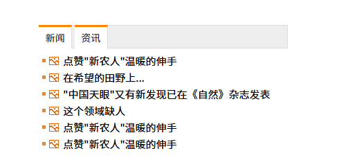
八、酷我音乐(移动端)
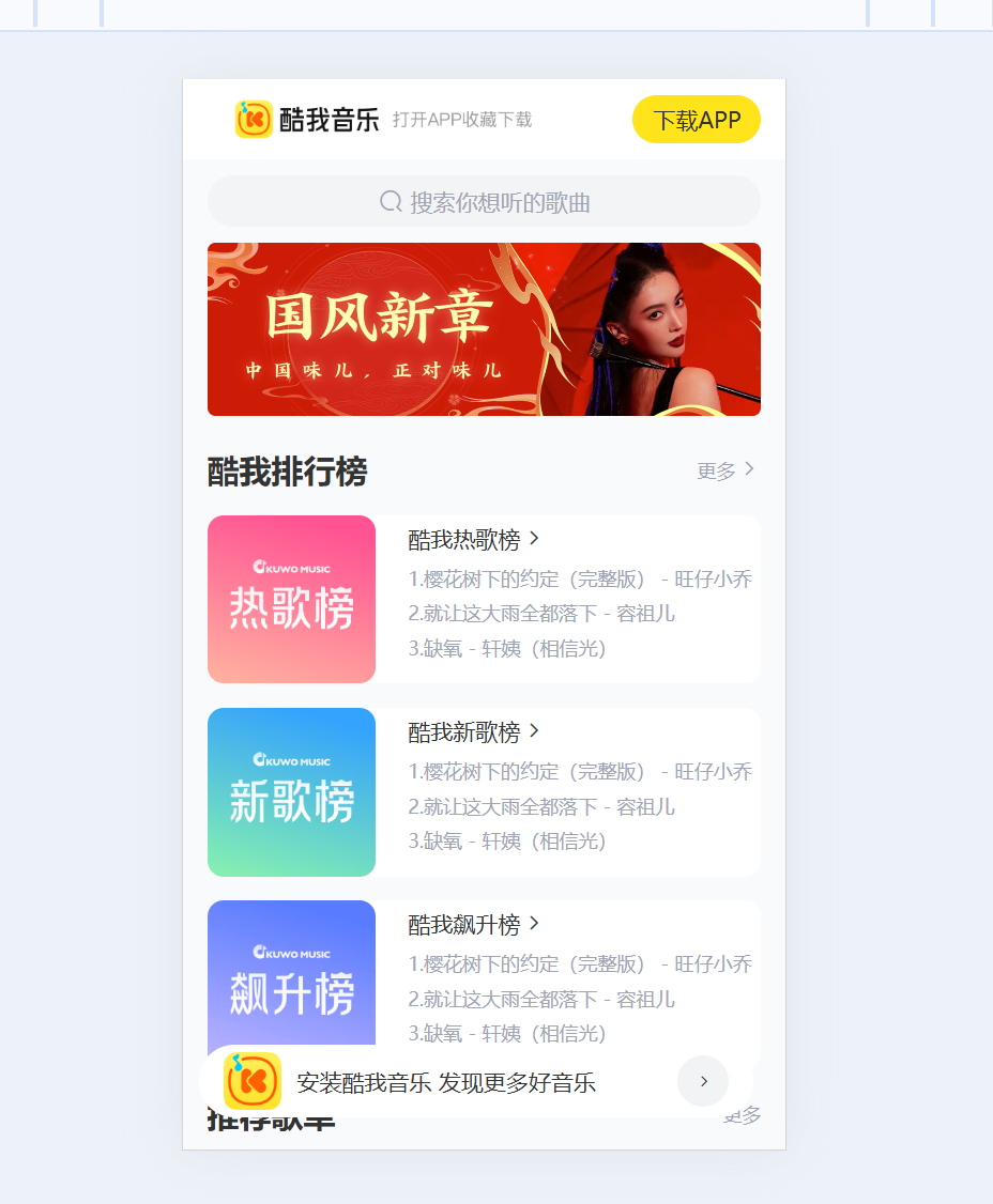
使用vw实现移动端适配
vw:视口宽度的百分之一
元素fixed固定后,会变成行内元素,行内元素宽度由内容撑开,顶部元素内容不够345px,则没有铺满整个宽度,需要手动设置,头部元素固定后,会盖住搜索部分,需要让搜索部分与头部隔开,加一个margin-top就可以实现
<!DOCTYPE html>
<html lang="en">
<head>
    <meta charset="UTF-8">
    <meta name="viewport" content="width=device-width, initial-scale=1.0">
    <link rel="stylesheet" href="css/index.css"></link>
    <link rel="stylesheet" href="iconfont/iconfont.css"></link>
    <title>酷我音乐</title>
</head>
<body>
    <div class="header">
        <div class="left"></div>
        <a href="#">下载APP</a>
    </div>
    <div class="search">
        <div class="txt">
            <span class="iconfont icon-sousuo"></span>
            <span>搜索你想听的歌曲</span>
        </div>
    </div>
    <!-- banner -->
    <div class="banner">
        <ul>
            <li><a><img src="./assets/banner01.jpeg"></a></li>
            <!-- <li><a><img src="./assets/banner02.jpeg"></a></li>
             <li><a><img src="./assets/banner03.jpeg"></a></li> -->
        </ul>
            </li>
            </li>
        </ul>
    </div>
    <!-- 排行榜 -->
     <div class="list">
        <!-- 标题 -->
         <div class="title">
            <h4>酷我排行榜</h4>
            <a href="#"><span>更多<span class="iconfont icon-right"></span></a>
         </div>
         <!-- 内容 -->
         <div class="content">
      <ul>
        <li>
          <div class="pic"><img src="./assets/icon_rank_hot.png" alt=""></div>
          <div class="txt">
            <a href="#" class="more">酷我热歌榜<span class="iconfont icon-right"></span></a>
            <a href="#">1.樱花树下的约定(完整版) - 旺仔小乔</a>
            <a href="#">2.就让这大雨全都落下 - 容祖儿</a>
            <a href="#">3.缺氧 - 轩姨(相信光)</a>
          </div>
        </li>
        <li>
          <div class="pic"><img src="./assets/icon_rank_new.png" alt=""></div>
          <div class="txt">
            <a href="#" class="more">酷我新歌榜<span class="iconfont icon-right"></span></a>
            <a href="#">1.樱花树下的约定(完整版) - 旺仔小乔</a>
            <a href="#">2.就让这大雨全都落下 - 容祖儿</a>
            <a href="#">3.缺氧 - 轩姨(相信光)</a>
          </div>
        </li>
        <li>
          <div class="pic"><img src="./assets/icon_rank_rise.png" alt=""></div>
          <div class="txt">
            <a href="#" class="more">酷我飙升榜<span class="iconfont icon-right"></span></a>
            <a href="#">1.樱花树下的约定(完整版) - 旺仔小乔</a>
            <a href="#">2.就让这大雨全都落下 - 容祖儿</a>
            <a href="#">3.缺氧 - 轩姨(相信光)</a>
          </div>
        </li>
      </ul>
    </div>
     </div>
     <!-- 推荐歌单 -->
     <div class="recommend">
        <div class="title">
            <h4>推荐歌单</h4>
            <a href="#">更多</a>
        </div>
        <div class="content">
            <ul>
                <li>
                    <a>
                        <div class="pic">
                            <img src="./assets/song01.jpeg">
                            <div class="cover"><span>18.2W</span></div>
                        </div>
                        <div class="text">
                            <span>抖音嗨爆DJ!劲爆旋律萦绕双耳</span>
                        </div>
                    </a>
                </li>
                 <li>
                    <a>
                        <div class="pic">
                            <img src="./assets/song02.jpeg">
                            <div class="cover"><span>18.2W</span></div>
                        </div>
                        <div class="text">
                            <span>抖音嗨爆DJ!劲爆旋律萦绕双耳</span>
                        </div>
                    </a>
                </li>
                 <li>
                    <a>
                        <div class="pic">
                            <img src="./assets/song03.jpeg">
                            <div class="cover"><span>18.2W</span></div>
                        </div>
                        <div class="text">
                            <span>抖音嗨爆DJ!劲爆旋律萦绕双耳</span>
                        </div>
                    </a>
                </li>
            </ul>
        </div>
     </div>

     <!-- 下载区域 -->
      <div class="download">
        <img src="./assets/logo.png">
        <p>安装酷我音乐 发现更多好音乐</p>
        <span class="iconfont icon-right"></span>
      </div>
</body>
</html>

// out: ../css/

@import "./base";

@vw:3.75vw;

body {
  background-color: #f9fafb;
}

// header
.header {
  position: fixed;
  top: 0;
  left: 0;
  display: flex;
  justify-content: space-between;
  align-items: center;
  background-color: #fff;
  padding:0 (15 / @vw);
  height: (50 / @vw);
  // 固定定位的盒子,宽度靠内容撑开
  width: 100%;
  .left {
    width: (235 / @vw);
    height: (50 / @vw) ;
    background-image: url(../assets/head.png);
    background-repeat: no-repeat;
    background-size: contain;
  }
  a {
    width: (80 / @vw);
    height: (30 /@vw);
    background-color: #ffe31b;
    border-radius: (15 /@vw);
    text-align: center;
    line-height: (30 /@vw);
    font-size: (14 / @vw);
  }
}

.search {
  // 头部固定定位,脱标不占位,搜索去最顶了,加上外边距挤下来即可
  height: (52 / @vw);
  margin-top: (50 / @vw);
  padding: (10 / @vw) (15 / @vw);
  .txt {
    height: (32 / @vw);
    background-color: #f2f4f5;
    color: #a1a4b3;
    border-radius: (16 / @vw);
    font-size: (14 / @vw);
    // 让文字居中
    text-align: center;
    line-height: (32 / @vw);
    .iconfont {
      font-size: (16 / @vw);
    }
  }
}

// banner
.banner {
  height: (108 / @vw);
  padding: 0 (15 / @vw);
  ul {
    li {
      width: (345 / @vw);
      height: (108 / @vw);
    }
    img {
      width: 100%;
      height: 100%;
      // cover完全覆盖
      // 缩放img,图片比例跟父级盒子比例不同,避免图片挤压变形
      object-fit: cover;
      border-radius: (5 / @vw);
    }
  }
}

// 排行榜
.list {
  margin-top: (20 / @vw);
  padding: 0 (15 / @vw);
  li {
    margin-bottom: (15 / @vw);
    display: flex;
    height: (105 / @vw);
    background-color: #fff;
    border-radius: (10 / @vw);
  }
  .pic {
     margin-right: (20 / @vw);
    img {
      width: (105 / @vw);
      height: (105 / @vw);
      border-radius: (10 / @vw);
    }
  }

  .txt {
    a {
      line-height: 1.8;
      display: block;
      color: #a1a4b3;
      font-size: (12 / @vw);
    }
    .more {
      color: #333;
      font-size: (14 / @vw);
    }
  }
}


.title {
    display: flex;
    justify-content: space-between;
    align-items: center;
    margin-bottom: (15 / @vw);
    h4 {
      font-size: (20 /@vw)
    }
    a {
      font-size: (12 /@vw);
      color: #a1a4b3;
    }
  }


.recommend {
   padding: 0 (15 / @vw);
   .content ul {
    display: flex;
    justify-content: space-between;
    flex-wrap: wrap;
    a {
      display: block;
      width: (105 / @vw);
      margin-bottom: (15 / @vw);
    }
  }
  .pic {
    margin-right: (20 / @vw);
    position: relative;
    img {
      width: (105 / @vw);
      height: (105 / @vw);
      border-radius: (10 / @vw);
    }
    .cover {
      position: absolute;
      left: 0;
      bottom: 0;
      border-radius: (5 / @vw);
      width: (70 / @vw);
      height: (28 / @vw);
      background-color: rgba(0, 0, 0, 0.8);
      text-align: center;
      line-height: (28 / @vw);
      span {
        color: #fff;
        font-size: (14 /@vw);
      }
    }
  }
  .text {
    width: (105 / @vw);
    height: (38 / @vw);
    font-size: (14 /@vw);
  }

}

.download {
  position: fixed;
  display: flex;
  align-items: center;
  left: (10 / @vw);
  bottom : (20 / @vw);
  padding: 0 (15 / @vw);
  width: (345 / @vw);
  height: (45 / @vw);
  border-radius: (22 / @vw);
  background-color: #ffffff;
  img {
    width: (36 / @vw);
    height: (36 / @vw);
    margin-right: (10 / @vw);
  }
  p {
    flex: 1;
    font-size: (14 /@vw);
  }
  span {
    width: (32 / @vw);
    height: (32 / @vw);
    border-radius: (16 / @vw);
    background-color: #f2f3f5;
    text-align: center;
    line-height: (32 / @vw);
    font-size: (12 /@vw);
  }

}