一、需求背景:
数据可视化大屏是一种将数据、信息和可视化效果集中展示在一块或多块大屏幕上的技术。通过各种图形、图表、数据可视化等方式,将复杂的数据和信息变得直观、易懂,让人们能够快速地了解数据和信息的含义。
应对现在数据可视化的趋势,越来越多企业需要在很多场景(营销数据,生产数据,用户数据)下使用,可视化图表来展示体现数据,让数据更加直观,数据特点更加突出。
根据不同的业务场景,做一个好的大屏需要考虑大屏布局、图表展现、交互动效、操作是否简单、是否能自适应等等因素。其中大屏是否能自适应也是一个比较重要的因素。
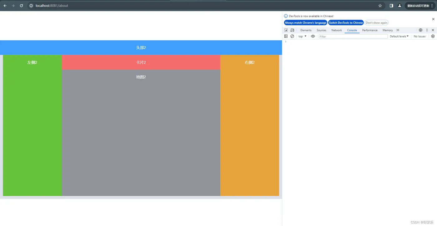
在做可视化大屏时,大屏的分辨率基本都是固定死的,因此我们只需要把页面按照设计稿尺寸写死即可,但是我们开发屏幕很小,这时候总要将浏览器进行缩小,这里给出一个通用方法,供大家使用,无需缩放浏览器。
二、需求分析:
本示例按照1920*1080的分辨率来写,也就是16:9的比例。你也可以替换成你自己的分辨率。效果是一样的。
做大屏项目时,需要适配不同屏幕,且在任意屏幕下保持16:9的比例,保持显示效果一致,屏幕比例不一致两边留白即可。
不同屏幕宽高比例(和设计稿16:9)相比会有两种情况:
- 更宽:(Width / Height) > 16/9,以高度为基准,去适配宽度。
- 更高:(Width / Height) < 16/9,以宽度为基准,去适配高度。
三、选择方案:
首先我们严格按照给定的UI设计稿的宽高尺寸画页面。然后我们再去计算一下放大或者缩小的倍数。
这时候要注意了,因为每块屏幕不一样,所以这个缩放的数值不是个固定的值,所以是个变量。这时候我们就要进入页面的时候计算出来这个缩放值。
利用transform的scale属性缩放,缩放整个页面。
我们还使用transform-origin属性将缩放的中心点设置为左上角,以确保大屏幕按比例缩放。
合适分辨率:
屏幕分辨率比 16:9更宽时
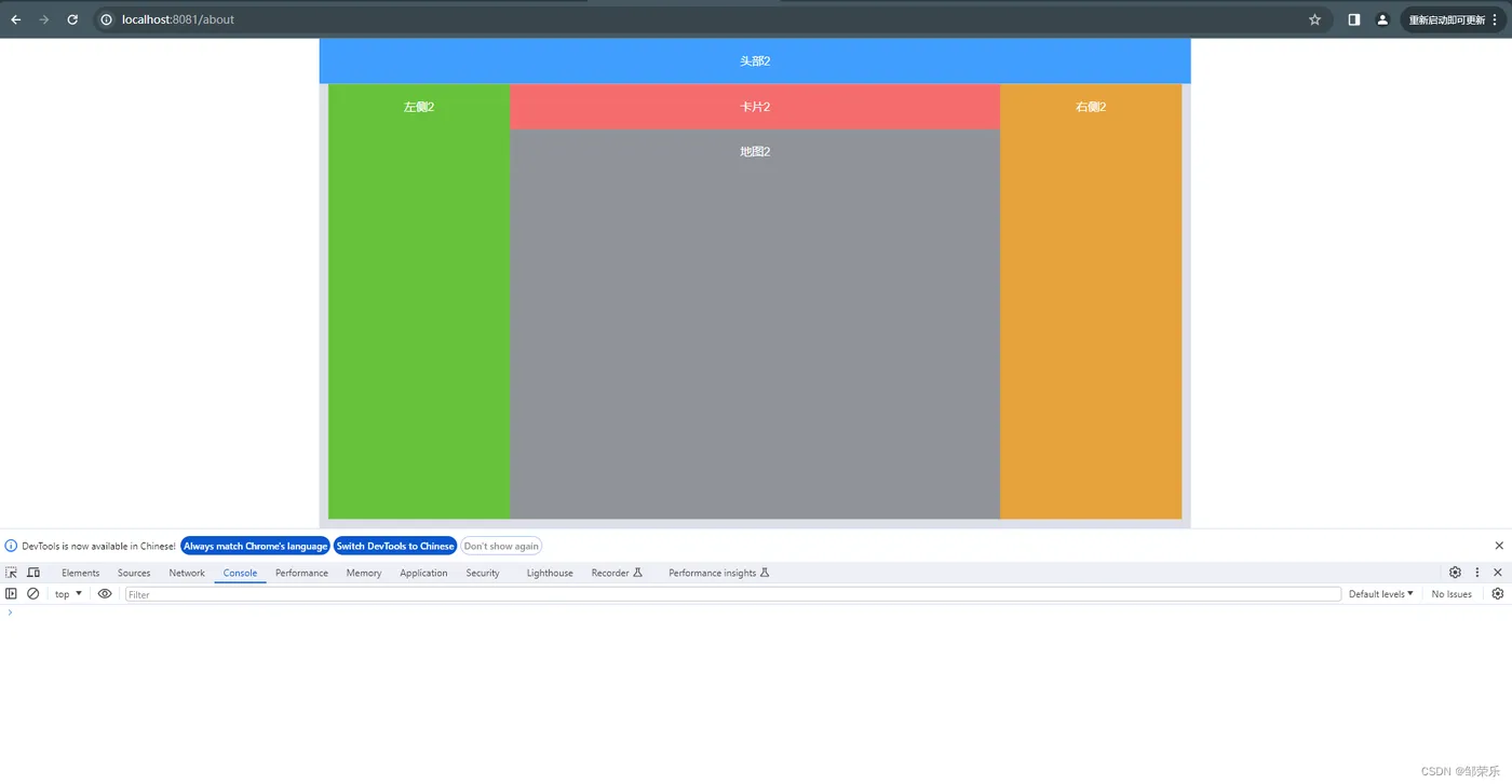
屏幕比 16:9 更高时:
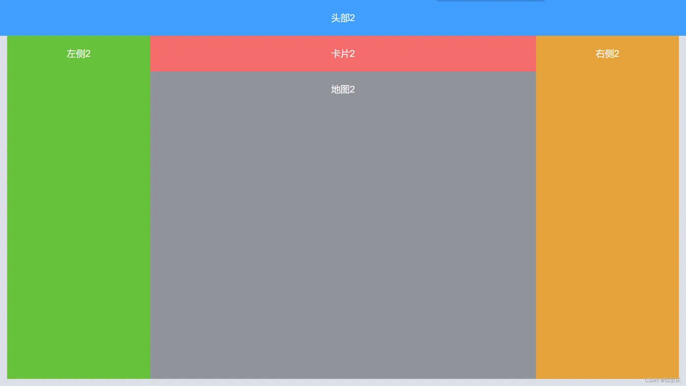
代码 demo如下:
html
<template>
  <div class="auto-scal-container" ref="AutoScalContainerRef">
    <div ref="DomRef" class="auto-scal-container-inner">
      <div class="custom-big-box">
        <div class="top">头部</div>
        <div class="bot">
          <div class="left">左侧</div>
          <div class="mid">
            <div class="midtop">卡片</div>
            <div class="midbot">地图</div>
          </div>
          <div class="right">右侧</div>
        </div>
      </div>
    </div>
  </div>
</template>

<script>
import { transform } from 'lodash';

export default {
  data() {
    return {
      width: 1912,
      height: 1080,
    };
  },
  mounted() {
    this.$nextTick(_ => {
      this.autoResizeScreen();
    });

    window.addEventListener('resize', this.autoResizeScreen);
  },
  methods: {
    autoResizeScreen() {
      let rect = this.$refs.AutoScalContainerRef.getBoundingClientRect();
      let DomRef = this.$refs.DomRef;

      let clientWidth = window.innerWidth;
      let clientHeight = window.innerHeight;
      var width = this.width;
      var height = this.height;
      let left = 0;
      let top = 0;
      let scale = 0;
      let origin = `left top`;
      let ratio = width / height; // 16: 9
      // 比 16:9 更宽,以高度为准缩放
      if ((clientWidth / clientHeight) >= ratio) {
        scale = clientHeight / height;
        const boxWidth = DomRef.getBoundingClientRect().width;
        const boxHeight = DomRef.getBoundingClientRect().height;

        left = 0;
        top = -(window.innerHeight - this.height * scale) / 2;
        origin = `center top`;
        console.log(boxWidth, clientHeight,boxHeight, scale, '16:9 更大,宽度更宽,以高度为准盒子上中点进行缩放, scale');
      } else {
        scale = clientWidth / width;
        const boxWidth = DomRef.getBoundingClientRect().width;
        const boxHeight = DomRef.getBoundingClientRect().height;

        left = 0;
        top = (window.innerHeight - this.height * scale) / 2;
        origin = `left top`;
        console.log(boxWidth, boxHeight, scale, '比 16:9 更小,长度更高,以宽度为准盒子左中点进行缩放, scale');
      }


      Object.assign(DomRef.style, {
        transformOrigin: origin,
        webkitTransform: `translate(${left}px, ${top}px) rotate(0) scale(${scale})`,
      });

    },
  },
  beforeDestroy() {
    window.removeEventListener('resize', this.autoResizeScreen);
  },
};
</script>

<style>
.auto-scal-containe {
  /* position: relative; */
}
.auto-scal-container-inner {
  /* position: absolute; */
  width: 1920px;
  height: 1080px;
}
.custom-big-box {
  width: 1920px;
  height: 1080px;
  font-size: 26px;
  color: #fff;
  text-align: center;
  line-height: 100px;
}

.top {
  width: 100%;
  height: 100px;
  background-color: #409eff;
}

.bot {
  padding: 20px;
  padding-top: 0;
  display: flex;
  height: 980px;
  background-color: #dcdfe6;
}

.left {
  width: 400px;
  height: 960px;
  background-color: #67c23a;
}

.mid {
  width: 1080px;
  height: 960px;
}

.right {
  width: 400px;
  height: 960px;
  background-color: #e6a23c;
}

.midtop {
  height: 100px;
  width: 100%;
  background-color: #f56c6c;
}

.midbot {
  width: 100%;
  height: 860px;
  background-color: #909399;
}
</style>