一、为什么选G6
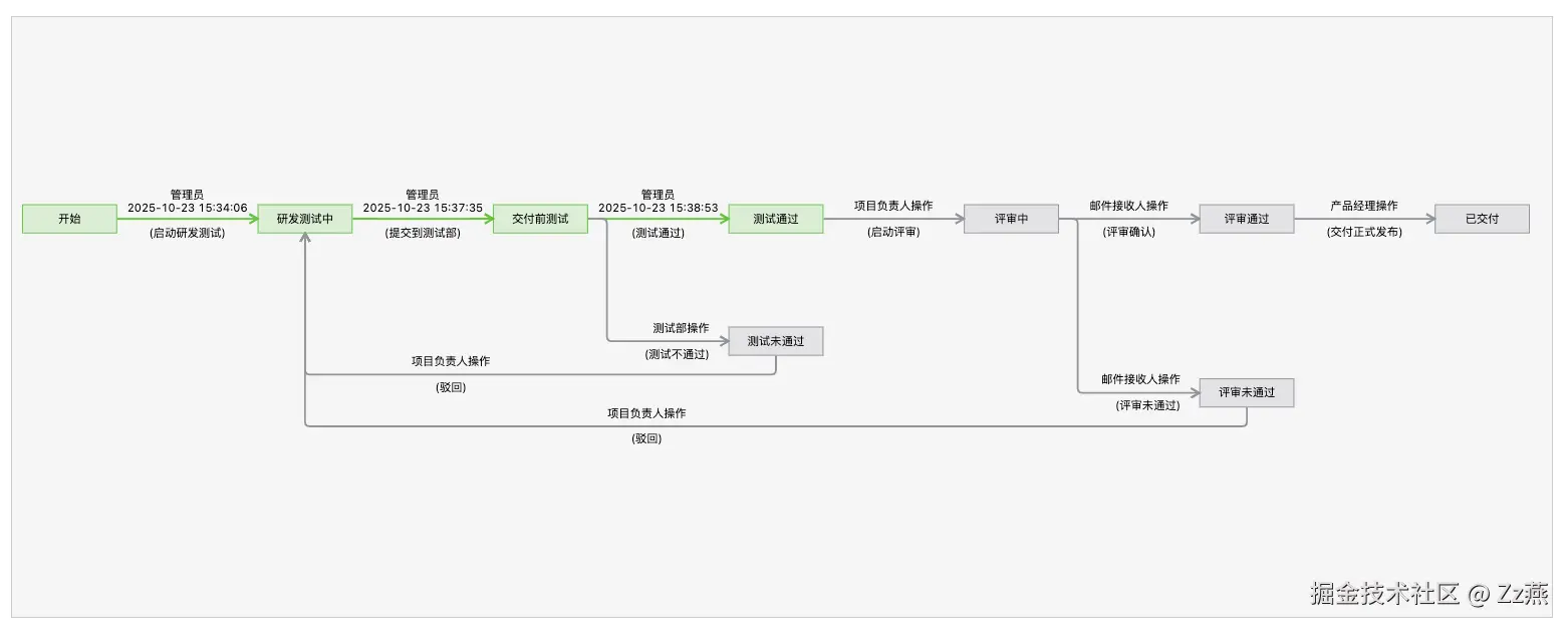
调研了10款前端流程图框架,好用省事的要钱。最终选择用 G6 实现一个从左到右、自动居中、可缩放拖拽的流程图。效果图如下:
二、在 Vue2 中集成 G6@4.x
直接安装 G6 5.x,引入就报错。直接降低版本到 4.x,查阅4.x的文档。
1、安装
ruby
$ npm install @antv/g6@4.8.252、引入
JS
import G6 from '@antv/g6'3、创建一个容器
bash
<div id="mountNode"></div>4、构造节点和边数据
JS
const data = {
  // 节点集
  nodes: [
    {
      id: 'node1', // String,该节点存在则必须,节点的唯一标识
      x: 100, // Number,可选,节点位置的 x 值
      y: 200, // Number,可选,节点位置的 y 值
    },
    {
      id: 'node2', // String,该节点存在则必须,节点的唯一标识
      x: 300, // Number,可选,节点位置的 x 值
      y: 200, // Number,可选,节点位置的 y 值
    },
  ],
  // 边集
  edges: [
    {
      source: 'node1', // String,必须,起始点 id
      target: 'node2', // String,必须,目标点 id
    },
  ],
};
5、创建关系图
JS
const graph = new G6.Graph({
  container: 'mountNode', // String | HTMLElement,必须,在 Step 1 中创建的容器 id 或容器本身
  width: 800, // 图的宽度
  height: 500, // 图的高度
  data: data // 传入在3中构造的数据
});
6、渲染
scss
graph.render(); // 渲染图三、自定义配置
1、配置项:自适应居中
将固定长宽 width 、height 配置改为 autoResize、fitView、fitCenter配置:
JS
const graph = new G6.Graph({
    container: 'mountNode', // String | HTMLElement,必须,在 Step 1 中创建的容器 id 或容器本身
    data: data // 传入在3中构造的数据
    // width: 800, // 图的宽度
    // height: 500, // 图的高度
    autoResize: true, // 是否在窗口大小变化时自动调整画布大小
    fitView: true, // 是否自适应画布。
    fitCenter: true, // 5.x 有变动,可以配置为 autoFit: 'center'

})2、交互模式:支持缩放、整体拖拽
JS
const graph = new G6.Graph({
    container: 'mountNode', // String | HTMLElement,必须,在 Step 1 中创建的容器 id 或容器本身
    data: data // 传入在3中构造的数据
    autoResize: true, // 是否在窗口大小变化时自动调整画布大小
    autoFit: 'center', // 自动适配策略,'view'(适应视图)或'center'(居中)
    modes: { // 交互模式,与5.x用法不同
        default: ['zoom-canvas', 'drag-canvas'],
    },
})3、全局节点配置项
节点类型一样,且有相同的样式,可使用defaultNode统一全局配置:
JS
const graph = new G6.Graph({
    container: 'mountNode', // String | HTMLElement,必须,在 Step 1 中创建的容器 id 或容器本身
    data: data // 传入在3中构造的数据
    autoResize: true, // 是否在窗口大小变化时自动调整画布大小
    autoFit: 'center', // 自动适配策略,'view'(适应视图)或'center'(居中)
    modes: { // 交互模式,与5.x用法不同
        default: ['zoom-canvas', 'drag-canvas'],
    },
    defaultNode: {
        type: 'rect', // 矩形
        style: {
          fill: '#909399', // 背景色
          fillOpacity: 0.2, // 背景色透明度
          stroke: '#909399', // 节点边颜色
       }
    },
})4、全局边配置项
定义大部分边类型、相同的样式,可使用defaultEdge统一全局配置,后续可在构造数据时进行覆盖:
JS
const graph = new G6.Graph({
    container: 'mountNode', // String | HTMLElement,必须,在 Step 1 中创建的容器 id 或容器本身
    data: data // 传入在3中构造的数据
    autoResize: true, // 是否在窗口大小变化时自动调整画布大小
    autoFit: 'center', // 自动适配策略,'view'(适应视图)或'center'(居中)
    modes: { // 交互模式,与5.x用法不同
        default: ['zoom-canvas', 'drag-canvas'],
    },
    defaultNode: {
        type: 'rect', // 矩形
        style: {
          fill: '#909399', // 背景色
          fillOpacity: 0.2, // 背景色透明度
          stroke: '#909399', // 节点边颜色
       }
    },
    defaultEdge: {
        type: 'line',
        style: {
          radius: 5, // 拐弯处的圆角弧度,若不设置则为直角,polyline 特有
          offset: 20, // 拐弯处距离节点最小距离,默认为 5,polyline 特有
          stroke: '#909399', // 边颜色
          lineWidth: 2, // 边宽度
          endArrow: true, // 结束的位置有箭头
          startArrow: false, // 开始的位置无箭头
        },
        labelCfg: {} // 定义标签的位置偏移量
   },
})5、图布局:层次布局
流程图选层次布局,通过设置rankdir的值来实现从上到下或是从左到右:
JS
const graph = new G6.Graph({
    container: 'mountNode', // String | HTMLElement,必须,在 Step 1 中创建的容器 id 或容器本身
    data: data // 传入在3中构造的数据
    ...
    layout: {
        type: 'dagre',
        rankdir: 'LR', // 方向,LR:从左到右,TB:从上到下
        align: 'UL', // 节点对齐方式,UL:左上角
        nodesep: 30, // 竖直间距
        ranksep: 70, // 水平相邻节点间距:lable文字太长被遮挡可调整此参数
    },
})6、指定节点的接入位置
- 在从左到右布局中,节点默认左进右出,如果需要设置其它方向,比如从下出上进。需要在节点数据中指定
anchorPoints。 anchorPoints是一个二维数组,每一项表示一个连接点的位置,如下值,依次是上、下、左、右。- 边可以通过指定
sourceAnchor和targetAnchor分别选择起始点、结束点。取的值是相对应节点上anchorPoints数组的索引值。
JS
const DATA = {
  nodes: [
    { id: '0', label: '开始', anchorPoints: [[0.5, 0], [0.5, 1], [0, 0.5], [1, 0.5]] },
    { id: '1', label: '成功', anchorPoints: [[0.5, 0], [0.5, 1], [0, 0.5], [1, 0.5]] },
    { id: '2', label: '失败', anchorPoints: [[0.5, 0], [0.5, 1], [0, 0.5], [1, 0.5]] },
  ],
  edges: [
    { id: '0-1', source: '0', target: '1', label: '通过' },
    { id: '0-2', type: 'polyline', source: '0', target: '2', sourceAnchor: 3, targetAnchor: 2, label: '不通过', labelCfg: { refX: -20, position: 'end' } },
  ],
}
通过以上配置,就能渲染出一个布局好看且合理的流程图啦。