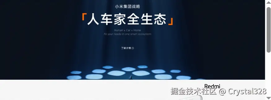
1. 经典视觉差效果
- 为要盖住的图片添加 background-attachment:fixed
- scroll: 图片随着页面的滚动而滚动,相对于元素本身是固定,不会随着元素的内容而滚走
- fixed: 固定 背景图片相对于视口固定,相对于元素本身是固定,不会随着元素的内容而滚走(主要用作视觉差效果)
- local: 背景相对于元素的内容固定(内容/浏览器滚动都会让图片滚动)
html
<!DOCTYPE html>
<html lang="en">
<head>
    <meta charset="UTF-8">
    <meta name="viewport" content="width=device-width, initial-scale=1.0">
    <title>视觉差效果</title>
    <style>
        body {
            margin: 0;
            padding: 0;
        }
        .one {
            height: 800px;
            background-image: url(../html+css/images/04-1.webp);
            background-position: center;
            background-size: cover;
            background-attachment: fixed;
        }
        .two {
            height: 1000px;
            background-image: url(../html+css/images/04-2.avif);
            background-position: center;
            background-size: cover;

        }
    </style>
</head>
<body>
    <div class="one"></div>
    <div class="two"></div>
</body>
</html>
2. 将背景图片作为文字的背景颜色
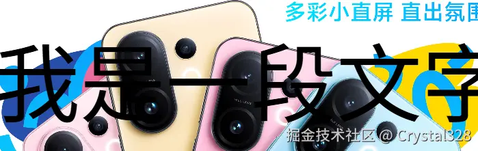 ------------------------------------------------------------------------------------------------------------------------------------》》》》效果如图
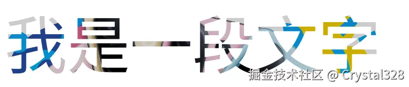
- 文字设置半透明
- 使用background-clip:text
html
<!DOCTYPE html>
<html lang="en">
<head>
<meta charset="UTF-8">
<meta name="viewport" content="width=device-width, initial-scale=1.0">
<title>Document</title>
<style>
.one {
height: 200px;
font-size: 100px;
line-height: 200px;
text-align: center;
background-image: url('../html+css/images/04-2.avif');
background-size: cover;
background-position: center;
/* 重要代码 */
color: rgba(0,0,0,.2);
background-clip: text;
-webkit-background-clip: text;
}
</style>
</head>
<body>
<div class="one">我是一段文字</div>
</body>
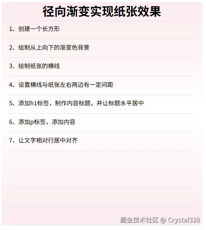
</html>3. 绘制纸张
-
创建一个长方形盒子
-
绘制从上往下的渐变色背景
-
绘制纸张的横线
- 每个横框从上往下渐变 框宽度与父亲一致 高度50px
- 要写在背景颜色之前 写的往后的在下面
-
添加标签
html
<!DOCTYPE html>
<html lang="en">
<head>
    <meta charset="UTF-8">
    <meta name="viewport" content="width=device-width, initial-scale=1.0">
    <title>绘制纸张</title>
    <style>
        .box {
            width: 500px;
            height: 600px;
            margin: 0 auto;
            padding: 0 20px;
            background-image:
            linear-gradient(to bottom,transparent 49px, #ddd 49px),
            linear-gradient(to bottom, #fbebed,#fff, #fbebed);
            background-size: auto 50px ,auto auto;
            background-clip: content-box, border-box;
        }
      h1 {
        margin: 0;
        text-align: center;
      }
      p {
        line-height: 50px;
        margin: 0;
      }
    </style>
</head>
<body>
    <div class="box">
        <h1>径向渐变实现纸张效果</h1>
  <p>1、创建一个长方形</p>
  <p>2、绘制从上向下的渐变色背景</p>
  <p>3、绘制纸张的横线</p>
  <p>4、设置横线与纸张左右两边有一定间距</p>
  <p>5、添加h1标签,制作内容标题,并让标题水平居中</p>
  <p>6、添加p标签,添加内容</p>
  <p>7、让文字相对行居中对齐</p>

    </div>
</body>
</html>
5. 绘制棋盘
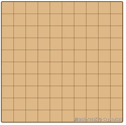
html
<!DOCTYPE html>
<html lang="en">
<head>
    <meta charset="UTF-8">
    <meta name="viewport" content="width=device-width, initial-scale=1.0">
    <title>绘制棋盘</title>
    <style>
        .board {
            width: 399px;
            height: 399px;
            border: 3px solid #654321;
            border-radius: 5px;
            background-color: #deb887;
            /* 绘制横线竖线 */
            background-image:
                linear-gradient(to bottom, transparent 39px,  #654321 39px),
                linear-gradient(to right, transparent 39px,  #654321 39px);
                background-size: auto 40px, 40px auto;
        }
    </style>
</head>
<body>
    <div class="board"></div>
</body>
</html>