前言
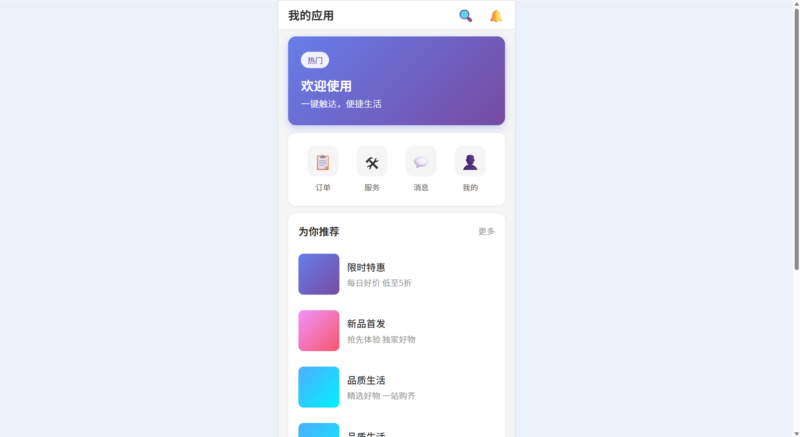
预期效果
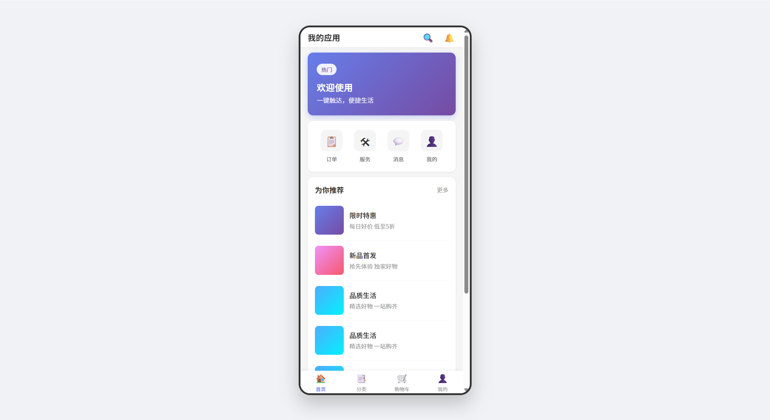
本文要实现的效果是:在基于postcss-px-to-viewport完成移动端应用开发后,新增对PC端的兼容能力,使页面在PC环境下也能正常显示。预期效果如图所示:
如何解决?
在使用postcss-px-to-viewport将移动端按viewport适配时,PC端"正常显示"的核心问题只有一个:如何避免大屏被无限放大。为什么会被无限放大?因为postcss-px-to-viewport会根据视窗宽度动态把px值计算转换成vw。
那么怎么解决这个问题?我询问了AI(ChatGPT 5.2),并且AI给出了一堆解决方案,但**没一个有效、能用的方案!**没错,全部不行!
本文内容就是说明AI提供的这些方案是否有效,以及提供最终找到的解决方案。
无效方案
以下均是AI给出的无效方案,最终解决方案可直接点目录跳转查看。
AI方案一
 AI回答
AI回答 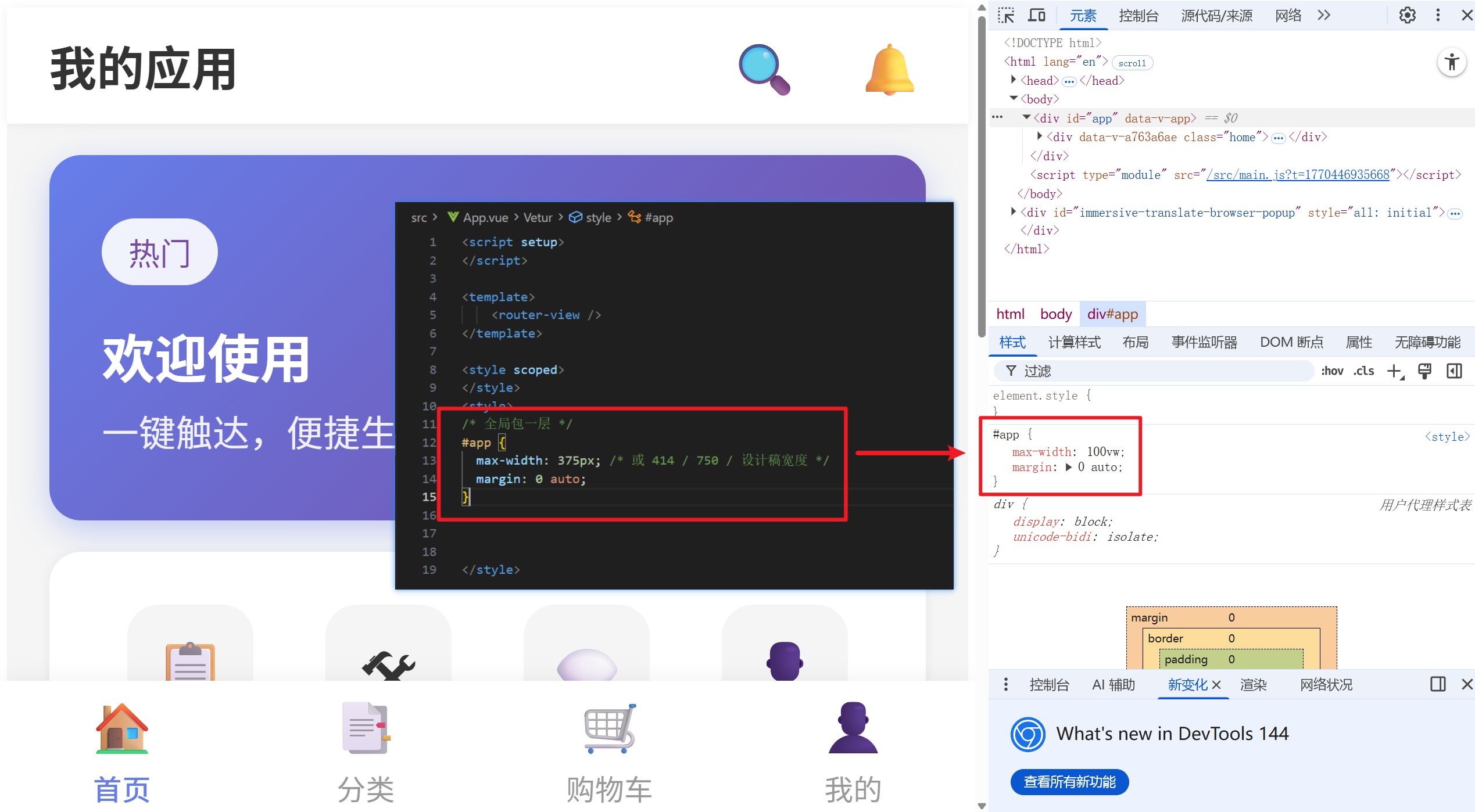 尝试实现 无效,从图中可以看到,方案中最外层的 max-width: 375px; 也被转换成 vw了
AI方案二
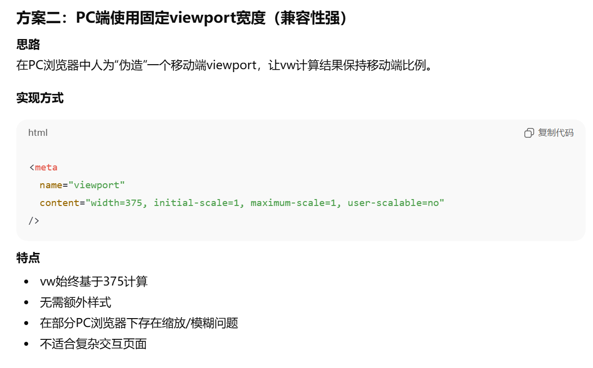
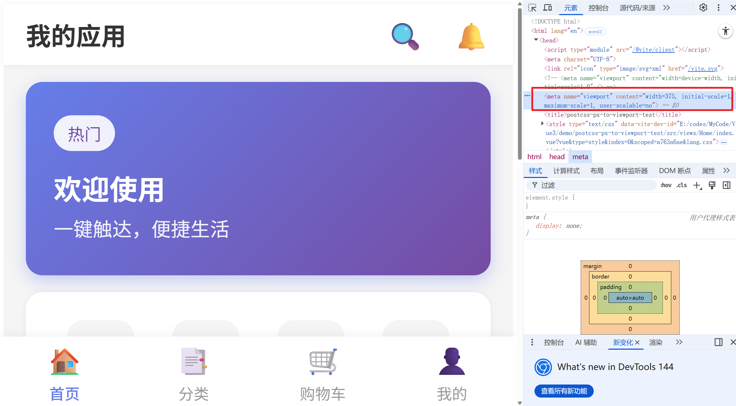
无效,因为添加的如下代码,实际上是告诉浏览器:你别管实际窗口多大,就给我按375算,然后还是不会影响postcss-px-to-viewport的计算,最终还是基于窗口宽度(375)来计算转换成了vw。
html
<meta name="viewport" content="width=375, initial-scale=1, maximum-scale=1, user-scalable=no" />AI方案三
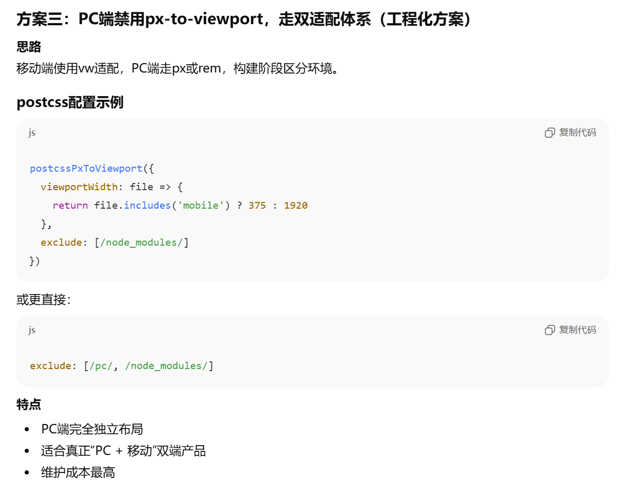
这个方案的意思是:如果css文件路径里包含mobile,当成移动端样式按375设计稿,把px转成vw,否则当成PC端样式按1920设计稿计算。
这样还得重新实现维护一套css,所以是不可行的。
AI方案四
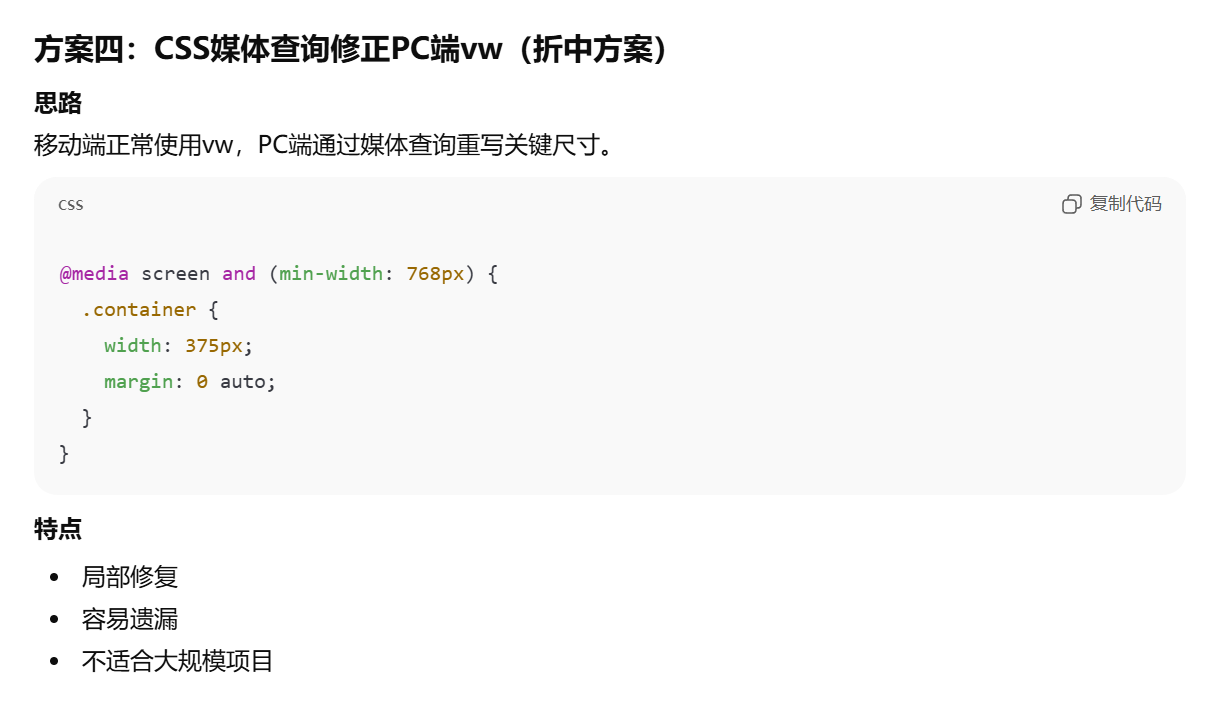
还是老问题,px值都会被postcss-px-to-viewport转换,所以和方案一一样,也是没用的。
AI方案五
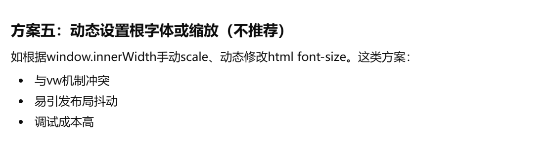
这种的更是没有可行性,完全不行。
有效解决方案
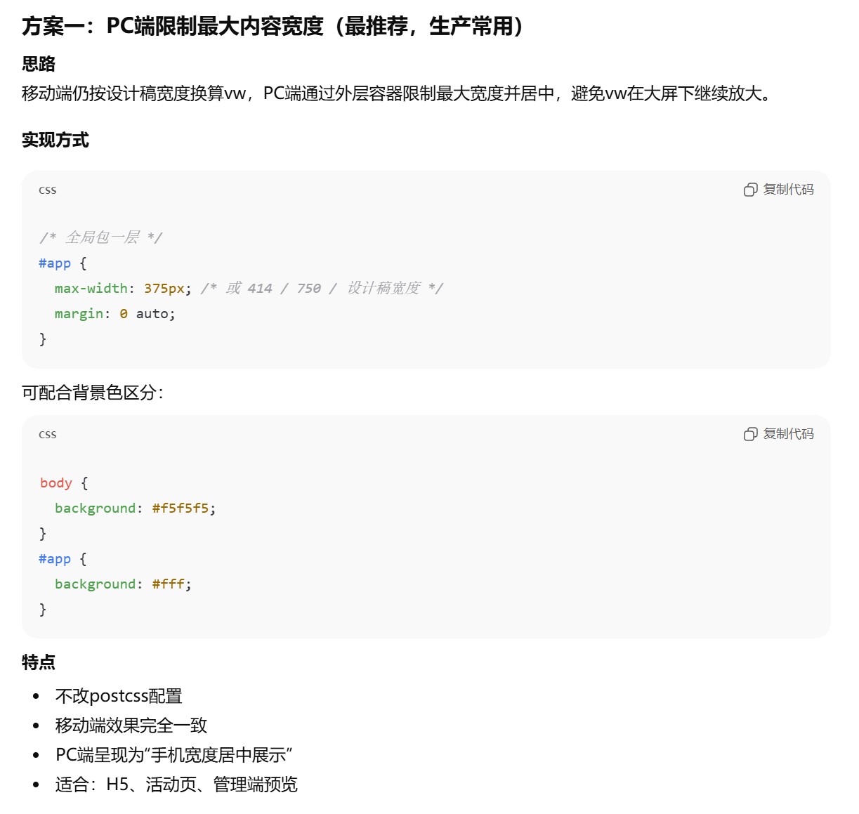
方案一(快速但样式会出问题,不推荐)
如下两种代码,本质都差不多,样式都会出问题。只能是最低限度的临时解决。
写法1代码
css
@media screen and (orientation: landscape) {
  body, html {
    height: 100%;
    margin: 0;
    background-color: #edf2fa ;
  }

  #app {
    min-height: calc(100vh / 0.3);
    transform: scale(0.3);
    transform-origin: top center;
    background: #EFF0F3;
    border: #c6c7ca solid 2px;
  }

}
写法1效果
写法2代码
css
@media screen and (orientation: landscape) {
  body, html {
    height: 100%;
    margin: 0 auto;
    width: 750px;
    background-color: #edf2fa ;
  }

  #app {
    zoom: 0.4;
    background: #EFF0F3;
    border: #c6c7ca solid 2px;
  }

}
写法2效果
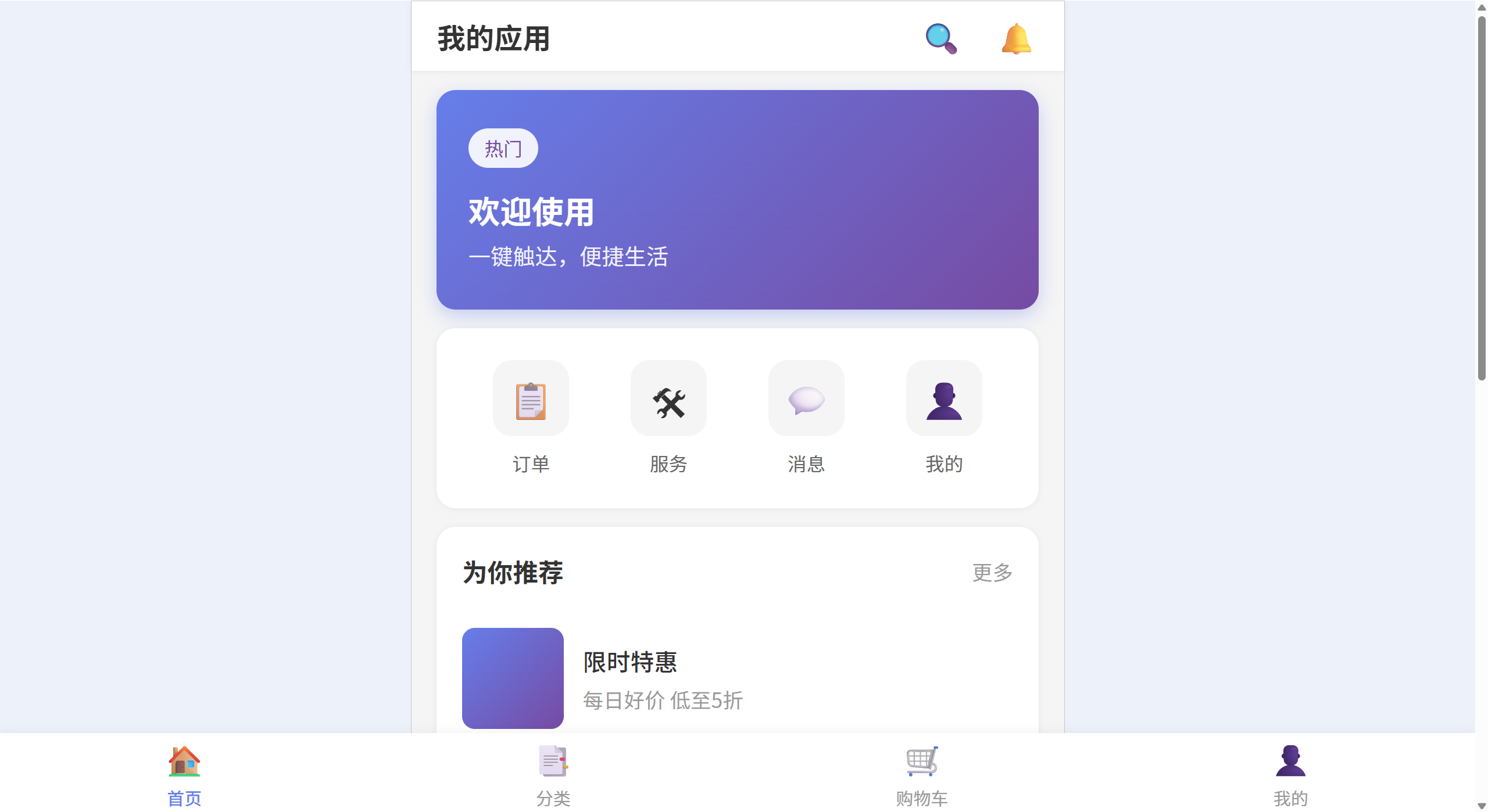
方案二 最终使用方案
这个方案是使用iframe,效果是最好,但要注意主子页面的路由同步问题,iframe路由修改之后同步修改主页面地址栏的参数。
最终效果
完整代码
javascript
export default {
  plugins: {
    'postcss-px-to-viewport': {
      viewportWidth: 375,        // 设计稿宽度,一般为 375 或 750
      viewportHeight: 812,      // 设计稿高度(可选)
      unitPrecision: 5,         // 转换后保留的小数位数
      viewportUnit: 'vw',       // 转换成的视口单位
      exclude: [/src[\\/]assets[\\/]pc\.css$/], // 排除pc样式
      minPixelValue: 1,         // 小于等于 1px 不转换
      mediaQuery: false,        // 是否转换媒体查询里的 px
    },
  },
}
css
/* src\assets\pc.css */
/*
  PC端外框容器
*/
/* 认为宽度>=768px 就是PC端 */
@media screen and (min-width: 768px) {
  body {
    background-color: #f0f2f5; /* 柔和的灰色背景 */
  }
}

.pc-container {
  width: 100vw; /* 关键修改:从 375px 改为全屏,否则背景出不来 */
  height: 100vh;

  background-size: 20px 20px;

  display: flex;
  align-items: center;
  justify-content: center;
  overflow: hidden;
}

/*
  模拟手机样式的 iframe
  核心思路:利用 border 模拟手机边框,利用 box-shadow 模拟立体感
*/
.mobile-frame {
  width: 375px; /* 固定宽度 */

  /*
    高度优化:
    原先是 100vh,为了让"手机"看起来像浮在屏幕中间,
    建议改为固定高度 (如 iPhone X 的 812px) 或 90vh
  */
  height: 812px;
  max-height: 90vh; /* 防止在小屏幕笔记本上撑爆屏幕 */

  background: #fff;

  /* 关键样式:手机外壳效果 */
  border-radius: 25px; /* 大圆角 */
  border: 4px solid #333; /* 用黑色边框模拟手机壳,比写很多 div 简单 */

  /* 增加阴影,制造悬浮感 */
  box-shadow: 0 20px 40px rgba(0, 0, 0, 0.2);

  /* 滚动条隐藏优化 */
  display: block;
}
javascript
// main.js
import './assets/pc.css'
注意路由同步问题,一不小心就死循环了哦
html
<!-- APP.vue -->
<template>
  <!-- PC端显示iframe -->
  <div v-if="isPC" class="pc-container">
    <iframe ref="iframeRef" class="mobile-frame" :src="iframeSrc" frameborder="0"></iframe>
  </div>
  <!-- 移动端正常渲染 -->
  <div v-else>
    <router-view></router-view>
  </div>
</template>
<script setup>
import { ref, onMounted, onUnmounted } from 'vue'
import router from './router'

// pc兼容
/**
 * 设备检测:如果是PC,则整页显示iframe
 * PC检测逻辑:宽度>768认为是PC
 */
const isPC = ref(false)
const iframeSrc = ref(window.location.href)
let checkCallback = null

const checkDevice = () => {
  isPC.value = window.innerWidth > 768
  if (checkCallback) {
    checkCallback(isPC.value)
  }
}

onMounted(() => {
  checkCallback = () => {
    // 控制台切换模式时更新iframeSrc
    iframeSrc.value = window.location.href
  }
  checkDevice()
  window.addEventListener('resize', checkDevice)
})

onUnmounted(() => {
  checkCallback = null
  window.removeEventListener('resize', checkDevice)
})

// pc下iframe同步路由
const isInIframe = window.self !== window.top
const iframeRef = ref(null)
// 父页面
if (!isInIframe) {
  // 接收子路由变化
  let lastChildPath = ''

  window.addEventListener('message', (e) => {
    const { type, path } = e.data || {}
    // console.log('接收子路由改变 app-child-router-change')
    if (type === 'app-child-router-change') {
      // 若路径不同 → 同步
      // console.log('子 父 路径', path, lastChildPath)

      /**
       * 错误实现 if (path !== router.currentRoute.value.fullPath)
       * router.currentRoute.value.fullPath 一直是 /home
       * 所有前往 home 的行为的同步都会出问题
       */
      if (path !== lastChildPath) {
        lastChildPath = path
        // console.log('路由不同 同步子页面路由')
        /**
         * 错误实现: router.replace(path).catch((err) => console.log(err))
         * 使用router.replace会在登录时报错出现跳转问题, 使用windo原生方法
         */
        // 1. 解析目标路径得到完整的 URL (兼容 Hash 模式和 History 模式)
        // 例如:path="/home" -> 可能是 "/#/home" 或 "/home"
        const targetUrl = router.resolve(path).href
        // 2. 仅修改浏览器地址栏显示,不触发布局更新和路由守卫
        window.history.replaceState(null, '', targetUrl)
      } else {
        // console.log('路由相同 不同步子页面路由')
      }
    }
  })
}

// iframe内嵌页面
if (isInIframe) {
  // 发送子页面路由变化
  router.afterEach((to) => {
    // 没有匹配到组件的路由,直接忽略(有三方污染)
    // console.log('子路由改变', to.fullPath)
    if (to.matched.length === 0) return
    // console.log('发送子页面路由变化 path', to.fullPath)
    window.parent.postMessage({ type: 'app-child-router-change', path: to.fullPath }, '*')
  })
}
</script>
<style>
* {
  padding: 0;
  margin: 0;
}
</style>
方案二详解
一、整体思路
-
设备判断 :根据窗口宽度(如
> 768px)认为是 PC。 -
PC :不直接渲染
<router-view>,而是渲染一个 iframe ,src指向当前站点地址(即同一套代码、同一套路由),这样 iframe 里的视口就是"一整块 375px 宽的区域"(由外层用 CSS 固定 iframe 宽高实现)。 -
移动端 :照常渲染
<router-view>,和原来一样。 -
样式隔离 :PC 外层的"壳"(全屏容器 + 手机框 + iframe 尺寸)单独写在
pc.css里,且该文件不参与 postcss-px-to-viewport 的转换,保持用px,避免被转成 vw 导致 PC 布局错乱。 -
路由同步 :iframe 内页面路由变化时,通过
postMessage通知父页面,父页面用history.replaceState同步地址栏,这样刷新、分享链接时仍然正确。
二、关键实现
1. PostCSS:排除 PC 样式文件
移动端业务样式需要 px → vw,但 PC 壳子 的样式必须保持 px(固定 375px 宽、812px 高、圆角、阴影等),否则会被当成 375 设计稿一起转成 vw,在 PC 上就乱了。
在 postcss.config.js 里对 postcss-px-to-viewport 增加 exclude,排除 PC 专用样式文件:
javascript
// postcss.config.js
export default {
  plugins: {
    'postcss-px-to-viewport': {
      viewportWidth: 375,
      viewportHeight: 812,
      unitPrecision: 5,
      viewportUnit: 'vw',
      exclude: [/src[\\/]assets[\\/]pc\.css$/], // 排除 pc 样式,保持 px
      minPixelValue: 1,
      mediaQuery: false,
    },
  },
}
2. PC 壳子样式:pc.css
PC 端需要两类样式,这是可选实现,主要目的是优化观感:
-
外层容器:全屏、居中、背景色(如浅灰),营造"桌面上的手机"的感觉。
-
手机框:固定宽高(如 375×812)、圆角、边框、阴影,中间是 iframe。
注意:这里所有尺寸都用 px,且该文件已被 exclude,不会变成 vw。
css
/* src/assets/pc.css */

/* 宽度 >= 768px 视为 PC */
@media screen and (min-width: 768px) {
  body {
    background-color: #f0f2f5;
  }
}

.pc-container {
  width: 100vw;
  height: 100vh;
  display: flex;
  align-items: center;
  justify-content: center;
  overflow: hidden;
}

.mobile-frame {
  width: 375px;
  height: 812px;
  max-height: 90vh;
  background: #fff;
  border-radius: 25px;
  border: 4px solid #333;
  box-shadow: 0 20px 40px rgba(0, 0, 0, 0.2);
  display: block;
}
在入口里引入,保证 PC 壳子样式全局生效:
javascript
// src/main.js
import './assets/pc.css'
import App from './App.vue'
// ...
3. 根组件:按设备切换「直出」或「iframe」
在 App.vue 里做三件事:
-
根据宽度判断是否 PC (如
window.innerWidth > 768),用isPC控制渲染。 -
PC :只渲染一个带
pc-container的 div,里面放 iframe,src设为当前页面地址(例如window.location.href),这样 iframe 里会再次加载同一应用,但视口被外层限制成 375px 宽,vw 布局按 375 视口计算,效果就和手机一致。 -
非 PC :照常渲染
<router-view>。
监听 resize,在用户拉窗从手机切到 PC(或反之)时切换展示方式;切到 PC 时更新一次 iframeSrc,避免 iframe 还停留在旧地址。
html
<!-- App.vue 简化示意 -->
<template>
  <div v-if="isPC" class="pc-container">
    <iframe ref="iframeRef" class="mobile-frame" :src="iframeSrc" frameborder="0"></iframe>
  </div>
  <div v-else>
    <router-view></router-view>
  </div>
</template>
javascript
const isPC = ref(false)
const iframeSrc = ref(window.location.href)

const checkDevice = () => {
  isPC.value = window.innerWidth > 768
  if (checkCallback) checkCallback(isPC.value)
}

onMounted(() => {
  checkCallback = () => { iframeSrc.value = window.location.href }
  checkDevice()
  window.addEventListener('resize', checkDevice)
})
onUnmounted(() => {
  checkCallback = null
  window.removeEventListener('resize', checkDevice)
})
4. 路由同步:父子页面通过 postMessage 通信
-
父页面:当前窗口(可能正在用 iframe 展示"手机")。
-
子页面:iframe 里的同源页面,路由会随用户点击而变化。
目标:子页面路由一变,父页面地址栏要跟着变,这样刷新、复制链接、分享都是对的。
实现方式:
-
子页面 (iframe 内):在 Vue Router 的
afterEach里给父窗口发postMessage,带上type和当前路径path。 -
父页面 :监听
message,若type === 'app-child-router-change'且 path 与上次不同,则用router.resolve(path).href得到完整 URL,再用window.history.replaceState(null, '', targetUrl)只改地址栏,不触发表格重载、不重复走路由逻辑。
判断
type === 'app-child-router-change'是因为在Edge浏览器调试时,有很多第三方的postMessage消息,干扰到了代码逻辑,可能是我装的第三方浏览器插件导致的,所以做这个判断避免被其他消息干扰。
用 router.resolve 可以兼容 Hash 和 History 两种路由模式,避免手写拼接。
注意:只有"在 iframe 里"才注册 afterEach 发消息,只有"不在 iframe 里"才监听 message 并改 history,用 window.self !== window.top 判断即可。
javascript
const isInIframe = window.self !== window.top

if (!isInIframe) {
  let lastChildPath = ''
  window.addEventListener('message', (e) => {
    const { type, path } = e.data || {}
    if (type === 'app-child-router-change' && path !== lastChildPath) {
      lastChildPath = path
      const targetUrl = router.resolve(path).href
      window.history.replaceState(null, '', targetUrl)
    }
  })
}

if (isInIframe) {
  router.afterEach((to) => {
    if (to.matched.length === 0) return
    window.parent.postMessage({ type: 'app-child-router-change', path: to.fullPath }, '*')
  })
}
三、小结
| 要点 | 说明 |
|---|---|
| 为何用 iframe | 同一套 vw 布局需要在"固定 375px 视口"里跑,PC 上用 iframe 限制宽高即可,无需再写一套 PC 页或媒体查询改布局。 |
| 为何排除 pc.css | PC 壳子要用固定 px(375、812 等),若被 postcss-px-to-viewport 转成 vw,在 PC 大屏上会错乱。 |
| 为何路由要同步 | iframe 内跳转不会改父窗口地址栏,通过 postMessage + replaceState 同步,保证 URL 与真实页面一致。 |
| 设备判断 | 用宽度 > 768 区分 PC/移动端,与 pc.css 的媒体查询一致即可。 |
这样,在基于 postcss-px-to-viewport 完成移动端开发后,只需增加一层"PC 壳 + iframe + 路由同步",就能在不改业务布局的前提下,为 PC 端提供"手机模拟器"式的兼容能力。