ResizeObserver:轻松监听元素尺寸变化
什么是ResizeObserver?
在前端开发中,我们经常需要知道一个元素的尺寸是否发生了变化。过去,我们只能通过监听window的resize事件,但这只能监听浏览器窗口的变化,无法监听具体元素的变化。ResizeObserver应运而生,它可以帮助我们监听任意元素的大小变化。
简单来说,ResizeObserver就像是一个"尺寸监视器",当被观察的元素尺寸发生变化时,它会立即通知我们。
为什么需要ResizeObserver?
在ResizeObserver出现之前,我们想要监听元素尺寸变化通常有以下几种方法:
- window.resize事件:只能监听窗口变化,不能监听具体元素
- 轮询检查:通过定时器不断检查元素尺寸,性能差
- MutationObserver:可以监听DOM变化,但无法直接监听尺寸变化
这些方法要么功能有限,要么性能不佳。ResizeObserver专门为解决这个问题而生,它提供了高效、精准的元素尺寸监听能力。
基本使用方法
创建ResizeObserver
javascript
// 创建ResizeObserver实例
const resizeObserver = new ResizeObserver((entries) => {
  for (let entry of entries) {
    // entry.target:被观察的元素
    // entry.contentRect:元素的尺寸信息
    console.log('元素尺寸发生变化:', entry.contentRect);
  }
});
观察元素
javascript
const element = document.getElementById('myElement');
resizeObserver.observe(element);
停止观察
javascript
// 停止观察特定元素
resizeObserver.unobserve(element);

// 停止所有观察并销毁实例
resizeObserver.disconnect();
完整示例
html
<!DOCTYPE html>
<html lang="en">
  <head>
    <meta charset="UTF-8" />
    <meta name="viewport" content="width=device-width, initial-scale=1.0" />
    <title>ResizeObserver</title>
  </head>
  <style>
    .box {
      display: flex;
      gap: 20px;
    }
    .resizeable {
      width: 300px;
      height: 200px;
      resize: both;
      border: 1px solid #ccc;
      overflow: auto;
      display: flex;
      align-items: center;
      justify-content: center;
    }
    .resizeable1 {
      background-color: aquamarine;
    }
    .resizeable2 {
      background-color: blueviolet;
    }
    .log {
      width: 300px;
      height: 200px;
      resize: both;
      border: 1px solid #ccc;
      display: flex;
      flex-direction: column;
      justify-content: space-around;
      align-items: center;
    }
  </style>
  <body>
    <div class="box">
      <div class="resizeable resizeable1" id="resizeable1">box1</div>
      <div class="resizeable resizeable2" id="resizeable2">box2</div>
      <div class="log">
        <div class="text1"></div>
        <div class="text2"></div>
      </div>
    </div>
  </body>
  <script>
    const textNode1 = document.querySelector(".text1");
    const textNode2 = document.querySelector(".text2");

    const resizeNode1 = document.querySelector("#resizeable1");
    const resizeNode2 = document.querySelector("#resizeable2");

    const nodeObserver = new ResizeObserver((entries) => {
      for (let entry of entries) {
        console.log(entry);
        const { width, height } = entry.contentRect;
        if (entry.target.id === "resizeable1") {
          textNode1.textContent = `box1当前尺寸:${Math.round(
            width
          )} * ${Math.round(height)} 像素`;
        } else {
          textNode2.textContent = `box2当前尺寸:${Math.round(
            width
          )} * ${Math.round(height)} 像素`;
        }
      }
    });
    nodeObserver.observe(resizeNode1);
    nodeObserver.observe(resizeNode2);
  </script>
</html>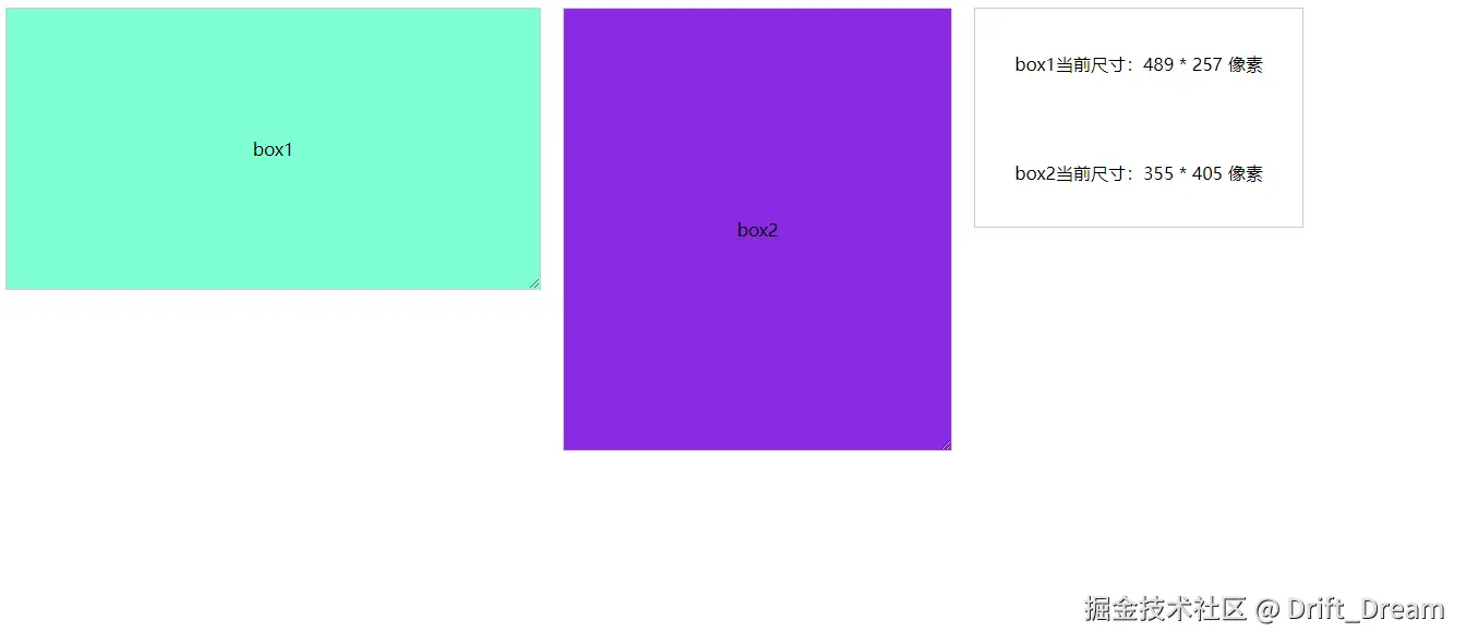
在Vue 3中的使用实践
组合式API用法
javascript
<template>
  <div class="resize-observer">
    <div ref="resizableElement" class="resizable-box">
      <p>ResizeObserver 简单示例</p>
      <p>当前宽度: {{ width }}px</p>
      <p>当前高度: {{ height }}px</p>
    </div>
  </div>
</template>
<script lang="ts" setup>
import { ref, onMounted, onUnmounted } from "vue";
const resizableElement = ref(null);
const width = ref(0);
const height = ref(0);
let resizeObserver: ResizeObserver | null = null;

onMounted(() => {
  if (resizableElement.value) {
    resizeObserver = new ResizeObserver((entries) => {
      for (let entry of entries) {
        width.value = entry.contentRect.width;
        height.value = entry.contentRect.height;
      }
    });

    resizeObserver.observe(resizableElement.value);
  }
});

onUnmounted(() => {
  if (resizeObserver) {
    resizeObserver.disconnect();
  }
});
</script>

<style lang="scss" scoped>
.resizable-box {
  resize: both;
  overflow: auto;
  border: 1px solid #e0e0e0;
  padding: 20px;
  min-width: 200px;
  min-height: 100px;
  background-color: #f5f5f5;
}
</style>
自定义Hook封装
为了更好地复用,我们可以将ResizeObserver封装成自定义Hook:
javascript
import { onUnmounted, ref } from "vue";

export function useResizeObserver() {
  const width = ref(0);
  const height = ref(0);
  let resizeObserver: ResizeObserver | null = null;

  const observe = (el: HTMLElement) => {
    if (resizeObserver) {
      resizeObserver.disconnect();
    }
    resizeObserver = new ResizeObserver((entries) => {
      for (const entry of entries) {
        width.value = entry.contentRect.width;
        height.value = entry.contentRect.height;
      }
    });
    resizeObserver.observe(el);
  };
  const unobserve = () => {
    if (resizeObserver) {
      resizeObserver.disconnect();
    }
  };
  onUnmounted(() => {
    if (resizeObserver) {
      resizeObserver.disconnect();
    }
  });
  return {
    width,
    height,
    observe,
    unobserve,
  };
}
使用自定义Hook
javascript
<template>
  <div class="resize-observer">
    <div ref="resizableElement" class="resizable-box">
      <p>使用钩子函数实现的 ResizeObserver</p>
      <p>当前宽度: {{ width }}px</p>
      <p>当前高度: {{ height }}px</p>
    </div>
  </div>
</template>
<script lang="ts" setup>
import { onMounted, onUnmounted, ref } from "vue";
import { useResizeObserver } from "@/hook/useResizeObserver.ts";

const { width, height, observe, unobserve } = useResizeObserver();

const resizableElement = ref(null);

onMounted(() => {
  if (resizableElement.value) {
    observe(resizableElement.value);
  }
});

onUnmounted(() => {
  if (resizableElement.value) {
    unobserve(resizableElement.value);
  }
});
</script>

<style lang="scss" scoped>
.resizable-box {
  resize: both;
  overflow: auto;
  border: 1px solid #e0e0e0;
  padding: 20px;
  min-width: 200px;
  min-height: 100px;
  background-color: aquamarine;
}
</style>
Vue 3中ResizeObserver的实际应用:可调整布局的管理后台
html
<template>
  <div class="demo-container">
    <!-- 可调整宽度的侧边栏 -->
    <aside
      ref="sidebarRef"
      class="sidebar"
      :style="{ width: sidebarWidth + 'px' }"
    >
      <div class="sidebar-content">
        <h3>导航菜单</h3>
        <nav>
          <a
            v-for="item in menuItems"
            :key="item.id"
            class="nav-item"
            :class="{ active: activeMenu === item.id }"
            @click="activeMenu = item.id"
          >
            {{ item.name }}
          </a>
        </nav>
      </div>

      <!-- 拖拽把手 -->
      <div class="resize-handle" @mousedown="startResize"></div>
    </aside>
    <main ref="mainRef" class="main-content">
      <div class="content-header">
        <button @click="toggleSidebar" class="toggle-btn">
          {{ isSidebarCollapsed ? "展开侧边栏" : "折叠侧边栏" }}
        </button>
        <h2>主要内容区域</h2>
      </div>
      <!-- 显示当前尺寸信息 -->
      <div class="size-info">
        <p>侧边栏宽度: {{ sidebarWidth }}px</p>
        <p>主内容区域宽度: {{ mainContentWidth }}px</p>
      </div>
    </main>
  </div>
</template>

<script setup lang="ts">
import { ref, onMounted, onUnmounted } from "vue";

//  侧边栏状态
const sidebarWidth = ref(280);
const isSidebarCollapsed = ref(false);
const activeMenu = ref("dashboard");

// 元素引用
const sidebarRef = ref(null);
const mainRef = ref(null);

// 尺寸数据
const mainContentWidth = ref(0);

// 菜单数据
const menuItems = [
  { id: "dashboard", name: "仪表盘" },
  { id: "users", name: "用户管理" },
  { id: "orders", name: "订单管理" },
  { id: "settings", name: "系统设置" },
];

// 监听主内容区域宽度变化
let mainResizeObserver: ResizeObserver | null = null;

onMounted(() => {
  // 监听主内容区域宽度
  mainResizeObserver = new ResizeObserver((entries) => {
    for (let entry of entries) {
      mainContentWidth.value = entry.contentRect.width;
    }
  });

  if (mainRef.value) {
    mainResizeObserver.observe(mainRef.value);
  }
});

// 切换侧边栏显示/隐藏
const toggleSidebar = () => {
  isSidebarCollapsed.value = !isSidebarCollapsed.value;
  sidebarWidth.value = isSidebarCollapsed.value ? 0 : 280;
};

// 开始调整侧边栏宽度
const startResize = (e: MouseEvent) => {
  e.preventDefault();
  const startX = e.clientX;
  const startWidth = sidebarWidth.value;

  const handleMouseMove = (e: MouseEvent) => {
    const newWidth = startWidth + (e.clientX - startX);
    // 限制最小和最大宽度
    if (newWidth >= 200 && newWidth <= 500) {
      sidebarWidth.value = newWidth;
      isSidebarCollapsed.value = false;
    }
  };

  const handleMouseUp = () => {
    document.removeEventListener("mousemove", handleMouseMove);
    document.removeEventListener("mouseup", handleMouseUp);
  };

  document.addEventListener("mousemove", handleMouseMove);
  document.addEventListener("mouseup", handleMouseUp);
};

onUnmounted(() => {
  if (mainResizeObserver) {
    mainResizeObserver.disconnect();
  }
});
</script>
<style scoped>
.demo-container {
  display: flex;
  height: 100vh;
  font-family: Arial, sans-serif;
}

.sidebar {
  position: relative;
  background: #2c3e50;
  color: white;
  transition: width 0.3s ease;
  min-width: 0;
  overflow: hidden;
}

.sidebar-content {
  padding: 20px;
}

.sidebar h3 {
  margin-bottom: 20px;
  border-bottom: 1px solid #34495e;
  padding-bottom: 10px;
}

.nav-item {
  display: block;
  padding: 10px 15px;
  margin: 5px 0;
  border-radius: 4px;
  cursor: pointer;
  transition: background 0.3s;
}

.nav-item:hover {
  background: #34495e;
}

.nav-item.active {
  background: #3498db;
}

.resize-handle {
  position: absolute;
  right: 0;
  top: 0;
  width: 4px;
  height: 100%;
  background: #34495e;
  cursor: col-resize;
  transition: background 0.3s;
}

.resize-handle:hover {
  background: #3498db;
}

.main-content {
  flex: 1;
  padding: 20px;
  background: #ecf0f1;
  overflow-y: auto;
}

.content-header {
  display: flex;
  align-items: center;
  margin-bottom: 20px;
  gap: 15px;
}

.toggle-btn {
  padding: 8px 16px;
  background: #3498db;
  color: white;
  border: none;
  border-radius: 4px;
  cursor: pointer;
}

.toggle-btn:hover {
  background: #2980b9;
}

.size-info {
  background: white;
  padding: 15px;
  border-radius: 4px;
  margin-bottom: 20px;
  box-shadow: 0 2px 4px rgba(0, 0, 0, 0.1);
}

.chart-container,
.table-container {
  background: white;
  padding: 20px;
  border-radius: 4px;
  margin-bottom: 20px;
  box-shadow: 0 2px 4px rgba(0, 0, 0, 0.1);
}
</style>