效果图
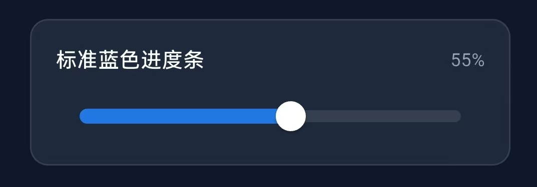
标准蓝色进度条
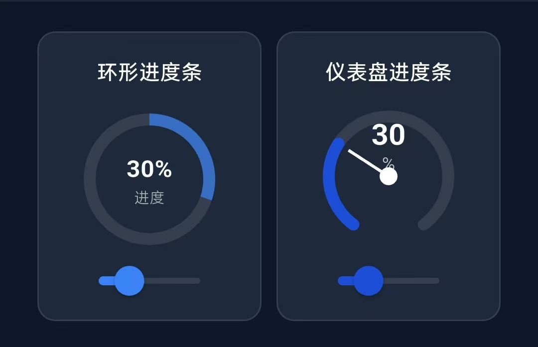
环形进度条和仪表盘进度条
标准蓝色进度条的实现步骤
1.设置变量
Dart
double _sliderValue1 = 0.3;,//进度条默认滑动的距离的比例2.设置进度条的通用子项
Dart
 // ================= 标准蓝色进度条 =================
  Widget _buildSliderCard({
    required String title, //进度条标题
    required double value, //当前的进度值 (0.0~1.0)
    required ValueChanged<double> onChanged, //值改变时的回调函数
    required Color color, //进度条激活时的颜色
    bool showValue = false, //是否显示百分比
  }) {
    return Container(
      padding: const EdgeInsets.all(16),
      decoration: BoxDecoration(
        color: const Color(0xFF1E293B),
        borderRadius: BorderRadius.circular(12),
        border: Border.all(color: Colors.white.withOpacity(0.1)),
      ),
      child: Column(
        crossAxisAlignment: CrossAxisAlignment.start,
        children: [
          Row(
            mainAxisAlignment: MainAxisAlignment.spaceBetween,
            children: [
              //标题
              Text(
                title,
                style: const TextStyle(
                  color: Colors.white,
                  fontSize: 14,
                  fontWeight: FontWeight.w500,
                ),
              ),

              //进度条滑动的值
              if (showValue)
                Text(
                  '${(value * 100).toInt()}%',//value*100转化为百分比,.toInt是取证的方法
                  style: const TextStyle(
                    color: Color(0xFF94A3B8),
                    fontSize: 12,
                  ),
                ),
            ],
          ),
          const SizedBox(height: 12),

          //进度条核心部分
          SliderTheme(
            data: SliderThemeData(
              trackHeight: 8, //进度条轨道高度
              thumbShape: const RoundSliderThumbShape(
                enabledThumbRadius: 10, //滑块半径
                pressedElevation: 18, //按下时阴影高度
              ),
              overlayShape: const RoundSliderOverlayShape(overlayRadius: 16), //点击涟漪效果半径
              activeTrackColor: color, //激活的颜色
              inactiveTrackColor: Colors.white.withOpacity(0.1),//未激活的颜色
              thumbColor: Colors.white, //滑块颜色
              overlayColor: color.withOpacity(0.2), //点击涟漪效果
            ),
            child: Slider(//自动检测和计算滑动的大小和方向
              value: value, //绑定当前值
              onChanged: onChanged, //绑定回调函数,当用户滑动时被调用
            ),
          ),
        ],
      ),
    );
  }
3.使用这个子项
Dart
        _buildSliderCard(
            title: '标准蓝色进度条', //标题
            value: _sliderValue1, //进度条当前进度值
            onChanged: (newValueFromSlider) => setState(() => _sliderValue1 = newValueFromSlider),
            color: const Color(0xFF2178E3), //进度条激活颜色
            showValue: true, //是否显示百分比
          ),
完整代码执行逻辑
Dart
1. 初始构建
_sliderValue1 = 0.3
Slider.value = 0.3
显示百分比: 30%

2. 用户滑动到35%位置
Slider检测到滑动 → 调用 onChanged(0.35),newValueFromSlider = 0.35

3. 执行回调
setState(() => _sliderValue1 = 0.35)
_sliderValue1 更新为 0.35

4. 触发重新构建
build() 方法再次执行

5. 传递新值给组件
_buildSliderCard(value: 0.35, ...)

6. 组件内部
- Slider.value = 0.35
- 滑块移动到35%位置
- 文字更新: '35%'

7. UI更新完成
环形进度条和仪表盘进度条的实现步骤
1.设置变量,初始进度条值
Dart
double _sliderValue2 = 0.3;2.设置环形进度条的UI框架的通用子项
Dart
  Widget _buildCircularProgressCard({
    required String title, //标题
    required double value, //当前进度值
    required ValueChanged<double> onChanged, //值变化的回调
  }) {
    return Container(
      width: 150,
      padding: const EdgeInsets.all(16),
      decoration: BoxDecoration(
        color: const Color(0xFF1E293B),
        borderRadius: BorderRadius.circular(12),
        border: Border.all(color: Colors.white.withOpacity(0.1)),
      ),
      child: Column(
        children: [
          //标题
          Text(
            title,
            style: const TextStyle(
              color: Colors.white,
              fontSize: 14,
              fontWeight: FontWeight.w500,
            ),
          ),
          const SizedBox(height: 12),
          SizedBox(
            height: 100,
            child: Stack(
              alignment: Alignment.center, //所有子项居中对齐,所以背景圆环和进度圆环能自定对齐圆心
              children: [

                // 背景圆环
                Container(
                  width: 88,
                  height: 88,
                  decoration: BoxDecoration(
                    shape: BoxShape.circle,
                    border: Border.all(
                      color: Colors.white.withOpacity(0.1),
                      width: 8, //边框宽度:这个边框宽度做了圆形进度条的背景
                    ),
                  ),
                ),

                // 进度圆环
                SizedBox(
                  width: 80,
                  height: 80,
                  child: CircularProgressIndicator( //绘制环形进度条
                    value: value, //传入值
                    strokeWidth: 8, //传入圆环的粗细
                    backgroundColor: Colors.transparent,
                    valueColor: AlwaysStoppedAnimation( //传入进度条激活的颜色
                      Color(0xFF3B82F6).withOpacity(0.7),
                    ),
                  ),
                ),


                // 中心文本
                Column(
                  mainAxisAlignment: MainAxisAlignment.center,
                  children: [
                    Text(
                      '${(value * 100).toInt()}%',
                      style: const TextStyle(
                        color: Colors.white,
                        fontSize: 16,
                        fontWeight: FontWeight.bold,
                      ),
                    ),
                    Text(
                      '进度',
                      style: TextStyle(
                        color: Colors.white.withOpacity(0.6),
                        fontSize: 10,
                      ),
                    ),
                  ],
                ),
              ],
            ),
          ),
          const SizedBox(height: 8),

          //控制滑块
          SizedBox(
            height: 20, //滑块区域高度
            child: Slider(
              value: value,
              onChanged: onChanged, //值变化时回调
              activeColor: const Color(0xFF3B82F6), //激活颜色
              inactiveColor: Colors.white.withOpacity(0.1), //未激活颜色
            ),
          ),
        ],
      ),
    );
  }
3.设置仪表盘进度条的UI框架
Dart
  Widget _buildGaugeProgressCard({
    required String title, //标题
    required double value, //当前进度值
    required ValueChanged<double> onChanged, //值变化回调
  }) {
    return Container(
      width: 150,
      padding: const EdgeInsets.all(16),
      decoration: BoxDecoration(
        color: const Color(0xFF1E293B),
        borderRadius: BorderRadius.circular(12),
        border: Border.all(color: Colors.white.withOpacity(0.1)),
      ),
      child: Column(
        children: [
          //标题
          Text(
            title,
            style: const TextStyle(
              color: Colors.white,
              fontSize: 14,
              fontWeight: FontWeight.w500,
            ),
          ),
          const SizedBox(height: 12),

          //仪表盘绘制区域
          SizedBox(
            height: 60,
            child: CustomPaint(
              size: const Size(100, 60), //绘制区域
              painter: _GaugePainter(value: value),//自定义绘制器
            ),
          ),
          const SizedBox(height: 48),

          //控制滑块
          SizedBox(
            height: 20,
            child: Slider(
              value: value,
              onChanged: onChanged,
              activeColor: const Color(0xFF1D4ED8),
              inactiveColor: Colors.white.withOpacity(0.1),
            ),
          ),
        ],
      ),
    );
  }
4.绘制仪表盘进度条
Dart
class _GaugePainter extends CustomPainter {

  final double value; //进度值(0.0~1.0)

  _GaugePainter({required this.value}); //构造函数,接收进度值

  @override
  void paint(Canvas canvas, Size size) {
    const startAngle = -pi * 1.3; //起始角度
    const sweepAngle = pi * 1.6;  //总角度范围
    final center = Offset(size.width / 2, size.height * 0.8); //圆心位置
    const radius = 40.0; //圆弧半径

    // 绘制背景圆弧
    final backgroundPaint = Paint() //创建画笔
      ..color = Colors.white.withOpacity(0.1) //背景颜色
      ..style = PaintingStyle.stroke //描边模式
      ..strokeWidth = 8  //线条宽度
      ..strokeCap = StrokeCap.round; //线条端点圆角

    canvas.drawArc(
      Rect.fromCircle(center: center, radius: radius), //圆弧所在矩形
      startAngle, //使用起始角度
      sweepAngle, //使用角度范围
      false, //不填充中心,只是描边
      backgroundPaint, //使用画笔
    );

    // 绘制进度圆弧
    final progressPaint = Paint() //绘制画笔
      ..color = const Color(0xFF1D4ED8) //背景颜色
      ..style = PaintingStyle.stroke //描边模式
      ..strokeWidth = 8 //线宽
      ..strokeCap = StrokeCap.round; //线条端点圆角

    canvas.drawArc(
      Rect.fromCircle(center: center, radius: radius),
      startAngle,
      sweepAngle * value,
      false,
      progressPaint,
    );

    //绘制指针
    //指针角度 = 起始角度 + (总角度 * 进度值)
    final pointerAngle = startAngle + sweepAngle * value;
    final pointerPaint = Paint()
      ..color = Colors.white
      ..style = PaintingStyle.fill; //填充模式

    //绘制指针圆点
    canvas.drawCircle(
      center, //圆心位置
      6, //半径
      pointerPaint,
    );

    // 绘制指针线
    final pointerLinePaint = Paint()
      ..color = Colors.white
      ..style = PaintingStyle.stroke
      ..strokeWidth = 2;

    //计算指针终点位置
    final pointerEnd = Offset( //计算
      center.dx + cos(pointerAngle) * radius * 0.8, //X坐标
      center.dy + sin(pointerAngle) * radius * 0.8, //Y坐标
    );

    //绘制从圆心到终点的线条
    canvas.drawLine(center, pointerEnd, pointerLinePaint);

    // 绘制刻度值
    final textPainter = TextPainter(
      text: TextSpan(
        text: '${(value * 100).toInt()}', //计算百分比
        style: const TextStyle(
          color: Colors.white,
          fontSize: 20,
          fontWeight: FontWeight.bold,
        ),
      ),
      textDirection: TextDirection.ltr, //从左到右文本方向
    );

    textPainter.layout(); //布局计算文本尺寸
    textPainter.paint(
      canvas,
      Offset( //位置
          center.dx - textPainter.width / 2,  //水平居中
          center.dy - 40 //圆心上方的位置
      ),
    );

    // 绘制百分号单位
    final unitPainter = TextPainter(
      text: const TextSpan(
        text: '%',
        style: TextStyle(
          color: Colors.white70,
          fontSize: 12,
        ),
      ),
      textDirection: TextDirection.ltr,
    );

    unitPainter.layout();
    unitPainter.paint(
      canvas,
      Offset(center.dx - unitPainter.width / 2, center.dy - 15), //位置
    );
  }

  @override
  bool shouldRepaint(covariant CustomPainter oldDelegate) => true;
}
5.使用这两个进度条
Dart
// 环形和仪表盘进度条
          Row(
            mainAxisAlignment: MainAxisAlignment.spaceAround,
            children: [
              //环形进度条
              _buildCircularProgressCard(
                title: '环形进度条',
                value: _sliderValue2,
                onChanged: (value) => setState(() => _sliderValue2 = value),
              ),

              //仪表盘进度条
              _buildGaugeProgressCard(
                title: '仪表盘进度条',
                value: _sliderValue2,
                onChanged: (value) => setState(() => _sliderValue2 = value),
              ),
            ],
          ),