利用表格探索宜居城市
python
from pathlib import Path

import matplotlib
import matplotlib.pyplot as plt
import numpy as np
import pandas as pd
from matplotlib.colors import LinearSegmentedColormap
from PIL import Image

from plottable import ColumnDefinition, Table
from plottable.cmap import normed_cmap
from plottable.plots import circled_image
数据探索
以下数据如果有需要的同学可关注公众号HsuHeinrich,回复【数据可视化】自动获取~
python
df = pd.read_csv(
    "https://raw.githubusercontent.com/fortune-uwha/Global-liveability-Index-2023/main/Data/cities.csv"
)

df.head()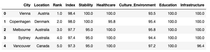
旗帜图片可以关注公众号HsuHeinrich,回复【可视化素材】自动获取~
注:在country文件夹中
python
# 数据预处理

# 重置字段顺序
columns_titles = ["City", "Location", "Rank", "Index", "Stability","Healthcare", "Education", "Culture_Environment","Infrastructure"]
df=df.reindex(columns=columns_titles)

# 获取图片本地地址(图片可在)
flag_paths = list(Path("pic/country").glob("*.png"))
country_to_flagpath = {p.stem: p for p in flag_paths}

# 将排名改为整数
df["Rank"] = df["Rank"].round().astype(int)

# 新增Flag列,为对应的路径地址
df.insert(0, "Flag", df["Location"].apply(lambda x: country_to_flagpath.get(x)))

# 将City转为索引
df = df.set_index("City")

# 列重命名
df.rename(columns={'Culture_Environment': 'Environment'}, inplace=True)

df.head()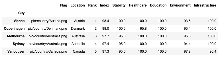
绘制基础的表格
python
# 将后5列分为两大类
basic_services_cols = ["Stability", "Healthcare", "Education"]
infrastructure_env_cols = ["Environment", "Infrastructure"]

## 自定义各列
col_defs = (
    [
        ColumnDefinition(
            name="Flag",
            title="",
            textprops={"ha": "center"},
            width=0.5,
            plot_fn=circled_image,
        ),
        ColumnDefinition(
            name="City",
            textprops={"ha": "left", "weight": "bold"},
            width=1.5,
        ),
        ColumnDefinition(
            name="Location",
            textprops={"ha": "center"},
            width=0.75,
        ),
         ColumnDefinition(
            name="Rank",
            textprops={"ha": "center"},
            width=0.75,
        ),
         ColumnDefinition(
            name="Index",
            textprops={"ha": "center"},
            width=0.75,
        ),
        ColumnDefinition(
            name="Stability",
            width=0.75,
            textprops={
                "ha": "center",
                "bbox": {"boxstyle": "circle", "pad": 0.35},
            },
            cmap=normed_cmap(df["Stability"], cmap=matplotlib.cm.PiYG, num_stds=4),
            group="Quality of Life",
        ),
        ColumnDefinition(
            name="Healthcare",
            width=0.75,
            textprops={
                "ha": "center",
                "bbox": {"boxstyle": "circle", "pad": 0.35},
            },
            cmap=normed_cmap(df["Healthcare"], cmap=matplotlib.cm.PiYG, num_stds=4),
            group="Quality of Life",
        ),
         ColumnDefinition(
            name="Education",
            width=0.75,
            textprops={
                "ha": "center",
                "bbox": {"boxstyle": "circle", "pad": 0.35},
            },
            cmap=normed_cmap(df["Education"], cmap=matplotlib.cm.PiYG, num_stds=4),
            group="Quality of Life",
        ),
          ColumnDefinition(
            name="Environment",
            width=0.75,
            textprops={
                "ha": "center",
                "bbox": {"boxstyle": "circle", "pad": 0.35},
            },
            cmap=normed_cmap(df["Environment"], cmap=matplotlib.cm.PiYG, num_stds=4),
            group="Environment",
        ),
             ColumnDefinition(
            name="Infrastructure",
            width=0.75,
            textprops={
                "ha": "center",
                "bbox": {"boxstyle": "circle", "pad": 0.35},
            },
            cmap=normed_cmap(df["Infrastructure"], cmap=matplotlib.cm.PiYG, num_stds=4),
            group="Environment",
        ),
    ])
python
# 修改字体和框边界
plt.rcParams["font.family"] = ["DejaVu Sans"]
plt.rcParams["savefig.bbox"] = "tight"

# 布局
fig, ax = plt.subplots(figsize=(20, 22))

table = Table(
    df,
    column_definitions=col_defs,
    row_dividers=True,
    footer_divider=True,
    ax=ax,
    textprops={"fontsize": 14},
    row_divider_kw={"linewidth": 1, "linestyle": (0, (1, 5))},
    col_label_divider_kw={"linewidth": 1, "linestyle": "-"},
    column_border_kw={"linewidth": 1, "linestyle": "-"},
)

# 标题
header_text = "\n THE GLOBAL LIVEABILITY INDEX 2023"
header_props = {'fontsize': 18, 'fontweight': 'bold', 'va': 'center', 'ha': 'center'}
# 调整 y 坐标以使标题更靠近表格
plt.text(0.5, 0.91, header_text, transform=fig.transFigure, **header_props)

# 副标题
subtitle_text = "\n The Table visualizes a list of the Top 10 and Bottom 10 cities to Live in 2023. \n It rates living conditions in 173 cities across these five categories: stability, health care, culture and environment, education and infrastructure."
subtitle_props = {'fontsize': 14, 'va': 'center', 'ha': 'center', 'color': 'gray'}
plt.text(0.5, 0.89, subtitle_text, transform=fig.transFigure, **subtitle_props)

# 脚注
footer_text = "Source: The Economist Intelligence Unit • Visual and Analysis: Fortune Uwha"
footer_props = {'fontsize': 14, 'va': 'center', 'ha': 'center'}
# 调整 y 坐标以使页脚更靠近图形底部
plt.text(0.5, 0.09, footer_text, transform=fig.transFigure, **footer_props)

# 加载logo图片
logo_path = "pic/table_log.png"
logo = Image.open(logo_path)
# 调整图片尺寸
new_logo_size = (180, 100)
logo = logo.resize(new_logo_size)
# 转为array
logo = np.array(logo)
# 将徽标放置在页面右侧
xo = 0.5
yo = 0.09

plt.figimage(logo, xo=xo, yo=yo, origin='upper')

plt.show()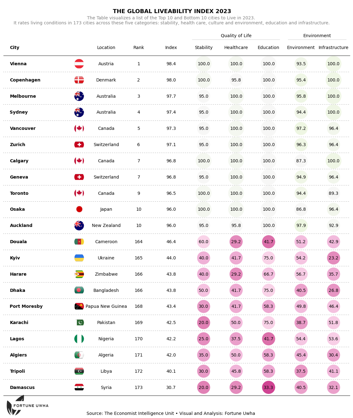
参考:Publication ready table with plottable
共勉~