 核心逻辑被称为 "摩天轮效应" (Ferris Wheel Effect)
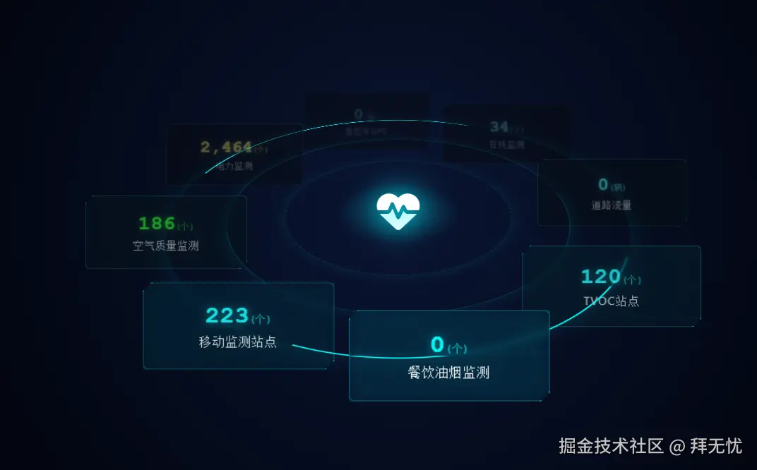
- 功能概述该系统模拟了一个悬浮在深空中的数据监控平台,具有以下视觉特性:2.5D 伪 3D 视角:平台呈 60 度倾斜,形成类似战术地图的俯视感。动态公转系统:8个数据卡片围绕中心全息图腾进行圆周运动。摩天轮效应 (Ferris Wheel Effect):卡片在公转的同时,始终保持水平且垂直面对屏幕,不会随平台倾斜或旋转而颠倒。大气透视 (Atmospheric Perspective):模拟真实物理景深,距离屏幕越近的卡片越亮、越清晰;越远则越暗淡、模糊。赛博朋克美学:包含霓虹辉光、磨砂玻璃质感、脉冲光柱及心率波形动画。
- 核心实现原理解析
A. 空间的构建 (The Stage)利用 CSS3 的透视属性构建舞台:perspective: 1200px:定义了观察者距离屏幕的视距,这是产生"近大远小" 3D 效果的基础。transform-style: preserve-3d:这是关键指令,它告诉浏览器子元素(平台、卡片)应当位于独立的 3D 空间中,而不是被压平在父容器的 2D 平面上。
B. 摩天轮物理逻辑 (Ferris Wheel Physics)这是整个系统的核心难点,即"如何让卡片在旋转的圆盘上保持直立"。我们应用了变换抵消矩阵逻辑:平台倾斜:父级 Platform 做了 rotateX(60deg)。轨道公转:Orbit-System 做 0∘→360∘ 的 Z 轴旋转。卡片姿态修正(反向补偿):为了保持卡片垂直且正对屏幕,卡片内部必须执行一个复合的反向动画 counter-rotate:T_{card} = R_z(-\\theta) \\times R_x(-60\^\\circ)R_z(-\\theta) :抵消父级的公转。父级转多少度,子级就反向转多少度,保证卡片不发生侧翻。R_x(-60\^\\circ):抵消平台的倾斜。平台倒下 60 度,卡片就"躺"下了,所以必须逆向立起来 60 度。
C. 时空同步机制 (Negative Delay Trick)这是一个非常巧妙的 CSS 技巧,解决了"不同位置的卡片如何同步运动"的问题。问题:8张卡片分布在圆周的 0∘,45∘,90∘... 等不同位置。如果给它们写不同的动画关键帧(keyframes)会非常繁琐。解法:所有卡片共用同一个 counter-rotate 动画(周期 T=20s)。利用 animation-delay 的负值特性。例如,位于 45∘ 的卡片(占圆周的 1/8),设置 animation-delay: -2.5s(即 20s×81)。原理:这意味着动画"已经运行了 2.5 秒",此刻卡片的内部旋转角度恰好是 −45∘,完美抵消了它在圆周上的初始位置偏移。
D. 视觉景深系统 (Atmospheric Depth)为了增强 3D 沉浸感,引入了 depth-fade 动画,它与旋转动画严格同步:轨迹映射:0% / 100% (12点钟方向,最远端):设置低透明度 (opacity: 0.3)、低亮度 (brightness(0.4)) 和高斯模糊 (blur(1px)。50% (6点钟方向,最近端):设置全不透明、高亮、无模糊,并提升 z-index 确保遮挡关系正确。这模拟了光线在介质中传播的衰减,让平面屏幕产生纵深感
xml
<!DOCTYPE html>
<html lang="zh-CN">
<head>
    <meta charset="UTF-8">
    <meta name="viewport" content="width=device-width, initial-scale=1.0">
    <title>CYBERPUNK 3D VISUALIZATION ENGINE</title>
    <!-- 引入 FontAwesome 图标库 -->
    <link rel="stylesheet" href="https://cdnjs.cloudflare.com/ajax/libs/font-awesome/6.4.0/css/all.min.css">
    <style>
        :root {
            --bg-color: #02050f;
            --neon-blue: #00f3ff;
            --neon-cyan: #0ff;
            --neon-green: #0f0;
            --neon-yellow: #ff0;
            --glass-bg: rgba(2, 20, 40, 0.6);
            --border-color: rgba(0, 243, 255, 0.3);
            --platform-size: 800px;
            --orbit-radius: 320px;
            --anim-duration: 20s;
        }

        * {
            box-sizing: border-box;
            margin: 0;
            padding: 0;
        }

        body {
            background-color: var(--bg-color);
            background-image:
                radial-gradient(circle at 50% 50%, #0a1533 0%, #02050f 80%);
            height: 100vh;
            overflow: hidden;
            font-family: 'Segoe UI', 'Roboto', monospace;
            color: #fff;
            display: flex;
            justify-content: center;
            align-items: center;
        }

        /* --- 3D 舞台 --- */
        .stage {
            width: 100%;
            height: 100%;
            perspective: 1200px; /* 设定视距,产生3D透视感 */
            display: flex;
            justify-content: center;
            align-items: center;
        }

        /* --- 倾斜的平台容器 --- */
        .platform {
            position: relative;
            width: var(--platform-size);
            height: var(--platform-size);
            transform-style: preserve-3d; /* 关键:保留子元素的3D空间 */
            transform: rotateX(60deg); /* 平台整体沿X轴倒下60度 */
        }

        /* --- 装饰性底座光环 --- */
        .base-ring {
            position: absolute;
            top: 50%;
            left: 50%;
            transform: translate(-50%, -50%);
            border-radius: 50%;
            border: 2px solid rgba(0, 243, 255, 0.1);
            box-shadow: 0 0 20px rgba(0, 243, 255, 0.1);
        }

        .ring-1 { width: 40%; height: 40%; border-style: dashed; animation: spin-right 40s linear infinite; }
        .ring-2 { width: 60%; height: 60%; border: 1px solid rgba(0, 243, 255, 0.2); }
        .ring-3 {
            width: 80%;
            height: 80%;
            border: 2px solid transparent;
            border-top: 2px solid var(--neon-cyan);
            border-bottom: 2px solid var(--neon-cyan);
            animation: spin-left 30s linear infinite;
            box-shadow: 0 0 30px rgba(0, 255, 255, 0.1);
        }

        /* 中心脉冲光柱底座 */
        .center-glow {
            position: absolute;
            top: 50%;
            left: 50%;
            width: 150px;
            height: 150px;
            transform: translate(-50%, -50%);
            background: radial-gradient(circle, rgba(0,243,255,0.4) 0%, rgba(0,0,0,0) 70%);
            border-radius: 50%;
            animation: pulse 3s infinite ease-in-out;
        }

        /* --- 旋转公转层 --- */
        .orbit-system {
            position: absolute;
            top: 0;
            left: 0;
            width: 100%;
            height: 100%;
            transform-style: preserve-3d;
            animation: orbit-rotate var(--anim-duration) linear infinite;
        }

        /* --- 数据卡片容器 --- */
        .card-wrapper {
            position: absolute;
            top: 50%;
            left: 50%;
            width: 0;
            height: 0;
            transform-style: preserve-3d;
        }

        /* --- 核心:数据卡片实体 --- */
        .data-card {
            position: relative;
            width: 220px;
            height: 100px;
            background: var(--glass-bg);
            border: 1px solid var(--border-color);
            margin-left: -110px;
            margin-top: -50px;

            backdrop-filter: blur(4px);
            box-shadow: 0 0 15px rgba(0, 243, 255, 0.15);
            border-radius: 6px;

            display: flex;
            flex-direction: column;
            justify-content: center;
            align-items: center;
            text-align: center;

            /* 修改点:这里组合了两个动画
               1. counter-rotate: 负责物理姿态(保持直立)
               2. depth-fade: 负责视觉特效(远暗近亮)
            */
            animation:
                counter-rotate var(--anim-duration) linear infinite,
                depth-fade var(--anim-duration) linear infinite;

            clip-path: polygon(
                10px 0, 100% 0,
                100% calc(100% - 10px), calc(100% - 10px) 100%,
                0 100%, 0 10px
            );
        }

        .data-card::before, .data-card::after {
            content: '';
            position: absolute;
            width: 10px;
            height: 10px;
            border: 1px solid var(--neon-cyan);
            transition: all 0.3s;
        }
        .data-card::before { top: -1px; left: -1px; border-right: none; border-bottom: none; }
        .data-card::after { bottom: -1px; right: -1px; border-left: none; border-top: none; }

        .data-value {
            font-size: 28px;
            font-weight: bold;
            font-family: 'Courier New', monospace;
            color: var(--neon-cyan);
            text-shadow: 0 0 10px rgba(0, 243, 255, 0.5);
            margin-bottom: 4px;
        }

        .data-unit {
            font-size: 12px;
            opacity: 0.7;
            font-weight: normal;
        }

        .data-label {
            font-size: 14px;
            color: #ddd;
            letter-spacing: 1px;
            text-transform: uppercase;
        }

        .status-green .data-value { color: var(--neon-green); text-shadow: 0 0 10px rgba(0, 255, 0, 0.5); }
        .status-yellow .data-value { color: var(--neon-yellow); text-shadow: 0 0 10px rgba(255, 255, 0, 0.5); }

        .center-totem {
            position: absolute;
            top: 50%;
            left: 50%;
            transform: translate(-50%, -50%) rotateX(-60deg);
            text-align: center;
            z-index: 10;
        }

        .totem-icon {
            font-size: 60px;
            color: #fff;
            filter: drop-shadow(0 0 20px var(--neon-blue));
            animation: heartbeat 2s infinite;
        }

        /* --- 动画关键帧 --- */

        @keyframes orbit-rotate {
            from { transform: rotateZ(0deg); }
            to { transform: rotateZ(360deg); }
        }

        @keyframes counter-rotate {
            from { transform: rotateZ(0deg) rotateX(-60deg); }
            to { transform: rotateZ(-360deg) rotateX(-60deg); }
        }

        /* 新增:景深光影动画
           逻辑:
           0% (12点方向/最远): 暗淡,模糊
           25% (3点方向): 逐渐变亮
           50% (6点方向/最近): 全亮,清晰,无滤镜
           75% (9点方向): 逐渐变暗
           100% (回到12点): 暗淡
        */
        @keyframes depth-fade {
            0%, 100% {
                opacity: 0.3;
                filter: brightness(0.4) grayscale(80%) blur(1px);
                z-index: 1; /* 层级低 */
            }
            25%, 75% {
                opacity: 0.7;
                filter: brightness(0.8) grayscale(30%) blur(0.5px);
                z-index: 5;
            }
            50% {
                opacity: 1;
                filter: brightness(1.2) grayscale(0%) blur(0px) drop-shadow(0 0 10px rgba(0,243,255,0.4));
                z-index: 10; /* 层级最高,确保在最前 */
            }
        }

        @keyframes spin-right { 100% { transform: translate(-50%, -50%) rotate(360deg); } }
        @keyframes spin-left { 100% { transform: translate(-50%, -50%) rotate(-360deg); } }
        @keyframes pulse { 0%, 100% { opacity: 0.4; transform: translate(-50%, -50%) scale(1); } 50% { opacity: 0.8; transform: translate(-50%, -50%) scale(1.2); } }
        @keyframes heartbeat { 0% { transform: scale(1); } 10% { transform: scale(1.1); } 20% { transform: scale(1); } }

        /* 布局计算 */
        .pos-1 { transform: rotateZ(0deg) translateY(calc(-1 * var(--orbit-radius))); }
        .pos-2 { transform: rotateZ(45deg) translateY(calc(-1 * var(--orbit-radius))); }
        .pos-3 { transform: rotateZ(90deg) translateY(calc(-1 * var(--orbit-radius))); }
        .pos-4 { transform: rotateZ(135deg) translateY(calc(-1 * var(--orbit-radius))); }
        .pos-5 { transform: rotateZ(180deg) translateY(calc(-1 * var(--orbit-radius))); }
        .pos-6 { transform: rotateZ(225deg) translateY(calc(-1 * var(--orbit-radius))); }
        .pos-7 { transform: rotateZ(270deg) translateY(calc(-1 * var(--orbit-radius))); }
        .pos-8 { transform: rotateZ(315deg) translateY(calc(-1 * var(--orbit-radius))); }

        /* 动画延迟设置(必须匹配位置,确保光影与位置同步) */
        .pos-1 .data-card { animation-delay: 0s; }
        .pos-2 .data-card { animation-delay: -2.5s; }
        .pos-3 .data-card { animation-delay: -5s; }
        .pos-4 .data-card { animation-delay: -7.5s; }
        .pos-5 .data-card { animation-delay: -10s; }
        .pos-6 .data-card { animation-delay: -12.5s; }
        .pos-7 .data-card { animation-delay: -15s; }
        .pos-8 .data-card { animation-delay: -17.5s; }

    </style>
</head>
<body>

    <div class="stage">
        <div class="platform">

            <div class="center-glow"></div>
            <div class="base-ring ring-1"></div>
            <div class="base-ring ring-2"></div>
            <div class="base-ring ring-3"></div>

            <div class="center-totem">
                <i class="fas fa-heartbeat totem-icon"></i>
            </div>

            <div class="orbit-system">

                <div class="card-wrapper pos-1">
                    <div class="data-card">
                        <div class="data-value">34<span class="data-unit">(个)</span></div>
                        <div class="data-label">在线监测</div>
                    </div>
                </div>

                <div class="card-wrapper pos-2">
                    <div class="data-card">
                        <div class="data-value">0<span class="data-unit">(辆)</span></div>
                        <div class="data-label">道路流量</div>
                    </div>
                </div>

                <div class="card-wrapper pos-3">
                    <div class="data-card">
                        <div class="data-value">120<span class="data-unit">(个)</span></div>
                        <div class="data-label">TVOC站点</div>
                    </div>
                </div>

                <div class="card-wrapper pos-4">
                    <div class="data-card">
                        <div class="data-value">0<span class="data-unit">(个)</span></div>
                        <div class="data-label">餐饮油烟监测</div>
                    </div>
                </div>

                <div class="card-wrapper pos-5">
                    <div class="data-card">
                        <div class="data-value">223<span class="data-unit">(个)</span></div>
                        <div class="data-label">移动监测站点</div>
                    </div>
                </div>

                <div class="card-wrapper pos-6">
                    <div class="data-card status-green">
                        <div class="data-value">186<span class="data-unit">(个)</span></div>
                        <div class="data-label">空气质量监测</div>
                    </div>
                </div>

                <div class="card-wrapper pos-7">
                    <div class="data-card status-yellow">
                        <div class="data-value">2,464<span class="data-unit">(个)</span></div>
                        <div class="data-label">电力监测</div>
                    </div>
                </div>

                <div class="card-wrapper pos-8">
                    <div class="data-card">
                        <div class="data-value">0<span class="data-unit">(辆)</span></div>
                        <div class="data-label">重型车GPS</div>
                    </div>
                </div>

            </div>
        </div>
    </div>

</body>
</html>