组件属性
button组件接收以下属性
- type 类型
- size 尺寸
- plain 朴素按钮
- round 圆角按钮
- circle 圆形按钮
- loading 加载
- disabled禁用
- text 文字
button组件全部代码如下:
vue
// button.vue
<template>
  <button
    class="dlx-button"
    :class="[
      buttonSize ? `dlx-button--${buttonSize}` : '',
      buttonType ? `dlx-button--${buttonType}` : '',
      {
        'is-plain': plain,
        'is-round': round,
        'is-circle': circle,
        'is-disabled': disabled,
        'is-loading': loading,
        'is-text': text,
        'is-link': link,
      },
    ]"
    :disabled="disabled || loading"
    @click="handleClick"
  >
    <span v-if="loading" class="dlx-button__loading">
      <span class="dlx-button__loading-spinner"></span>
    </span>
    <span class="dlx-button__content">
      <slot></slot>
    </span>
  </button>
</template>

<script lang="ts" setup>
import { computed } from 'vue'

defineOptions({
  name: 'DlxButton',
})

const props = defineProps({
  // 按钮类型
  type: {
    type: String,
    values: ['primary', 'success', 'warning', 'danger', 'info'],
    default: '',
  },
  // 按钮尺寸
  size: {
    type: String,
    values: ['large', 'small'],
    default: '',
  },
  // 是否为朴素按钮
  plain: {
    type: Boolean,
    default: false,
  },
  // 是否为圆角按钮
  round: {
    type: Boolean,
    default: false,
  },
  // 是否为圆形按钮
  circle: {
    type: Boolean,
    default: false,
  },
  // 是否为加载中状态
  loading: {
    type: Boolean,
    default: false,
  },
  // 是否禁用
  disabled: {
    type: Boolean,
    default: false,
  },
  // 是否为文字按钮
  text: {
    type: Boolean,
    default: false,
  },
  // 是否为链接按钮
  link: {
    type: Boolean,
    default: false,
  },
})

const buttonSize = computed(() => props.size)
const buttonType = computed(() => props.type)

const handleClick = (evt: MouseEvent) => {
  if (props.disabled || props.loading) return
  emit('click', evt)
}

const emit = defineEmits(['click'])
</script>

<style lang="less" scoped>
.dlx-button {
  display: inline-flex;
  justify-content: center;
  align-items: center;
  line-height: 1;
  height: 32px;
  white-space: nowrap;
  cursor: pointer;
  color: #606266;
  text-align: center;
  box-sizing: border-box;
  outline: none;
  transition: 0.1s;
  font-weight: 500;
  padding: 8px 15px;
  font-size: 14px;
  border-radius: 4px;
  background-color: #fff;
  border: 1px solid #dcdfe6;

  &:hover,
  &:focus {
    color: #409eff;
    border-color: #c6e2ff;
    background-color: #ecf5ff;
  }

  &:active {
    color: #3a8ee6;
    border-color: #3a8ee6;
    outline: none;
  }

  // 主要按钮
  &--primary {
    color: #fff;
    background-color: #409eff;
    border-color: #409eff;

    &:hover,
    &:focus {
      background: #66b1ff;
      border-color: #66b1ff;
      color: #fff;
    }

    &:active {
      background: #3a8ee6;
      border-color: #3a8ee6;
      color: #fff;
    }
  }

  // 成功按钮
  &--success {
    color: #fff;
    background-color: #67c23a;
    border-color: #67c23a;

    &:hover,
    &:focus {
      background: #85ce61;
      border-color: #85ce61;
      color: #fff;
    }

    &:active {
      background: #5daf34;
      border-color: #5daf34;
      color: #fff;
    }
  }

  // 警告按钮
  &--warning {
    color: #fff;
    background-color: #e6a23c;
    border-color: #e6a23c;

    &:hover,
    &:focus {
      background: #ebb563;
      border-color: #ebb563;
      color: #fff;
    }

    &:active {
      background: #cf9236;
      border-color: #cf9236;
      color: #fff;
    }
  }

  // 危险按钮
  &--danger {
    color: #fff;
    background-color: #f56c6c;
    border-color: #f56c6c;

    &:hover,
    &:focus {
      background: #f78989;
      border-color: #f78989;
      color: #fff;
    }

    &:active {
      background: #dd6161;
      border-color: #dd6161;
      color: #fff;
    }
  }

  // 信息按钮
  &--info {
    color: #fff;
    background-color: #909399;
    border-color: #909399;

    &:hover,
    &:focus {
      background: #a6a9ad;
      border-color: #a6a9ad;
      color: #fff;
    }

    &:active {
      background: #82848a;
      border-color: #82848a;
      color: #fff;
    }
  }

  // 大尺寸
  &--large {
    height: 40px;
    padding: 12px 19px;
    font-size: 14px;
    border-radius: 4px;
  }

  // 小尺寸
  &--small {
    height: 24px;
    padding: 5px 11px;
    font-size: 12px;
    border-radius: 3px;
  }

  // 朴素按钮
  &.is-plain {
    background: #fff;

    // 不同类型按钮的默认状态
    &.dlx-button--primary {
      color: #409eff;
      border-color: #409eff;
    }

    &.dlx-button--success {
      color: #67c23a;
      border-color: #67c23a;
    }

    &.dlx-button--warning {
      color: #e6a23c;
      border-color: #e6a23c;
    }

    &.dlx-button--danger {
      color: #f56c6c;
      border-color: #f56c6c;
    }

    &.dlx-button--info {
      color: #909399;
      border-color: #909399;
    }

    &:hover,
    &:focus {
      background: #ecf5ff;
      border-color: #409eff;
      color: #409eff;
    }

    &:active {
      background: #ecf5ff;
      border-color: #3a8ee6;
      color: #3a8ee6;
    }

    // 为不同类型的朴素按钮添加对应的悬浮状态
    &.dlx-button--primary {
      &:hover,
      &:focus {
        background: #ecf5ff;
        border-color: #409eff;
        color: #409eff;
      }
      &:active {
        border-color: #3a8ee6;
        color: #3a8ee6;
      }
    }

    &.dlx-button--success {
      &:hover,
      &:focus {
        background: #f0f9eb;
        border-color: #67c23a;
        color: #67c23a;
      }
      &:active {
        border-color: #5daf34;
        color: #5daf34;
      }
    }

    &.dlx-button--warning {
      &:hover,
      &:focus {
        background: #fdf6ec;
        border-color: #e6a23c;
        color: #e6a23c;
      }
      &:active {
        border-color: #cf9236;
        color: #cf9236;
      }
    }

    &.dlx-button--danger {
      &:hover,
      &:focus {
        background: #fef0f0;
        border-color: #f56c6c;
        color: #f56c6c;
      }
      &:active {
        border-color: #dd6161;
        color: #dd6161;
      }
    }

    &.dlx-button--info {
      &:hover,
      &:focus {
        background: #f4f4f5;
        border-color: #909399;
        color: #909399;
      }
      &:active {
        border-color: #82848a;
        color: #82848a;
      }
    }
  }

  // 圆角按钮
  &.is-round {
    border-radius: 20px;
  }

  // 圆形按钮
  &.is-circle {
    border-radius: 50%;
    padding: 8px;
  }

  // 文字按钮
  &.is-text {
    border-color: transparent;
    background: transparent;
    padding-left: 0;
    padding-right: 0;

    &:not(.is-disabled) {
      // 默认文字按钮
      color: #409eff;

      &:hover,
      &:focus {
        color: #66b1ff;
        background-color: transparent;
        border-color: transparent;
      }

      &:active {
        color: #3a8ee6;
      }

      // 不同类型的文字按钮颜色
      &.dlx-button--primary {
        color: #409eff;
        &:hover,
        &:focus {
          color: #66b1ff;
        }
        &:active {
          color: #3a8ee6;
        }
      }

      &.dlx-button--success {
        color: #67c23a;
        &:hover,
        &:focus {
          color: #85ce61;
        }
        &:active {
          color: #5daf34;
        }
      }

      &.dlx-button--warning {
        color: #e6a23c;
        &:hover,
        &:focus {
          color: #ebb563;
        }
        &:active {
          color: #cf9236;
        }
      }

      &.dlx-button--danger {
        color: #f56c6c;
        &:hover,
        &:focus {
          color: #f78989;
        }
        &:active {
          color: #dd6161;
        }
      }

      &.dlx-button--info {
        color: #909399;
        &:hover,
        &:focus {
          color: #a6a9ad;
        }
        &:active {
          color: #82848a;
        }
      }
    }

    // 文字按钮的禁用状态
    &.is-disabled {
      color: #c0c4cc;
    }
  }

  // 链接按钮
  &.is-link {
    border-color: transparent;
    color: #409eff;
    background: transparent;
    padding-left: 0;
    padding-right: 0;

    &:hover,
    &:focus {
      color: #66b1ff;
    }

    &:active {
      color: #3a8ee6;
    }
  }

  // 禁用状态
  &.is-disabled {
    &,
    &:hover,
    &:focus,
    &:active {
      cursor: not-allowed;

      // 普通按钮的禁用样式
      &:not(.is-text):not(.is-link) {
        background-color: #fff;
        border-color: #dcdfe6;
        color: #c0c4cc;

        // 有颜色的按钮的禁用样式
        &.dlx-button--primary {
          background-color: #a0cfff;
          border-color: #a0cfff;
          color: #fff;
        }

        &.dlx-button--success {
          background-color: #b3e19d;
          border-color: #b3e19d;
          color: #fff;
        }

        &.dlx-button--warning {
          background-color: #f3d19e;
          border-color: #f3d19e;
          color: #fff;
        }

        &.dlx-button--danger {
          background-color: #fab6b6;
          border-color: #fab6b6;
          color: #fff;
        }

        &.dlx-button--info {
          background-color: #c8c9cc;
          border-color: #c8c9cc;
          color: #fff;
        }
      }
    }
  }

  // 有颜色的按钮禁用状态 - 直接选择器
  &.is-disabled.dlx-button--primary {
    background-color: #a0cfff;
    border-color: #a0cfff;
    color: #fff;
  }

  &.is-disabled.dlx-button--success {
    background-color: #b3e19d;
    border-color: #b3e19d;
    color: #fff;
  }

  &.is-disabled.dlx-button--warning {
    background-color: #f3d19e;
    border-color: #f3d19e;
    color: #fff;
  }

  &.is-disabled.dlx-button--danger {
    background-color: #fab6b6;
    border-color: #fab6b6;
    color: #fff;
  }

  &.is-disabled.dlx-button--info {
    background-color: #c8c9cc;
    border-color: #c8c9cc;
    color: #fff;
  }

  // 文字按钮禁用状态
  &.is-disabled.is-text {
    background-color: transparent;
    border-color: transparent;
    color: #c0c4cc;
  }

  // 链接按钮禁用状态
  &.is-disabled.is-link {
    background-color: transparent;
    border-color: transparent;
    color: #c0c4cc;
  }

  // 加载状态
  &.is-loading {
    position: relative;
    pointer-events: none;

    &:before {
      pointer-events: none;
      content: '';
      position: absolute;
      left: -1px;
      top: -1px;
      right: -1px;
      bottom: -1px;
      border-radius: inherit;
      background-color: rgba(255, 255, 255, 0.35);
    }
  }

  .dlx-button__loading {
    display: inline-flex;
    align-items: center;
    margin-right: 4px;
  }

  .dlx-button__loading-spinner {
    display: inline-block;
    width: 14px;
    height: 14px;
    border: 2px solid #fff;
    border-radius: 50%;
    border-top-color: transparent;
    animation: button-loading 1s infinite linear;
  }
}

@keyframes button-loading {
  0% {
    transform: rotate(0);
  }
  100% {
    transform: rotate(360deg);
  }
}
</style>
引用
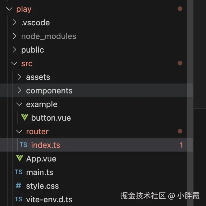
在play的src下新建example,存放各个组件的代码,先在play下安装vue-router
js
pnpm i vue-router目录结构如下
app.vue如下:
js
<template>
  <div class="app-container">
    <div class="sidebar">
      <h2 class="sidebar-title">组件列表</h2>
      <ul class="menu-list">
        <li
          v-for="item in menuItems"
          :key="item.path"
          :class="{ active: currentPath === item.path }"
          @click="handleMenuClick(item.path)"
        >
          {{ item.name }}
        </li>
      </ul>
    </div>
    <div class="content">
      <router-view></router-view>
    </div>
  </div>
</template>

<script setup lang="ts">
import { ref } from 'vue'
import { useRouter } from 'vue-router'

const router = useRouter()
const currentPath = ref('/button')

const menuItems = [
  { name: 'Button 按钮', path: '/button' },
  // 后续添加其他组件...
]

const handleMenuClick = (path: string) => {
  currentPath.value = path
  router.push(path)
}
</script>

<style scoped>
.app-container {
  display: flex;
  min-height: 100vh;
}

.sidebar {
  width: 240px;
  background-color: #f5f7fa;
  border-right: 1px solid #e4e7ed;
  padding: 20px 0;
}

.sidebar-title {
  padding: 0 20px;
  margin: 0 0 20px;
  font-size: 18px;
  color: #303133;
}

.menu-list {
  list-style: none;
  padding: 0;
  margin: 0;
}

.menu-list li {
  padding: 12px 20px;
  cursor: pointer;
  color: #303133;
  font-size: 14px;
  transition: all 0.3s;
}

.menu-list li:hover {
  color: #409eff;
  background-color: #ecf5ff;
}

.menu-list li.active {
  color: #409eff;
  background-color: #ecf5ff;
}

.content {
  flex: 1;
  padding: 20px;
}
</style>
router/index.ts如下:
js
import { createRouter, createWebHistory } from 'vue-router'
import ButtonExample from '../example/button.vue'

const routes = [
  {
    path: '/',
    redirect: '/button',
  },
  {
    path: '/button',
    component: ButtonExample,
  },
]

const router = createRouter({
  history: createWebHistory(),
  routes,
})

export default routerplay下执行pnpm run dev
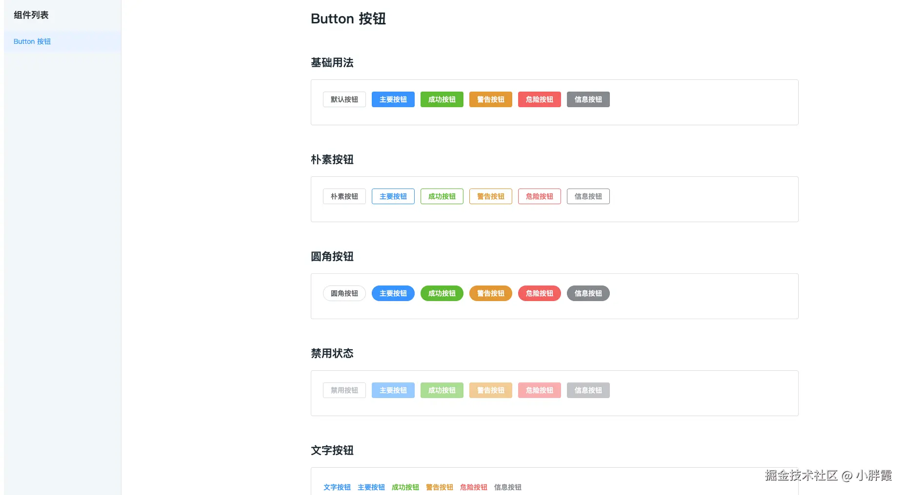
运行效果: