一、Grid 组件简介
- 网格容器,由"行"和"列"分割的单元格所组成,通过指定"项目"所在的单元格做出各种各样的布局。网格布局具有较强的页面均分能力,子组件占比控制能力,是一种重要自适应布局,其使用场景有九宫格图片展示、日历、计算器等。
- ArkUI 提供了 Grid 容器组件和子组件 GridItem,用于构建网格布局。Grid 用于设置网格布局相关参数,GridItem 定义子组件相关特征。Grid 组件支持使用条件渲染、循环渲染、懒加载等渲染控制方式生成子组件。
- 在 HarmonyOS NEXT 的 ArkUI 框架中,Grid 组件是一种强大的网格容器,它与 GridItem 子组件一起使用,可以创建灵活的网格布局。网格布局是由"行"和"列"分割的单元格组成,通过指定"项目"所在的单元格,可以实现各种各样的布局效果。
① Grid 与 GridItem 的关系
- Grid:网格容器组件,用于设置网格布局相关参数;
- GridItem:网格子项组件,定义子组件相关特征;
- Grid 的子组件必须是 GridItem 组件。
③ Grid 组件的主要特性
| 特性 | 描述 |
|---|---|
| 自定义行列数 | 可以通过 rowsTemplate 和 columnsTemplate 属性设置网格的行数和列数 |
| 尺寸占比控制 | 可以控制每行每列的尺寸占比 |
| 子组件跨行列 | 可以设置子组件横跨几行或几列 |
| 布局方向 | 可以设置子组件横跨几行或几列 |
| 间距控制 | 可以设置行间距和列间距 |
| 滚动能力 | 支持构建可滚动的网格布局 |
④ Grid 组件的高级属性
| 属性 | 描述 | 用途 |
|---|---|---|
| maxCount | 设置每行/列最大子组件数量 | 控制网格布局的密度 |
| minCount | 设置每行/列最小子组件数量 | 确保布局的最小密度 |
| cellLength | 设置网格布局中单元格的长度 | 精确控制单元格尺寸 |
| multiSelectable | 是否支持多选 | 实现商品多选功能 |
| cachedCount | 设置预加载的网格项数量 | 优化长列表性能 |
二、Grid 设置排列方式
-
通过设置行列数量与尺寸占比可以确定网格布局的整体排列方式。Grid 组件提供了 rowsTemplate 和 columnsTemplate 属性用于设置网格布局行列数量与尺寸占比。rowsTemplate 和 columnsTemplate 属性值是一个由多个空格和'数字+fr'间隔拼接的字符串,fr 的个数即网格布局的行或列数,fr 前面的数值大小,用于计算该行或列在网格布局宽度上的占比,最终决定该行或列的宽度。
-
通过设置行列数量与尺寸占比可以确定网格布局的整体排列方式,Grid 组件提供了 rowsTemplate 和 columnsTemplate 属性用于设置网格布局行列数量与尺寸占比。rowsTemplate 和 columnsTemplate 属性值是一个由多个空格和'数字+fr'间隔拼接的字符串,fr 的个数即网格布局的行或列数,fr 前面的数值大小,用于计算该行或列在网格布局宽度上的占比,最终决定该行或列的宽度。
-
使用 Grid 构建网格布局时,若没有设置行列数量与占比,可以通过 layoutDirection 可以设置网格布局的主轴方向,决定子组件的排列方式。此时可以结合 minCount 和 maxCount 属性来约束主轴方向上的网格数量。
-
通过 Grid 的 rowsGap 和 columnsGap 可以设置网格布局的行列间距。
Grid() {
...
}
.columnsGap(10)
.rowsGap(15) -
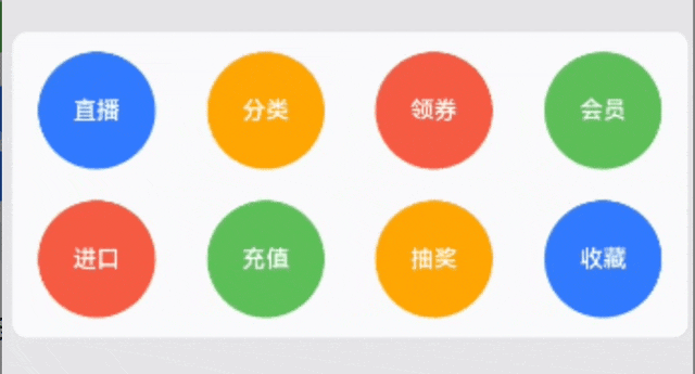
构建可滚动的网格布局:可滚动的网格布局常用在文件管理、购物或视频列表等页面中。在设置 Grid 的行列数量与占比时,如果仅设置行、列数量与占比中的一个,即仅设置 rowsTemplate 或仅设置 columnsTemplate 属性,网格单元按照设置的方向排列,超出 Grid 显示区域后,Grid 拥有可滚动能力。如下图所示:
-
如果设置的是 columnsTemplate,Grid 的滚动方向为垂直方向;如果设置的是 rowsTemplate,Grid 的滚动方向为水平方向。如上图所示的横向可滚动网格布局,只要设置 rowsTemplate 属性的值且不设置 columnsTemplate 属性,当内容超出 Grid 组件宽度时,Grid 可横向滚动进行内容展示:
@Componentstruct Shopping {
@State services: Array= ['直播', '进口', ...] ...
build() {
Column({ space: 5 }) {
Grid() {
ForEach(this.services, (service: string, index) => { GridItem() {
.}
.width('25%')
}, service => service)
}
.rowsTemplate('1fr 1fr') // 只设置rowsTemplate属性,当内容超出Grid区域时,可水平滚动
.rowsGap(15)
}
}
}
三、控制滚动位置
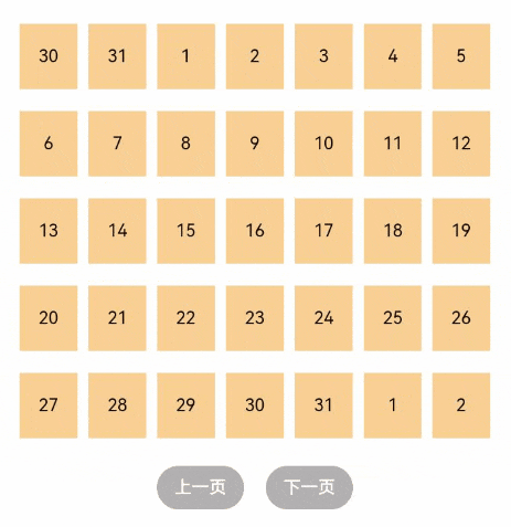
- 与新闻列表的返回顶部场景类似,控制滚动位置功能在网格布局中也很常用,例如下图所示日历的翻页功能:
-
Grid 组件初始化时,可以绑定一个 Scroller 对象,用于进行滚动控制,例如通过 Scroller 对象的 scrollPage 方法进行翻页。 在日历页面中,用户在点击"下一页"按钮时,应用响应点击事件,通过指定 scrollPage 方法的参数 next 为 true,滚动到下一页。
Column({ space: 5 }) {
Grid(this.scroller) {
... }
.columnsTemplate('1fr 1fr 1fr 1fr 1fr 1fr 1fr') ... Row({space: 20}) {
Button('上一页')
.onClick(() => {
this.scroller.scrollPage({
next: false}) }) Button('下一页') .onClick(() => { this.scroller.scrollPage({ next: true }) })}
}
...
四、实战演练
① 基础网格布局
-
定义数据模型:
export interface ProductData {
id: number,
name: string,
price: number,
image: string,
discount?: number
} -
创建数据数组:
@State productsArray : ProductData[] = [{id: 1, name: 'iPhone 17 Pro', price: 8999.00, image: 'iPhone17Pro', discount: 10.0},
{id: 2, name: 'Macbook Pro', price: 16999.00, image: 'MacbookPro', discount: 12.0},
{id: 3, name: 'Mate 70 Pro', price: 5999.00, image: 'Mate70Pro', discount: 30.0},
{id: 4, name: 'Airpods Pro', price: 1999.00, image: 'AirpodsPro', discount: 0.0},
{id: 5, name: 'Apple Pencil', price: 699.00, image: 'ApplePencil', discount: 0.0},
{id: 6, name: 'iPhone Pocket', price: 1299.00, image: 'iPhonePocket', discount: 10.0}] -
分类标签实现:
Row() {
Text('热门商品')
.fontSize(18)
.fontWeight(FontWeight.Medium)
.fontColor('#1D1D1F')Blank() Text('查看全部') .fontSize(14) .fontColor('#007AFF') } .width('100%') .padding({ left: 20, right: 20, top: 10, bottom: 10 }) .backgroundColor('#F2F2F7') -
Grid 网格布局实现:
Grid() { } .columnsTemplate('1fr 1fr') // 两列布局 .columnsGap(16) // 列间距 .rowsGap(16) // 行间距 .width('100%') .layoutWeight(1) .padding({ left: 20, right: 20, bottom: 20 }) .backgroundColor('#F2F2F7') -
说明:
-
- columnsTemplate('1fr 1fr'):设置两列布局,每列占比相等;
-
- columnsGap(16):设置列间距为 16vp;
-
- rowsGap(16):设置行间距为 16vp。
-
再使用 ForEach 循环遍历商品数据,创建一个 GridItem:
ForEach(this.productsArray, (product:ProductData) => { GridItem() { Column() { // 商品图片容器 Stack({ alignContent: Alignment.TopEnd }) { Image($r('app.media.' + product.image)) .width('100%') .height(120) .objectFit(ImageFit.Contain) .backgroundColor(Color.White) .borderRadius(12) // 折扣标签 if (product.discount) { Text(`-${product.discount}%`) .fontSize(12) .fontColor('#FFFFFF') .backgroundColor('#FF3B30') .padding({ left: 8, right: 8, top: 4, bottom: 4 }) .borderRadius(8) .margin({ top: 8, right: 8 }) } } .width('100%') .height(120) // 商品信息 Column() { Text(product.name) .fontSize(14) .fontWeight(FontWeight.Medium) .fontColor('#1D1D1F') .maxLines(2) .textOverflow({ overflow: TextOverflow.Ellipsis }) .margin({ top: 12 }) Row() { if (product.discount) { Text(`¥${(product.price * (100 - product.discount) / 100).toFixed(0)}`) .fontSize(16) .fontWeight(FontWeight.Bold) .fontColor('#FF3B30') Text(`¥${product.price}`) .fontSize(12) .fontColor('#8E8E93') .decoration({ type: TextDecorationType.LineThrough }) .margin({ left: 4 }) } else { Text(`¥${product.price}`) .fontSize(16) .fontWeight(FontWeight.Bold) .fontColor('#1D1D1F') } Blank() Button() { Image($r('app.media.add')) .width(18) .height(18) .fillColor('#FFFFFF') } .width(30) .height(30) .borderRadius(14) .backgroundColor(Color.White) } .width('100%') .margin({ top: 8 }) } .alignItems(HorizontalAlign.Start) .width('100%') } .width('100%') .padding(12) .backgroundColor('#FFFFFF') .borderRadius(16) .shadow({ radius: 8, color: 'rgba(0, 0, 0, 0.1)', offsetX: 0, offsetY: 2 }) } .onClick(() => { console.log(`点击商品: ${product.name}`) }) }) -
效果展示:
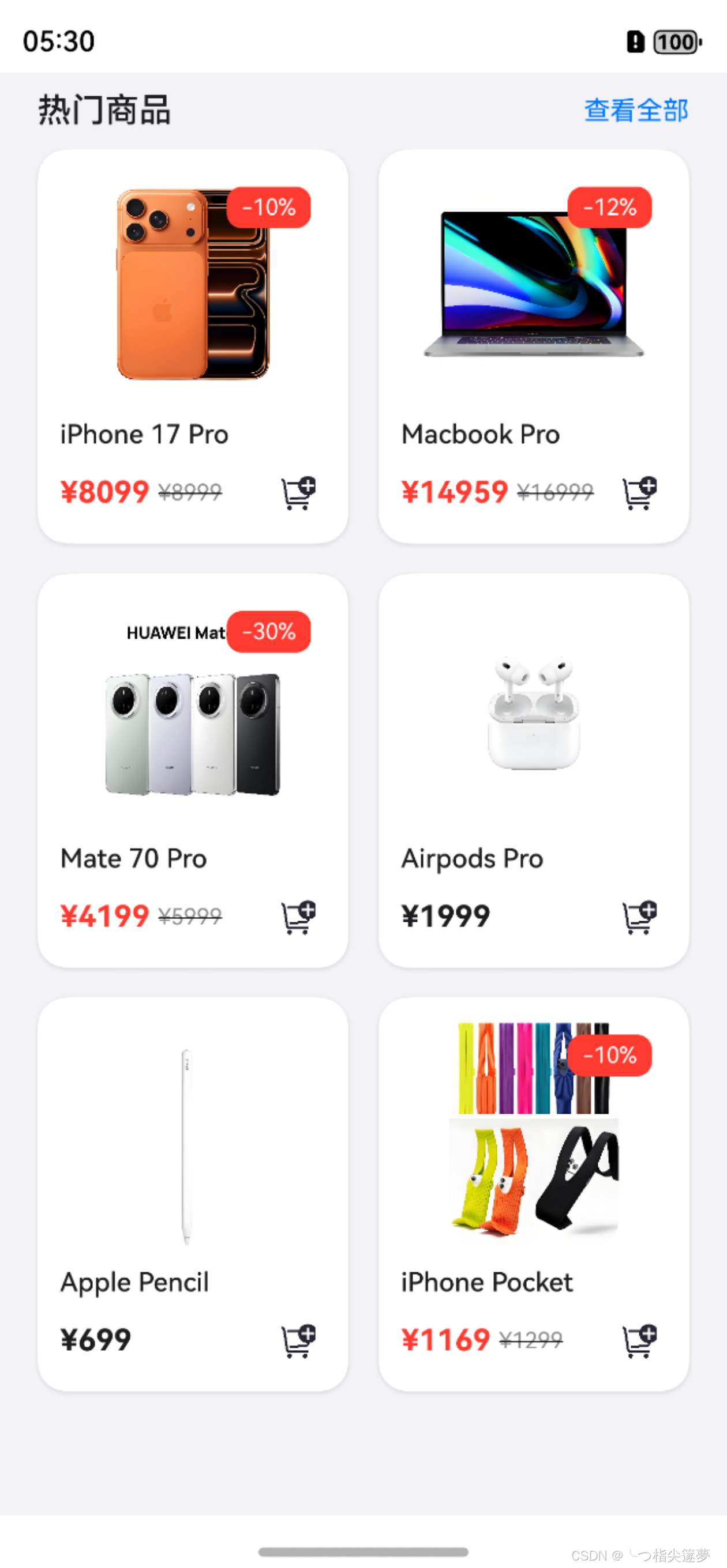
- 每个 GridItem 包含:
-
- 商品图片:使用 Stack 布局,支持在右上角显示折扣标签;
-
- 商品名称:支持最多显示两行,超出部分使用省略号;
-
- 价格信息:显示原价和折扣价(如果有折扣);
-
- 添加按钮:用于将商品添加到购物车。
- 行列设置:
-
- columnsTemplate:设置网格布局的列数和每列的尺寸占比,'1fr 2fr',两列布局,第二列是第一列的两倍宽;
-
- rowsTemplate:设置网格布局的行数和每行的尺寸占比 '1fr 1fr 1fr',三行布局,每行高度相等;
-
- columnsGap:设置列间距 columnsGap(16);
-
- rowsGap:设置行间距 rowsGap(16)。
- GridItem 定位属性:
-
- rowStart:设置起始行号 rowStart(1);
-
- rowEnd:设置结束行号 rowEnd(3);
-
- columnStart:设置起始列号 columnStart(2);
-
- columnEnd:设置结束列号 columnEnd(4)。
② Grid 组件进阶特性
- GridItem 的高级属性:
| 属性 | 描述 | 用途 |
|---|---|---|
| selectable | 是否可选中 | 控制单个商品是否可选 |
| selected | 是否被选中 | 控制商品的选中状态 |
-
状态变量定义:
// 商品数据状态
@State products: Product[] = [...]// 购物车状态
@State cartItems: Map<number, number> = new Map<number, number>()// 筛选状态
@State filterOptions: {
priceRange: [number, number],
hasDiscount: boolean,
sortBy: 'price' | 'popularity' | 'newest'
} = {
priceRange: [0, 50000],
hasDiscount: false,
sortBy: 'popularity'
}// 布局状态
@State gridColumns: string = '1fr 1fr'
@State isListView: boolean = false -
扩展数据模型,添加更多属性以支持进阶功能:
interface ProductData {
id: number,
name: string,
price: number,
image: Resource,
discount?: number,
// 新增属性
category: string,
rating: number,
stock: number,
dateAdded: Date,
popularity: number
} -
商品筛选:
// 筛选面板组件
@Component
struct FilterPanel {
@Link filterOptions: {
priceRange: [number, number],
hasDiscount: boolean,
sortBy: 'price' | 'popularity' | 'newest'
}
@Consume('closeFilter') closeFilter: () => voidbuild() { Column() { // 价格范围选择 Text('价格范围') .fontSize(16) .fontWeight(FontWeight.Medium) .margin({ top: 16, bottom: 8 }) Row() { Slider({ value: this.filterOptions.priceRange[0], min: 0, max: 50000, step: 100, onChange: (value: number) => { this.filterOptions.priceRange[0] = value } }) .width('80%') Text(`¥${this.filterOptions.priceRange[0]}`) .fontSize(14) .margin({ left: 8 }) } .width('100%') Row() { Slider({ value: this.filterOptions.priceRange[1], min: 0, max: 50000, step: 100, onChange: (value: number) => { this.filterOptions.priceRange[1] = value } }) .width('80%') Text(`¥${this.filterOptions.priceRange[1]}`) .fontSize(14) .margin({ left: 8 }) } .width('100%') // 折扣商品筛选 Row() { Text('只看折扣商品') .fontSize(16) .fontWeight(FontWeight.Medium) Toggle({ type: ToggleType.Checkbox, isOn: this.filterOptions.hasDiscount }) .onChange((isOn: boolean) => { this.filterOptions.hasDiscount = isOn }) } .width('100%') .justifyContent(FlexAlign.SpaceBetween) .margin({ top: 16, bottom: 16 }) // 排序方式 Text('排序方式') .fontSize(16) .fontWeight(FontWeight.Medium) .margin({ bottom: 8 }) Column() { Radio({ value: 'price', group: 'sortBy' }) .checked(this.filterOptions.sortBy === 'price') .onChange((isChecked: boolean) => { if (isChecked) { this.filterOptions.sortBy = 'price' } }) Text('按价格') .fontSize(14) } .width('100%') .alignItems(HorizontalAlign.Start) Column() { Radio({ value: 'popularity', group: 'sortBy' }) .checked(this.filterOptions.sortBy === 'popularity') .onChange((isChecked: boolean) => { if (isChecked) { this.filterOptions.sortBy = 'popularity' } }) Text('按热度') .fontSize(14) } .width('100%') .alignItems(HorizontalAlign.Start) .margin({ top: 8 }) Column() { Radio({ value: 'newest', group: 'sortBy' }) .checked(this.filterOptions.sortBy === 'newest') .onChange((isChecked: boolean) => { if (isChecked) { this.filterOptions.sortBy = 'newest' } }) Text('按最新') .fontSize(14) } .width('100%') .alignItems(HorizontalAlign.Start) .margin({ top: 8 }) // 应用按钮 Button('应用筛选') .width('100%') .height(40) .margin({ top: 24 }) .onClick(() => { this.closeFilter() }) } .width('100%') .padding(16) }}
-
商品排序:
// 根据筛选条件对商品进行排序和过滤
private getFilteredProducts(): Product[] {
// 首先过滤价格范围
let filtered = this.products.filter(product => {
const discountedPrice = product.discount ?
product.price * (100 - product.discount) / 100 :
product.price;return discountedPrice >= this.filterOptions.priceRange[0] && discountedPrice <= this.filterOptions.priceRange[1]; }); // 如果只看折扣商品 if (this.filterOptions.hasDiscount) { filtered = filtered.filter(product => product.discount !== undefined); } // 根据排序方式排序 switch (this.filterOptions.sortBy) { case 'price': filtered.sort((a, b) => { const priceA = a.discount ? a.price * (100 - a.discount) / 100 : a.price; const priceB = b.discount ? b.price * (100 - b.discount) / 100 : b.price; return priceA - priceB; }); break; case 'popularity': filtered.sort((a, b) => b.popularity - a.popularity); break; case 'newest': filtered.sort((a, b) => b.dateAdded.getTime() - a.dateAdded.getTime()); break; } return filtered;}
-
添加购物车:
// 添加商品到购物车
private addToCart(productId: number): void {
if (this.cartItems.has(productId)) {
// 如果已在购物车中,数量+1
this.cartItems.set(productId, this.cartItems.get(productId) + 1);
} else {
// 否则添加到购物车,数量为1
this.cartItems.set(productId, 1);
}// 更新购物车图标上的数字 this.updateCartBadge();}
// 从购物车移除商品
private removeFromCart(productId: number): void {
if (this.cartItems.has(productId)) {
const currentCount = this.cartItems.get(productId);
if (currentCount > 1) {
// 如果数量大于1,数量-1
this.cartItems.set(productId, currentCount - 1);
} else {
// 否则从购物车中移除
this.cartItems.delete(productId);
}// 更新购物车图标上的数字 this.updateCartBadge(); }}
// 更新购物车图标上的数字
private updateCartBadge(): void {
let totalItems = 0;
this.cartItems.forEach(count => {
totalItems += count;
});// 更新UI上的购物车数量 this.cartItemCount = totalItems;}
-
为了适应不同屏幕尺寸,可以实现更加智能的响应式布局:
// 在组件初始化时设置响应式布局
aboutToAppear() {
// 获取屏幕信息
const displayInfo = display.getDefaultDisplaySync();
const screenWidth = px2vp(displayInfo.width);// 根据屏幕宽度设置网格列数 if (screenWidth < 360) { // 小屏手机 this.gridColumns = '1fr'; } else if (screenWidth < 600) { // 普通手机 this.gridColumns = '1fr 1fr'; } else if (screenWidth < 840) { // 大屏手机/小平板 this.gridColumns = '1fr 1fr 1fr'; } else { // 平板/桌面 this.gridColumns = '1fr 1fr 1fr 1fr'; }}
// 监听屏幕旋转
onPageShow() {
display.on('change', this.updateLayout.bind(this));
}onPageHide() {
display.off('change', this.updateLayout.bind(this));
}// 更新布局
private updateLayout() {
const displayInfo = display.getDefaultDisplaySync();
const screenWidth = px2vp(displayInfo.width);// 如果是列表视图,保持单列 if (this.isListView) { this.gridColumns = '1fr'; return; } // 根据屏幕宽度更新网格列数 if (screenWidth < 360) { this.gridColumns = '1fr'; } else if (screenWidth < 600) { this.gridColumns = '1fr 1fr'; } else if (screenWidth < 840) { this.gridColumns = '1fr 1fr 1fr'; } else { this.gridColumns = '1fr 1fr 1fr 1fr'; }}