<!DOCTYPE html>
<html lang="zh-CN">
<head>
<meta charset="UTF-8" />
<meta name="viewport" content="width=device-width, initial-scale=1.0" />
<title>响应式栅格布局(纯CSS + JS)</title>
<style>
body {
font-family: -apple-system, BlinkMacSystemFont, 'Segoe UI', Roboto, sans-serif;
background: #f5f7fa;
min-height: 100vh;
margin: 0;
padding: 20px 0;
}
h1 {
text-align: center;
margin-bottom: 30px;
color: #2d3748;
}
.container {
margin: 0 20px;
padding: 20px 0;
}
.info {
background: white;
padding: 20px;
border-radius: 8px;
margin-bottom: 20px;
box-shadow: 0 2px 4px rgba(0,0,0,0.1);
}
.info.details {
margin-top: 30px;
}
.info h3 {
color: #2d3748;
margin-bottom: 10px;
}
.info ul {
padding-left: 20px;
margin: 10px 0;
}
.info li {
margin: 5px 0;
color: #4a5568;
}
.screen-info {
display: flex;
flex-wrap: wrap;
gap: 10px;
margin-top: 15px;
padding-top: 15px;
border-top: 1px solid #e2e8f0;
}
.screen-info span {
background: #edf2f7;
padding: 6px 12px;
border-radius: 6px;
font-size: 14px;
color: #4a5568;
}
/* 栅格布局系统 */
.grid-wrapper {
display: grid;
width: 100%;
min-height: 200px;
gap: 10px;
grid-template-columns: repeat(4, 1fr);
}
.div1, .div2 {
min-height: 150px;
padding: 20px;
border-radius: 8px;
display: flex;
align-items: center;
justify-content: center;
color: white;
font-size: 18px;
font-weight: bold;
transition: all 0.3s ease;
}
.div1:hover, .div2:hover {
transform: translateY(-2px);
box-shadow: 0 8px 16px rgba(0,0,0,0.2);
}
.div1 {
background: linear-gradient(135deg, #667eea 0%, #764ba2 100%);
}
.div2 {
background: linear-gradient(135deg, #f093fb 0%, #f5576c 100%);
}
/* 小屏幕(默认已设置)*/
.div1 { grid-column: span 1; }
.div2 { grid-column: span 3; }
/* 中屏幕 */
@media (min-width: 768px) and (max-width: 1023px) {
.grid-wrapper {
gap: 15px;
grid-template-columns: repeat(8, 1fr);
}
.div1 { grid-column: span 1; }
.div2 { grid-column: span 7; }
}
/* 大屏幕 */
@media (min-width: 1024px) {
.grid-wrapper {
gap: 20px;
grid-template-columns: repeat(12, 1fr);
}
.div1 { grid-column: span 1; }
.div2 { grid-column: span 11; }
.div1, .div2 {
min-height: 180px;
font-size: 20px;
}
}
/* 额外的小屏幕优化 */
@media (max-width: 480px) {
.div1, .div2 {
min-height: 120px;
padding: 15px;
font-size: 16px;
}
.screen-info {
flex-direction: column;
}
}
</style>
</head>
<body>
<div class="pure-css-grid">
<h1>响应式栅格布局(纯CSS + JS)</h1>
<div class="container">
<div class="info">
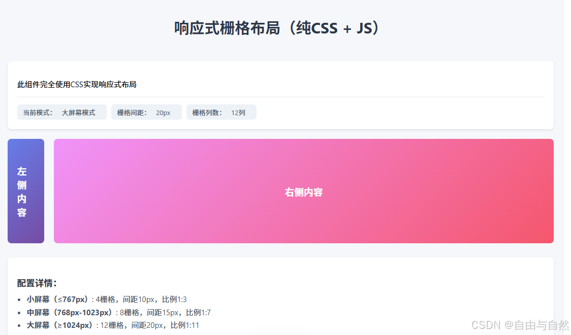
<p>此组件完全使用CSS实现响应式布局</p>
<div class="screen-info">
<span>当前模式:<span id="mode">-</span></span>
<span>栅格间距:<span id="gap">-</span></span>
<span>栅格列数:<span id="cols">-</span></span>
</div>
</div>
<div class="grid-wrapper">
<div class="div1">左侧内容</div>
<div class="div2">右侧内容</div>
</div>
<div class="info details">
<h3>配置详情:</h3>
<ul>
<li><strong>小屏幕(≤767px)</strong>: 4栅格,间距10px,比例1:3</li>
<li><strong>中屏幕(768px-1023px)</strong>: 8栅格,间距15px,比例1:7</li>
<li><strong>大屏幕(≥1024px)</strong>: 12栅格,间距20px,比例1:11</li>
</ul>
</div>
</div>
</div>
<script>
const modeEl = document.getElementById('mode');
const gapEl = document.getElementById('gap');
const colsEl = document.getElementById('cols');
function updateInfo() {
const width = window.innerWidth;
let mode, gap, cols;
if (width < 768) {
mode = '小屏幕模式';
gap = '10px';
cols = '4列';
} else if (width >= 768 && width < 1024) {
mode = '中屏幕模式';
gap = '15px';
cols = '8列';
} else {
mode = '大屏幕模式';
gap = '20px';
cols = '12列';
}
modeEl.textContent = mode;
gapEl.textContent = gap;
colsEl.textContent = cols;
}
// 初始化
updateInfo();
window.addEventListener('resize', updateInfo);
</script>
</body>
</html>