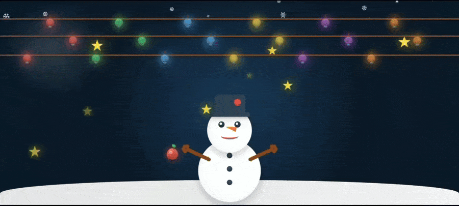
一:效果展示
本项目基于
CSS动画和JavaScript动态生成技术,展示了飘雪、糖果棒下落、闪烁星星等圣诞主题动画效果,搭配可爱的雪人、圣诞树和礼物盒,营造出圣诞温馨欢乐的节日氛围
二:完整代码
html
<!DOCTYPE html>
<html lang="zh-CN">
<head>
<meta charset="UTF-8">
<meta name="viewport" content="width=device-width, initial-scale=1.0">
<title>可爱圣诞雪人</title>
<style>
* {
margin: 0;
padding: 0;
box-sizing: border-box;
}
body, html {
width: 100%;
height: 100%;
background: radial-gradient(circle at center, #1a3a5a, #0d1b2a, #0a1929);
overflow: hidden;
}
.snowflake {
position: absolute;
color: white;
font-size: 1.2em;
pointer-events: none;
z-index: 1;
animation: snowFall linear infinite;
opacity: 0.7;
}
@keyframes snowFall {
0% {
transform: translateY(-10vh) rotate(0deg);
opacity: 0;
}
10% {
opacity: 0.8;
}
90% {
opacity: 0.8;
}
100% {
transform: translateY(110vh) rotate(720deg);
opacity: 0;
}
}
.candy-cane {
position: absolute;
font-size: 1.5em;
pointer-events: none;
z-index: 1;
animation: candyFall linear infinite;
opacity: 0.8;
}
@keyframes candyFall {
0% {
transform: translateY(-10vh) rotate(0deg);
opacity: 0;
}
10% {
opacity: 0.9;
}
90% {
opacity: 0.9;
}
100% {
transform: translateY(110vh) rotate(-720deg);
opacity: 0;
}
}
.snowman-container {
position: absolute;
bottom: 10px;
left: 50%;
transform: translateX(-50%);
z-index: 10;
}
.snowman {
position: relative;
width: 180px;
height: 280px;
animation: snowmanBounce 3s ease-in-out infinite;
}
.ground {
background:
linear-gradient(45deg, #e0e0e0 25%, transparent 25%) -10px 0,
linear-gradient(-45deg, #f0f0f0 25%, transparent 25%) -10px 0,
linear-gradient(135deg, #e0e0e0 25%, transparent 25%),
linear-gradient(-135deg, #f0f0f0 25%, transparent 25%);
background-size: 20px 20px;
}
@keyframes snowmanBounce {
0%, 100% {
transform: translateY(0);
}
50% {
transform: translateY(-15px);
}
}
.snowman-body {
position: absolute;
bottom: 0;
left: 50%;
transform: translateX(-50%);
width: 140px;
height: 140px;
background: linear-gradient(135deg, #f8f9fa, #ffffff);
border-radius: 50%;
box-shadow:
0 10px 20px rgba(0,0,0,0.2),
inset 0 -10px 20px rgba(0,0,0,0.05),
inset 0 10px 20px rgba(255,255,255,0.8);
z-index: 1;
}
.snowman-button {
position: absolute;
width: 12px;
height: 12px;
background: #34495e;
border-radius: 50%;
left: 50%;
transform: translateX(-50%);
box-shadow: inset 0 -2px 4px rgba(0,0,0,0.3);
}
.button-1 { top: 30px; }
.button-2 { top: 60px; }
.button-3 { top: 90px; }
.snowman-head {
position: absolute;
bottom: 110px;
left: 50%;
transform: translateX(-50%);
width: 100px;
height: 100px;
background: linear-gradient(135deg, #f8f9fa, #ffffff);
border-radius: 50%;
box-shadow:
0 8px 15px rgba(0,0,0,0.2),
inset 0 -8px 15px rgba(0,0,0,0.05),
inset 0 8px 15px rgba(255,255,255,0.8);
z-index: 2;
}
.snowman-eye {
position: absolute;
width: 14px;
height: 14px;
background: #2c3e50;
border-radius: 50%;
top: 30px;
box-shadow: inset 0 -3px 3px rgba(0,0,0,0.3);
animation: blink 4s infinite ease-in-out;
}
.snowman-eye.left {
left: 25px;
}
.snowman-eye.right {
right: 25px;
}
.snowman-eye.right::after {
content: '';
position: absolute;
width: 5px;
height: 5px;
background: white;
border-radius: 50%;
top: 3px;
left: 3px;
}
.snowman-eye.left::after {
content: '';
position: absolute;
width: 5px;
height: 5px;
background: white;
border-radius: 50%;
top: 3px;
left: 3px;
}
@keyframes blink {
0%, 90%, 100% {
height: 14px;
border-radius: 50%;
}
95% {
height: 2px;
border-radius: 3px;
}
}
.snowman-mouth {
position: absolute;
top: 55px;
left: 50%;
transform: translateX(-50%);
width: 40px;
height: 15px;
border-bottom: 4px solid #e74c3c;
border-radius: 0 0 50% 50%;
}
.snowman-nose {
position: absolute;
width: 25px;
height: 10px;
background: linear-gradient(135deg, #ff9800, #ff5722);
clip-path: polygon(0 50%, 100% 0, 100% 100%);
top: 40px;
left: 40px;
transform: rotate(10deg);
box-shadow: 0 2px 5px rgba(0,0,0,0.2);
z-index: 3;
animation: wiggleNose 5s infinite ease-in-out;
}
@keyframes wiggleNose {
0%, 100% {
transform: rotate(10deg);
}
50% {
transform: rotate(15deg);
}
}
.snowman-hat {
position: absolute;
top: -30px;
left: 50%;
transform: translateX(-50%);
width: 70px;
height: 40px;
background: linear-gradient(135deg, #2c3e50, #34495e);
border-radius: 10px 10px 0 0;
box-shadow: 0 5px 10px rgba(0,0,0,0.3);
z-index: 4;
}
.snowman-hat-brim {
position: absolute;
top: 40px;
left: 50%;
transform: translateX(-50%);
width: 90px;
height: 10px;
background: linear-gradient(135deg, #2c3e50, #34495e);
border-radius: 5px;
box-shadow: 0 3px 8px rgba(0,0,0,0.3);
}
.snowman-hat-decoration {
position: absolute;
top: 10px;
right: 10px;
width: 15px;
height: 15px;
background: #e74c3c;
border-radius: 50%;
box-shadow: 0 2px 5px rgba(0,0,0,0.2);
}
.snowman-arm {
position: absolute;
top: 30px;
width: 60px;
height: 8px;
background: #8b4513;
border-radius: 4px;
z-index: 0;
animation: waveArm 6s infinite ease-in-out;
}
@keyframes waveArm {
0%, 100% {
transform: rotate(10deg);
}
50% {
transform: rotate(25deg);
}
}
.arm-left {
left: -30px;
transform: rotate(10deg);
}
.arm-right {
right: -30px;
transform: rotate(-10deg);
animation: waveArmRight 6s infinite ease-in-out;
}
@keyframes waveArmRight {
0%, 100% {
transform: rotate(-10deg);
}
50% {
transform: rotate(-25deg);
}
}
.snowman-hand {
position: absolute;
width: 15px;
height: 8px;
background: #8b4513;
border-radius: 4px;
}
.hand-left-1 {
top: -5px;
left: -10px;
transform: rotate(-30deg);
}
.hand-left-2 {
top: 5px;
left: -10px;
transform: rotate(30deg);
}
.hand-right-1 {
top: -5px;
right: -10px;
transform: rotate(30deg);
}
.hand-right-2 {
top: 5px;
right: -10px;
transform: rotate(-30deg);
}
.snowman-apple {
position: absolute;
width: 25px;
height: 25px;
background: linear-gradient(135deg, #e74c3c, #c0392b);
border-radius: 50% 50% 50% 50% / 60% 60% 40% 40%;
box-shadow:
0 3px 6px rgba(0,0,0,0.3),
inset 0 -5px 8px rgba(0,0,0,0.2),
inset 0 5px 8px rgba(255,255,255,0.2);
z-index: 5;
left: -70px;
top: 20px;
animation: appleGlow 3s infinite ease-in-out alternate;
}
.snowman-apple::before {
content: '';
position: absolute;
width: 8px;
height: 8px;
background: rgba(255,255,255,0.4);
border-radius: 50%;
top: 5px;
left: 5px;
}
.snowman-apple::after {
content: '';
position: absolute;
width: 3px;
height: 8px;
background: #8b4513;
border-radius: 3px;
top: -5px;
right: 8px;
transform: rotate(-15deg);
}
.apple-leaf {
position: absolute;
width: 8px;
height: 6px;
background: linear-gradient(135deg, #2ecc71, #27ae60);
border-radius: 0 50% 0 50%;
top: -8px;
right: 5px;
transform: rotate(15deg);
z-index: 6;
}
@keyframes appleGlow {
0% {
box-shadow: 0 3px 6px rgba(0,0,0,0.3),
inset 0 -5px 8px rgba(0,0,0,0.2),
inset 0 5px 8px rgba(255,255,255,0.2);
}
100% {
box-shadow: 0 0 15px rgba(231,76,60,0.8),
0 3px 6px rgba(0,0,0,0.3),
inset 0 -5px 8px rgba(0,0,0,0.2),
inset 0 5px 8px rgba(255,255,255,0.3);
}
}
.ground {
position: absolute;
bottom: 0;
width: 100%;
height: 60px;
background: linear-gradient(135deg, #e0e0e0, #f0f0f0);
border-radius: 50% 50% 0 0;
z-index: 1;
}
.glow {
position: absolute;
width: 220px;
height: 220px;
background: radial-gradient(circle, rgba(255,255,255,0.2) 0%, rgba(255,255,255,0) 70%);
border-radius: 50%;
z-index: 5;
animation: glowPulse 4s infinite ease-in-out;
}
@keyframes glowPulse {
0%, 100% {
transform: scale(1);
opacity: 0.7;
}
50% {
transform: scale(1.1);
opacity: 0.9;
}
}
.christmas-tree {
position: absolute;
bottom: 40px;
left: -200px;
width: 150px;
height: 200px;
z-index: 8;
}
.tree-trunk {
position: absolute;
bottom: 0;
left: 50%;
transform: translateX(-50%);
width: 20px;
height: 40px;
background: linear-gradient(90deg, #8b4513, #5d3a1f);
border-radius: 4px;
}
.tree-top {
position: absolute;
bottom: 30px;
left: 50%;
transform: translateX(-50%);
width: 0;
height: 0;
}
.tree-layer {
position: absolute;
left: 50%;
transform: translateX(-50%);
background: linear-gradient(135deg, #27ae60, #2ecc71);
clip-path: polygon(50% 0%, 0% 100%, 100% 100%);
}
.layer-1 {
bottom: 30px;
width: 120px;
height: 80px;
}
.layer-2 {
bottom: 70px;
width: 90px;
height: 60px;
}
.layer-3 {
bottom: 100px;
width: 60px;
height: 40px;
}
.tree-ornament {
position: absolute;
width: 12px;
height: 12px;
border-radius: 50%;
box-shadow: 0 2px 4px rgba(0,0,0,0.3);
animation: ornamentGlow 2s infinite alternate;
}
@keyframes ornamentGlow {
0% { transform: scale(1); }
100% { transform: scale(1.1); }
}
.ornament-red { background: linear-gradient(135deg, #e74c3c, #c0392b); }
.ornament-blue { background: linear-gradient(135deg, #3498db, #2980b9); }
.ornament-gold { background: linear-gradient(135deg, #f1c40f, #d4ac0d); }
.ornament-purple { background: linear-gradient(135deg, #9b59b6, #8e44ad); }
.tree-star {
display: none;
}
.lucky-star {
position: absolute;
top: 0;
left: 50%;
transform: translateX(-50%);
width: 30px;
height: 30px;
z-index: 10;
animation: starTwinkle 1.5s ease-in-out infinite alternate;
}
.star {
width: 100%;
height: 100%;
background: gold;
clip-path: polygon(
50% 0%,
61% 35%,
98% 35%,
68% 57%,
79% 91%,
50% 70%,
21% 91%,
32% 57%,
2% 35%,
39% 35%
);
position: relative;
}
.star:before {
content: '';
position: absolute;
top: 0;
left: 0;
right: 0;
bottom: 0;
background:
radial-gradient(circle at 30% 30%, white 0%, transparent 25%),
radial-gradient(circle at 70% 30%, white 0%, transparent 25%),
radial-gradient(circle at 50% 60%, white 0%, transparent 20%);
opacity: 0.8;
}
@keyframes starTwinkle {
0% {
transform: translateX(-50%) scale(0.95) rotate(0deg);
opacity: 0.9;
filter: drop-shadow(0 0 5px gold);
}
100% {
transform: translateX(-50%) scale(1.05) rotate(5deg);
opacity: 1;
filter: drop-shadow(0 0 15px gold);
}
}
.gift-box {
position: absolute;
bottom: 40px;
right: -150px;
width: 80px;
height: 80px;
z-index: 8;
animation: giftFloat 3s infinite ease-in-out;
}
@keyframes giftFloat {
0%, 100% { transform: translateY(0); }
50% { transform: translateY(-10px); }
}
.gift-box-1 {
right: -150px;
width: 70px;
height: 70px;
}
.gift-box-2 {
right: -80px;
bottom: 60px;
width: 50px;
height: 50px;
}
.gift-box-3 {
right: -120px;
bottom: 20px;
width: 60px;
height: 60px;
}
.gift-body {
position: absolute;
width: 100%;
height: 100%;
background: linear-gradient(135deg, #e74c3c, #c0392b);
border-radius: 4px;
box-shadow: 0 5px 10px rgba(0,0,0,0.3);
}
.gift-ribbon {
position: absolute;
background: linear-gradient(135deg, #f1c40f, #f39c12);
}
.gift-ribbon-h {
top: 50%;
left: 0;
width: 100%;
height: 10px;
transform: translateY(-50%);
}
.gift-ribbon-v {
top: 0;
left: 50%;
width: 10px;
height: 100%;
transform: translateX(-50%);
}
.gift-bow {
position: absolute;
top: -15px;
left: 50%;
transform: translateX(-50%);
width: 25px;
height: 25px;
}
.gift-bow::before,
.gift-bow::after {
content: '';
position: absolute;
width: 20px;
height: 20px;
background: linear-gradient(135deg, #f1c40f, #f39c12);
border-radius: 50%;
}
.gift-bow::before { left: -10px; }
.gift-bow::after { right: -10px; }
.christmas-lights {
position: absolute;
left: 0;
width: 100%;
height: 120px;
z-index: 6;
top: 30px;
}
.lights-layer {
position: absolute;
width: 100%;
height: 40px;
}
.lights-layer-1 {
top: 0;
}
.lights-layer-2 {
top: 40px;
}
.lights-layer-3 {
top: 80px;
}
.light-string {
position: absolute;
top: 15px;
left: 0;
width: 100%;
height: 3px;
background: linear-gradient(90deg, #6d4c41, #8b4513, #6d4c41);
border-radius: 3px;
box-shadow: 0 1px 3px rgba(0,0,0,0.5);
}
.lights-layer-1 .light-string {
animation: stringWave1 8s infinite ease-in-out;
}
@keyframes stringWave1 {
0%, 100% { transform: translateY(0); }
25% { transform: translateY(-2px); }
75% { transform: translateY(2px); }
}
.lights-layer-2 .light-string {
animation: stringWave2 9s infinite ease-in-out 1s;
}
@keyframes stringWave2 {
0%, 100% { transform: translateY(0); }
25% { transform: translateY(-3px); }
75% { transform: translateY(1px); }
}
.lights-layer-3 .light-string {
animation: stringWave3 7s infinite ease-in-out 0.5s;
}
@keyframes stringWave3 {
0%, 100% { transform: translateY(0); }
25% { transform: translateY(-1px); }
75% { transform: translateY(3px); }
}
.light-bulb {
position: absolute;
bottom: 8px;
width: 18px;
height: 18px;
border-radius: 50%;
box-shadow:
0 4px 8px rgba(0,0,0,0.4),
inset 0 -3px 5px rgba(0,0,0,0.3),
inset 0 3px 5px rgba(255,255,255,0.2);
animation: lightPulse 1.5s infinite alternate, bulbSwing 4s infinite ease-in-out;
z-index: 1;
filter: drop-shadow(0 0 8px currentColor);
}
.light-bulb::before {
content: '';
position: absolute;
top: -8px;
left: 50%;
transform: translateX(-50%);
width: 2px;
height: 8px;
background: #8b4513;
border-radius: 2px 2px 0 0;
z-index: -1;
}
.light-bulb::after {
content: '';
position: absolute;
bottom: -2px;
left: 50%;
transform: translateX(-50%);
width: 8px;
height: 4px;
background: linear-gradient(90deg, #7f8c8d, #95a5a6, #7f8c8d);
border-radius: 2px;
box-shadow: inset 0 -1px 2px rgba(0,0,0,0.3);
}
@keyframes lightPulse {
0% {
opacity: 0.7;
transform: scale(0.95);
filter: drop-shadow(0 0 8px currentColor);
}
100% {
opacity: 1;
transform: scale(1.1);
filter: drop-shadow(0 0 25px currentColor) drop-shadow(0 0 10px currentColor);
}
}
@keyframes bulbSwing {
0%, 100% { transform: rotate(-2deg); }
50% { transform: rotate(2deg); }
}
.light-red {
background: radial-gradient(circle, #ff6b6b, #e74c3c, #c0392b);
color: #ff6b6b;
box-shadow:
0 4px 8px rgba(0,0,0,0.4),
inset 0 -3px 5px rgba(0,0,0,0.3),
inset 0 3px 5px rgba(255,255,255,0.4),
0 0 10px rgba(231,76,60,0.5);
}
.light-green {
background: radial-gradient(circle, #51cf66, #2ecc71, #27ae60);
color: #51cf66;
box-shadow:
0 4px 8px rgba(0,0,0,0.4),
inset 0 -3px 5px rgba(0,0,0,0.3),
inset 0 3px 5px rgba(255,255,255,0.4),
0 0 10px rgba(46,204,113,0.5);
}
.light-blue {
background: radial-gradient(circle, #4dabf7, #3498db, #2980b9);
color: #4dabf7;
box-shadow:
0 4px 8px rgba(0,0,0,0.4),
inset 0 -3px 5px rgba(0,0,0,0.3),
inset 0 3px 5px rgba(255,255,255,0.4),
0 0 10px rgba(52,152,219,0.5);
}
.light-yellow {
background: radial-gradient(circle, #ffd43b, #f1c40f, #d4ac0d);
color: #ffd43b;
box-shadow:
0 4px 8px rgba(0,0,0,0.4),
inset 0 -3px 5px rgba(0,0,0,0.3),
inset 0 3px 5px rgba(255,255,255,0.4),
0 0 10px rgba(241,196,15,0.5);
}
.light-purple {
background: radial-gradient(circle, #be4bdb, #9b59b6, #8e44ad);
color: #be4bdb;
box-shadow:
0 4px 8px rgba(0,0,0,0.4),
inset 0 -3px 5px rgba(0,0,0,0.3),
inset 0 3px 5px rgba(255,255,255,0.4),
0 0 10px rgba(155,89,182,0.5);
}
.light-orange {
background: radial-gradient(circle, #ff922b, #e67e22, #d35400);
color: #ff922b;
box-shadow:
0 4px 8px rgba(0,0,0,0.4),
inset 0 -3px 5px rgba(0,0,0,0.3),
inset 0 3px 5px rgba(255,255,255,0.4),
0 0 10px rgba(230,126,34,0.5);
}
.lights-layer-1 .light-red { left: 10%; }
.lights-layer-1 .light-green { left: 25%; }
.lights-layer-1 .light-blue { left: 40%; }
.lights-layer-1 .light-yellow { left: 55%; }
.lights-layer-1 .light-purple { left: 70%; }
.lights-layer-1 .light-orange { left: 85%; }
.lights-layer-2 .light-red { left: 15%; }
.lights-layer-2 .light-green { left: 30%; }
.lights-layer-2 .light-blue { left: 45%; }
.lights-layer-2 .light-yellow { left: 60%; }
.lights-layer-2 .light-purple { left: 75%; }
.lights-layer-2 .light-orange { left: 90%; }
.lights-layer-3 .light-red { left: 5%; }
.lights-layer-3 .light-green { left: 20%; }
.lights-layer-3 .light-blue { left: 35%; }
.lights-layer-3 .light-yellow { left: 50%; }
.lights-layer-3 .light-purple { left: 65%; }
.lights-layer-3 .light-orange { left: 80%; }
.christmas-star {
position: absolute;
z-index: 5;
animation: luckyStarTwinkle 2.5s infinite ease-in-out;
opacity: 0;
}
.christmas-star .star {
width: 100%;
height: 100%;
background: gold;
clip-path: polygon(
50% 0%,
61% 35%,
98% 35%,
68% 57%,
79% 91%,
50% 70%,
21% 91%,
32% 57%,
2% 35%,
39% 35%
);
position: relative;
}
.christmas-star .star:before {
content: '';
position: absolute;
top: 0;
left: 0;
right: 0;
bottom: 0;
background:
radial-gradient(circle at 30% 30%, white 0%, transparent 25%),
radial-gradient(circle at 70% 30%, white 0%, transparent 25%),
radial-gradient(circle at 50% 60%, white 0%, transparent 20%);
opacity: 0.8;
}
@keyframes luckyStarTwinkle {
0%, 10%, 90%, 100% {
opacity: 0;
transform: scale(0.8);
filter: drop-shadow(0 0 3px gold);
}
20%, 80% {
opacity: 1;
transform: scale(1.1);
filter: drop-shadow(0 0 12px gold);
}
50% {
opacity: 0.8;
transform: scale(1);
filter: drop-shadow(0 0 8px gold);
}
}
</style>
</head>
<body>
<div class="glow"></div>
<div class="christmas-lights">
<div class="lights-layer lights-layer-1">
<div class="light-string"></div>
<div class="light-bulb light-red"></div>
<div class="light-bulb light-green"></div>
<div class="light-bulb light-blue"></div>
<div class="light-bulb light-yellow"></div>
<div class="light-bulb light-purple"></div>
<div class="light-bulb light-orange"></div>
</div>
<div class="lights-layer lights-layer-2">
<div class="light-string"></div>
<div class="light-bulb light-red"></div>
<div class="light-bulb light-green"></div>
<div class="light-bulb light-blue"></div>
<div class="light-bulb light-yellow"></div>
<div class="light-bulb light-purple"></div>
<div class="light-bulb light-orange"></div>
</div>
<div class="lights-layer lights-layer-3">
<div class="light-string"></div>
<div class="light-bulb light-red"></div>
<div class="light-bulb light-green"></div>
<div class="light-bulb light-blue"></div>
<div class="light-bulb light-yellow"></div>
<div class="light-bulb light-purple"></div>
<div class="light-bulb light-orange"></div>
</div>
</div>
<div class="christmas-tree">
<div class="tree-trunk"></div>
<div class="tree-top">
<div class="tree-layer layer-1"></div>
<div class="tree-layer layer-2"></div>
<div class="tree-layer layer-3"></div>
<div class="tree-ornament ornament-red" style="bottom: 40px; left: 30%;"></div>
<div class="tree-ornament ornament-blue" style="bottom: 60px; left: 70%;"></div>
<div class="tree-ornament ornament-gold" style="bottom: 80px; left: 40%;"></div>
<div class="tree-ornament ornament-purple" style="bottom: 50px; left: 60%;"></div>
<div class="tree-ornament ornament-red" style="bottom: 90px; left: 50%;"></div>
<div class="lucky-star">
<div class="star"></div>
</div>
</div>
</div>
<div class="gift-box gift-box-1">
<div class="gift-body"></div>
<div class="gift-ribbon gift-ribbon-h"></div>
<div class="gift-ribbon gift-ribbon-v"></div>
<div class="gift-bow"></div>
</div>
<div class="gift-box gift-box-2">
<div class="gift-body" style="background: linear-gradient(135deg, #3498db, #2980b9);"></div>
<div class="gift-ribbon gift-ribbon-h" style="background: linear-gradient(135deg, #2ecc71, #27ae60);"></div>
<div class="gift-ribbon gift-ribbon-v" style="background: linear-gradient(135deg, #2ecc71, #27ae60);"></div>
<div class="gift-bow" style="background: linear-gradient(135deg, #2ecc71, #27ae60);"></div>
</div>
<div class="gift-box gift-box-3">
<div class="gift-body" style="background: linear-gradient(135deg, #9b59b6, #8e44ad);"></div>
<div class="gift-ribbon gift-ribbon-h" style="background: linear-gradient(135deg, #e74c3c, #c0392b);"></div>
<div class="gift-ribbon gift-ribbon-v" style="background: linear-gradient(135deg, #e74c3c, #c0392b);"></div>
<div class="gift-bow" style="background: linear-gradient(135deg, #e74c3c, #c0392b);"></div>
</div>
<div class="snowman-container">
<div class="snowman">
<div class="snowman-body">
<div class="snowman-button button-1"></div>
<div class="snowman-button button-2"></div>
<div class="snowman-button button-3"></div>
<div class="snowman-arm arm-left">
<div class="snowman-hand hand-left-1"></div>
<div class="snowman-hand hand-left-2"></div>
</div>
<div class="snowman-arm arm-right">
<div class="snowman-hand hand-right-1"></div>
<div class="snowman-hand hand-right-2"></div>
</div>
<div class="snowman-apple">
<div class="apple-leaf"></div>
</div>
</div>
<div class="snowman-head">
<div class="snowman-eye left"></div>
<div class="snowman-eye right"></div>
<div class="snowman-mouth"></div>
<div class="snowman-nose"></div>
<div class="snowman-hat">
<div class="snowman-hat-decoration"></div>
<div class="snowman-hat-brim"></div>
</div>
</div>
</div>
</div>
<div class="ground"></div>
<script>
function createSnowflakes() {
const body = document.body;
const snowflakeCount = 80;
const snowflakes = ['❄', '❅', '❆', '*', '✧'];
for (let i = 0; i < snowflakeCount; i++) {
const snowflake = document.createElement('div');
snowflake.classList.add('snowflake');
snowflake.innerHTML = snowflakes[Math.floor(Math.random() * snowflakes.length)];
const size = Math.random() * 12 + 8;
const startX = Math.random() * 100;
const duration = Math.random() * 20 + 10;
const delay = Math.random() * 5;
const opacity = Math.random() * 0.5 + 0.3;
snowflake.style.fontSize = `${size}px`;
snowflake.style.left = `${startX}%`;
snowflake.style.top = '-10%';
snowflake.style.opacity = opacity;
snowflake.style.animationDuration = `${duration}s`;
snowflake.style.animationDelay = `${delay}s`;
body.appendChild(snowflake);
}
}
function createCandyCanes() {
const body = document.body;
const candyCount = 20;
const candies = ['🍬', '🍭', '🎄', '🎁'];
for (let i = 0; i < candyCount; i++) {
const candy = document.createElement('div');
candy.classList.add('candy-cane');
candy.innerHTML = candies[Math.floor(Math.random() * candies.length)];
const size = Math.random() * 15 + 10;
const startX = Math.random() * 100;
const duration = Math.random() * 25 + 15;
const delay = Math.random() * 10;
const opacity = Math.random() * 0.6 + 0.4;
candy.style.fontSize = `${size}px`;
candy.style.left = `${startX}%`;
candy.style.top = '-10%';
candy.style.opacity = opacity;
candy.style.animationDuration = `${duration}s`;
candy.style.animationDelay = `${delay}s`;
body.appendChild(candy);
}
}
function createStars() {
const body = document.body;
const starCount = 12;
const starSizes = [18, 20, 22, 24, 26, 28];
for (let i = 0; i < starCount; i++) {
const starContainer = document.createElement('div');
starContainer.classList.add('christmas-star');
const star = document.createElement('div');
star.classList.add('star');
starContainer.appendChild(star);
const top = Math.random() * 80 + 5;
const left = Math.random() * 90 + 5;
const size = starSizes[Math.floor(Math.random() * starSizes.length)];
const delay = Math.random() * 3;
starContainer.style.top = `${top}%`;
starContainer.style.left = `${left}%`;
starContainer.style.width = `${size}px`;
starContainer.style.height = `${size}px`;
starContainer.style.animationDelay = `${delay}s`;
body.appendChild(starContainer);
}
}
createSnowflakes();
createCandyCanes();
createStars();
</script>
</body>
</html>最后,祝所有粉丝圣诞节快乐~🎄,平平安安🍎,心想事成🍊