前言
作品详情页面是内容平台中展示单个作品完整信息的核心页面。它需要展示作品图片、标题、作者信息、详细描述、互动数据等内容,并提供点赞、收藏、评论、分享等交互功能。本文将详细介绍如何在Flutter和OpenHarmony平台上实现一个功能完善的作品详情页面。
作品详情页面的设计需要突出作品本身,同时提供丰富的互动入口。页面布局应该清晰有序,让用户能够快速获取关键信息。
Flutter作品详情页面实现
页面结构设计
作品详情页面接收作品信息参数。
dart
class ArtworkDetailPage extends StatefulWidget {
  final String title;
  final String author;

  const ArtworkDetailPage({super.key, required this.title, required this.author});

  @override
  State<ArtworkDetailPage> createState() => _ArtworkDetailPageState();
}

class _ArtworkDetailPageState extends State<ArtworkDetailPage> {
  bool _isLiked = false;
  bool _isCollected = false;
  int _likeCount = 128;
使用StatefulWidget管理点赞和收藏状态。title和author通过构造函数传入。
页面布局实现
使用CustomScrollView实现可折叠的头部效果。
dart
  @override
  Widget build(BuildContext context) {
    return Scaffold(
      body: CustomScrollView(
        slivers: [
          SliverAppBar(
            expandedHeight: 300,
            pinned: true,
            backgroundColor: const Color(0xFF8B4513),
            leading: IconButton(
              icon: const Icon(Icons.arrow_back, color: Colors.white),
              onPressed: () => Navigator.pop(context),
            ),
            actions: [
              IconButton(icon: const Icon(Icons.share, color: Colors.white), onPressed: () {}),
            ],
            flexibleSpace: FlexibleSpaceBar(
              background: Container(
                color: Colors.grey[300],
                child: const Center(child: Icon(Icons.image, size: 80, color: Colors.grey)),
              ),
            ),
          ),
SliverAppBar实现可折叠的图片头部。expandedHeight设置展开高度。pinned使AppBar在滚动时固定在顶部。
作品信息区域
展示作品标题、作者和描述。
dart
SliverToBoxAdapter(
child: Container(
padding: const EdgeInsets.all(16),
child: Column(
crossAxisAlignment: CrossAxisAlignment.start,
children: [
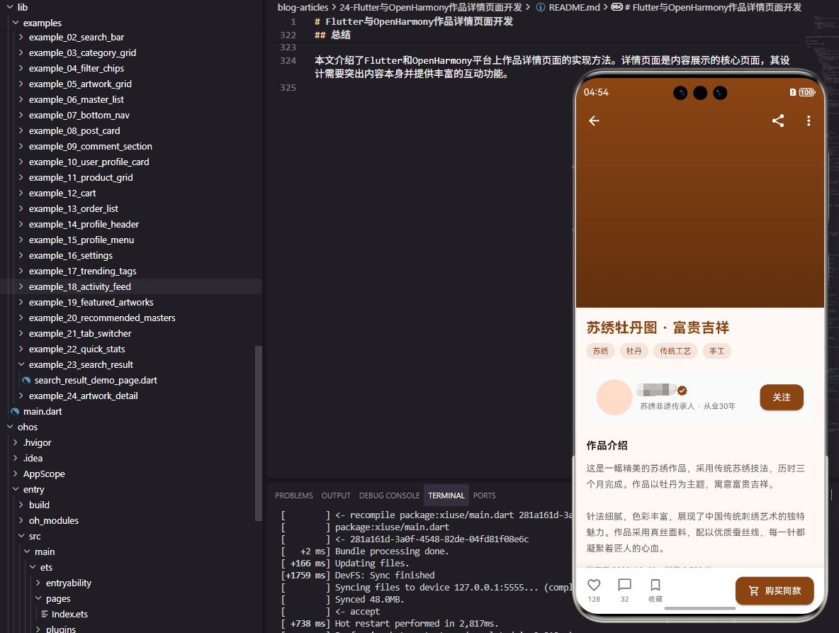
Text(widget.title, style: const TextStyle(fontSize: 22, fontWeight: FontWeight.bold, color: Color(0xFF8B4513))),
const SizedBox(height: 12),
Row(
children: [
CircleAvatar(
radius: 20,
backgroundColor: const Color(0xFF8B4513),
child: Text(widget.author[0], style: const TextStyle(color: Colors.white)),
),
const SizedBox(width: 12),
Column(
crossAxisAlignment: CrossAxisAlignment.start,
children: [
Text(widget.author, style: const TextStyle(fontSize: 14, fontWeight: FontWeight.bold)),
Text('发布于 2023-12-10', style: TextStyle(fontSize: 12, color: Colors.grey[600])),
],
),
const Spacer(),
ElevatedButton(
onPressed: () {},
style: ElevatedButton.styleFrom(backgroundColor: const Color(0xFF8B4513)),
child: const Text('关注', style: TextStyle(color: Colors.white, fontSize: 12)),
),
],
),
const SizedBox(height: 16),
const Text(
'这是一幅精美的刺绣作品,采用传统苏绣技法,历时三个月完成。作品以牡丹为主题,寓意富贵吉祥。针法细腻,色彩丰富,展现了中国传统刺绣艺术的独特魅力。',
style: TextStyle(fontSize: 14, height: 1.6, color: Color(0xFF666666)),
),作者信息区域包含头像、名称、发布时间和关注按钮。作品描述使用较大的行高提升可读性。
互动按钮区域
底部固定的互动按钮栏。
dart
                ],
              ),
            ),
          ),
        ],
      ),
      bottomNavigationBar: Container(
        padding: const EdgeInsets.all(16),
        decoration: BoxDecoration(
          color: Colors.white,
          boxShadow: [BoxShadow(color: Colors.black.withOpacity(0.1), blurRadius: 10, offset: const Offset(0, -5))],
        ),
        child: Row(
          mainAxisAlignment: MainAxisAlignment.spaceAround,
          children: [
            _buildActionButton(
              icon: _isLiked ? Icons.favorite : Icons.favorite_border,
              label: '$_likeCount',
              color: _isLiked ? Colors.red : Colors.grey,
              onTap: () => setState(() {
                _isLiked = !_isLiked;
                _likeCount += _isLiked ? 1 : -1;
              }),
            ),
            _buildActionButton(icon: Icons.chat_bubble_outline, label: '32', color: Colors.grey, onTap: () {}),
            _buildActionButton(
              icon: _isCollected ? Icons.bookmark : Icons.bookmark_border,
              label: '收藏',
              color: _isCollected ? const Color(0xFF8B4513) : Colors.grey,
              onTap: () => setState(() => _isCollected = !_isCollected),
            ),
            _buildActionButton(icon: Icons.share_outlined, label: '分享', color: Colors.grey, onTap: () {}),
          ],
        ),
      ),
    );
  }

  Widget _buildActionButton({required IconData icon, required String label, required Color color, required VoidCallback onTap}) {
    return GestureDetector(
      onTap: onTap,
      child: Column(
        mainAxisSize: MainAxisSize.min,
        children: [
          Icon(icon, color: color, size: 24),
          const SizedBox(height: 4),
          Text(label, style: TextStyle(fontSize: 12, color: color)),
        ],
      ),
    );
  }
}
bottomNavigationBar固定在页面底部。点赞和收藏按钮根据状态显示不同图标和颜色。点赞数实时更新。
OpenHarmony鸿蒙实现
页面定义
鸿蒙平台使用路由参数接收作品信息。
typescript
@Entry
@Component
struct ArtworkDetailPage {
  @State title: string = ''
  @State author: string = ''
  @State isLiked: boolean = false
  @State isCollected: boolean = false
  @State likeCount: number = 128

  aboutToAppear() {
    const params = router.getParams() as Record<string, string>
    this.title = params?.title || '作品详情'
    this.author = params?.author || '未知作者'
  }
页面布局实现
使用Scroll和Column构建页面。
typescript
  build() {
    Column() {
      Scroll() {
        Column() {
          Stack() {
            Image($r('app.media.artwork_placeholder'))
              .width('100%')
              .height(300)
              .objectFit(ImageFit.Cover)

            Row() {
              Image($r('app.media.back'))
                .width(24)
                .height(24)
                .fillColor(Color.White)
                .onClick(() => router.back())
              Blank()
              Image($r('app.media.share'))
                .width(24)
                .height(24)
                .fillColor(Color.White)
            }
            .width('100%')
            .padding(16)
            .position({ y: 40 })
          }
          .width('100%')
          .height(300)
          .backgroundColor('#F0F0F0')

          Column() {
            Text(this.title)
              .fontSize(22)
              .fontWeight(FontWeight.Bold)
              .fontColor('#8B4513')
              .width('100%')

            Row() {
              Text(this.author.charAt(0))
                .fontSize(14)
                .fontColor(Color.White)
                .width(40)
                .height(40)
                .borderRadius(20)
                .backgroundColor('#8B4513')
                .textAlign(TextAlign.Center)

              Column() {
                Text(this.author)
                  .fontSize(14)
                  .fontWeight(FontWeight.Bold)
                Text('发布于 2023-12-10')
                  .fontSize(12)
                  .fontColor('#666666')
                  .margin({ top: 2 })
              }
              .alignItems(HorizontalAlign.Start)
              .margin({ left: 12 })

              Blank()

              Button('关注')
                .fontSize(12)
                .fontColor(Color.White)
                .backgroundColor('#8B4513')
                .height(32)
            }
            .width('100%')
            .margin({ top: 12 })

            Text('这是一幅精美的刺绣作品,采用传统苏绣技法,历时三个月完成。作品以牡丹为主题,寓意富贵吉祥。')
              .fontSize(14)
              .fontColor('#666666')
              .lineHeight(22)
              .margin({ top: 16 })
              .width('100%')
          }
          .width('100%')
          .padding(16)
        }
      }
      .layoutWeight(1)

      Row() {
        this.ActionButton($r('app.media.heart'), this.likeCount.toString(), this.isLiked ? '#F44336' : '#999999', () => {
          this.isLiked = !this.isLiked
          this.likeCount += this.isLiked ? 1 : -1
        })
        this.ActionButton($r('app.media.comment'), '32', '#999999', () => {})
        this.ActionButton($r('app.media.bookmark'), '收藏', this.isCollected ? '#8B4513' : '#999999', () => {
          this.isCollected = !this.isCollected
        })
        this.ActionButton($r('app.media.share'), '分享', '#999999', () => {})
      }
      .width('100%')
      .height(60)
      .padding({ left: 16, right: 16 })
      .backgroundColor(Color.White)
      .justifyContent(FlexAlign.SpaceAround)
    }
    .width('100%')
    .height('100%')
  }

  @Builder ActionButton(icon: Resource, label: string, color: string, onClick: () => void) {
    Column() {
      Image(icon)
        .width(24)
        .height(24)
        .fillColor(color)
      Text(label)
        .fontSize(12)
        .fontColor(color)
        .margin({ top: 4 })
    }
    .onClick(onClick)
  }
}
@Builder定义可复用的互动按钮。点赞和收藏状态通过@State管理,变化时自动更新UI。
总结
本文介绍了Flutter和OpenHarmony平台上作品详情页面的实现方法。详情页面是内容展示的核心页面,其设计需要突出内容本身并提供丰富的互动功能。欢迎加入开源鸿蒙跨平台社区:https://openharmonycrossplatform.csdn.net