前言
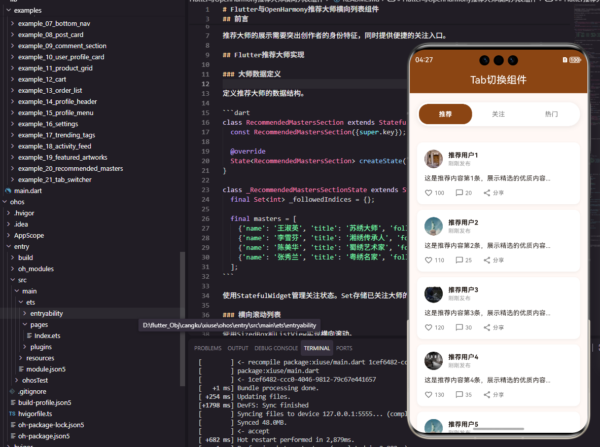
Tab切换是移动应用中最常用的导航模式之一,它允许用户在同一页面内快速切换不同的内容视图。无论是社区页面的"推荐/关注/热门"切换,还是商城页面的"商品/购物车/订单"切换,Tab组件都扮演着重要角色。本文将详细介绍如何在Flutter和OpenHarmony平台上实现一个功能完善的Tab切换组件。
Tab切换的设计需要考虑切换动画的流畅性、选中状态的清晰反馈、以及内容区域的状态保持。
Flutter Tab切换实现
组件结构设计
Tab切换需要管理当前选中的索引状态。
dart
class CommunityTabsWidget extends StatefulWidget {
  final Function(int) onTabChanged;

  const CommunityTabsWidget({super.key, required this.onTabChanged});

  @override
  State<CommunityTabsWidget> createState() => _CommunityTabsWidgetState();
}

class _CommunityTabsWidgetState extends State<CommunityTabsWidget> {
  int _selectedIndex = 0;
  final List<String> _tabs = ['推荐', '关注', '热门'];
onTabChanged回调用于通知父组件Tab切换事件。_selectedIndex存储当前选中的Tab索引。
Tab栏构建
使用Row和GestureDetector构建自定义Tab栏。
dart
  @override
  Widget build(BuildContext context) {
    return Container(
      margin: const EdgeInsets.symmetric(horizontal: 16),
      padding: const EdgeInsets.all(4),
      decoration: BoxDecoration(
        color: Colors.white,
        borderRadius: BorderRadius.circular(25),
        boxShadow: [BoxShadow(color: Colors.black.withOpacity(0.08), blurRadius: 8)],
      ),
      child: Row(
        children: _tabs.asMap().entries.map((entry) {
          final index = entry.key;
          final tab = entry.value;
          final isSelected = _selectedIndex == index;

          return Expanded(
            child: GestureDetector(
              onTap: () {
                setState(() => _selectedIndex = index);
                widget.onTabChanged(index);
              },
              child: AnimatedContainer(
                duration: const Duration(milliseconds: 200),
                padding: const EdgeInsets.symmetric(vertical: 10),
                decoration: BoxDecoration(
                  color: isSelected ? const Color(0xFF8B4513) : Colors.transparent,
                  borderRadius: BorderRadius.circular(20),
                ),
                child: Text(
                  tab,
                  textAlign: TextAlign.center,
                  style: TextStyle(
                    fontSize: 14,
                    fontWeight: isSelected ? FontWeight.bold : FontWeight.normal,
                    color: isSelected ? Colors.white : Colors.grey[600],
                  ),
                ),
              ),
            ),
          );
        }).toList(),
      ),
    );
  }
}
Expanded使每个Tab等宽分布。AnimatedContainer提供平滑的切换动画。选中Tab使用品牌色背景和白色文字,未选中使用透明背景和灰色文字。
OpenHarmony鸿蒙实现
组件定义
鸿蒙平台使用@State管理选中状态。
typescript
@Component
struct CommunityTabsComponent {
  @State selectedIndex: number = 0
  private tabs: Array<string> = ['推荐', '关注', '热门']
  onTabChanged: (index: number) => void = () => {}
Tab栏实现
使用Row构建Tab栏。
typescript
  build() {
    Row() {
      ForEach(this.tabs, (item: string, index: number) => {
        Text(item)
          .fontSize(14)
          .fontWeight(this.selectedIndex === index ? FontWeight.Bold : FontWeight.Normal)
          .fontColor(this.selectedIndex === index ? Color.White : '#666666')
          .textAlign(TextAlign.Center)
          .layoutWeight(1)
          .padding({ top: 10, bottom: 10 })
          .backgroundColor(this.selectedIndex === index ? '#8B4513' : Color.Transparent)
          .borderRadius(20)
          .animation({ duration: 200 })
          .onClick(() => {
            this.selectedIndex = index
            this.onTabChanged(index)
          })
      })
    }
    .width('90%')
    .padding(4)
    .backgroundColor(Color.White)
    .borderRadius(25)
  }
}
layoutWeight(1)使Tab等宽分布。animation属性添加切换动画。条件样式根据选中状态设置不同的颜色和背景。
与TabBar组件对比
Flutter还提供了官方的TabBar和TabBarView组件,适合需要滑动切换内容的场景。自定义Tab组件更加灵活,可以实现各种自定义样式。鸿蒙的Tabs组件也提供了类似的官方实现。选择哪种方式取决于具体的设计需求。
总结
本文介绍了Flutter和OpenHarmony平台上Tab切换组件的实现方法。Tab切换是应用中最基础的交互模式之一,其实现需要注意动画流畅性和状态管理的正确性。欢迎加入开源鸿蒙跨平台社区:https://openharmonycrossplatform.csdn.net