前言
帖子详情页面是社区应用中展示单个帖子完整内容的核心页面。它需要展示帖子内容、作者信息、图片、评论列表,并提供点赞、评论、分享等互动功能。本文将详细介绍如何在Flutter和OpenHarmony平台上实现一个功能完善的帖子详情页面。
帖子详情页面的设计需要突出内容本身,同时提供便捷的互动入口,促进用户参与讨论。
Flutter帖子详情页面实现
页面结构设计
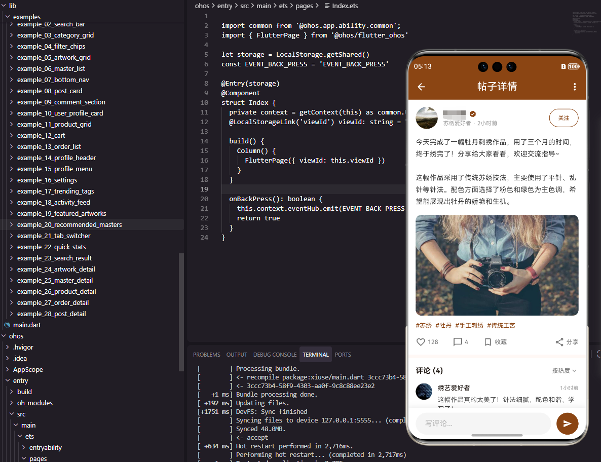
帖子详情页面展示帖子的完整信息和评论。
dart
class PostDetailPage extends StatefulWidget {
  final String postId;

  const PostDetailPage({super.key, required this.postId});

  @override
  State<PostDetailPage> createState() => _PostDetailPageState();
}

class _PostDetailPageState extends State<PostDetailPage> {
  bool _isLiked = false;
  int _likeCount = 128;
  final TextEditingController _commentController = TextEditingController();
使用StatefulWidget管理点赞状态和评论输入。
帖子内容区域
展示作者信息和帖子内容。
dart
  @override
  Widget build(BuildContext context) {
    return Scaffold(
      appBar: AppBar(
        title: const Text('帖子详情', style: TextStyle(color: Colors.white)),
        backgroundColor: const Color(0xFF8B4513),
        leading: IconButton(
          icon: const Icon(Icons.arrow_back, color: Colors.white),
          onPressed: () => Navigator.pop(context),
        ),
        actions: [
          IconButton(icon: const Icon(Icons.more_vert, color: Colors.white), onPressed: () {}),
        ],
      ),
      body: Column(
        children: [
          Expanded(
            child: SingleChildScrollView(
              child: Column(
                crossAxisAlignment: CrossAxisAlignment.start,
                children: [
                  Container(
                    padding: const EdgeInsets.all(16),
                    color: Colors.white,
                    child: Column(
                      crossAxisAlignment: CrossAxisAlignment.start,
                      children: [
                        Row(
                          children: [
                            CircleAvatar(
                              radius: 24,
                              backgroundColor: const Color(0xFF8B4513),
                              child: const Text('张', style: TextStyle(color: Colors.white, fontWeight: FontWeight.bold)),
                            ),
                            const SizedBox(width: 12),
                            Expanded(
                              child: Column(
                                crossAxisAlignment: CrossAxisAlignment.start,
                                children: [
                                  const Text('张小绣', style: TextStyle(fontSize: 16, fontWeight: FontWeight.bold, color: Color(0xFF8B4513))),
                                  Text('2小时前', style: TextStyle(fontSize: 12, color: Colors.grey[500])),
                                ],
                              ),
                            ),
                            OutlinedButton(
                              onPressed: () {},
                              style: OutlinedButton.styleFrom(
                                side: const BorderSide(color: Color(0xFF8B4513)),
                                padding: const EdgeInsets.symmetric(horizontal: 12),
                              ),
                              child: const Text('关注', style: TextStyle(fontSize: 12, color: Color(0xFF8B4513))),
                            ),
                          ],
                        ),
                        const SizedBox(height: 16),
                        const Text(
                          '今天完成了一幅牡丹刺绣作品,用了三个月的时间,终于绣完了!分享给大家看看,欢迎交流指导~\n\n这幅作品采用了传统苏绣技法,主要使用了平针、乱针等针法。配色方面选择了粉色和绿色为主色调,希望能展现出牡丹的娇艳和生机。',
                          style: TextStyle(fontSize: 15, height: 1.6, color: Color(0xFF333333)),
                        ),
作者信息区域包含头像、名称、发布时间和关注按钮。帖子内容使用较大的行高提升可读性。
图片展示区域
展示帖子配图。
dart
                        const SizedBox(height: 16),
                        ClipRRect(
                          borderRadius: BorderRadius.circular(12),
                          child: Container(
                            height: 200,
                            width: double.infinity,
                            color: Colors.grey[200],
                            child: const Center(child: Icon(Icons.image, size: 60, color: Colors.grey)),
                          ),
                        ),
                        const SizedBox(height: 16),
                        Row(
                          children: [
                            _buildInteractionButton(
                              icon: _isLiked ? Icons.favorite : Icons.favorite_border,
                              label: '$_likeCount',
                              color: _isLiked ? Colors.red : Colors.grey,
                              onTap: () => setState(() {
                                _isLiked = !_isLiked;
                                _likeCount += _isLiked ? 1 : -1;
                              }),
                            ),
                            const SizedBox(width: 24),
                            _buildInteractionButton(icon: Icons.chat_bubble_outline, label: '32', color: Colors.grey, onTap: () {}),
                            const SizedBox(width: 24),
                            _buildInteractionButton(icon: Icons.share_outlined, label: '分享', color: Colors.grey, onTap: () {}),
                          ],
                        ),
                      ],
                    ),
                  ),
互动按钮区域包含点赞、评论和分享。点赞按钮根据状态显示不同图标和颜色。
评论列表区域
展示帖子的评论列表。
dart
                  const SizedBox(height: 8),
                  Container(
                    padding: const EdgeInsets.all(16),
                    color: Colors.white,
                    child: Column(
                      crossAxisAlignment: CrossAxisAlignment.start,
                      children: [
                        const Text('评论 (32)', style: TextStyle(fontSize: 16, fontWeight: FontWeight.bold, color: Color(0xFF8B4513))),
                        const SizedBox(height: 16),
                        ...List.generate(3, (index) => _buildCommentItem(
                          name: '用户${index + 1}',
                          content: '这幅作品真的太美了!针法细腻,配色和谐,学习了!',
                          time: '${index + 1}小时前',
                        )),
                      ],
                    ),
                  ),
                ],
              ),
            ),
          ),
评论列表显示评论数量和评论内容。
评论输入区域
底部固定的评论输入框。
dart
          Container(
            padding: const EdgeInsets.all(12),
            decoration: BoxDecoration(
              color: Colors.white,
              boxShadow: [BoxShadow(color: Colors.black.withOpacity(0.1), blurRadius: 10, offset: const Offset(0, -5))],
            ),
            child: Row(
              children: [
                Expanded(
                  child: TextField(
                    controller: _commentController,
                    decoration: InputDecoration(
                      hintText: '写评论...',
                      filled: true,
                      fillColor: Colors.grey[100],
                      border: OutlineInputBorder(borderRadius: BorderRadius.circular(20), borderSide: BorderSide.none),
                      contentPadding: const EdgeInsets.symmetric(horizontal: 16, vertical: 8),
                    ),
                  ),
                ),
                const SizedBox(width: 12),
                ElevatedButton(
                  onPressed: () {},
                  style: ElevatedButton.styleFrom(backgroundColor: const Color(0xFF8B4513), shape: const CircleBorder(), padding: const EdgeInsets.all(12)),
                  child: const Icon(Icons.send, color: Colors.white, size: 20),
                ),
              ],
            ),
          ),
        ],
      ),
    );
  }

  Widget _buildInteractionButton({required IconData icon, required String label, required Color color, required VoidCallback onTap}) {
    return GestureDetector(
      onTap: onTap,
      child: Row(
        children: [
          Icon(icon, size: 20, color: color),
          const SizedBox(width: 4),
          Text(label, style: TextStyle(fontSize: 13, color: color)),
        ],
      ),
    );
  }

  Widget _buildCommentItem({required String name, required String content, required String time}) {
    return Padding(
      padding: const EdgeInsets.only(bottom: 16),
      child: Row(
        crossAxisAlignment: CrossAxisAlignment.start,
        children: [
          CircleAvatar(radius: 16, backgroundColor: Colors.grey[300], child: Text(name[0], style: const TextStyle(fontSize: 12))),
          const SizedBox(width: 12),
          Expanded(
            child: Column(
              crossAxisAlignment: CrossAxisAlignment.start,
              children: [
                Row(
                  children: [
                    Text(name, style: const TextStyle(fontSize: 13, fontWeight: FontWeight.bold)),
                    const Spacer(),
                    Text(time, style: TextStyle(fontSize: 11, color: Colors.grey[500])),
                  ],
                ),
                const SizedBox(height: 4),
                Text(content, style: TextStyle(fontSize: 13, color: Colors.grey[700])),
              ],
            ),
          ),
        ],
      ),
    );
  }
}
评论输入框使用圆角设计。发送按钮使用圆形设计。
OpenHarmony鸿蒙实现
页面定义
鸿蒙平台使用@State管理交互状态。
typescript
@Entry
@Component
struct PostDetailPage {
  @State isLiked: boolean = false
  @State likeCount: number = 128
  @State commentText: string = ''
页面布局实现
使用Column和Scroll构建页面。
typescript
  build() {
    Column() {
      Row() {
        Image($r('app.media.back'))
          .width(24)
          .height(24)
          .fillColor(Color.White)
          .onClick(() => router.back())
        Text('帖子详情')
          .fontSize(18)
          .fontColor(Color.White)
          .layoutWeight(1)
          .textAlign(TextAlign.Center)
        Image($r('app.media.more'))
          .width(24)
          .height(24)
          .fillColor(Color.White)
      }
      .width('100%')
      .height(56)
      .padding({ left: 16, right: 16 })
      .backgroundColor('#8B4513')

      Scroll() {
        Column() {
          Column() {
            Row() {
              Text('张')
                .fontSize(16)
                .fontColor(Color.White)
                .width(48)
                .height(48)
                .borderRadius(24)
                .backgroundColor('#8B4513')
                .textAlign(TextAlign.Center)

              Column() {
                Text('张小绣')
                  .fontSize(16)
                  .fontWeight(FontWeight.Bold)
                  .fontColor('#8B4513')
                Text('2小时前')
                  .fontSize(12)
                  .fontColor('#999999')
                  .margin({ top: 2 })
              }
              .layoutWeight(1)
              .alignItems(HorizontalAlign.Start)
              .margin({ left: 12 })

              Button('关注')
                .fontSize(12)
                .fontColor('#8B4513')
                .backgroundColor(Color.White)
                .border({ width: 1, color: '#8B4513' })
                .height(28)
            }
            .width('100%')

            Text('今天完成了一幅牡丹刺绣作品,用了三个月的时间,终于绣完了!分享给大家看看,欢迎交流指导~')
              .fontSize(15)
              .fontColor('#333333')
              .lineHeight(24)
              .margin({ top: 16 })
              .width('100%')

            Stack() {
              Image($r('app.media.post_image'))
                .width('100%')
                .height(200)
                .objectFit(ImageFit.Cover)
                .borderRadius(12)
            }
            .width('100%')
            .height(200)
            .backgroundColor('#F0F0F0')
            .borderRadius(12)
            .margin({ top: 16 })

            Row() {
              this.InteractionButton($r('app.media.heart'), this.likeCount.toString(), this.isLiked ? '#F44336' : '#999999', () => {
                this.isLiked = !this.isLiked
                this.likeCount += this.isLiked ? 1 : -1
              })
              this.InteractionButton($r('app.media.comment'), '32', '#999999', () => {})
              this.InteractionButton($r('app.media.share'), '分享', '#999999', () => {})
            }
            .width('100%')
            .margin({ top: 16 })
          }
          .width('100%')
          .padding(16)
          .backgroundColor(Color.White)
        }
      }
      .layoutWeight(1)

      Row() {
        TextInput({ placeholder: '写评论...', text: this.commentText })
          .layoutWeight(1)
          .height(40)
          .backgroundColor('#F5F5F5')
          .borderRadius(20)
          .onChange((value: string) => { this.commentText = value })

        Button() {
          Image($r('app.media.send'))
            .width(20)
            .height(20)
            .fillColor(Color.White)
        }
        .width(40)
        .height(40)
        .backgroundColor('#8B4513')
        .borderRadius(20)
        .margin({ left: 12 })
      }
      .width('100%')
      .padding(12)
      .backgroundColor(Color.White)
    }
    .width('100%')
    .height('100%')
  }

  @Builder InteractionButton(icon: Resource, label: string, color: string, onClick: () => void) {
    Row() {
      Image(icon)
        .width(20)
        .height(20)
        .fillColor(color)
      Text(label)
        .fontSize(13)
        .fontColor(color)
        .margin({ left: 4 })
    }
    .margin({ right: 24 })
    .onClick(onClick)
  }
}
@Builder定义可复用的互动按钮。TextInput实现评论输入功能。
总结
本文介绍了Flutter和OpenHarmony平台上帖子详情页面的实现方法。帖子详情页面是社区应用的核心页面,其设计需要突出内容并提供便捷的互动功能。欢迎加入开源鸿蒙跨平台社区:https://openharmonycrossplatform.csdn.net