前言:本文介绍了基于ECharts的图表配置工具chartConfig.ts及其在Vue项目中的应用。该工具提供了多种图表主题配置、自动滚动功能、颜色渐变效果等实用功能。主要特性包括:1)自定义主题样式,包括tooltip、legend、grid等组件样式;2)实现x轴数据滚动条和数据自动轮播功能;3)提供水平和垂直两种颜色渐变方法;4)支持两种特殊图表类型:带分隔符的象形柱状图和立体柱状图。在Vue组件中,通过调用initChartHandler方法初始化图表,并正确处理组件卸载时的定时器清理。该工具封装了ECharts常见配置,简化了复杂图表的开发流程。
1.chartConfig.ts
TypeScript
import { graphic, init } from 'echarts';
// chart公共配置
export function myTheme() {
  return {
    barGap: 0.3,
    tooltip: {
      trigger: 'axis',
      axisPointer: {
        type: 'shadow',
      },
      backgroundColor: '#0F0C47',
      borderColor: '#1FF0FF',
      textStyle: {
        color: '#fff',
      },
      valueFormatter: (value:string) => `${value} 吨`
    },
    legend: {
      itemWidth: 8,
      itemHeight: 8,
      top: 18,
      right: 0,
      textStyle: {
        color: '#E6EEF7'
      }
    },
    grid: {
      top: 58,
      right: 15,
      bottom: 14,
      left: 15,
      containLabel: true
    },
    yAxis: {
      name: '吨',
      axisTick: {
        show: true,
        inside: true,
        lineStyle: { color: '#fff' }
      },
      nameTextStyle: {
        color: '#E6EEF7'
      },
      splitLine: {
        lineStyle: {
          color: 'rgba(255, 255, 255, 0.2)'
        }
      },
      axisLabel: {
        color: '#E6EEF7'
      }
    },
    xAxis: {
      data: [],
      axisLabel: {
        color: '#E6EEF7'
      }
    },
  }
}
/**
 * echarts x轴滚动条
 * @param {Number} dataLength series.data数组长度
 * @param {Number} endValue 一次显示多少条
 * @returns datazoom对象
 */
export const dataZoom = (dataLength = 0, endValue = 11) => {
  return {
    show: dataLength > endValue ? true : false,
    type: 'slider',
    startValue: 0,
    endValue,
    showDataShadow: false,
    textStyle: false,
    fillerColor: '#054A99',
    moveHandleSize: 0,
    borderColor: '#054A99',
    backgroundColor: '#006AFF',
    height: 6,
    bottom: 15,
    handleStyle: { borderWidth: 0, color: '#054A99' }
  }
}
// 用于组件卸载时清除已开启定时器
export const timerObj: any = {}
/**
 * echarts图标自动滚动
 * @param {object} documentEC echarts实例对象
 * @param {object} option echarts图表配置
 * @param {Number} dataLength series.data数组长度
 * @param {Number} endValue 一次显示多少条
 */
export const autoMove = (documentEC: any, option: any, dataLength: number, endValue = 11, chart: string) => {
  timerObj[chart] && clearInterval(timerObj[chart])
  timerObj[chart] = setInterval(() => {
    if (Number(option?.dataZoom.endValue) === dataLength - 1) {
      option.dataZoom.endValue = endValue;
      option.dataZoom.startValue = 0;
    } else {
      option.dataZoom.endValue = option?.dataZoom.endValue + 1;
      option.dataZoom.startValue = option?.dataZoom.startValue + 1;
    }
    documentEC.setOption(option);
  }, 3000);
}
// 挂载图表
export function initChartHandler(option: any, chart: string, scroll?: any) {
  const myChart = init(document.getElementById(chart));
  myChart.setOption(option);
  if (scroll) {
    const automaticEC = () => autoMove(myChart, option, scroll.dataLength, scroll.endValue, chart)
    automaticEC()
    myChart.on('mouseover', () => clearInterval(timerObj[chart]))
    myChart.on('mouseout', automaticEC)
  }
  window.addEventListener('resize', () => myChart.resize())
}

// 横向渐变
export function colorLinear(c1: string, c2: string, c3: string, c4: string) {
  return {
    type: 'linear',
    x: 0,
    x2: 1,
    y: 0,
    y2: 0,
    colorStops: [
      { offset: 0, color: c1 },
      { offset: 0.5, color: c2 },
      { offset: 0.5, color: c3 },
      { offset: 1, color: c4 }
    ]
  }
}
// 竖向渐变
export function colorLinearGradient(c1: string, c2: string) {
  return new graphic.LinearGradient(0, 0, 0, 1, [
    { offset: 0, color: c1 },
    { offset: 1, color: c2 }
  ])
}- 页面中使用
javascript
<script setup lang="ts">
import { onMounted, onUnmounted, ref } from 'vue'
import { graphic } from 'echarts';
import { myTheme, colorLinear, colorLinearGradient, initChartHandler, dataZoom, timerObj } from '@/utils/chartConfig'
onUnmounted(() => {
// 清除所有定时器
Object.values(timerObj).forEach((f: any) => {
clearInterval(f)
})
})
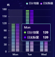
// 象形分隔
const pictorialBarInit = (chart: string) => {
const option: any = {
...myTheme(),
dataZoom: dataZoom(7, 7),
barWidth: 16,
color: [new graphic.LinearGradient(0, 0, 0, 1, [
{ offset: 0, color: '#32D74B' },
{ offset: 0.5, color: '#00D1FF' },
{ offset: 1, color: '#FFFFFF' }
]), new graphic.LinearGradient(0, 0, 0, 1, [
{ offset: 0, color: '#6A35FF' },
{ offset: 0.5, color: '#D355FF' },
{ offset: 1, color: '#FFFFFF' }
])],
series: [
{ name: '日计划量', type: 'bar', data: [120, 180, 100], z: 10, zlevel: 0 },
{ name: '日实际量', type: 'bar', data: [120, 180, 100], z: 10, zlevel: 0 },
{
// 分隔
type: 'pictorialBar',
itemStyle: { color: '#161146' },
tooltip: { show: false },
symbolRepeat: 'fixed',
symbolMargin: 2,
symbol: 'rect',
symbolClip: true,
symbolSize: [40, 3],
data: [120, 180, 100],
zlevel: 1
}
]
};
option.xAxis.data = ['Mon', 'Tue', 'Wed']
initChartHandler(option, chart, { dataLength: 7, endValue: 7})
}
// 立体柱状图
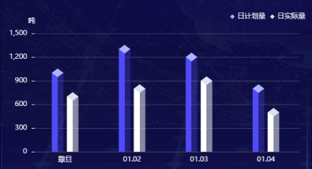
const stereoscopicBarInit = (chart: string) => {
const option: any = {
...myTheme(),
barWidth: 20,
series: [
{
z: 2,
name: '日计划量',
type: 'pictorialBar',
symbolPosition: 'end',
data: [1000, 1300, 1200, 800],
symbol: 'diamond',
symbolOffset: [-13, '-50%'],
symbolSize: [20, 15],
itemStyle: { color: '#A0BAFF' },
tooltip: { show: false }
},
{
z: 1,
type: 'bar',
name: '日计划量',
barGap: '-50%',
data: [1000, 1300, 1200, 800],
itemStyle: { color: colorLinear('#2962ff', '#2962ff', '#2962ff4d', '#2962ff4d') }
},
{
z: 3,
name: '日实际量',
type: 'pictorialBar',
symbolPosition: 'end',
data: [700, 800, 900, 500],
symbol: 'diamond',
symbolOffset: [13, '-50%'],
symbolSize: [20, 15],
itemStyle: { color: '#D0E5F5' },
tooltip: { show: false }
},
{
z: 2,
type: 'bar',
name: '日实际量',
data: [700, 800, 900, 500],
itemStyle: { color: colorLinear('#fff', '#fff', '#ffffff80', '#ffffff80') }
}
]
};
option.xAxis.data = ['撒旦', '01.02', '01.03', '01.04']
initChartHandler(option, chart)
}
</script>3.象形分隔-效果图
4.立体柱状图-效果图