React Native 横向滚动指示器组件库
前言
在 React Native 开发中,横向滚动是常见需求,但原生 ScrollView 的滚动条样式有限。本文介绍一个带自定义滚动指示器的组件库:@zhenryx/react-native-indicator-scrollview,提供两种组件,提升滚动体验。
组件参考为淘宝京东等app金刚区旧版和新版滚动实现。
组件库简介
@zhenryx/react-native-indicator-scrollview 提供两个组件:
-
IndicatorScrollView - 基础横向滚动视图,带滚动指示器

-
PaginatedIndicatorScrollView - 分页式横向滚动视图,支持第一页固定、第二页展开,带双指示器
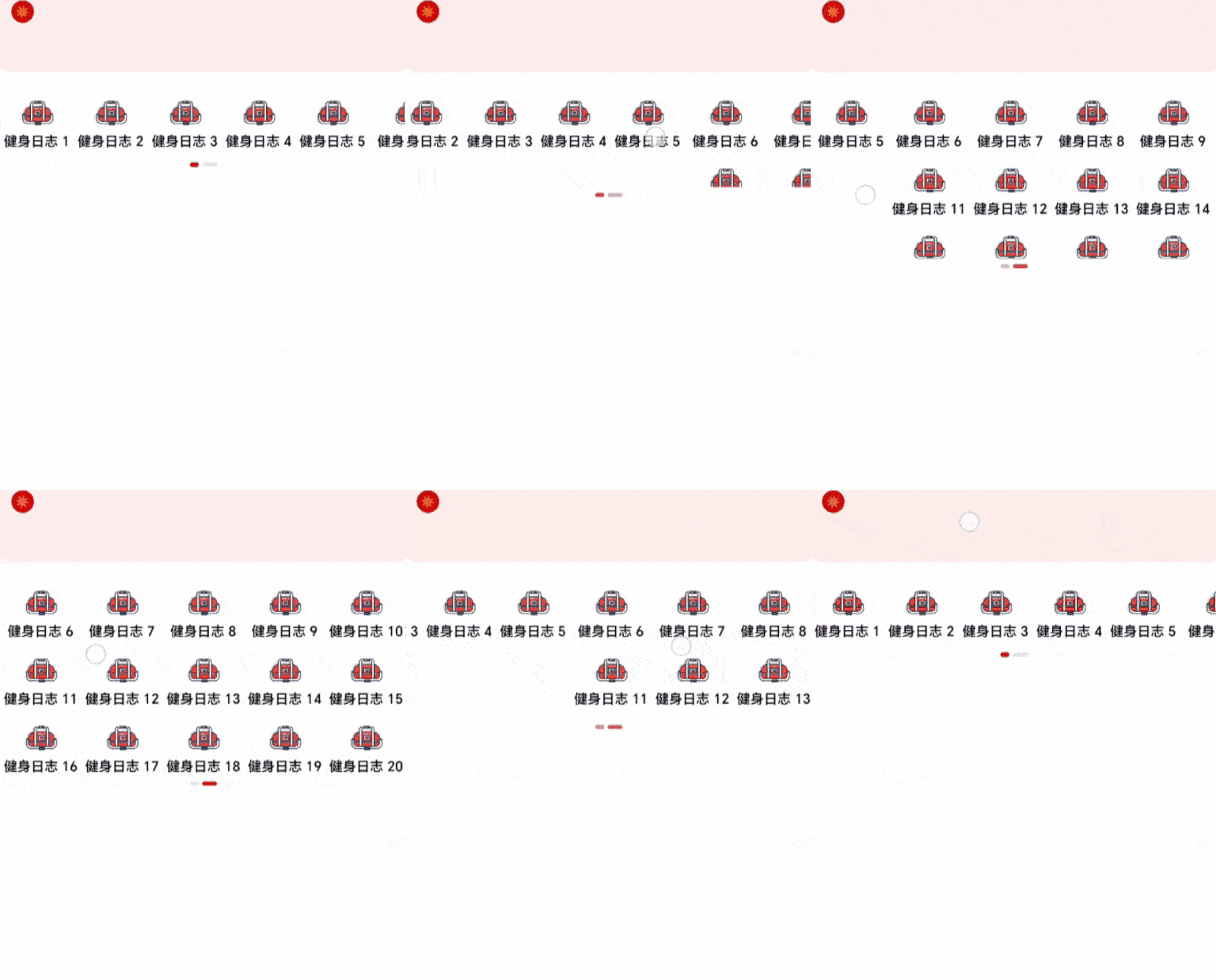
快速开始
安装
bash
npm install @zhenryx/react-native-indicator-scrollview基础使用
tsx
import { IndicatorScrollView } from '@zhenryx/react-native-indicator-scrollview';组件一:IndicatorScrollView
代码示例
tsx
import React from 'react';
import { View, Text, StyleSheet } from 'react-native';
import { IndicatorScrollView } from '@zhenryx/react-native-indicator-scrollview';

export default function TagList() {
  const tags = ['React', 'React Native', 'TypeScript', 'JavaScript', 'Node.js', 'Vue', 'Angular'];

  return (
    <IndicatorScrollView
      trackWidth={60}      // 指示器轨道宽度
      thumbWidth={20}      // 指示器滑块宽度
      trackColor="#e2e2e2" // 轨道颜色
      thumbColor="#f35c10" // 滑块颜色
      scrollMarginVertical={10}
    >
      <View style={styles.tagContainer}>
        {tags.map((tag, index) => (
          <View key={index} style={styles.tag}>
            <Text style={styles.tagText}>{tag}</Text>
          </View>
        ))}
      </View>
    </IndicatorScrollView>
  );
}
const styles = StyleSheet.create({
  tagContainer: {
    flexDirection: 'row',
    paddingHorizontal: 10,
  },
  tag: {
    paddingHorizontal: 16,
    paddingVertical: 8,
    marginRight: 10,
    backgroundColor: '#f0f0f0',
    borderRadius: 20,
  },
  tagText: {
    fontSize: 14,
    color: '#333',
  },
});
Props 说明
| 属性 | 类型 | 默认值 | 说明 |
|---|---|---|---|
trackWidth |
number |
20 |
指示器轨道宽度(水平长度) |
trackHeight |
number |
4 |
指示器轨道高度 |
trackColor |
string |
#e2e2e2ff |
指示器轨道颜色 |
thumbWidth |
number |
8 |
指示器滑块宽度 |
thumbColor |
string |
#f35c10ff |
指示器滑块颜色 |
showIndicator |
boolean |
true |
是否显示指示器 |
style |
StyleProp<ViewStyle> |
- | 外层容器样式 |
scrollMarginVertical |
number |
10 |
滚动区域的上下外边距 |
实现原理
- 使用
Animated.ScrollView监听滚动 - 通过
interpolate将滚动偏移映射到指示器位置 - 根据内容宽度与布局宽度决定是否显示指示器
组件二:PaginatedIndicatorScrollView
代码示例
tsx
import React from 'react';
import { PaginatedIndicatorScrollView, MenuItem } from '@zhenryx/react-native-indicator-scrollview';

const menuData: MenuItem[] = [
  { id: 1, name: '首页', icon: require('./assets/home.png'), href: '/' },
  { id: 2, name: '分类', icon: require('./assets/category.png'), href: '/category' },
  { id: 3, name: '购物车', icon: require('./assets/cart.png'), href: '/cart' },
  { id: 4, name: '我的', icon: require('./assets/user.png'), href: '/user' },
  { id: 5, name: '搜索', icon: require('./assets/search.png'), href: '/search' },
  { id: 6, name: '收藏', icon: require('./assets/favorite.png'), href: '/favorite' },
  { id: 7, name: '订单', icon: require('./assets/order.png'), href: '/order' },
  { id: 8, name: '设置', icon: require('./assets/settings.png'), href: '/settings' },
  // ... 更多菜单项
];

export default function MenuScreen() {
  const handleItemPress = (item: MenuItem) => {
    console.log('点击了菜单项:', item.name);
    // 处理导航逻辑
    // navigation.navigate(item.href);
  };

  return (
    <PaginatedIndicatorScrollView
      data={menuData}
      firstPageCount={5}  // 第一页显示5个
      onItemPress={handleItemPress}
      activeColor="#ce0707"    // 激活状态颜色
      inactiveColor="#e2e2e2"  // 非激活状态颜色
    />
  );
}
核心特性解析
1. 分页机制
- 第一页:固定显示
firstPageCount个菜单项 - 第二页:剩余菜单项以网格形式展开
- 滚动切换:左右滑动切换页面
2. 双指示器系统
- 左侧指示器:第一页激活时高亮
- 右侧指示器:第二页激活时高亮
- 颜色过渡:使用
Animated实现平滑过渡
3. 动态高度计算
第二页高度根据菜单项数量自动计算,确保内容完整显示。
Props 说明
| 属性 | 类型 | 默认值 | 说明 |
|---|---|---|---|
data |
MenuItem[] |
- | 菜单数据数组(必需) |
onItemPress |
(item: MenuItem) => void |
- | 点击菜单项的回调函数 |
firstPageCount |
number |
5 |
第一页显示的数量 |
activeColor |
string |
#ce0707ff |
激活状态颜色 |
inactiveColor |
string |
#e2e2e2ff |
非激活状态颜色 |
containerStyle |
StyleProp<ViewStyle> |
- | 容器样式 |
pageStyle |
StyleProp<ViewStyle> |
- | 页面样式 |
itemStyle |
StyleProp<ViewStyle> |
- | 菜单项样式 |
menuIconStyle |
StyleProp<ImageStyle> |
- | 菜单图标样式 |
menuTextStyle |
StyleProp<TextStyle> |
- | 菜单文字样式 |
indicatorStyle |
StyleProp<ViewStyle> |
- | 指示器容器样式 |
trackStyle |
StyleProp<ViewStyle> |
- | 指示器轨道样式 |
thumbStyle |
StyleProp<ViewStyle> |
- | 指示器滑块样式 |
MenuItem 类型定义
typescript
interface MenuItem {
  id: number;        // 唯一标识
  name: string;      // 菜单名称
  icon: any;         // React Native Image source
  href: string;      // 跳转路径(可自定义使用)
}
总结
@zhenryx/react-native-indicator-scrollview 提供了两个实用的横向滚动组件:
- IndicatorScrollView:适合通用横向滚动场景
- PaginatedIndicatorScrollView:适合菜单、分类等分页场景
两个组件都支持样式定制,API 简洁,易于集成。如果你需要更好的横向滚动体验,可以尝试这个组件库。
相关链接
希望这篇文章能帮助你了解和使用这个组件库。如有问题或建议,欢迎在 GitHub 上提出 Issue 或 PR。