前言
消息提示是移动应用中向用户传递反馈信息的重要组件。在打卡工具类应用中,消息提示用于显示打卡成功、操作确认、错误警告等各种反馈。本文将详细介绍如何在Flutter和OpenHarmony平台上实现美观且功能完善的消息提示组件。
消息提示的设计需要考虑显示位置、持续时间、视觉样式和交互方式。我们将实现支持多种类型和样式的消息提示组件,包括Toast、Snackbar和顶部通知等形式。
Flutter消息提示实现
首先创建自定义Toast组件:
dart
enum ToastType { success, error, warning, info }

class CustomToast {
  static OverlayEntry? _overlayEntry;
  static Timer? _timer;

  static void show(
    BuildContext context, {
    required String message,
    ToastType type = ToastType.info,
    Duration duration = const Duration(seconds: 2),
  }) {
    _dismiss();

    _overlayEntry = OverlayEntry(
      builder: (context) => _ToastWidget(
        message: message,
        type: type,
        onDismiss: _dismiss,
      ),
    );

    Overlay.of(context).insert(_overlayEntry!);

    _timer = Timer(duration, _dismiss);
  }

  static void _dismiss() {
    _timer?.cancel();
    _overlayEntry?.remove();
    _overlayEntry = null;
  }
}

class _ToastWidget extends StatefulWidget {
  final String message;
  final ToastType type;
  final VoidCallback onDismiss;

  const _ToastWidget({
    required this.message,
    required this.type,
    required this.onDismiss,
  });

  @override
  State<_ToastWidget> createState() => _ToastWidgetState();
}

class _ToastWidgetState extends State<_ToastWidget>
    with SingleTickerProviderStateMixin {
  late AnimationController _controller;
  late Animation<double> _fadeAnimation;
  late Animation<Offset> _slideAnimation;

  @override
  void initState() {
    super.initState();
    _controller = AnimationController(
      duration: const Duration(milliseconds: 300),
      vsync: this,
    );
    _fadeAnimation = Tween<double>(begin: 0, end: 1).animate(_controller);
    _slideAnimation = Tween<Offset>(
      begin: const Offset(0, -0.5),
      end: Offset.zero,
    ).animate(CurvedAnimation(parent: _controller, curve: Curves.easeOut));
    _controller.forward();
  }

  Color get _backgroundColor {
    switch (widget.type) {
      case ToastType.success: return Colors.green;
      case ToastType.error: return Colors.red;
      case ToastType.warning: return Colors.orange;
      case ToastType.info: return Colors.blue;
    }
  }

  IconData get _icon {
    switch (widget.type) {
      case ToastType.success: return Icons.check_circle;
      case ToastType.error: return Icons.error;
      case ToastType.warning: return Icons.warning;
      case ToastType.info: return Icons.info;
    }
  }

  @override
  Widget build(BuildContext context) {
    return Positioned(
      top: MediaQuery.of(context).padding.top + 16,
      left: 16,
      right: 16,
      child: FadeTransition(
        opacity: _fadeAnimation,
        child: SlideTransition(
          position: _slideAnimation,
          child: Material(
            color: Colors.transparent,
            child: Container(
              padding: const EdgeInsets.symmetric(horizontal: 16, vertical: 12),
              decoration: BoxDecoration(
                color: _backgroundColor,
                borderRadius: BorderRadius.circular(12),
                boxShadow: [
                  BoxShadow(
                    color: _backgroundColor.withOpacity(0.3),
                    blurRadius: 12,
                    offset: const Offset(0, 4),
                  ),
                ],
              ),
              child: Row(
                children: [
                  Icon(_icon, color: Colors.white),
                  const SizedBox(width: 12),
                  Expanded(
                    child: Text(
                      widget.message,
                      style: const TextStyle(color: Colors.white, fontSize: 14),
                    ),
                  ),
                  GestureDetector(
                    onTap: widget.onDismiss,
                    child: const Icon(Icons.close, color: Colors.white70, size: 20),
                  ),
                ],
              ),
            ),
          ),
        ),
      ),
    );
  }

  @override
  void dispose() {
    _controller.dispose();
    super.dispose();
  }
}
CustomToast使用Overlay在应用顶层显示消息。四种类型(成功、错误、警告、信息)使用不同的颜色和图标。淡入和滑动动画让消息出现更加自然,关闭按钮允许用户手动关闭。Timer控制自动消失时间。
OpenHarmony消息提示实现
在鸿蒙系统中创建消息提示:
typescript
@Component
struct ToastMessage {
  @Prop message: string = ''
  @Prop type: string = 'info'  // success, error, warning, info
  @State visible: boolean = true
  @State offsetY: number = -50
  private onDismiss: () => void = () => {}

  aboutToAppear() {
    animateTo({ duration: 300, curve: Curve.EaseOut }, () => {
      this.offsetY = 0
    })
  }

  getBackgroundColor(): string {
    switch (this.type) {
      case 'success': return '#4CAF50'
      case 'error': return '#F44336'
      case 'warning': return '#FF9800'
      default: return '#2196F3'
    }
  }

  getIcon(): Resource {
    switch (this.type) {
      case 'success': return $r('app.media.check_circle')
      case 'error': return $r('app.media.error')
      case 'warning': return $r('app.media.warning')
      default: return $r('app.media.info')
    }
  }

  build() {
    if (this.visible) {
      Row() {
        Image(this.getIcon())
          .width(20)
          .height(20)
          .fillColor(Color.White)

        Text(this.message)
          .fontSize(14)
          .fontColor(Color.White)
          .margin({ left: 12 })
          .layoutWeight(1)

        Image($r('app.media.close'))
          .width(20)
          .height(20)
          .fillColor('rgba(255,255,255,0.7)')
          .onClick(() => {
            this.visible = false
            this.onDismiss()
          })
      }
      .width('100%')
      .padding({ left: 16, right: 16, top: 12, bottom: 12 })
      .backgroundColor(this.getBackgroundColor())
      .borderRadius(12)
      .shadow({ radius: 12, color: this.getBackgroundColor() + '4D', offsetY: 4 })
      .offset({ y: this.offsetY })
    }
  }
}
鸿蒙的消息提示使用offset属性配合animateTo实现滑入动画。visible状态控制消息的显示和隐藏,点击关闭按钮时设为false并调用onDismiss回调。颜色和图标根据type动态获取。
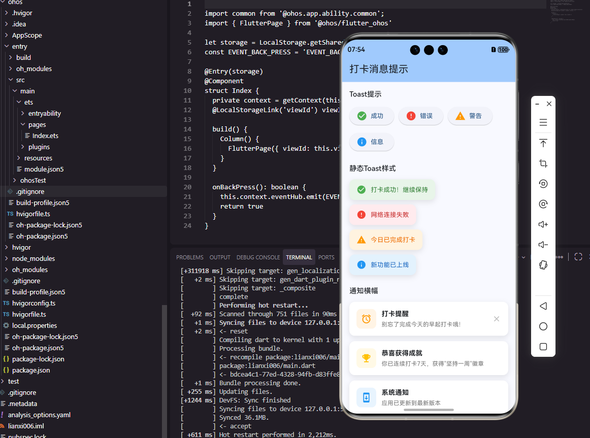
打卡成功提示
实现打卡成功的专用提示:
dart
class CheckInSuccessToast {
  static void show(BuildContext context, {required int streak}) {
    final overlay = Overlay.of(context);
    late OverlayEntry entry;

    entry = OverlayEntry(
      builder: (context) => _CheckInSuccessWidget(
        streak: streak,
        onDismiss: () => entry.remove(),
      ),
    );

    overlay.insert(entry);

    Future.delayed(const Duration(seconds: 3), () {
      if (entry.mounted) entry.remove();
    });
  }
}

class _CheckInSuccessWidget extends StatefulWidget {
  final int streak;
  final VoidCallback onDismiss;

  const _CheckInSuccessWidget({required this.streak, required this.onDismiss});

  @override
  State<_CheckInSuccessWidget> createState() => _CheckInSuccessWidgetState();
}

class _CheckInSuccessWidgetState extends State<_CheckInSuccessWidget>
    with SingleTickerProviderStateMixin {
  late AnimationController _controller;

  @override
  void initState() {
    super.initState();
    _controller = AnimationController(
      duration: const Duration(milliseconds: 500),
      vsync: this,
    )..forward();
  }

  @override
  Widget build(BuildContext context) {
    return Positioned(
      top: MediaQuery.of(context).size.height * 0.3,
      left: 0,
      right: 0,
      child: ScaleTransition(
        scale: CurvedAnimation(parent: _controller, curve: Curves.elasticOut),
        child: Center(
          child: Container(
            padding: const EdgeInsets.symmetric(horizontal: 32, vertical: 24),
            decoration: BoxDecoration(
              color: Colors.white,
              borderRadius: BorderRadius.circular(20),
              boxShadow: [
                BoxShadow(
                  color: Colors.black.withOpacity(0.15),
                  blurRadius: 20,
                  offset: const Offset(0, 10),
                ),
              ],
            ),
            child: Column(
              mainAxisSize: MainAxisSize.min,
              children: [
                const Icon(Icons.celebration, color: Colors.orange, size: 48),
                const SizedBox(height: 12),
                const Text(
                  '打卡成功!',
                  style: TextStyle(fontSize: 20, fontWeight: FontWeight.bold),
                ),
                const SizedBox(height: 8),
                Text(
                  '已连续打卡 ${widget.streak} 天',
                  style: TextStyle(fontSize: 14, color: Colors.grey.shade600),
                ),
              ],
            ),
          ),
        ),
      ),
    );
  }

  @override
  void dispose() {
    _controller.dispose();
    super.dispose();
  }
}
打卡成功提示使用弹性缩放动画(elasticOut)增强成就感。居中显示的卡片包含庆祝图标、成功文字和连续天数,视觉效果更加丰富。3秒后自动消失,不打断用户操作。
Snackbar消息
实现底部Snackbar消息:
dart
class AppSnackbar {
  static void show(
    BuildContext context, {
    required String message,
    String? actionLabel,
    VoidCallback? onAction,
    Duration duration = const Duration(seconds: 3),
  }) {
    ScaffoldMessenger.of(context).showSnackBar(
      SnackBar(
        content: Text(message),
        duration: duration,
        behavior: SnackBarBehavior.floating,
        shape: RoundedRectangleBorder(borderRadius: BorderRadius.circular(8)),
        action: actionLabel != null
            ? SnackBarAction(
                label: actionLabel,
                onPressed: onAction ?? () {},
              )
            : null,
      ),
    );
  }

  static void showUndo(
    BuildContext context, {
    required String message,
    required VoidCallback onUndo,
  }) {
    show(
      context,
      message: message,
      actionLabel: '撤销',
      onAction: onUndo,
      duration: const Duration(seconds: 5),
    );
  }
}
AppSnackbar封装了Flutter的SnackBar,提供了简化的API。floating行为让Snackbar悬浮在内容上方,圆角设计更加美观。showUndo方法专门用于可撤销操作的提示,如删除习惯后提供撤销选项。
使用示例
dart
// 显示成功提示
CustomToast.show(context, message: '设置已保存', type: ToastType.success);

// 显示错误提示
CustomToast.show(context, message: '网络连接失败', type: ToastType.error);

// 显示打卡成功
CheckInSuccessToast.show(context, streak: 7);

// 显示可撤销操作
AppSnackbar.showUndo(
  context,
  message: '习惯已删除',
  onUndo: () => restoreHabit(),
);
总结
本文详细介绍了在Flutter和OpenHarmony平台上实现消息提示组件的完整方案。消息提示通过不同的类型、位置和样式,为用户提供了清晰的操作反馈。打卡成功提示使用动画增强成就感,Snackbar支持撤销操作。两个平台的实现都注重动画效果和用户体验,确保消息提示既美观又实用。
欢迎加入开源鸿蒙跨平台社区:https://openharmonycrossplatform.csdn.net