效果图
实现方案
我将创建一个直观、响应式的图像对比滑块,用户可以拖动滑块来比较两张图像的不同部分。
思路分析
使用容器包裹两张重叠的图像
创建滑块控件来调整分割线位置
使用CSS clip-path或宽度控制显示区域
添加交互反馈和响应式设计
实现过程
css
* {
            margin: 0;
            padding: 0;
            box-sizing: border-box;
            font-family: 'Segoe UI', Tahoma, Geneva, Verdana, sans-serif;
        }

        body {
            display: flex;
            flex-direction: column;
            align-items: center;
            justify-content: center;
            min-height: 100vh;
            background: linear-gradient(135deg, #1a1a2e 0%, #16213e 100%);
            color: #fff;
            padding: 20px;
        }

        .container {
            width: 100%;
            max-width: 1200px;
            padding: 20px;
        }

        header {
            text-align: center;
            margin-bottom: 30px;
            width: 100%;
        }

        h1 {
            font-size: 2.8rem;
            margin-bottom: 10px;
            background: linear-gradient(90deg, #00dbde, #fc00ff);
            -webkit-background-clip: text;
            background-clip: text;
            color: transparent;
            text-shadow: 0 5px 15px rgba(0, 0, 0, 0.1);
        }

        .subtitle {
            font-size: 1.2rem;
            color: #a0a0c0;
            max-width: 600px;
            margin: 0 auto 20px;
            line-height: 1.6;
        }

        .comparison-container {
            position: relative;
            width: 100%;
            max-width: 900px;
            margin: 0 auto;
            border-radius: 15px;
            overflow: hidden;
            box-shadow: 0 15px 35px rgba(0, 0, 0, 0.5);
            border: 1px solid rgba(255, 255, 255, 0.1);
        }

        .image-container {
            position: relative;
            width: 100%;
            height: 500px;
            overflow: hidden;
        }

        .image-before, .image-after {
            position: absolute;
            top: 0;
            left: 0;
            width: 100%;
            height: 100%;
            object-fit: cover;
        }

        .image-before {
            z-index: 1;
            clip-path: polygon(0 0, var(--slider-position, 50%) 0, var(--slider-position, 50%) 100%, 0 100%);
        }

        .slider {
            position: absolute;
            top: 0;
            left: var(--slider-position, 50%);
            width: 4px;
            height: 100%;
            background-color: white;
            z-index: 10;
            transform: translateX(-50%);
            cursor: ew-resize;
            transition: background-color 0.2s;
        }

        .slider:hover {
            background-color: #fc00ff;
        }

        .slider::before {
            content: '';
            position: absolute;
            top: 50%;
            left: 50%;
            transform: translate(-50%, -50%);
            width: 50px;
            height: 50px;
            background-color: white;
            border-radius: 50%;
            box-shadow: 0 5px 15px rgba(0, 0, 0, 0.4);
        }

        .slider::after {
            content: '\f07e';
            font-family: 'Font Awesome 6 Free';
            font-weight: 900;
            position: absolute;
            top: 50%;
            left: 50%;
            transform: translate(-50%, -50%) rotate(90deg);
            color: #333;
            font-size: 20px;
        }

        .slider-controls {
            display: flex;
            justify-content: center;
            align-items: center;
            gap: 20px;
            margin-top: 30px;
            flex-wrap: wrap;
        }

        .slider-input {
            width: 300px;
            height: 10px;
            -webkit-appearance: none;
            appearance: none;
            background: linear-gradient(90deg, #00dbde, #fc00ff);
            border-radius: 5px;
            outline: none;
        }

        .slider-input::-webkit-slider-thumb {
            -webkit-appearance: none;
            appearance: none;
            width: 25px;
            height: 25px;
            border-radius: 50%;
            background: white;
            cursor: pointer;
            box-shadow: 0 3px 10px rgba(0, 0, 0, 0.3);
            transition: transform 0.2s;
        }

        .slider-input::-webkit-slider-thumb:hover {
            transform: scale(1.2);
        }

        .value-display {
            font-size: 1.5rem;
            font-weight: bold;
            min-width: 60px;
            text-align: center;
            background: rgba(255, 255, 255, 0.1);
            padding: 10px 15px;
            border-radius: 8px;
            border: 1px solid rgba(255, 255, 255, 0.2);
        }

        .image-labels {
            position: absolute;
            top: 20px;
            left: 0;
            width: 100%;
            display: flex;
            justify-content: space-between;
            padding: 0 20px;
            z-index: 5;
            pointer-events: none;
        }

        .label {
            background-color: rgba(0, 0, 0, 0.7);
            padding: 8px 15px;
            border-radius: 20px;
            font-weight: bold;
            font-size: 1rem;
            backdrop-filter: blur(5px);
        }

        .label-before {
            color: #00dbde;
        }

        .label-after {
            color: #fc00ff;
        }

        .instructions {
            max-width: 600px;
            margin: 30px auto 0;
            background: rgba(255, 255, 255, 0.08);
            padding: 20px;
            border-radius: 10px;
            border-left: 4px solid #fc00ff;
        }

        .instructions h3 {
            color: #00dbde;
            margin-bottom: 10px;
            display: flex;
            align-items: center;
            gap: 10px;
        }

        .instructions ul {
            padding-left: 20px;
            line-height: 1.6;
            color: #c0c0e0;
        }

        .instructions li {
            margin-bottom: 8px;
        }

        .instructions i {
            color: #fc00ff;
            width: 20px;
        }

        .divider-line {
            width: 100%;
            height: 1px;
            background: linear-gradient(90deg, transparent, rgba(255, 255, 255, 0.3), transparent);
            margin: 40px 0;
        }

        .examples {
            display: flex;
            flex-wrap: wrap;
            justify-content: center;
            gap: 20px;
            margin-top: 30px;
        }

        .example-btn {
            padding: 12px 25px;
            background: rgba(255, 255, 255, 0.1);
            border: 1px solid rgba(255, 255, 255, 0.2);
            border-radius: 8px;
            color: white;
            font-weight: bold;
            cursor: pointer;
            transition: all 0.3s;
        }

        .example-btn:hover {
            background: linear-gradient(90deg, #00dbde, #fc00ff);
            transform: translateY(-3px);
        }

        footer {
            margin-top: 40px;
            text-align: center;
            color: #a0a0c0;
            font-size: 0.9rem;
            padding: 20px;
            border-top: 1px solid rgba(255, 255, 255, 0.1);
            width: 100%;
        }

        @media (max-width: 768px) {
            .image-container {
                height: 400px;
            }

            h1 {
                font-size: 2.2rem;
            }

            .slider-controls {
                flex-direction: column;
                gap: 15px;
            }

            .slider-input {
                width: 100%;
                max-width: 300px;
            }
        }

        @media (max-width: 480px) {
            .image-container {
                height: 300px;
            }

            h1 {
                font-size: 1.8rem;
            }

            .label {
                font-size: 0.9rem;
                padding: 6px 12px;
            }
        }
html
<div class="container">
<header>
<h1><i class="fas fa-sliders-h"></i> 图像对比滑块</h1>
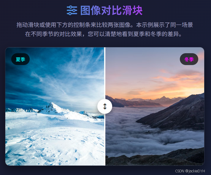
<p class="subtitle">拖动滑块或使用下方的控制条来比较两张图像。本示例展示了同一场景在不同季节的对比效果,您可以清楚地看到夏季和冬季的差异。</p>
</header>
<main>
<div class="comparison-container">
<div class="image-container" id="imageContainer">
<img class="image-after" src="https://images.unsplash.com/photo-1506905925346-21bda4d32df4?ixlib=rb-4.0.3&ixid=M3wxMjA3fDB8MHxwaG90by1wYWdlfHx8fGVufDB8fHx8fA%3D%3D&auto=format&fit=crop&w=1350&q=80" alt="夏季山脉">
<img class="image-before" src="https://images.unsplash.com/photo-1418985991508-e47386d96a71?ixlib=rb-4.0.3&ixid=M3wxMjA3fDB8MHxwaG90by1wYWdlfHx8fGVufDB8fHx8fA%3D%3D&auto=format&fit=crop&w=1350&q=80" alt="冬季山脉">
<div class="slider" id="slider"></div>
<div class="image-labels">
<div class="label label-before">夏季</div>
<div class="label label-after">冬季</div>
</div>
</div>
</div>
<div class="slider-controls">
<span style="color: #00dbde;"><i class="fas fa-mountain-sun"></i> 夏季</span>
<input type="range" min="0" max="100" value="50" class="slider-input" id="sliderInput">
<span style="color: #fc00ff;"><i class="fas fa-snowflake"></i> 冬季</span>
<div class="value-display" id="valueDisplay">50%</div>
</div>
<div class="instructions">
<h3><i class="fas fa-info-circle"></i> 使用说明</h3>
<ul>
<li><i class="fas fa-mouse-pointer"></i> <strong>拖动滑块</strong>:点击并拖动图像上的白色滑块左右移动</li>
<li><i class="fas fa-sliders-h"></i> <strong>使用控制条</strong>:拖动下方的控制条可以更精确地调整分割位置</li>
<li><i class="fas fa-undo-alt"></i> <strong>重置位置</strong>:点击下方的"重置到中心"按钮可以将滑块恢复到中间位置</li>
<li><i class="fas fa-image"></i> <strong>切换示例</strong>:尝试不同的图像对比示例,查看各种效果</li>
</ul>
</div>
<div class="divider-line"></div>
<div class="examples">
<button class="example-btn" id="example1">建筑对比</button>
<button class="example-btn" id="example2">景观对比</button>
<button class="example-btn" id="example3">季节对比</button>
<button class="example-btn" id="resetBtn">重置到中心</button>
</div>
</main>
<footer>
<p>© 2023 图像对比滑块演示 | 使用HTML、CSS和JavaScript实现</p>
<p>图片来自 Unsplash</p>
</footer>
</div>
javascript
document.addEventListener('DOMContentLoaded', function() {
            const slider = document.getElementById('slider');
            const sliderInput = document.getElementById('sliderInput');
            const valueDisplay = document.getElementById('valueDisplay');
            const imageBefore = document.querySelector('.image-before');
            const imageContainer = document.getElementById('imageContainer');
            const resetBtn = document.getElementById('resetBtn');

            // 示例图像数据
            const examples = {
                example1: {
                    before: 'https://images.unsplash.com/photo-1545324418-cc1a3fa10c00?ixlib=rb-4.0.3&auto=format&fit=crop&w=1350&q=80',
                    after: 'https://images.unsplash.com/photo-1545324418-cc1a3fa10c00?ixlib=rb-4.0.3&auto=format&fit=crop&w=1350&q=80',
                    beforeLabel: '改造前',
                    afterLabel: '改造后',
                    beforeAlt: '建筑改造前',
                    afterAlt: '建筑改造后'
                },
                example2: {
                    before: 'https://images.unsplash.com/photo-1501854140801-50d01698950b?ixlib=rb-4.0.3&auto=format&fit=crop&w=1350&q=80',
                    after: 'https://images.unsplash.com/photo-1470071459604-3b5ec3a7fe05?ixlib=rb-4.0.3&auto=format&fit=crop&w=1350&q=80',
                    beforeLabel: '晴天',
                    afterLabel: '雾天',
                    beforeAlt: '晴天景观',
                    afterAlt: '雾天景观'
                },
                example3: {
                    before: 'https://images.unsplash.com/photo-1506905925346-21bda4d32df4?ixlib=rb-4.0.3&ixid=M3wxMjA3fDB8MHxwaG90by1wYWdlfHx8fGVufDB8fHx8fA%3D%3D&auto=format&fit=crop&w=1350&q=80',
                    after: 'https://images.unsplash.com/photo-1418985991508-e47386d96a71?ixlib=rb-4.0.3&ixid=M3wxMjA3fDB8MHxwaG90by1wYWdlfHx8fGVufDB8fHx8fA%3D%3D&auto=format&fit=crop&w=1350&q=80',
                    beforeLabel: '夏季',
                    afterLabel: '冬季',
                    beforeAlt: '夏季山脉',
                    afterAlt: '冬季山脉'
                }
            };

            // 初始滑块位置
            let sliderPosition = 50;

            // 更新滑块位置和显示
            function updateSlider(position) {
                sliderPosition = position;

                // 更新CSS变量
                document.documentElement.style.setProperty('--slider-position', `${sliderPosition}%`);

                // 更新滑块位置
                slider.style.left = `${sliderPosition}%`;

                // 更新输入滑块的值
                sliderInput.value = sliderPosition;

                // 更新显示值
                valueDisplay.textContent = `${sliderPosition}%`;
            }

            // 处理鼠标拖动滑块
            slider.addEventListener('mousedown', function(e) {
                e.preventDefault();
                const containerRect = imageContainer.getBoundingClientRect();
                const containerWidth = containerRect.width;

                function handleMouseMove(e) {
                    let clientX = e.clientX;
                    if (e.type === 'touchmove') {
                        clientX = e.touches[0].clientX;
                    }

                    const relativeX = clientX - containerRect.left;
                    let newPosition = (relativeX / containerWidth) * 100;

                    // 限制在0-100%范围内
                    newPosition = Math.max(0, Math.min(100, newPosition));

                    updateSlider(newPosition);
                }

                function handleMouseUp() {
                    document.removeEventListener('mousemove', handleMouseMove);
                    document.removeEventListener('mouseup', handleMouseUp);
                    document.removeEventListener('touchmove', handleMouseMove);
                    document.removeEventListener('touchend', handleMouseUp);
                }

                document.addEventListener('mousemove', handleMouseMove);
                document.addEventListener('mouseup', handleMouseUp);
                document.addEventListener('touchmove', handleMouseMove);
                document.addEventListener('touchend', handleMouseUp);
            });

            // 处理触摸事件
            slider.addEventListener('touchstart', function(e) {
                e.preventDefault();
                slider.dispatchEvent(new MouseEvent('mousedown', { clientX: e.touches[0].clientX }));
            });

            // 处理输入滑块变化
            sliderInput.addEventListener('input', function() {
                updateSlider(this.value);
            });

            // 重置按钮
            resetBtn.addEventListener('click', function() {
                updateSlider(50);
            });

            // 示例切换
            document.getElementById('example1').addEventListener('click', function() {
                loadExample('example1');
            });

            document.getElementById('example2').addEventListener('click', function() {
                loadExample('example2');
            });

            document.getElementById('example3').addEventListener('click', function() {
                loadExample('example3');
            });

            // 加载示例
            function loadExample(exampleId) {
                const example = examples[exampleId];

                // 更新图像
                const beforeImg = document.querySelector('.image-before');
                const afterImg = document.querySelector('.image-after');

                // 添加淡出效果
                beforeImg.style.opacity = '0.7';
                afterImg.style.opacity = '0.7';

                setTimeout(() => {
                    beforeImg.src = example.before;
                    beforeImg.alt = example.beforeAlt;
                    afterImg.src = example.after;
                    afterImg.alt = example.afterAlt;

                    // 恢复不透明度
                    beforeImg.style.opacity = '1';
                    afterImg.style.opacity = '1';

                    // 更新标签
                    document.querySelector('.label-before').textContent = example.beforeLabel;
                    document.querySelector('.label-after').textContent = example.afterLabel;

                    // 重置滑块位置
                    updateSlider(50);
                }, 300);
            }

            // 初始化
            updateSlider(50);

            // 添加键盘控制
            document.addEventListener('keydown', function(e) {
                let increment = 0;

                if (e.key === 'ArrowLeft') {
                    increment = -5;
                } else if (e.key === 'ArrowRight') {
                    increment = 5;
                } else if (e.key === 'Home') {
                    updateSlider(0);
                    return;
                } else if (e.key === 'End') {
                    updateSlider(100);
                    return;
                } else if (e.key === ' ') {
                    updateSlider(50);
                    return;
                }

                if (increment !== 0) {
                    e.preventDefault();
                    const newPosition = Math.max(0, Math.min(100, sliderPosition + increment));
                    updateSlider(newPosition);
                }
            });
        });
功能说明
-
核心功能:
-
拖动中间滑块或使用下方控制条来调整分割线位置
-
实时显示当前分割百分比
-
支持键盘控制(左右箭头、Home、End、空格键)
-
-
交互特性:
-
响应式设计,适配各种屏幕尺寸
-
平滑的过渡动画效果
-
多种示例图像对比(季节、建筑、景观)
-
清晰的标签和说明
-
-
技术实现:
-
使用CSS变量动态更新分割线位置
-
使用clip-path属性裁剪图像
-
纯JavaScript实现交互逻辑,无外部依赖
-
支持触摸设备操作
-
图像对比滑块的核心原理是图层叠加与动态裁剪。实现这一效果的关键技术包括:
-
图层叠加:两张图像通过绝对定位叠加在同一个容器中
-
动态裁剪 :通过CSS的
clip-path属性或调整图像宽度来显示部分图像 -
交互响应:使用JavaScript监听鼠标/触摸事件,动态更新裁剪区域
-
视觉反馈:滑块控件提供明确的视觉指示和交互反馈
这种设计模式的主要优势在于:
-
直观的视觉比较,无需来回切换
-
占用空间小,适合在有限空间内展示对比
-
良好的用户体验,操作简单明了
HTML结构设计
合理的HTML结构是实现图像对比滑块的基础。我们需要以下核心元素:
html
<!-- 容器结构示例 -->
<div class="comparison-container">
  <div class="image-container">
    <!-- 后层图像(完整显示) -->
    <img class="image-after" src="after.jpg" alt="处理后图像">
    <!-- 前层图像(部分显示) -->
    <img class="image-before" src="before.jpg" alt="处理前图像">
    <!-- 滑块控件 -->
    <div class="slider"></div>
    <!-- 图像标签 -->
    <div class="image-labels">
      <div class="label label-before">处理前</div>
      <div class="label label-after">处理后</div>
    </div>
  </div>
</div>

<!-- 控制条 -->
<div class="slider-controls">
  <input type="range" class="slider-input">
  <div class="value-display">50%</div>
</div>结构解析:
-
comparison-container:最外层容器,控制整体尺寸和样式
-
image-container:图像容器,使用相对定位作为内部绝对定位元素的参考
-
image-after/image-before:两张对比图像,通过绝对定位叠加
-
slider:可拖动的滑块,控制分割线位置
-
image-labels:图像标签,帮助用户理解对比内容
-
slider-controls:辅助控制条,提供更精确的控制
这种分层结构确保了各元素的准确定位和灵活控制。
CSS样式实现
CSS样式部分负责视觉效果和响应式布局。以下是关键样式实现:
1. 容器与图像定位
css
.image-container {
  position: relative;
  width: 100%;
  height: 500px;
  overflow: hidden;
}

.image-before, .image-after {
  position: absolute;
  top: 0;
  left: 0;
  width: 100%;
  height: 100%;
  object-fit: cover; /* 确保图像覆盖整个容器 */
}

.image-before {
  z-index: 1;
  /* 使用clip-path动态裁剪图像 */
  clip-path: polygon(0 0, var(--slider-position, 50%) 0,
                     var(--slider-position, 50%) 100%, 0 100%);
}关键点:
-
object-fit: cover确保图像按比例填充容器,不会变形 -
clip-path使用CSS变量动态定义裁剪区域,这是实现动态效果的核心 -
z-index确保前层图像在上方,可以被裁剪
2. 滑块设计
css
.slider {
  position: absolute;
  top: 0;
  left: var(--slider-position, 50%);
  width: 4px;
  height: 100%;
  background-color: white;
  z-index: 10;
  transform: translateX(-50%);
  cursor: ew-resize; /* 显示可水平拖动的光标 */
}

.slider::before {
  content: '';
  position: absolute;
  top: 50%;
  left: 50%;
  transform: translate(-50%, -50%);
  width: 50px;
  height: 50px;
  background-color: white;
  border-radius: 50%;
  box-shadow: 0 5px 15px rgba(0, 0, 0, 0.4);
}

.slider::after {
  content: '\f07e'; /* FontAwesome图标 */
  font-family: 'Font Awesome 6 Free';
  font-weight: 900;
  position: absolute;
  top: 50%;
  left: 50%;
  transform: translate(-50%, -50%) rotate(90deg);
  color: #333;
  font-size: 20px;
}关键点:
-
使用CSS伪元素创建复杂的滑块视觉效果
-
cursor: ew-resize提供直观的交互提示 -
transform: translateX(-50%)确保滑块以自身中心点定位
3. 响应式设计
css
@media (max-width: 768px) {
  .image-container {
    height: 400px; /* 小屏幕调整高度 */
  }

  .slider-controls {
    flex-direction: column; /* 垂直排列控制元素 */
    gap: 15px;
  }
}

@media (max-width: 480px) {
  .image-container {
    height: 300px;
  }

  .label {
    font-size: 0.9rem; /* 减小标签字体 */
    padding: 6px 12px;
  }
}
JavaScript交互逻辑
JavaScript负责处理用户交互,更新UI状态。以下是核心交互逻辑:
1. 滑块拖动实现
javascript
// 鼠标拖动处理
slider.addEventListener('mousedown', function(e) {
  e.preventDefault();
  const containerRect = imageContainer.getBoundingClientRect();
  const containerWidth = containerRect.width;

  function handleMouseMove(e) {
    const clientX = e.clientX || e.touches[0].clientX;
    const relativeX = clientX - containerRect.left;
    let newPosition = (relativeX / containerWidth) * 100;

    // 限制在0-100%范围内
    newPosition = Math.max(0, Math.min(100, newPosition));

    updateSlider(newPosition);
  }

  function handleMouseUp() {
    // 移除事件监听器
    document.removeEventListener('mousemove', handleMouseMove);
    document.removeEventListener('mouseup', handleMouseUp);
  }

  // 添加事件监听器
  document.addEventListener('mousemove', handleMouseMove);
  document.addEventListener('mouseup', handleMouseUp);
});关键点:
-
使用
mousedown、mousemove和mouseup事件实现拖动逻辑 -
通过
getBoundingClientRect()获取容器的精确位置和尺寸 -
将鼠标位置转换为百分比值,控制滑块位置
2. 状态更新函数
javascript
function updateSlider(position) {
  // 更新CSS变量
  document.documentElement.style.setProperty('--slider-position', `${position}%`);

  // 更新滑块位置
  slider.style.left = `${position}%`;

  // 更新输入滑块的值
  sliderInput.value = position;

  // 更新显示值
  valueDisplay.textContent = `${position}%`;
}关键点:
-
使用CSS变量(
--slider-position)实现样式与逻辑的解耦 -
同时更新多个UI元素,确保状态一致性
3. 触摸事件支持
javascript
// 触摸事件适配
slider.addEventListener('touchstart', function(e) {
  e.preventDefault();
  // 将触摸事件转换为鼠标事件处理
  slider.dispatchEvent(new MouseEvent('mousedown', {
    clientX: e.touches[0].clientX
  }));
});关键点:
-
移动端适配,支持触摸交互
-
将触摸事件转换为鼠标事件,重用逻辑代码
4. 键盘辅助功能
javascript
// 键盘控制支持
document.addEventListener('keydown', function(e) {
  let increment = 0;

  if (e.key === 'ArrowLeft') {
    increment = -5; // 左箭头减少5%
  } else if (e.key === 'ArrowRight') {
    increment = 5;  // 右箭头增加5%
  } else if (e.key === 'Home') {
    updateSlider(0); // Home键跳转到0%
    return;
  } else if (e.key === 'End') {
    updateSlider(100); // End键跳转到100%
    return;
  } else if (e.key === ' ') {
    updateSlider(50); // 空格键重置到中间
    return;
  }

  if (increment !== 0) {
    e.preventDefault();
    const newPosition = Math.max(0, Math.min(100, sliderPosition + increment));
    updateSlider(newPosition);
  }
});关键点:
-
增强可访问性,支持键盘操作
-
遵循通用键盘快捷键约定
性能优化与注意事项
1. 性能优化建议
图像优化: 使用适当尺寸和格式的图像。对于滑块对比,可以考虑:
-
使用WebP格式以获得更好的压缩率
-
实现懒加载,特别是当页面上有多个对比滑块时
-
为移动设备提供适当尺寸的图像
事件处理优化: 避免在频繁触发的事件(如mousemove)中执行昂贵的DOM操作。可以考虑:
-
使用requestAnimationFrame进行平滑动画
-
对事件处理函数进行防抖或节流
-
缓存DOM查询结果
2. 可访问性考虑
ARIA属性: 为增强可访问性,可以添加以下ARIA属性:
html
<div class="slider" id="slider"
     role="slider"
     aria-label="图像对比滑块"
     aria-valuemin="0"
     aria-valuemax="100"
     aria-valuenow="50"
     tabindex="0">
</div>
html
键盘导航增强: 除了基本的方向键控制外,还可以添加:

Page Up/Page Down键大跨度调整

Enter键重置到默认位置

Esc键取消当前操作
3. 浏览器兼容性处理
对于不支持CSS clip-path的浏览器(如IE),可以使用替代方案:
css
.image-before {
  position: absolute;
  top: 0;
  left: 0;
  width: var(--slider-position, 50%);
  height: 100%;
  overflow: hidden;
  z-index: 1;
}

/* 降级方案:当clip-path不可用时使用width */
@supports not (clip-path: polygon(0 0, 100% 0, 100% 100%, 0 100%)) {
  .image-before {
    clip-path: none;
    width: var(--slider-position, 50%);
  }
}
实际应用场景
图像对比滑块在各种实际场景中都有广泛应用:
-
电商产品展示:展示产品使用前后效果,增强购买决策信心
-
房地产行业:展示房屋装修前后的变化,突出改进价值
-
设计工具:设计软件中对比不同版本或效果
-
教育领域:展示科学实验前后对比,或历史变迁
-
医疗美容:展示治疗前后对比,直观展示效果
简单实现效果
示例效果
html
<div class="container">
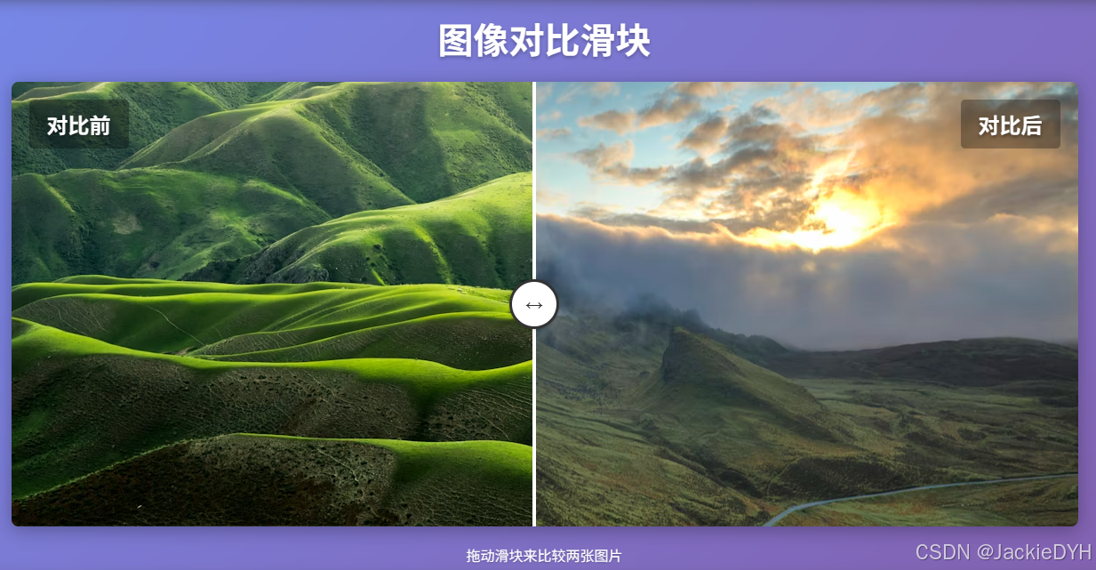
<h1>图像对比滑块</h1>
<div class="comparison-container">
<div class="image-after"></div>
<div class="image-before"></div>
<div class="label-after">对比后</div>
<div class="label-before">对比前</div>
<div class="slider-handle" id="sliderHandle"></div>
</div>
<p class="instructions">拖动滑块来比较两张图片</p>
</div>
css
body {
  font-family: Arial, sans-serif;
  display: flex;
  justify-content: center;
  align-items: center;
  min-height: 100vh;
  margin: 0;
  background: linear-gradient(135deg, #667eea 0%, #764ba2 100%);
  padding: 20px;
}

.container {
  text-align: center;
  width: 1200px;
  padding: 20px;
  background: rgba(255, 255, 255, 0.1);
  backdrop-filter: blur(10px);
  border-radius: 15px;
  box-shadow: 0 8px 32px rgba(0, 0, 0, 0.2);
}

h1 {
  color: white;
  text-shadow: 0 2px 4px rgba(0, 0, 0, 0.3);
  font-size: 2.5rem;
  margin-bottom: 10px;
}

.comparison-container {
  position: relative;
  width: 100%;
  height: 500px;
  margin: 20px auto;
  box-shadow: 0 4px 20px rgba(0, 0, 0, 0.3);
  border-radius: 8px;
  overflow: hidden;
}

.image-before,
.image-after {
  position: absolute;
  top: 0;
  width: 100%;
  height: 100%;
  background-size: cover;
  background-position: center;
}

.image-before {
  background-image: url("https://images.unsplash.com/photo-1501854140801-50d01698950b?ixlib=rb-4.0.3&ixid=M3wxMjA3fDB8MHxwaG90by1wYWdlfHx8fGVufDB8fHx8fA%3D%3D&auto=format&fit=crop&w=1200&q=80");
  left: 0;
  clip-path: inset(0 50% 0 0);
}

.image-after {
  background-image: url("https://images.unsplash.com/photo-1470071459604-3b5ec3a7fe05?ixlib=rb-4.0.3&ixid=M3wxMjA3fDB8MHxwaG90by1wYWdlfHx8fGVufDB8fHx8fA%3D%3D&auto=format&fit=crop&w=1200&q=80");
  left: 0;
}

.slider-handle {
  position: absolute;
  top: 0;
  left: 50%;
  width: 4px;
  height: 100%;
  background-color: white;
  cursor: ew-resize;
  transform: translateX(-50%);
  z-index: 10;
}

.slider-handle::before {
  content: "";
  position: absolute;
  top: 50%;
  left: 50%;
  transform: translate(-50%, -50%);
  width: 50px;
  height: 50px;
  border-radius: 50%;
  background-color: white;
  border: 3px solid #333;
  box-shadow: 0 0 5px rgba(0, 0, 0, 0.3);
}

.slider-handle::after {
  content: "↔";
  position: absolute;
  top: 50%;
  left: 50%;
  transform: translate(-50%, -50%);
  color: #333;
  font-size: 20px;
  font-weight: bold;
}

.label-before,
.label-after {
  position: absolute;
  top: 20px;
  color: white;
  font-size: 24px;
  font-weight: bold;
  text-shadow: 0 2px 4px rgba(0, 0, 0, 0.5);
  padding: 10px 20px;
  background: rgba(0, 0, 0, 0.3);
  border-radius: 5px;
  z-index: 5;
}

.label-before {
  left: 20px;
}

.label-after {
  right: 20px;
}

.instructions {
  margin-top: 20px;
  color: white;
  font-size: 16px;
  text-shadow: 0 1px 2px rgba(0, 0, 0, 0.3);
}
javascript
document.addEventListener("DOMContentLoaded", function () {
  const sliderHandle = document.getElementById("sliderHandle");
  const imageBefore = document.querySelector(".image-before");
  const container = document.querySelector(".comparison-container");

  // 设置初始位置
  let isDragging = false;

  // 鼠标按下事件
  sliderHandle.addEventListener("mousedown", function (e) {
    isDragging = true;
    e.preventDefault();
  });

  // 鼠标移动事件
  document.addEventListener("mousemove", function (e) {
    if (!isDragging) return;

    const containerRect = container.getBoundingClientRect();
    const x = e.clientX - containerRect.left;
    const percentage = Math.max(
      0,
      Math.min(100, (x / containerRect.width) * 100)
    );

    // 只移动滑块和裁剪区域,不改变图片大小
    sliderHandle.style.left = percentage + "%";
    imageBefore.style.clipPath = `inset(0 ${100 - percentage}% 0 0)`;
  });

  // 鼠标释放事件
  document.addEventListener("mouseup", function () {
    isDragging = false;
  });

  // 点击容器事件
  container.addEventListener("click", function (e) {
    const containerRect = container.getBoundingClientRect();
    const x = e.clientX - containerRect.left;
    const percentage = Math.max(
      0,
      Math.min(100, (x / containerRect.width) * 100)
    );

    // 只移动滑块和裁剪区域,不改变图片大小
    sliderHandle.style.left = percentage + "%";
    imageBefore.style.clipPath = `inset(0 ${100 - percentage}% 0 0)`;
  });
});