文章目录
盒子尺寸问题
如果添加了 box-sizing: border-box;那么无论怎么padding, border, margin属性怎么变,只要确定了盒子width ,height,盒子大小就不变
css
* {
      margin: 0;
      padding: 0;
      box-sizing: border-box;
    /* 固定盒子尺寸,防止margin和padding改变盒子尺寸 */
    }
案例:
<!DOCTYPE html>
<html lang="en">

<head>
  <meta charset="UTF-8">
  <meta name="viewport" content="width=device-width, initial-scale=1.0">
  <title>盒子尺寸计算box-sizing</title>
  <style>
    /* * {
      margin: 0;
      padding: 0;
      box-sizing: border-box;
    } */
    .box1 {
      width: 140px;
      height: 140px;
      background-color: pink;
      box-sizing: content-box;
      border: 10px solid red;
      padding: 20px;
    }

    .box2 {
      width: 200px;
      height: 200px;
      background-color: pink;
      box-sizing: border-box;
      border: 10px solid red;
      padding: 20px;
    }
  </style>
</head>

<body>
  <div class="box1">content-box</div>
  <div class="box2">border-box</div>
</body>

</html>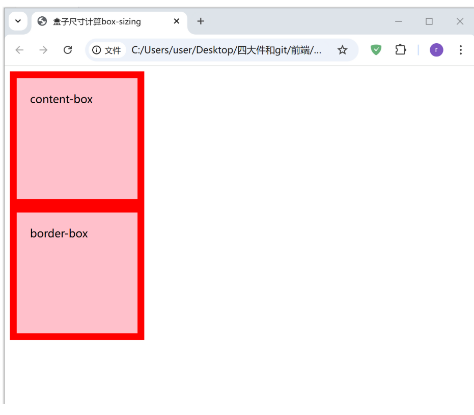
布局标签
网站的结构标签
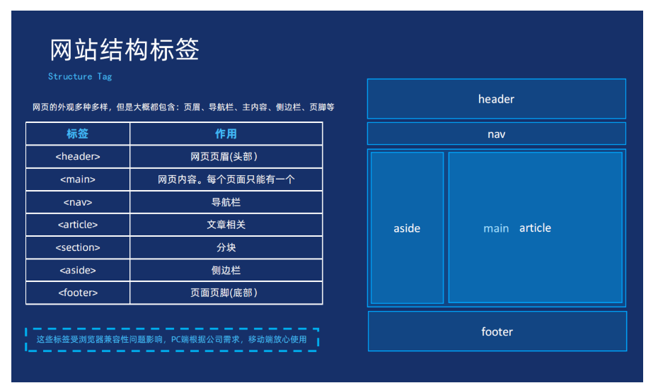
无语义标签
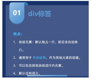
div标签
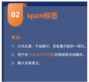
span标签
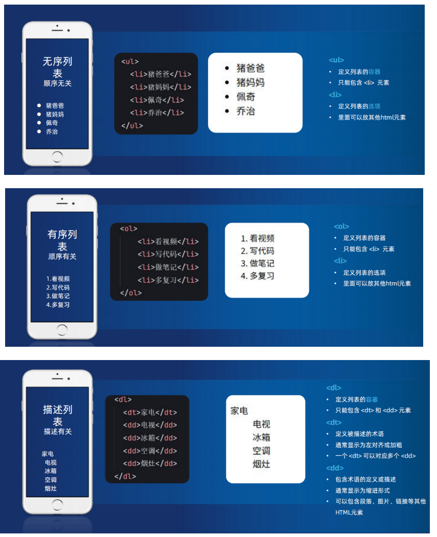
列表标签
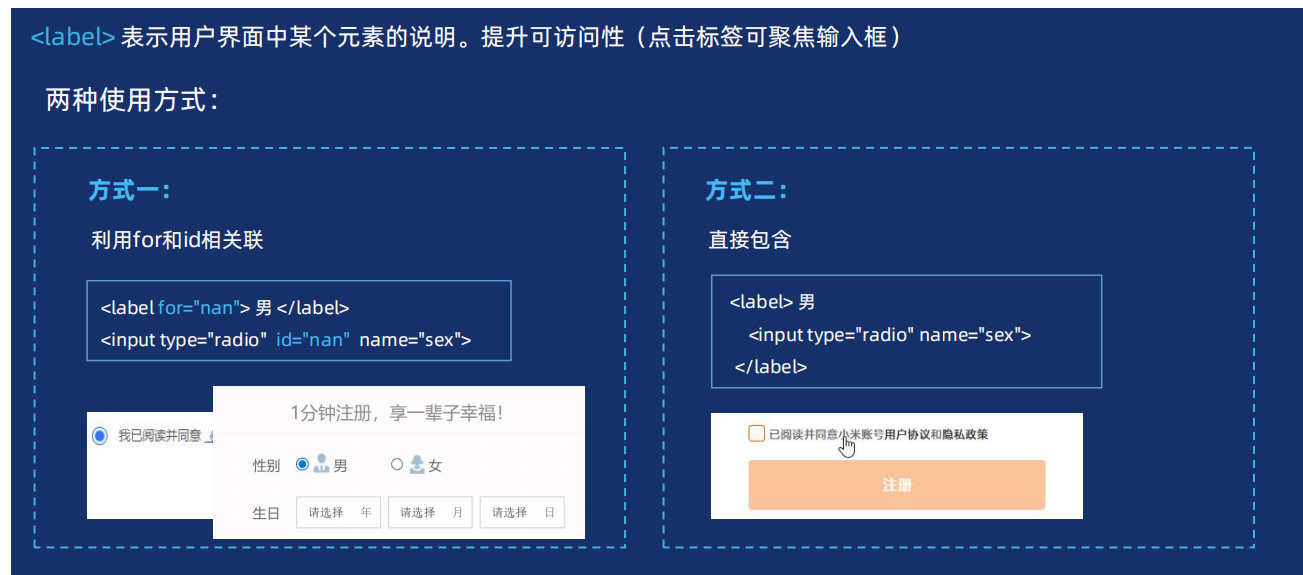
辅助标签label
一般第二种
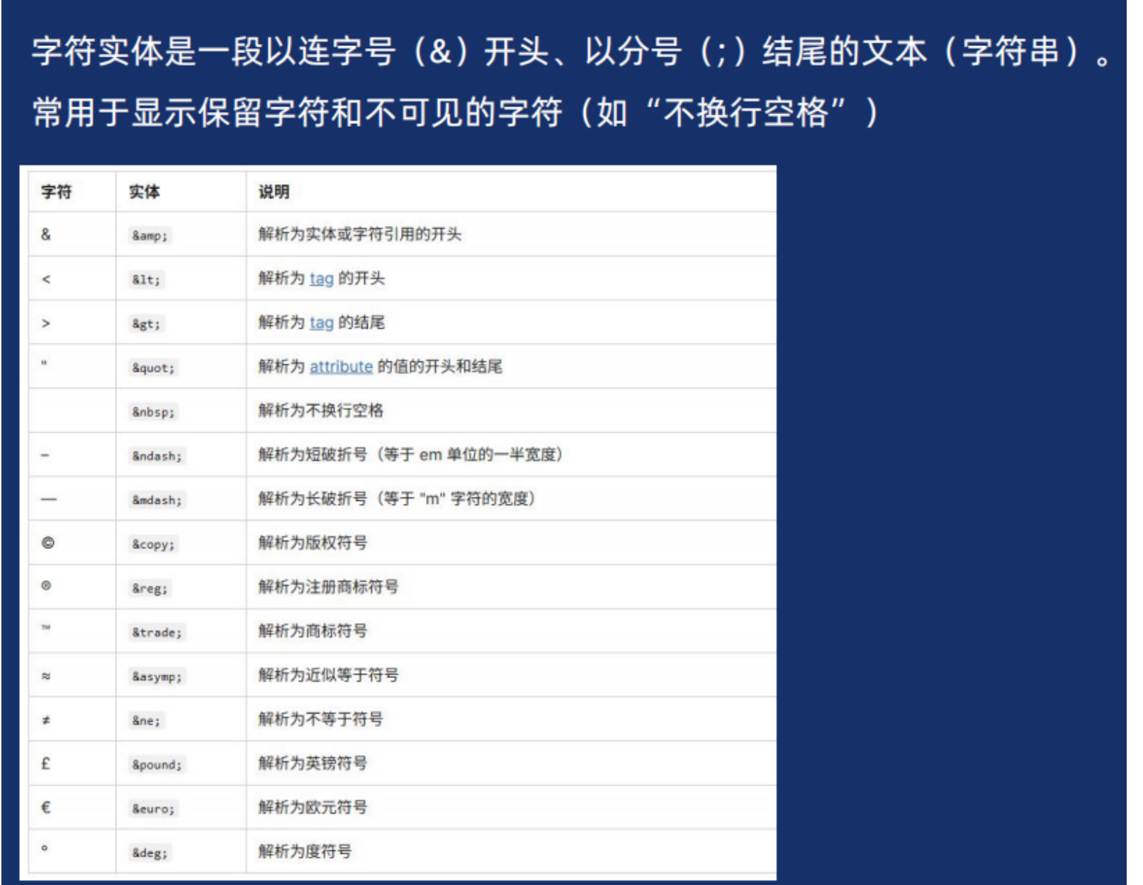
字符实体
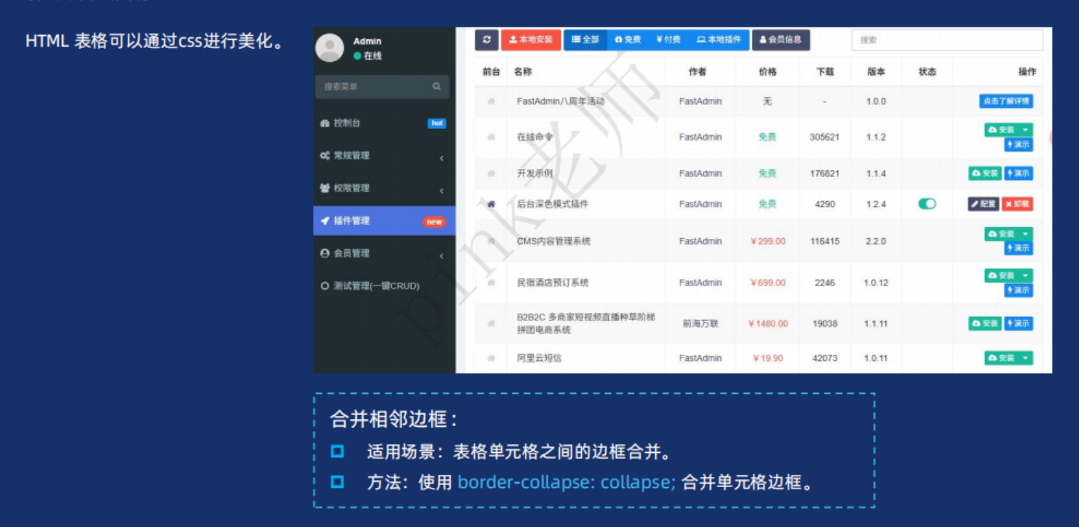
背景的复合写法
css
selector {
  		background: [background-color] [background-image] [background-position] / 	[background-size] [background-repeat] [background-attachment] [background-origin] [background-clip];
}
/*颜色、图片、平铺、滚动、位置*/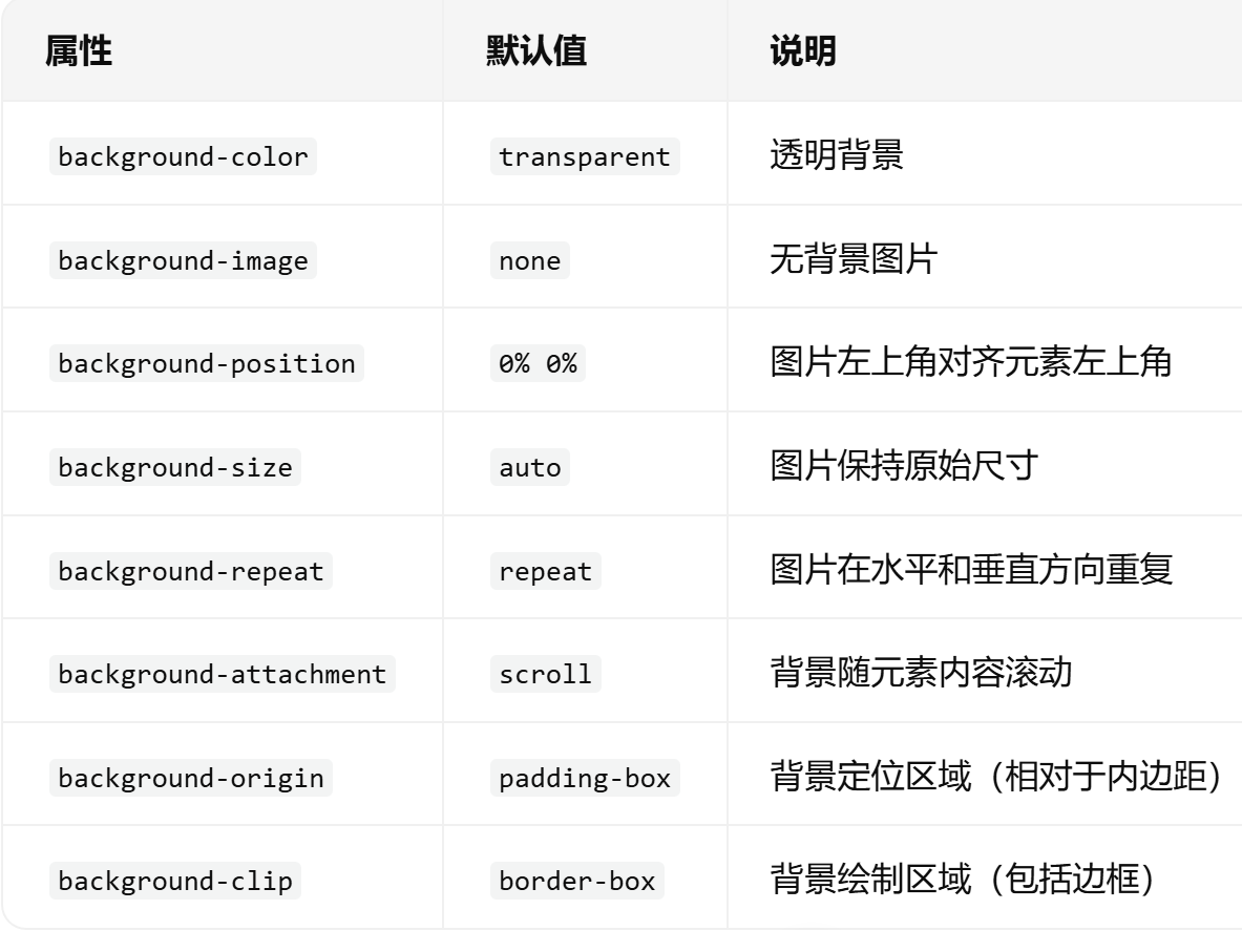
css
div {
  background: #f0f0f0 url("image.png") no-repeat center / cover;
    /*颜色、图片、平铺、滚动、位置*/
}
背景、文字渐变

案例:
css
<!DOCTYPE html>
<html lang="en">

<head>
  <meta charset="UTF-8">
  <meta name="viewport" content="width=device-width, initial-scale=1.0">
  <title>背景渐变</title>
  <style>
    .box {
      width: 300px;
      height: 200px;

      /* background-color: pink; */
      /* background: linear-gradient(to top, pink, red); */
      /* deg 角度  90deg 就是 90度 */
      /* background: linear-gradient(90deg, pink, red); */
      /* 位置 是色标的位置 */
      /* background: linear-gradient(90deg, pink 50%, red 50%); */
      /* background: linear-gradient(180deg, #3ECEC5D8 0%, #26BCC6 100%); */
      background-image: linear-gradient(180deg, #3ECEC5D8 0%, #26BCC6 100%);


    }

    .text {
      font-size: 30px;
      font-weight: 700;
      /* 渐变背景文字 */
      background-image: linear-gradient(97deg, #0096FF, #BB64FF 42%, #F2416B 74%, #EB7500);
      /* -webkit- 前缀  谷歌浏览器老版本的兼容性写法 */
      -webkit-background-clip: text;
      /* 背景裁剪 以文字的形式裁剪 */
      background-clip: text;
      /* 文本填充颜色 为透明 */
      -webkit-text-fill-color: transparent;
    }

    /* 添加按钮渐变样式 */
    .gradient-btn {
      background: linear-gradient(45deg, #ff6b6b, #4ecdc4);
      border: none;
      color: white;
      padding: 10px 20px;
      border-radius: 5px;
      cursor: pointer;
      font-size: 16px;
    }
  </style>
</head>

<body>
  <div class="box"></div>
  <div class="text">我是渐变的文字,你喜欢吗?</div>
  <button class="gradient-btn">搜索</button>
</body>

</html>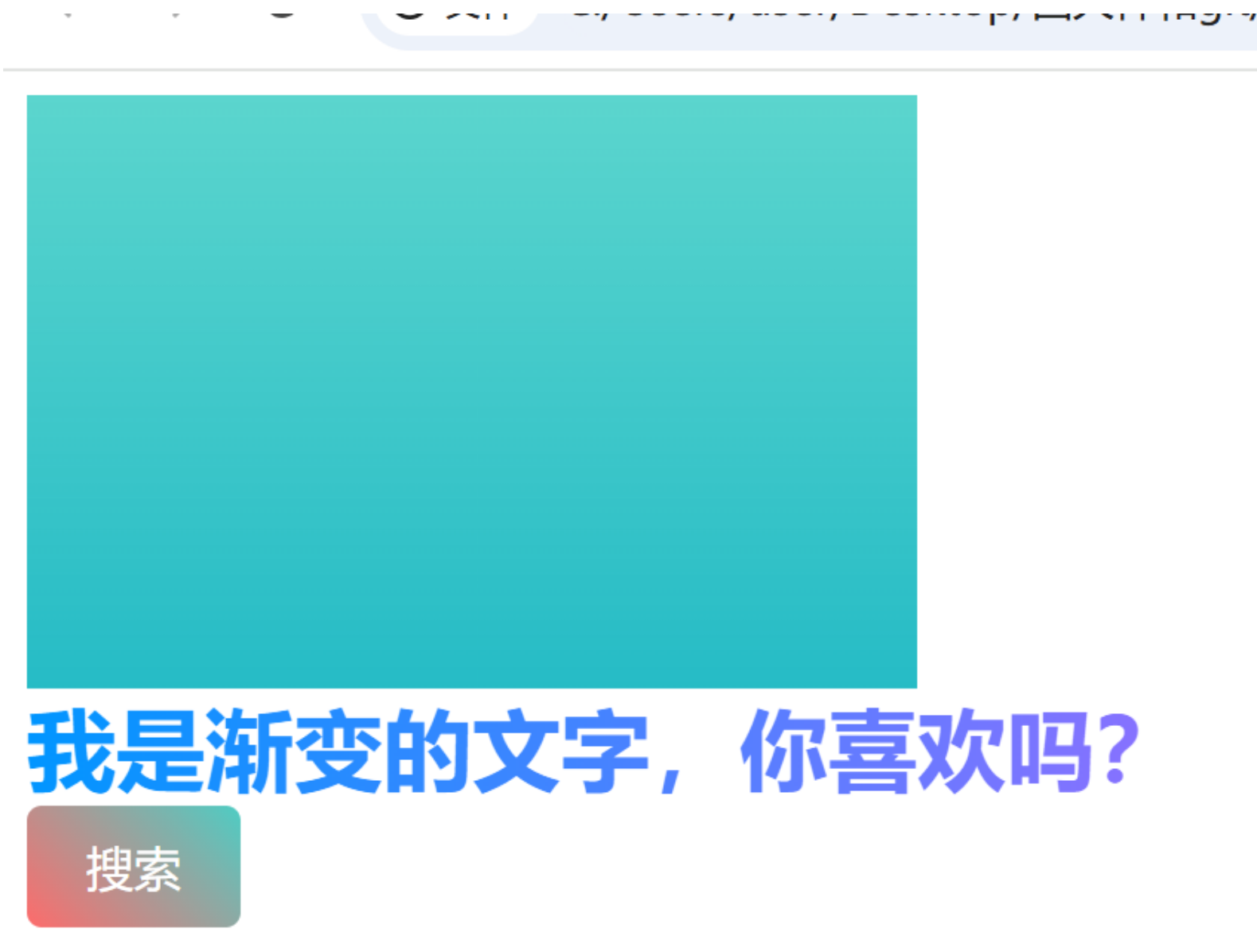
盒子阴影和过渡
案例:
html
<!DOCTYPE html>
<html lang="en">

<head>
  <meta charset="UTF-8">
  <meta name="viewport" content="width=device-width, initial-scale=1.0">
  <title>盒子阴影</title>
  <style>
    .box {
      width: 200px;
      height: 200px;
      background-color: pink;
      margin: 100px auto;
      /* 盒子阴影: 水平偏移量  垂直偏移量  模糊距离  扩散距离  阴影颜色 */
      /* box-shadow: 0 0 10px 10px rgba(0, 0, 0, 0.5); */
      /* box-shadow: rgba(0, 0, 0, 0.1) 0px 15px 30px; */
      /* 过渡写到盒子身上。 谁做过渡给谁加 */
      transition: all .3s;
    }

    .box:hover {
      width: 220px;
      height: 220px;
      box-shadow: rgba(0, 0, 0, 0.3) 0px 15px 30px;
    }
  </style>
</head>

<body>
  <div class="box"></div>
</body>

</html>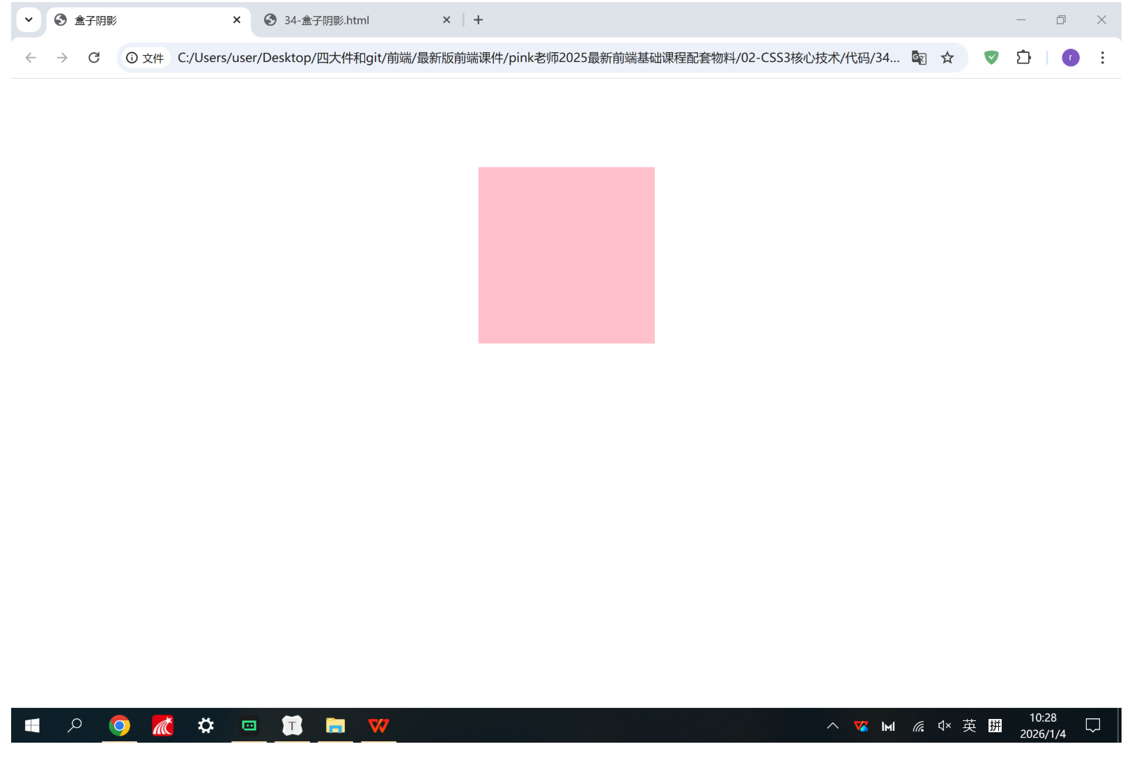
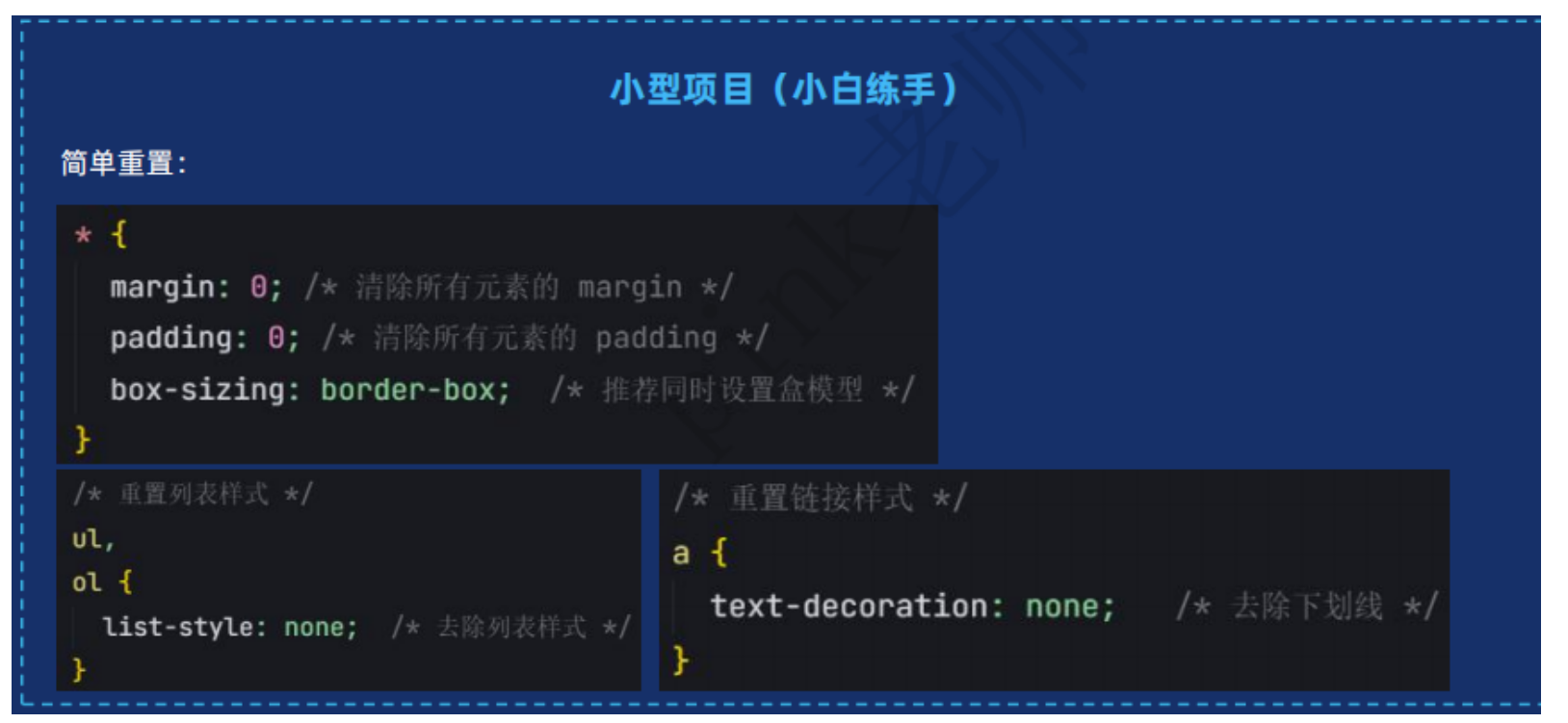
样式初始化
文字隐藏溢出显示省略号
单行
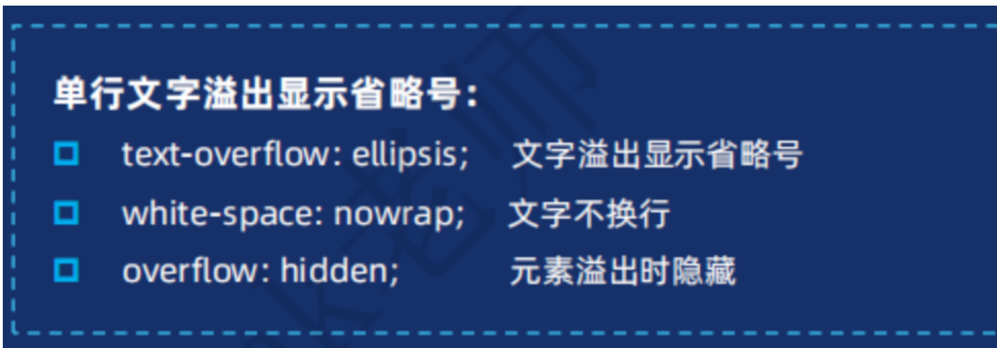
css
.box p:nth-child(3) {
font-size: 12px;
font-weight: 400;
color: gainsboro;
/* 超出部分省略号显示 */
text-overflow: ellipsis;
/* 超出部分隐藏 */
overflow: hidden;
/* 文字不换行 */
white-space: nowrap;
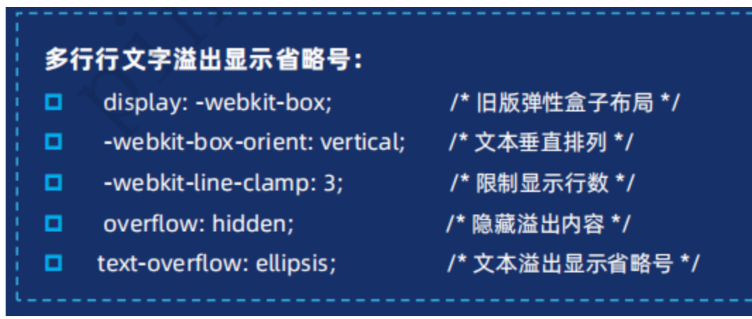
}多行
多行显示省略号,修改盒子高度为正好显示行数的高度。
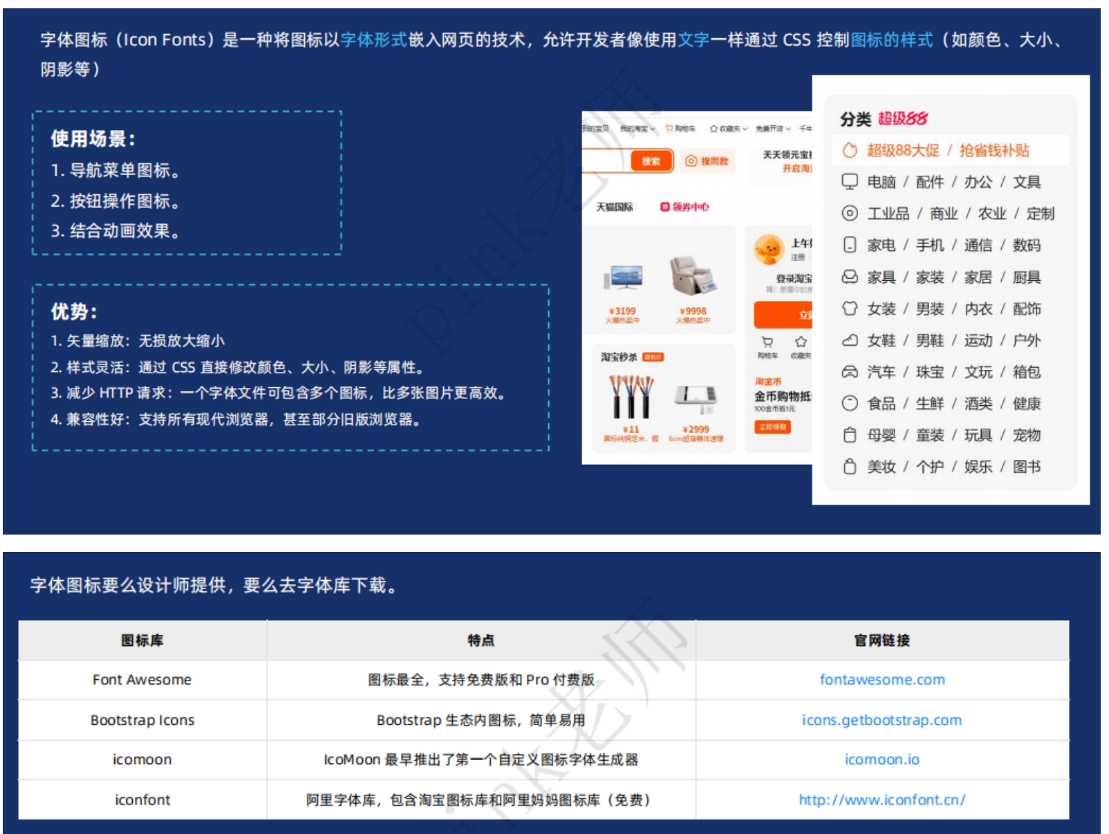
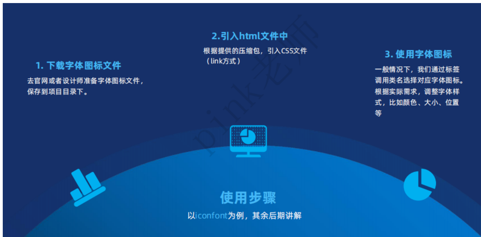
字体图标
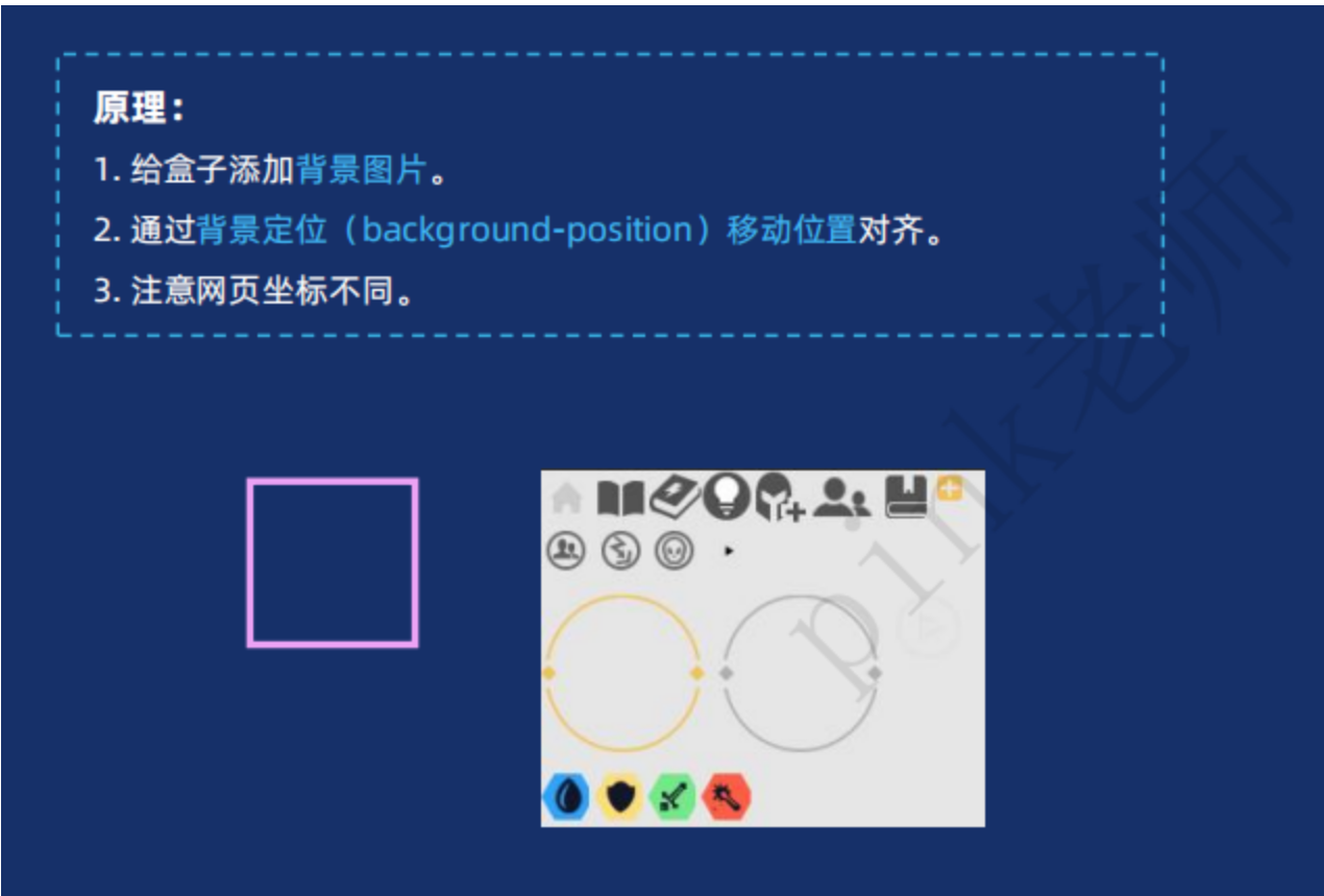
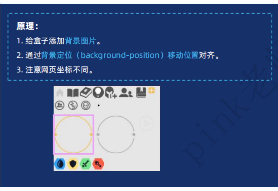
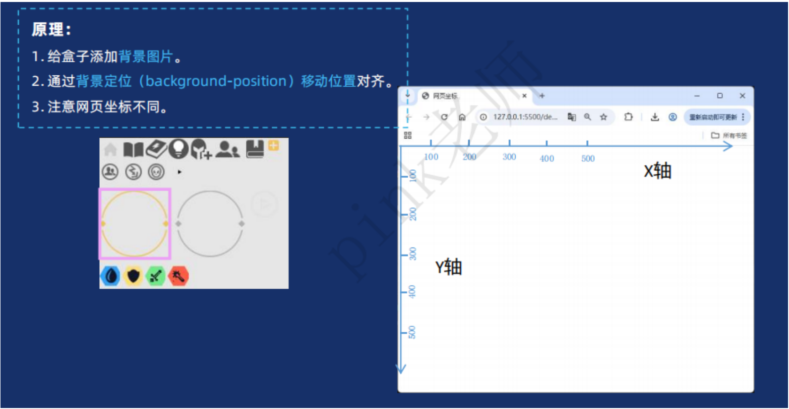
精灵图