在很多示例中,多行文本的末尾都是显示"展开收起",但是在实际的需求中,可能需要图标替代"展开收起"文字。
一、示例:
template部分:
html
<template>
  <!-- 当有内容时才显示整个组件 -->
  <div v-if="contentText" class="wrapper">
    <!-- 展开/收起的复选框,用于控制内容显示状态 -->
    <input
      v-if="state.showToggleButton"
      :id="uniqueId"
      class="exp"
      type="checkbox"
      @click.stop="displayAllContent"
    />
    <!-- 文本内容容器,根据是否需要展开按钮添加不同样式 -->
    <div
      ref="descRef"
      class="text"
      :class="{ 'text-white': isTextWhiteColor }"
      @click.stop="handleClickContentText"
    >
      <!-- 展开/收起按钮 -->
      <label
        v-if="state.showToggleButton"
        class="btn"
        :class="{ 'btn-white': isTextWhiteColor }"
        :for="uniqueId"
        aria-label="展开/收起"
      ></label>
      <!-- 展开/收起按钮 -->
      <span
        v-if="topic"
        class="topic-text"
        :class="{ 'topic-text-white': topicDisable }"
        @click.stop="handleClickTopicText"
      >
        {{ topic }}
      </span>
      <!-- 等级文本,如果等级有效则显示 -->
      <span v-if="level !== undefined && level !== null && level !== ''" class="g-font-number">
        {{ '等级' }}{{ level }}
      </span>
      <!-- 主要内容文本 -->
      {{ contentText }}
    </div>
  </div>
</template>
JavaScript部分:
javascript
<script setup>
import { ref, reactive, nextTick, watch, onMounted } from 'vue'

// 文本内容容器的引用,用于获取DOM元素的高度信息
const descRef = ref(null)

// 随机创建一个唯一的ID,用于关联checkbox和label
const uniqueId = ref(`exp-${Math.random().toString(36).slice(2, 11)}`)

// 定义组件属性
const props = defineProps({
  // 用户等级
  level: {
    type: Number,
  },
  // 话题内容
  topic: {
    type: String,
  },
  // 文本内容
  contentText: {
    type: String,
    required: true, // 必填属性
  },
  // 最多显示几行
  maxLines: {
    type: Number,
    default: 2,
    validator: (value) => value > 0, // 验证器:值必须大于0
  },
  // 行⾼
  lineHeight: {
    type: Number,
    default: 20,
    validator: (value) => value > 0, // 验证器:值必须大于0
  },
  // 字体⼤⼩
  fontSize: {
    type: Number,
    default: 14,
    validator: (value) => value > 0, // 验证器:值必须大于0
  },
  // 内容文字颜色是否为白色
  isTextWhiteColor: {
    type: Boolean,
    default: false,
  },
  // 话题文字是否可点击
  topicDisable: {
    type: Boolean,
    default: false,
  },
})

const state = reactive({
  // 是否展⽰所有⽂本内容
  showAll: true,
  // 当前是展开/收起状态
  collapsedStatus: true,
  // 是否显⽰展开收起按钮
  showToggleButton: false,
})

// 定义组件触发的事件,包含参数验证
const emit = defineEmits({
  // 展开/收起状态变化事件
  expanded: (newVal) => {
    if (typeof newVal === 'boolean') {
      return true
    } else {
      console.error('newVal is undefined')
      return false
    }
  },
  // 点击话题文本事件
  handleClickTopicText: null,
  // 点击内容文本事件
  handleClickContentText: null,
})

/**
 * 处理点击话题文本事件
 * 如果话题被禁用,则不触发事件
 */
const handleClickTopicText = () => {
  if (props.topicDisable) {
    return
  }
  emit('handleClickTopicText')
}

/**
 * 处理点击内容文本事件
 * 只有当点击的不是按钮元素时才触发
 * @param {Event} event - 点击事件对象
 */
const handleClickContentText = (event) => {
  if (!event.target.classList.contains('btn') && !event.target.classList.contains('exp')) {
    emit('handleClickContentText')
  }
}

/**
 * 处理展开/收起内容事件
 * 切换显示状态
 * @param {Event} event - 点击事件对象
 */
const displayAllContent = (event) => {
  if (event.target.classList.contains('btn') || event.target.classList.contains('exp')) {
    state.showAll = !state.showAll
    state.collapsedStatus = !state.collapsedStatus
  }
}

/**
 * 计算最大高度
 * @returns {number} 最大高度值
 */
const getMaxHeight = () => {
  //后面的 + 1 很重要,是为了让省略号和展开图标不会被最后一行的文字覆盖
  return props.lineHeight * props.maxLines + 1
}

/**
 * 初始化布局,计算是否需要显示展开/收起按钮
 */
const initLayout = async () => {
  await nextTick()
  // 添加额外的检查,确保元素存在
  if (!descRef.value) {
    console.warn('Element not found in DOM')
    return
  }

  try {
    // 获取实际文本高度
    const descHeight = parseFloat(window.getComputedStyle(descRef.value).height)

    // 获取最大允许高度
    const maxHeight = getMaxHeight()

    //后面的 - 1 很重要,因为getMaxHeight里面加了 1
    //同时检查高度和是否真的有被截断的内容;
    const shouldCollapse =
      descHeight > maxHeight - 1 && descRef.value.scrollHeight > descRef.value.clientHeight

    // 设置是否显示展开/收起按钮
    state.showToggleButton = shouldCollapse
  } catch (error) {
    console.warn('Failed to compute element style:', error)
  }
}

// 监听展开/收起状态变化,触发外部事件
watch(
  () => state.collapsedStatus,
  (newVal, oldVal) => {
    if (newVal !== oldVal) {
      //通知外部变化了
      emit('expanded', newVal)
    }
  },
)

// 监听内容文本变化,重新计算布局
watch(
  () => props.contentText,
  async (newVal) => {
    // 确保 DOM 更新后再执行
    await nextTick()
    initLayout()
  },
)

// 组件挂载完成后初始化布局
onMounted(async () => {
  // 确保 DOM 完全挂载后再执行
  await nextTick()
  initLayout()
})
</script>
css部分:
css
<style scoped>
/* 包装器样式 */
.wrapper {
  display: flex;
  width: 100%;
  overflow: hidden;
}

/* 文本容器样式 */
.text {
  font-size: v-bind('props.fontSize + "px"');
  overflow: hidden;
  text-overflow: ellipsis;
  text-align: justify;
  position: relative;
  line-height: v-bind('props.lineHeight + "px"');
  max-height: v-bind('getMaxHeight() + "px"');
  color: rgba(255, 255, 255, 0.6);
}

/* 白色文字样式 */
.text-white {
  width: 100%;
  color: rgb(255, 255, 255);
}

/* 伪元素创建省略号效果 */
.text::before {
  content: '';
  height: calc(100% - v-bind('props.lineHeight + "px"'));
  float: right;
}

/* 按钮样式 */
.btn {
  position: relative;
  float: right;
  clear: both;
  margin-left: 20px;
  font-size: v-bind('props.fontSize + "px"');
  line-height: v-bind('props.lineHeight + "px"');
  border-radius: 4px;
  color: rgba(255, 255, 255, 0.6);
}

/* 展开按钮的省略号样式 */
.btn::before {
  content: '...';
  position: absolute;
  left: -5px;
  color: rgba(255, 255, 255, 0.6);
  transform: translateX(-100%);
}

/* 白色主题的按钮样式 */
.btn-white::before {
  color: rgb(255, 255, 255);
}

/* 展开/收起图标样式 */
.btn::after {
  /* content: '展开'; */
  content: '';
  display: block; /* 使伪元素为块级元素 */
  width: 16px;
  height: 16px;
  background-image: url('../assets/arrow-down.png');
  background-size: cover;
  background-repeat: no-repeat;
  transform: translate(0, 10%);
}

/* 隐藏复选框 */
.exp {
  display: none;
}

/* 展开状态下的文本样式 */
.exp:checked + .text {
  max-height: none;
}

/* 展开状态下的图标样式 */
.exp:checked + .text .btn::after {
  /* content: '收起'; */
  content: '';
  display: block;
  width: 16px;
  height: 16px;
  background-image: url('../assets/arrow-up.png');
  background-size: cover;
  background-repeat: no-repeat;
  position: absolute;
  right: 10px;
  top: 50%;
  transform: translate(50%, 10%);
}

/* 展开状态下隐藏省略号 */
.exp:checked + .text .btn::before {
  visibility: hidden; /*在展开状态下隐藏省略号*/
}

/* 话题文本样式 */
.topic-text {
  color: yellow;
  font-size: v-bind('props.fontSize + "px"');
  line-height: v-bind('props.lineHeight + "px"');
  margin-right: 12px;
}

/* 白色主题话题文本样式 */
.topic-text-white {
  color: rgb(255, 255, 255);
}

/* 等级文本样式 */
.g-font-number {
  font-size: v-bind('props.fontSize + "px"');
  color: rgb(255, 255, 255) !important;
  margin-right: 5px;
  line-height: v-bind('props.lineHeight + "px"');
}
</style>
二、父组件使用:
javascript
import TextEllipsis from './components/TextEllipsis.vue'
html
<div class="wrapper">
<TextEllipsis
:level="8"
:maxLines="3"
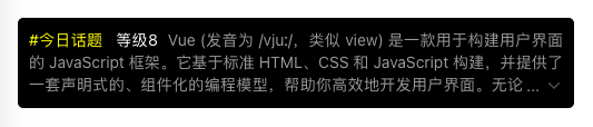
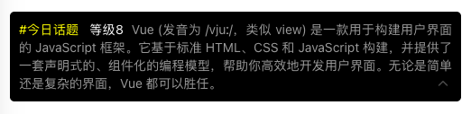
topic="#今日话题"
contentText="Vue (发音为 /vjuː/,类似 view) 是一款用于构建用户界面的 JavaScript 框架。它基于标准 HTML、CSS 和 JavaScript 构建,并提供了一套声明式的、组件化的编程模型,帮助你高效地开发用户界面。无论是简单还是复杂的界面,Vue 都可以胜任。"
/>
</div>
css
.wrapper {
  /** 宽高要设置 */
  width: 500px;
  min-height: 10px;

  background-color: black;
  margin-bottom: 200px;
  padding: 10px;
  border-radius: 5px;
}
最终效果:
(收起状态)
(展开状态)
以上部分也可以根据实际需求进行修改。