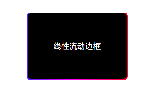
1. 效果图
2. 代码实现
核心技术:背景渐变+位移实现水平流动色带
html
<div class="flow-wrap">
  <div class="flow-box">线性流动边框</div>
</div>
css
.flow-wrap {
  position: relative;
  z-index: 1;
  padding: 50px;
}
.flow-box {
  position: relative;
  width: 300px;
  height: 200px;
  display: flex;
  justify-content: center;
  align-items: center;
  color: white;
  font-size: 24px;
  border-radius: 8px;
  margin: 0 auto;
}

.flow-box::before {
  content: '';
  position: absolute;
  width: 100%;
  height: 100%;
  top: 0;
  left: 0;
  z-index: -1;
  background: linear-gradient(90deg, #ff0000, #ff9900, #33ff00, #0099ff, #0033ff, #ff00ff, #ff0000);
  background-size: 400%;
  border-radius: 10px;
  animation: flow 8s linear infinite;
}

.flow-box::after {
  content: '';
  position: absolute;
  top: 0;
  left: 0;
  right: 0;
  bottom: 0;
  z-index: -1;
  background: #000;
  border-radius: 8px;
  margin: 3px;
}

@keyframes flow {
  0% {
    background-position: 0 0;
  }
  100% {
    background-position: 400% 0;
  }
}